Original Source: https://www.smashingmagazine.com/2019/04/art-direction-for-the-web-using-css-shapes/
Art Direction For The Web Using CSS Shapes
Art Direction For The Web Using CSS Shapes
Andrew Clarke
2019-04-11T13:30:16+02:00
2019-04-11T17:35:05+00:00
Last year, Rachel Andrew wrote an article that took a new look at CSS Shapes in which she reintroduced readers to the basics of using CSS Shapes. For anyone keen to understand how to use properties like shape-outside, shape-margin, and shape-image-threshold, Rachel’s is the ideal primer.
I’ve seen many examples of using the properties, but very few go beyond Basic Shapes, including circle(), ellipse(), inset(). Even examples using polygon() shapes rarely go far beyond them. Considering the creative opportunities CSS Shapes offer, this is disappointing. But, I’m sure that with a little inspiration and imagination, we can make more distinctive and engaging designs. So, I’m going to show you how to use CSS Shapes to create the following five different types of layout:
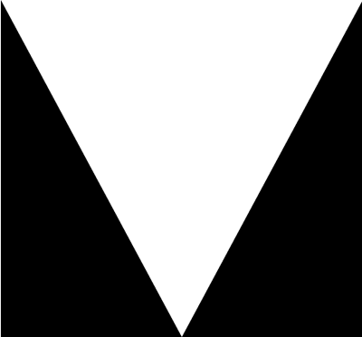
V-shapes
Z-patterns
Curved shapes
Diagonal shapes
Rotated shapes
A Little Inspiration
Sadly, you won’t find many inspiring examples of websites which use CSS Shapes. That doesn’t mean that inspiration isn’t out there — you just have to look a little further afield at advertising, magazine, and poster design. However, it would be foolish for us to merely mimic work from a previous era and medium.
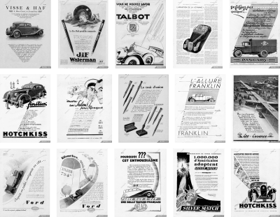
You can find inspiration in surprising places, such as these vintage advertisements.
For the past few years, I’ve filled Dropbox folders with inspiration and I really ought to move those examples to Pinterest. Fortunately, Kristopher Van Sant has been more diligent than me in compiling a Pinterest board full of inspiring ‘Shapes Of Text’ examples.
Shapes add energy to design, and this movement draws people in. They help to connect an audience with your story and make tighter connections between your visual and written content.
When you need content to flow around a shape, use the shape-outside property. You must float an element left or right for shape-outside to have any effect.
img {
float: <values>;
shape-outside: <values>;
}
NB: When you flow content around shapes, be careful not to allow any lines of text to become too narrow and fit only one or two words.
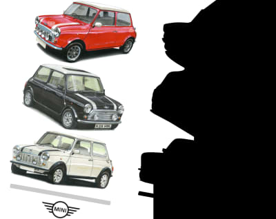
It often needs surprisingly little markup to develop dynamic and original layouts. My HTML for this series of five designs consists only of a header and main elements, figures, and images, and is often no more complicated than this:
<header role=”banner”>
<h1>Mini Cooper</h1>
</header>
<figure>
<img src=”mini.png” alt=”Mini Cooper”>
</figure>
<main>
…
</main>
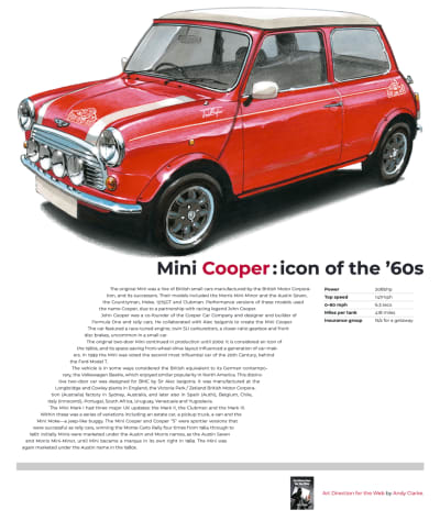
1. V-Shapes
For me, one of the most incredible aspects of modern-day CSS is that I can create a shape from the alpha channel of a partially transparent image with no need to draw a polygon path. I only need to create an image, and then a browser will take care of the rest.
I think this is one of the most exciting additions to CSS and it makes developing art direction for the web more straightforward, especially if you work with a content management system and dynamically generated content.
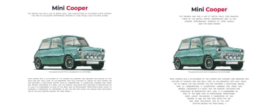
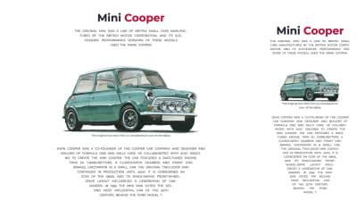
Left: Without CSS Shapes, this design feels dull and lifeless. Right: Creating v-shapes makes this design more distinctive and engaging.
To develop shapes from images, they must have an alpha channel which is either entirely or partially transparent. I needn’t draw a polygon to enable content to flow between the triangular shapes either side of my content in this first design; instead, I need only specify the URL of an image file as the shape-outside value:
[src*=”shape-left”],
[src*=”shape-right”] {
width: 50%;
height: 100%;
}
[src*=”shape-left”] {
float: left;
shape-outside: url(‘alpha-left.png’);
}
[src*=”shape-right”] {
float: right;
shape-outside: url(‘alpha-right.png’);
}
Watch out for CORS (cross-origin resource sharing) when using images to develop your shapes. You must host images on the same domain as your product or website. If you use a CDN, make sure it sends the correct headers to enable shapes. It’s also worth noting that the only way to test shapes locally is to use a web server. The file:// protocol simply won’t work.
Generated Content
As Rachel explained in her article:
“You could also use an image as the path for the shape to create a curved text effect without also including the image on the page. You still need something to float, however, and so for this, we can use Generated Content.”
As an alternative to alpha channel, I can use Generated Content — applied to two pseudo-elements — one for a polygon triangle on the left, the other for the right. My running text will now flow between the two generated shapes:
main::before {
content: “”;
display: block;
float: left;
width: 50%;
height: 100%;
shape-outside: polygon(0 0, 0 100%, 100% 100%);
}
main p:first-child::before {
content: “”;
display: block;
float: right;
width: 50%;
height: 100%;
shape-outside: polygon(100% 0, 0 100%, 100% 100%);
}
NB: Bennett Feely’s CSS clip-path maker is a fabulous tool for working out coordinate values for use with CSS Shapes.
Adjusting the width of alpha images at several breakpoints allows the shape of this running text to best suit its viewport.
2. Z-Patterns
A Z-pattern is a familiar path our eyes follow when reading content from left–right, top–bottom. By placing content along the hidden lines which form a Z, these patterns help guide a reader along this path, from where we’d like them to start reading towards a destination such as a call-to-action. Z-patterns can be either discreet — implied by focal points or elements with higher visual weight — or made obvious using CSS Shapes.
The z-pattern created by driving a narrow column of running text between two shapes suggests speed and the fun people will have when driving this iconic little car.
In this next design, a discreet z-pattern is formed as:
The large image spans the full page width, the end-point emphasised with a right aligned headline.
A block of running text is formed by two CSS Shapes.
The thick top border on a figure acting as a footer completes the Z.
There’s no need for complicated markup to implement this design and my simple HTML includes just three elements:
<header role=”banner”>
<h1>Mini Cooper:icon of the ’60s</h1>
<img src=”banner.png” alt=”Mini Cooper”>
</header>
<main>
<img src=”placeholder-left.png” alt=”” aria-hidden=”true”>
<img src=”placeholder-right.png” alt=”” aria-hidden=”true”>
…
</main>
<figure role=”contentinfo”>
…
</figure>
My page-width spanning header and figure needs no explanation, but flowing text between two triangular shapes is a little more complicated. To implement this z-pattern design, I choose to include two tiny 1×1px placeholder images onto which I apply two larger, shape-forming images using shape-outside. By attaching an aria-hidden attribute to these images, a screen reader won’t describe them.
After giving the two shape images the same dimensions,
I float one image left and the other to the right, which allows my running text to run between them:
[src*=”placeholder-left”],
[src*=”placeholder-right”] {
display: block;
width: 240px;
height: 100%;
}
[src*=”placeholder-left”] {
float: left;
shape-outside: url(‘shape-right.png’);
}
[src*=”placeholder-right”] {
float: right;
shape-outside: url(‘shape-right.png’);
}
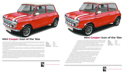
Left: A presentable but predictable design which lacks energy. Right: CSS Shapes suggest fun and speed.
The iconic Mini Cooper was fast and fun to drive. While my design would be perfectly presentable without a z-pattern formed by CSS Shapes, this layout looks predictable and lacks energy. The z-pattern created by driving a narrow column of running text between two shapes suggests speed and the fun people will have when driving this iconic little car.
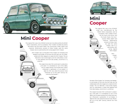
3. Curved Shapes
One of the most fascinating aspects of CSS Shapes is how I can create elegant shapes using the alpha channel from a partially transparent image. This shape can be anything I imagine. I only need to create the image, and a browser will flow content around it.
While confining content to within a shape has been proposed in the CSS Shapes Module Level 2 specification, there’s currently no way to know if and when this might be implemented in browsers. But while shape-inside isn’t available (yet!), that doesn’t mean I can’t create similar results using shape-outside.

Left: Another presentable, but predictable design. Right: A more distinctive look created by using CSS Shapes.
By confining my content within a curved image floated right, I can easily add a distinctive look to this next design. To create the shape, I again use the shape-outside property, this time with the value being the same URL as my visible image:
[src*=”curve”] {
float: right;
width: 400px;
height: 100vh;
shape-outside: url(‘curve.png’);
}
To put some distance between my shape and the content flowing around it, the shape-margin property draws a further shape outside the contours of the first one. I can use any CSS absolute length unit — millimeters, centimeters, inches, picas, pixels, and points — or relative units (ch, em, ex, rem, vh, and vw):
[src*="curve"] {
shape-margin: 3rem;
}
More Margins
Adding movement to this curved design relies on more than CSS Shapes. Using viewport width units, I give my headline, image, and running text a different left margin, each one proportional to the width of the viewport. This creates a diagonal from the back of my headline to the front of the car:
h1 {
margin-left: 5vw;
}
img {
margin-left: 10vw;
}
p {
margin-left: 20vw;
}
4. Diagonal Shapes
Angles can help make layouts look less structured and feel more organic. The absence of clear structure encourages the eye to roam freely around a composition. This movement also causes an arrangement to feel energetic.
I see designs set around horizontal and vertical axes every day, but rarely anything based on a diagonal. Every once in a while, I spot an angled element — perhaps a banner graphic with its bottom sloping — but it’s rarely essential to a design.
It’s common to see content flowing around shapes in print design, but this was impossible to achieve on the web before CSS Shapes.
Even though CSS Grid involves setting columns and rows, there’s no reason why it can’t be used to create dynamic diagonals. This next design needs just a header and main element:
<header role=”banner”>
<h1>Mini Cooper</h1>
<img src=”banner.png” alt=”Mini Cooper”>
</header>
<main>
<img src=”shape.png” alt=””>
…
</main>
To create the diagonal detail in this design, I again flow content around a shape image which itself is floated left. Again I use the shape-outside property with the same URL value as my visible image and a shape-margin to put distance between my shape and the content flowing around it:
[src*=”shape”] {
float: left;
shape-outside: url(‘shape.png’);
shape-margin: 3rem;
}
Given that responsiveness is one of the web’s intrinsic properties, we can rarely predict how content will flow, but we avoid designs like this one. When there’s too little space for all my running text to fit above the shape, the fact that each shape is floated means that content will flow into space below the shape.
5. Rotated Shapes
Why settle for just using CSS Grid and Shapes when adding Transforms to the mix can enable layouts which were unimaginable only a few years ago? In this final example, flowing text around the cars in this image, while at the same time rotating the entire composition needed a combination of all those properties.
Why settle for using only CSS Grid and Shapes?
As the image of these cars has no transparent alpha channel, flowing text around the shapes, it contains needs a second image which includes only alpha channel information.
Implementing this design requires two images; one visible, the other proving alpha channel information.
This time, I float the visible image right and apply the shape-outside property with a URL value which matches my alpha channel image:
[src*=”shape”] {
float: right;
width: 50%;
shape-outside: url(‘alpha.png’);
shape-margin: 1rem;
}
You may have noticed that both my images contain elements which I rotated clockwise by ten degrees. With those images in place, I can rotate the entire layout ten degrees in the opposite direction to give the illusion that my images are upright:
body {
transform: rotate(-10deg);
}
I rotate this layout just enough to make the design more appealing, without sacrificing readability.
Bonus Example: Polygon Shapes Sculpt Columns
An extract from ‘Art Direction for the Web’ available from 26th March 2019.
You can create strong, structural shapes with nothing more than type. Combining polygon() shapes and pseudo-elements, you can sculpt shapes from solid blocks of running text, in the style of Alexey Brodovitch and his influential work for Harper’s Bazaar.
Left: These beautiful numerals are almost too lovely to hide. They’re also perfect for carving into those columns. Right: When I use invisible pseudo-elements with no background or borders to develop polygon shapes, the result is two unusually shaped columns.
I formed these columns from two article elements, i.e. with a gutter between them and a maximum width, which help maintain a comfortable measure:
body {
display: grid;
grid-template-columns: 1fr 1fr;
grid-gap: 2vw;
max-width: 48em;
}
Because there are two article elements and I also specified
two columns for my grid, there’s no need to be specific about the position of those articles. I can let a browser place them for me, and all that remains for me is to apply shape-outside to a generated pseudo-element in each column:
article:nth-of-type(1) p:nth-of-type(1)::before {
content: “”;
float: left;
width: 160px;
height: 320px;
shape-outside: polygon(0px 0px, 90px 0px, […]);
}
article:nth-of-type(2) p:nth-of-type(2)::before {
content: “”;
float: right;
width: 160px;
height: 320px;
shape-outside: polygon(20px 220px, 120px 0px, […]);
}
The Pay-Off
Now that Firefox has released a version which supports CSS Shapes, and has launched a Shape Path Editor inside its Developer Tools, there’s now only Edge without support for Shapes. This situation will soon change now that Microsoft has announced a change from their own EdgeHTML rendering engine to Chromium’s Blink, the same engine as Chrome and Opera.
Tools like CSS Shapes now give us countless opportunities to use art direction to capture readers’ attention and keep them engaged. I hope by now you’re as excited about them as I am!
Editorial’s Note: Andy’s new book, Art Direction for the Web (pre-order your copy today), explores 100 years of art direction and how we can use this knowledge and the newest web technologies to create better digital products. Read an excerpt chapter to get a taste of what the book has to offer.
Further Resources
“Art Direction for the Web,” Andy Clarke
“Take A New Look At CSS Shapes,” Rachel Andrew
“CSS Shapes,” MDN web docs, Mozilla
“Edit Shape Paths In CSS,” MDN web docs, Mozilla
“Art Direction For The Web: A New Smashing Book,” Smashing Magazine

(mr, ip, il)

 Time to manage those packages


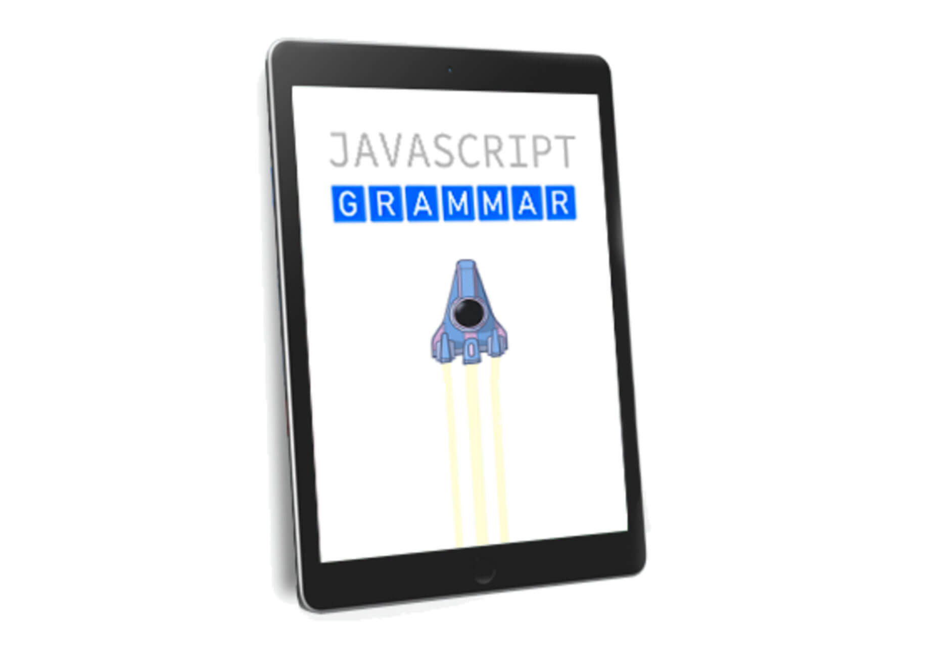
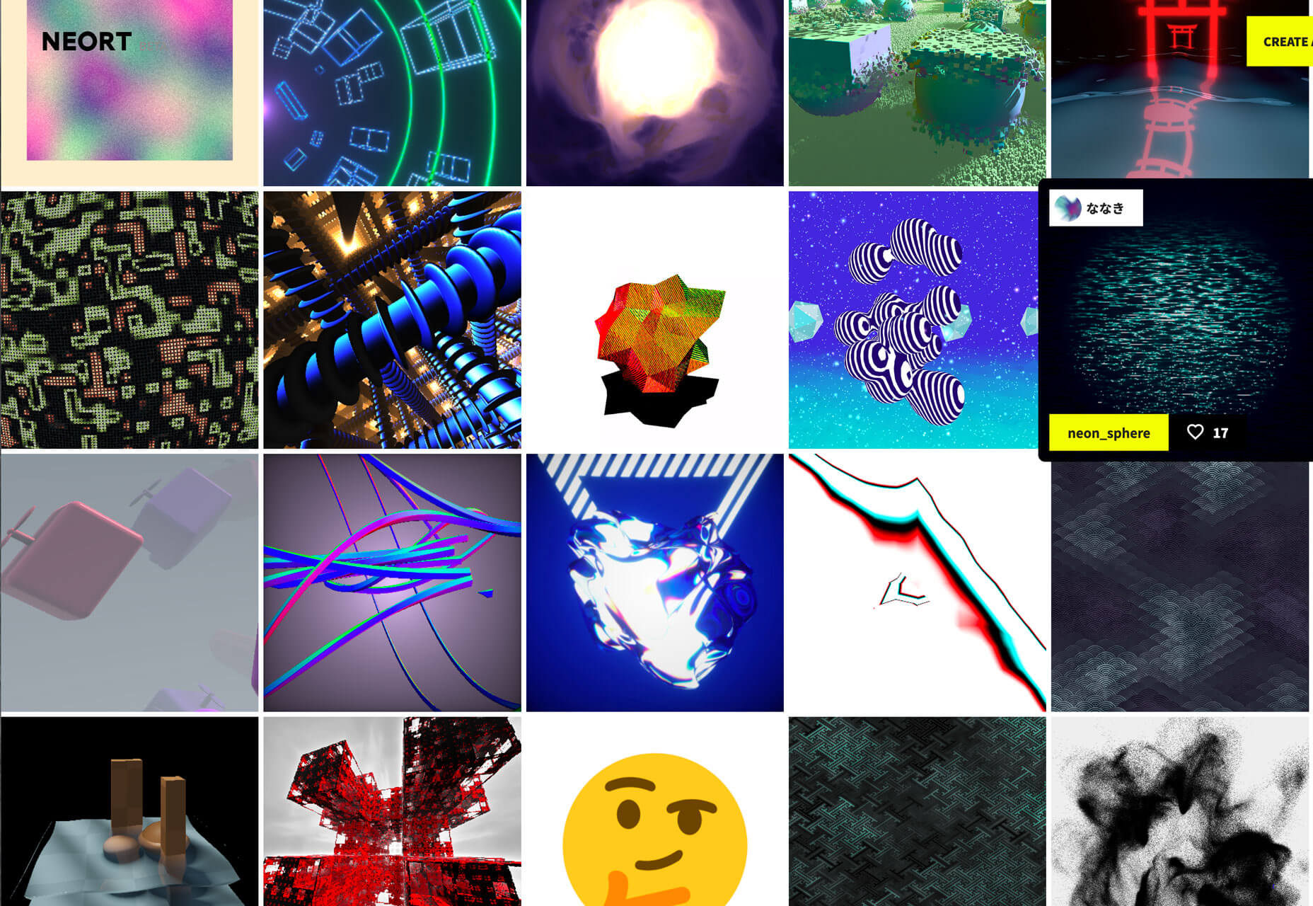
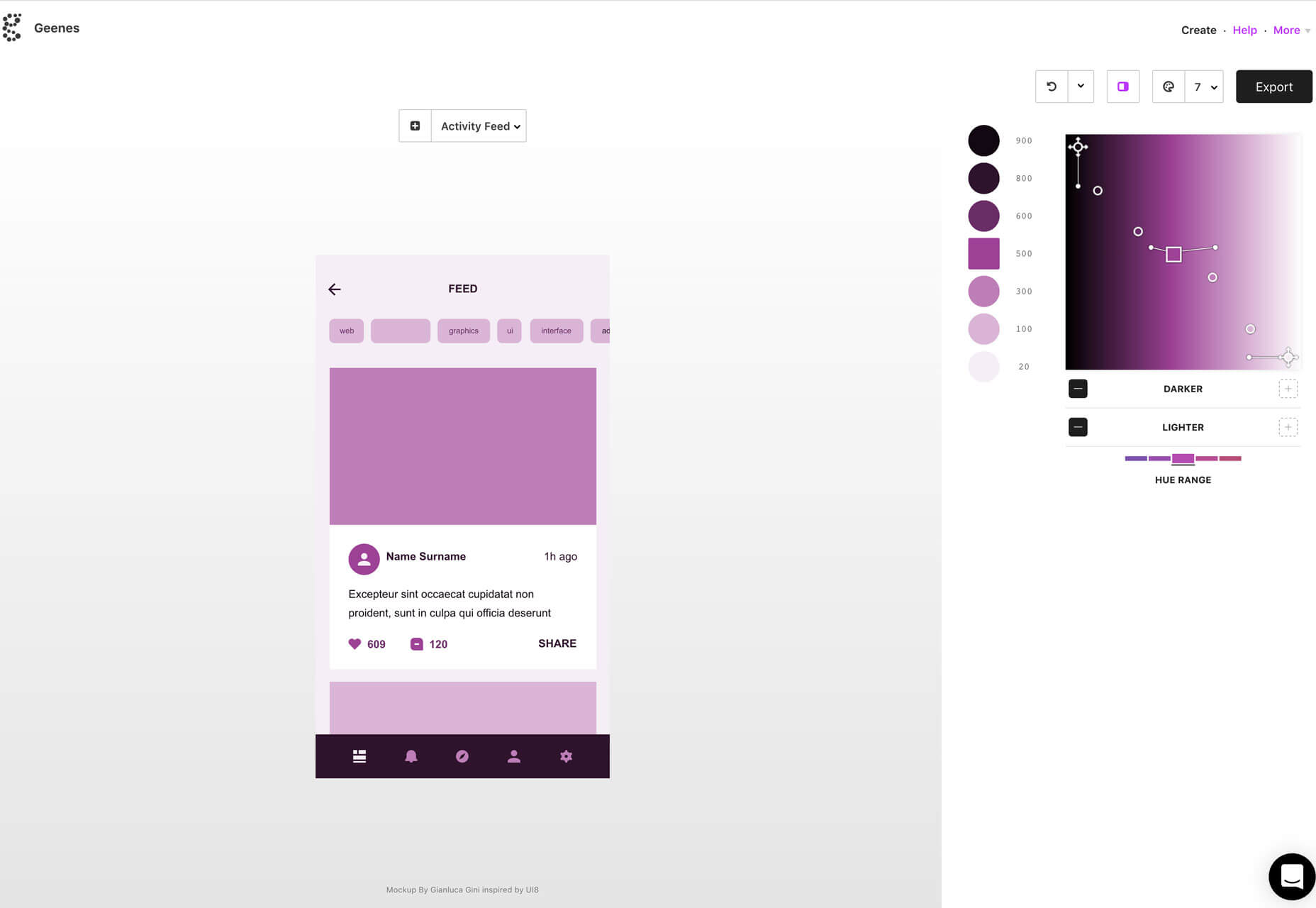
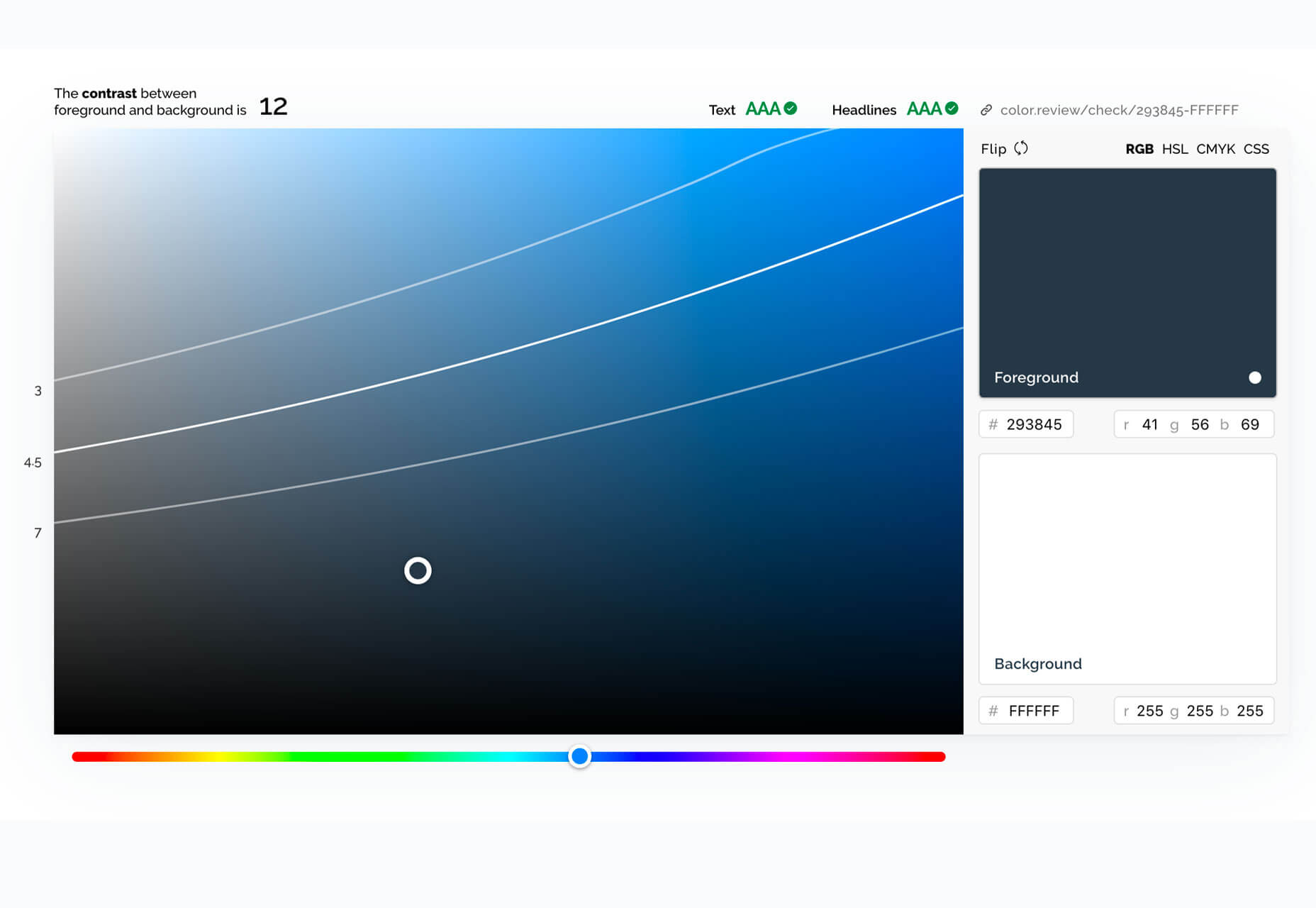
 We’re all about learning tools this month in our round of up new resources and tools for designers. From games to books to tutorials, there’s something new for everyone to learn and enjoy.


