The User’s Perspective: Using Story Structure To Stand In Your User’s Shoes

Original Source: https://www.smashingmagazine.com/2019/04/user-perspective-story-structure/

The User’s Perspective: Using Story Structure To Stand In Your User’s Shoes

The User’s Perspective: Using Story Structure To Stand In Your User’s Shoes

John Rhea

2019-04-16T16:00:16+02:00
2019-04-19T16:36:08+00:00

Every user interaction with your website is part of a story. The user—the hero—finds themselves on a journey through your website on the way to their goal. If you can see this journey from their perspective, you can better understand what they need at each step, and align your goals with theirs.

My first article on websites and story structure, Once Upon a Time: Using Story Structure for Better Engagement, goes into more depth on story structure (the frame around which we build the house of a story) and how it works. But here’s a quick refresher before we jump into implications:

The Hero’s Journey

Most stories follow a simple structure that Joseph Campbell in his seminal work, Hero with a Thousand Faces, called the Hero’s Journey. We’ll simplify it to a hybrid of the plot structure you learned in high school and the Hero’s Journey. We’ll then take that and apply it to how a user interacts with a website.

The Hero’s journey begins in the ordinary world. An inciting incident happens to draw the hero into the story. The hero prepares to face the ordeal/climax. The hero actually faces the ordeal. Then the hero must return to the ordinary world, his problem solved by the story.

Once upon a time… a hero went on a journey. (Large preview)

Ordinary World
The ordinary world is where the user starts (their every day) before they’ve met your website.

Inciting Incident/Call To Adventure
Near the beginning of any story, something will happen to the hero that will push (or pull) them into the story (the inciting incident/call to adventure). It will give them a problem they need to resolve. Similarly, a user has a problem they need to be solved, and your website might be just the thing to solve it. Sometimes though, a hero would rather stay in their safe, ordinary world. It’s too much cognitive trouble for the user to check out a new site. But their problem — their call to adventure — will not be ignored. It will drive the user into interacting with your site.

Preparation/Rising Action
They’ve found your website and they think it might work to solve their problem, but they need to gather information and prepare to make a final decision.

The Ordeal/Climax
In stories, the ordeal is usually the fight with the big monster, but here it’s the fight to decide to use your site. Whether they love the video game news you cover or need the pen you sell or believe in the graphic design prowess of your agency, they have to make the choice to engage.

The Road Back/Falling Action
Having made the decision to engage, the road back is about moving forward with that purchase, regular reading, or requesting the quote.

Resolution
Where they apply your website to their problem and their problem is *mightily* solved!

Return With Elixir
The user returns to the ordinary world and tells everyone about their heroic journey.

The User’s Perspective

Seeing the website from the user’s perspective is the most important part of this. The Hero’s Journey, as I use it, is a framework for better understanding your user and their state of mind during any given interaction on your site. If you understand where they are in their story, you can get a clearer picture of where and how you fit in (or don’t) to their story. Knowing where you are or how you can change your relationship to the user will make a world of difference in how you run your website, email campaigns, and any other interaction you have with them.

Numerous unsubscribes might not be a rejection of the product, but that you sent too many emails without enough value. Great testimonials that don’t drive engagement might be too vague or focused on how great you are, not what solutions you solve. A high bounce rate on your sign up page might be because you focused more on your goals and not enough on your users’ goals. Your greatest fans might not be talking about you to their friends, not because they don’t like you, but because you haven’t given them the opportunity for or incentivized the sharing. Let’s look at a few of these problems.

Plan For The Refusal Of The Call To Adventure

Often the hero doesn’t want to engage in the story or the user doesn’t want to expend the cognitive energy to look at another new site. But your user has come to your site because of their call to adventure—the problem that has pushed them to seek a solution—even if they don’t want to. If you can plan for a user’s initial rejection of you and your site, you’ll be ready to counteract it and mollify their concerns.

Follow up or reminder emails are one way to help the user engage. This is not a license to stuff your content down someone’s throat. But if we know that one or even seven user touches aren’t enough to draw someone in and engage them with your site, you can create two or eight or thirty-seven user touches.

Sometimes these touches need to happen outside of your website; you need to reach out to users rather than wait for them to come back to you. One important thing here, though, is not to send the same email thirty-seven times. The user already refused that first touch. The story’s hero rarely gets pulled into the story by the same thing that happens again, but rather the same bare facts looked at differently.

So vary your approach. Do email, social media, advertising, reward/referral programs, and so on. Or use the same medium with a different take on the same bare facts and/or new information that builds on the previous touches. Above all, though, ensure every touch has value. If it doesn’t, each additional touch will get more annoying and the user will reject your call forever.

Nick Stephenson is an author who tries to help other authors sell more books. He has a course called Your First 10K Readers and recently launched a campaign with the overall purpose of getting people to register for the course.

Before he opened registration, though, he sent a series of emails. The first was a thanks-for-signing-up-to-the-email-list-and-here’s-a-helpful-case-study email. He also said he would send you the first video in a three-part series in about five minutes. The second email came six minutes later and had a summary of what’s covered in the video and a link to the video itself. The next day he emailed with a personal story about his own struggles and a link to an article on why authors fail (something authors are very concerned about). Day 3 saw email number four… you know what? Let’s just make a chart.

Day
Value/Purpose
Email #

1
Case Study
1

1
Video 1 of 3
2

2
Personal Story and Why Authors Fail Article
3

3
Video 2 of 3
4

4
Honest discussion of his author revenue and a relevant podcast episode
5

5
Video 3 of 3
6

6
Testimonial Video
7

7
Registration Opens Tomorrow
8

8
Registration Info and a pitch on how working for yourself is awesome
9

By this point, he’s hooked a lot of users. They’ve had a week of high quality, free content related to their concerns. He’s paid it forward and now they can take it to the next level.

I’m sure some people unsubscribed, but I’m also sure a lot more people will be buying his course than with one or even two emails. He’s given you every opportunity to refuse the call and done eight different emails with resources in various formats to pull you back in and get you going on the journey.

I’ve Traveled This Road Before

It takes a lot less work to follow a path than to strike a new one. If you have testimonials, they can be signposts in the wilderness. While some of them can and should refer to the ordeal (things that might prevent a user from engaging with you), the majority of them should refer to how the product/website/thing will solve whatever problem the user set out to solve.

“This article was amazing!” says the author’s mother, or “I’m so proud of how he turned out… it was touch-and-go there for a while,” says the author’s father. While these are positive (mostly), they aren’t helpful. They tell you nothing about the article.

Testimonials should talk about the road traveled: “This article was awesome because it helped me see where we were going wrong, how to correct course, and how to blow our competitor out of the water,” says the author’s competitor. The testimonials can connect with the user where they are and show them how the story unfolded.

This testimonial for ChowNow talks about where they’ve been and why ChowNow worked better than their previous setup.

“Life before ChowNow was very chaotic — we got a lot of phone calls, a lot of mistyped orders. So with ChowNow, the ability to see the order from the customer makes it so streamlined.” John Sungkamee, Owner, Emporium Thai Cuisine

“I struggled with the same things you did, but this website helped me through.” (Large preview)

So often we hear a big promise in testimonials. “Five stars”, “best film of the year,” or “my son always does great.” But they don’t give us any idea of what it took to get where they are, that special world the testifier now lives in. And, even if that company isn’t selling a scam, your results will vary.

We want to trumpet our best clients, but we also want to ground those promises in unasterisked language. If we don’t, the user’s ordeal may be dealing with our broken promises, picking up the pieces and beginning their search all over again.

The Ordeal Is Not Their Goal

While you need to help users solve any problems preventing them from choosing you in their ordeal, the real goal is for them to have their problem solved. It’s easy to get these confused because your ordeal in your story is getting the user to buy in and engage with your site.

Your goal is for them to buy in/engage and your ordeal is getting them to do that. Their goal is having their problem solved and their ordeal is choosing you to solve that problem. If you conflate your goal and their goal then their problem won’t get solved and they won’t have a good experience with you.

This crops up whenever you push sales and profits over customer happiness. Andrew Mason, founder of Groupon, in his interview with Alex Bloomberg on the podcast “Without Fail”, discusses some of his regrets about his time at Groupon. The company started out with a one-deal-a-day email — something he felt was a core of the business. But under pressure to meet the growth numbers their investors wanted (their company goals), they tried things that weren’t in line with the customer’s goals.

Note: I have edited the below for length and clarity. The relevant section of the interview starts at about 29:10.

Alex: “There was one other part of this [resignation] letter that says, ‘my biggest regrets are the moments that I let a lack of data override my intuition on what’s best for our company’s customers.’ What did you mean by that?”

Andrew: “Groupon started out with these really tight principles about how the site was going to work and really being pro customer. As we expanded and as we went after growth at various points, people in the company would say, ‘hey why don’t we try running two deals a day? Why don’t we start sending two emails a day?’ And I think that sounds awful, like who wants that? Who wants to get two emails every single day from a company? And they’d be like, ‘Well sure, it sounds awful to you. But we’re a data driven company. Why don’t we let the data decide?’ …And we’d do a test and it would show that maybe people would unsubscribe at a slightly higher rate but the increase in purchasing would more than make up for it. You’d get in a situation like: ‘OK, I guess we can do this. It doesn’t feel right, but it does seem like a rational decision.’ …And of course the problem was when you’re in hypergrowth like [we were] …you don’t have time to see what is going to happen to the data in the long term. The churn caught up with [us]. And people unsubscribed at higher rates and then before [we] knew it, the service had turned into… a vestige of what it once was.”

— Without Fail, Groupon’s Andrew Mason: Pt. 2, The Fall (Oct. 8, 2018)

Tools For The Return With The Elixir

Your users have been on a journey. They’ve conquered their ordeal and done what you hoped they would, purchased your product, consumed your content or otherwise engaged with you. These are your favorite people. They’re about to go back to their ordinary world, to where they came from. Right here at this pivot is when you want to give them tools to tell how awesome their experience was. Give them the opportunity to leave a testimonial or review, offer a friends-and-family discount, or to share your content.

SunTrust allows electronic check deposit through their mobile app. For a long while, right after a deposit, they would ask you if you wanted to rate their app. That’s the best time to ask. The user has just put money in their account and are feeling the best they can while using the app.

suntrust app check deposit screen

“Money, money, money! Review us please?” (Large preview)

The only problem was is that they asked you after every deposit. So if you had twelve checks to put in after your birthday, they’d ask you every time. By the third check number, this was rage inducing and I’m certain they got negative reviews. They asked at the right time, but pestered rather than nudged and — harkening back to the refusal of the call section — they didn’t vary their approach or provide value with each user touch.

Note: Suntrust has since, thankfully, changed this behavior and no longer requests a rating after every deposit.

Whatever issue you’re trying to solve, the Hero’s Journey helps you see through your user’s eyes. You’ll better understand their triumphs and pain and be ready to take your user interactions to the next level.

So get out there, put on some user shoes, and make your users heroic!

Smashing Editorial
(cc, il)

Collective #509

Original Source: http://feedproxy.google.com/~r/tympanus/~3/k4M5W74SpTg/

C509_WOTW

Inspirational Website of the Week: Greater Than Avatars

A stunning design with great balance and details. Our pick this week.

Get inspired

C509_NW

This content is sponsored via Thought Leaders
Northwestern MS in Information Design and Strategy

Prepare for a range of dynamic communication roles and build the in-demand skills needed to drive user interactions.

Apply Now

C509_trends

Web Design Trends 2019

A very inspirational list of fundamental web design trends for 2019.

Read it

C509_hints

Optimizing Performance With Resource Hints

Learn how you can use Resource Hints to help the browser stay one step ahead of the user in this article by Drew McLellan.

Read it

C509_solar

Solar CSSystem

All the solar system’s planets made with CSS by Rob DiMarzo.

Check it out

C509_diagonal

Diagonal Containers in CSS

A tutorial by Sebastiano Guerriero, where he shows how to create full-width, diagonal sections in CSS using the clip-path property.

Read it

C509_cassie

Limitation Breeds Creativity

Cassie Evans’ great talk at Bytes Conf 2019.

Watch it

C509_3d

js-cloudimage-360-view

A simple, interactive resource that can be used to provide a virtual tour of your product.

Check it out

C509_movingmouse

Simulating Mouse Movement

Louis Hoebregts shows how to simulate a moving mouse using the Simplex noise algorithm.

Read it

C509_notre

Why Notre-Dame Was a Tinderbox

An scrollable WebGL presentation that visualizes why Notre-Dame was all but assured to go up in flames.

Check it out

C509_cube

cube.js

In case you didn’t know about it: Cube.js is an open source modular framework to build analytical web applications.

Check it out

C509_animatedgrid

Animated grid

A hypnotizing animated grid demo made by David A.

Check it out

C509_visualprogram

A graphical introduction to dynamic programming

Avik Das wrote and illustrated this visual introduction to dynamic programming.

Read it

C509_includinghtml

HTML Includes That Work Today

Scott Jehl describes an experimental technique for including another file directly into a page.

Read it

C509_ascii

ASCII WARP GITHUB

Ibrahim Tanyalcin shows how you can use LexiconMonoSeq to animate ASCII.

Check it out

C509_matt

ToneJS + canvas-sketch

An interactive and generative site made with canvas-sketch and Tone.js. By Matt DesLauriers.

Check it out

C509_slideshow

Fullscreen Scroll Slideshow

Yoichi Kobayashi created this useful fullscreen slideshow that works on scroll.

Check it out

C509_solid

Solid Template

Solid is a simple and responsive HTML landing page template for startups.

Check it out

C509_particles

Particles 101

Tibix’s tutorial on how to make animations based on moving particles.

Read it

C509_cssdrone

Only CSS: STARFOX Arwing Drone

Yusuke Nakaya created this stunning CSS-only flying drone demo.

Check it out

C509_url

URL equalizer

So much coding goodness in just a couple of tweets. A realtime favicon waveform follows.

Check it out

C509_nicedoc

Nicedoc.io

Nicedoc.io aims to reduce the documentation friction, converting any markup file hosted on github.com into great looking documentation.

Check it out

C509_pngs

IMGBIN

A place to find free PNG images for your next wild collage.

Check it out

C509_demos3

From Our Blog
Awesome Demos Roundup #3

The third collection of beautiful, creative experiments that we’ve found around the web.

Check it out

Collective #509 was written by Pedro Botelho and published on Codrops.

Optimizing Performance With Resource Hints

Original Source: https://www.smashingmagazine.com/2019/04/optimization-performance-resource-hints/

Optimizing Performance With Resource Hints

Optimizing Performance With Resource Hints

Drew McLellan

2019-04-17T12:30:16+02:00
2019-04-19T15:05:47+00:00

Modern web browsers use all sorts of techniques to help improve page load performance by guessing what the user may be likely to do next. The browser doesn’t know much about our site or application as a whole, though, and often the best insights about what a user may be likely to do come from us, the developer.

Take the example of paginated content, like a photo album. We know that if the user is looking at a photo in an album, the chance of them clicking the ‘next’ link to view the following image in the album is pretty high. The browser, however, doesn’t really know that of all the links on the page, that’s the one the user is most likely to click. To a browser, all those links carry equal weight.

What if the browser could somehow know where the user was going next and could fetch the next page ahead of time so that when the user clicks the link the page load is much, much faster? That’s in principal what Resource Hints are. They’re a way for the developer to tell the browser about what’s likely to happen in the future so that the browser can factor that into its choices for how it loads resources.

All these resource hints use the rel attribute of the <link> element that you’ll be familiar with finding in the <head> of your HTML documents. In this article we’ll take a look at the main types of Resource Hints and when and where we can use them in our pages. We’ll go from the small and subtle hints through to the big guns at the end.

DNS Prefetching

A DNS lookup is the process of turning a human-friendly domain name like example.com into the machine-friendly IP address like 123.54.92.4 that is actually needed in order to fetch a resource.

Every time you type a URL in the browser address bar, follow a link in a page or even load a resource like an image from a different domain, the browser needs to do a DNS lookup to find the server that holds the resource we’ve requested. For a busy page with lots of external resources (like perhaps a news website with loads of ads and trackers), there might be dozens of DNS lookups required per page.

The browser caches the results of these lookups, but they can be slow. One performance optimization technique is to reduce the number of DNS lookups required by organizing resources onto fewer domains. When that’s not possible, you can warn the browser about the domains it’s going to need to look up with the dns-prefetch resource hint.

<link rel=”dns-prefetch” href=”https://images.example.com”>

When the browser encounters this hint, it can start resolving the images.example.com domain name as soon as possible, even though it doesn’t know how it’ll be used yet. This enables the browser to get ahead of the game and do more work in parallel, decreasing the overall load time.

When Should I Use dns-prefetch?

Use dns-prefetch when your page uses resources from a different domain, to give the browser a head start. Browser support is really great, but if a browser doesn’t support it then no harm done — the prefetch just doesn’t happen.

Don’t prefetch any domains you’re not using, and if you find yourself wanting to prefetch a large number of domains you might be better to look at why all those domains are needed and if anything can be done to reduce the number.

Preconnecting

One step on from DNS prefetching is preconnecting to a server. Establishing a connection to a server hosting a resource takes several steps:

DNS lookup (as we’ve just discussed);
TCP handshake
A brief “conversation” between the browser and server to create the connection.
TLS negotiation on HTTPS sites
This verifies that the certificate information is valid and correct for the connection.

This typically happens once per server and takes up valuable time — especially if the server is very distant from the browser and network latency is high. (This is where globally distributed CDNs really help!) In the same way that prefetching DNS can help the browser get ahead of the game before it sees what’s coming, pre-connecting to a server can make sure that when the browser gets to the part of the page where a resource is needed, the slow work of establishing the connection has already taken place and the line is open and ready to go.

<link rel=”preconnect” href=”https://scripts.example.com”>

When Should I Use preconnect?

Again, browser support is strong and there’s no harm if a browser doesn’t support preconnecting — the result will be just as it was before. Consider using preconnect when you know for sure that you’re going to be accessing a resource and you want get ahead.

Be careful not to preconnect and then not use the connection, as this will both slow your page down and tie up a tiny amount of resource on the server you connect to too.

Prefetching The Next Page

The two hints we’ve looked at so far are primarily focussed on resources within the page being loaded. They might be useful to help the browser get ahead on images, scripts or fonts, for example. The next couple of hints are concerned more with navigation and predicting where the user might go after the page that’s currently being loaded.

The first of these is prefetching, and its link tag might look like this:

<link rel=”prefetch” href=”https://example.com/news/?page=2″ as=”document”>

This tells the browser that it can go ahead and fetch a page in the background so that it’s ready to go when requested. There’s a bit of a gamble here because you have to preempt where you think the user will navigate next. Get it right, and the next page might appear to load really quickly. Get it wrong, and you’ve wasted time and resources in downloading something that isn’t going to be used. If the user is on a metered connection like a limited mobile phone plan, you might actually cost them real money.

When a prefetch takes place, the browser does the DNS lookup and makes the server connection we’ve seen in the previous two types of hint, but then goes a step further and actually requests and downloads the files. It stops at that point, however, and the files are not parsed or executed and they are in no way applied to the current page. They’re just requested and kept ready.

You might think of a prefetch as being a bit like adding a file to the browser’s cache. Instead of needing to go out to the server and download it when the user clicks the link, the file can be pulled out of memory and used much quicker.

The as Attribute

In the example above, you can see that we’re setting the as attribute to as="document". This is an optional attribute that tells that browser that what we’re fetching should be handled as a document (i.e. a web page). This enables the browser to set the same sort of request headers and security policies as if we’d just followed a link to a new page.

There are lots of possible values for the as attribute by enabling the browser to handle different types of prefetch in the appropriate way.

Value of as
Type of resource

audio
Sound and music files

video
Video

Track
Video or audio WebVTT tracks

script
JavaScript files

style
CSS style sheets

font
Web fonts

image
Images

fetch
XHR and Fetch API requests

worker
Web workers

embed
Multimedia <embed> requests

object
Multimedia <object> requests

document
Web pages

The different values that can be used to specify resource types with the as attribute.

When Should I Use prefetch?

Again prefetch has great browser support. You should use it when you have a reasonable amount of certainty of the user might follow through your site if you believe that speeding up the navigation will positively impact the user experience. This should be weighed against the risk of wasting resources by possibly fetching a resource that isn’t then used.

Prerendering The Next Page

With prefetch, we’ve seen how the browser can download the files in the background ready to use, but also noted that nothing more was done with them at that point. Prerendering goes one step further and executes the files, doing pretty much all the work required to display the page except for actually displaying it.

This might include parsing the resource for any subresources such as JavaScript files and images and prefetching those as well.

<link rel=”prerender” href=”https://example.com/news/?page=2″>

This really can make the following page load feel instantaneous, with the sort of snappy load performance you might see when hitting your browser’s back button. The gamble is even greater here, however, as you’re not only spending time requesting and downloading the files, but executing them along with any JavaScript and such. This could use up memory and CPU (and therefore battery) that the user won’t see the benefit for if they end up not requesting the page.

When Should I Use prerender?

Browser support for prerender is currently very restricted, with really only Chrome and old IE (not Edge) offering support for the option. This might limit its usefulness unless you happen to be specifically targeting Chrome. Again it’s a case of “no harm, no foul” as the user won’t see the benefit but it won’t cause any issues for them if not.

Putting Resource Hints To Use

We’ve already seen how resource hints can be used in the <head> of an HTML document using the <link> tag. That’s probably the most convenient way to do it, but you can also achieve the same with the Link: HTTP header.

For example, to prefetch with an HTTP header:

Link: <https://example.com/logo.png>; rel=prefetch; as=image;

You can also use JavaScript to dynamically apply resource hints, perhaps in response to use interaction. To use an example from the W3C spec document:

var hint = document.createElement(“link”);
hint.rel = “prefetch”;
hint.as = “document”;
hint.href = “/article/part3.html”;
document.head.appendChild(hint);

This opens up some interesting possibilities, as it’s potentially easier to predict where the user might navigate next based on how they interact with the page.

Things To Note

We’ve looked at four progressively more aggressive ways of preloading resources, from the lightest touch of just resolving DNS through to rending a complete page ready to go in the background. It’s important to remember that these hints are just that; they’re hints of ways the browser could optimize performance. They’re not directives. The browser can take our suggestions and use its best judgement in deciding how to respond.

This might mean that on a busy or overstretched device, the browser doesn’t attempt to respond to the hints at all. If the browser knows it’s on a metered connection, it might prefetch DNS but not entire resources, for example. If memory is low, the browser might again decide that it’s not worth fetching the next page until the current one has been offloaded.

The reality is that on a desktop browser, the hints will likely all be followed as the developer suggests, but be aware that it’s up to the browser in every case.

The Importance Of Maintenance

If you’ve worked with the web for more than a couple of years, you’ll be familiar with the fact that if something on a page is unseen then it can often become neglected. Hidden metadata (such as page descriptions) is a good example of this. If the people looking after the site can’t readily see the data, then it can easily become neglected and drift out of date.

This is a real risk with resource hints. As the code is hidden away and goes pretty much undetected in use, it would be very easy for the page to change and any resource hints to go un-updated. The consequence of say, prefetching a page that you don’t use, means that the tools you’ve put in place to improve the performances of your site are then actively harming it. So having good procedures in place to key your resource hints up to date becomes really, really important.

Resources

“Resource Hints specification,” W3C
“Speed Up Next-Page Navigations With Prefetching,” Addy Osmani

Smashing Editorial
(il)

Sketch vs Figma, Adobe XD, And Other UI Design Applications

Original Source: https://www.smashingmagazine.com/2019/04/sketch-figma-adobe-xd-ui-design-applications/

Sketch vs Figma, Adobe XD, And Other UI Design Applications

Sketch vs Figma, Adobe XD, And Other UI Design Applications

Ashish Bogawat

2019-04-19T11:00:16+02:00
2019-04-19T13:35:39+00:00

For a while now, Sketch has been the application of choice for many UX and UI designers. However, we have lately seen many new contenders for Sketch’s position #1 as a universal UI design tool. Two apps that I think stand out mostly from the rest (and that have made the biggest strides in their development) are Figma and Adobe XD.

This article is oriented towards user interface designers and developers. I’ll try to summarize my thoughts on how Figma and Adobe XD compete with Sketch and what unique features each one of them brings to the table. I will also reference some other alternative apps that are aiming to become leaders in the same niche.

Note: To profit from the article, you don’t need to have prior experience with Sketch, Figma, or Adobe XD. Still, if you have some experience with at least one of these apps, it will certainly help.

Table of Contents

The Sketch Competitors (And Where It All Started For Us)

Figma
Adobe XD
Others

Similarities And Differences
User Interfaces

The Basics: Artboards And Pages
Grids And Layout
Drawing And Editing Tools
Symbols
Styles
Designing With Data
Plugins And Integrations
Prototyping, Interaction, And Motion Design
Collaboration

Which One Is Right For You?
References And Further Reading

The Sketch Competitors (And Where It All Started For Us)

A while ago, Adobe Fireworks was the preferred user interface design app for our entire team. Fireworks was flexible, easy to use, and with the help of many free extensions was fitting perfectly in our design workflow. When Adobe discontinued Fireworks, the only alternative we had left was Sketch. We made the switch (and it was an expensive one, considering we had also to move from Windows to Mac), but the gain in productivity was huge, and we never regretted the choice made.

For a while now, Sketch has been the application of choice not only for our team but for many other user interface designers. But in the last couple of years, a number of competitors started to seriously rival Sketch as the current tool #1. Given how rapidly these new competitor apps have improved, our team was tempted to try some of them out and even considered switching over. In this article, I’m hoping to give you a comprehensive comparison of the top contenders of Sketch in the UI design tools arena.

Although it feels like a week doesn’t go by without a new screen design app launching, only a few of them have matured enough to stand up to Sketch’s currently leading position. The two that I think come the closest are Figma and Adobe XD. Both apps have fully functional free versions — making the entry barrier for new users much lower.

XD has versions for Mac and Windows, while Figma supports Mac, Windows, Linux, and Chrome OS — pretty much any operating system on which a modern modern browser can be installed and run.

Sketch, Figma and Adobe XD logos

Comparing Sketch, Figma, and Adobe XD. (Large preview)

Figma

Figma is a web app; you can run it in a browser and therefore on pretty much any operating system. That’s one aspect completely in contrast with Sketch, which has been a Mac-only app. Contrary to my presumptions, Figma runs perfectly smooth and even trumps Sketch’s responsiveness in a number of areas. Here’s an example:

Why I choose @figmadesign over Sketch. pic.twitter.com/sZRO97tlNO

— Housseynou Fall (@HousseynouFall) 19. Dezember 2017

A lot has been said about how Figma compares with Sketch, but the race has only been heating up with the recent updates to both apps.

Figma’s success has the developers of Sketch reconsidering their native-only approach. The company recently raised $20 million to help it add more features — including a web version of Sketch app.

Adobe XD

Although an entire generation of designers grew up using Adobe Photoshop for design, it was never built with user interface designers in mind. Adobe realized this and started working from the ground up on a new app called XD. Although it took a while for XD to get up-to-speed with Sketch in terms of features, Adobe seems to have taken it very seriously in the last year. New features — and some of them quite powerful — are being added to the app almost every month, to a point where I can actually consider it a viable alternative at this point.

Others

Figma and Adobe XD are by no means the only contenders to Sketch’s leadership. Although it may seem like a new one joins the race every few weeks, some are clearly ahead at this point — just not in the same league as the ones above, in my opinion.

Framer X
Although Framer started off as a code based tool for creating prototypes, they have been steadily adding design capabilities. The latest iteration is Framer X, which can be termed as a UI design tool with the ability to code interactions and animations for finer control and flexibility.
InVision Studio
InVision started as the best way to share design mockups with colleagues and clients. Over the years though, they have added features to the app and also built Studio as a standalone app for UI design, prototypes, and animations. (Studio is probably based off of Macaw, which InVision bought in early 2016.)
Gravit
This is another UI design app that has been slowly but steadily improving in the background. Corel bought Gravit a few months ago, which means we might soon start seeing it gain more features and traction within the community.

“Another up and coming category of apps in this domain are the ones that combine design and code to output actual production-ready code that developers can directly use in their apps. Framer X actually does this to an extent, but apps like Alva, Modulz, and Supernova take things one level further. I will not dig into these here because all of them are in very early stages of development, but I wanted to point them out because that’s where the future of UI design tools seems to be headed.”

As a design consultancy, we — me and my team at Kritii Design — end up adapting to whatever toolset clients use. I saw the gradual shift from Photoshop to Sketch over the years, but in the last year or so we have seen a sudden switch from Sketch to Figma. Sketch is still the dominant tool in most teams, but Figma — and even XD in some cases — have begun to find favor with larger teams. I’m yet to come across a group that prefers any of the other options, but I’m assuming that divergence is not very far.

Similarities And Differences

I’ve been a Sketch user for three years now and consider myself a power user. I’ve been trying Figma on and off for about a year now, but much more so in the last couple of months. Adobe XD is fairly new to me — about a month since I started experimenting with it. As such, the comparison below is based on my experience with all three apps. I’ll also include snippets about other apps that seem to do certain things better, but it’s mostly just those three.

User Interfaces

I will not get into the details of the user interfaces of each app because all three share an almost identical interface: layers panel on the left, the canvas is in the middle, properties panel on the right, and tools toolbar at the top. Safe to say Figma and XD’s interfaces are heavily inspired by what Sketch started with.

Note: The right panel (which lets you control the properties of the objects on the canvas) is called Inspector in Sketch app, Properties in Figma Design, and Property Inspector in Adobe XD. They all do the same thing though.

The Basics: Artboards And Pages

When you create a new file in Sketch or Figma, you are on ‘Page 1’ by default, with a plain canvas staring at you. You can create artboards on the page, or add more pages. You can choose from a bunch of presets (for iPhone/Android phones, or for the web), or just drag any size you need.

Adobe XD does not support multiple pages yet. Just a canvas that you can add artboards to. Given how large some of my projects can get, I find this extremely limiting.

Artboards in Figma are called frames, and they’re much more powerful than Sketch. While Sketch stopped supporting nested artboards a few versions ago, Figma actually encourages nesting of frames. So you can have a frame for the screen, and then frames for the header, footer, lists, and so on. Each frame can have its own layout grid and can be set to clip content when resized.

Nested frames in Figma

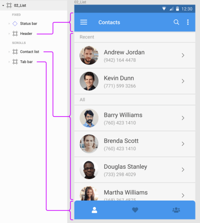
The header, list and tab bar are frames nested within a frame for the entire screen in Figma. (Large preview)

When you create a new document in Adobe XD, it explicitly asks you to choose from a preset list of artboard sizes. You can choose “Custom,” of course. The preset selection in baked in the way XD lets you preview the designs. Anything beyond the preset height scrolls by default. When you increase the height of the artboard, XD adds a marker to show the original height of the device frame.

Device height indicator in Adobe XD

A blue line shows the height of the selected device’s viewport to help position content appropriately ‘above the fold’. (Large preview)

One thing Sketch does differently from the other two applications is that it adds a ‘Symbols’ page that holds all your symbols by default. You can decide not to send symbols to this page when you create them, but I’ve never seen anyone doing that. It actually makes a lot of sense to centralize all the symbols, so they are easy to organize.

Summary

Sketch and Figma support pages and artboards, although Figma’s artboards (or frames) — are more flexible because they can be nested. Adobe XD supports only artboards.

Grids And Layout

All three apps let you overlay grids on top of the artboards. In Adobe XD, you can use a square grid or a column grid. Sketch allows for both at the same time, plus allows for columns as well and rows in the layout grid.

Figma lets you add as many as you want of each type — grid, columns, and rows. Another example of the attention to detail in Figma — when you set the gutter to 0, it automatically switches from showing filled columns to showing lines only.

Comparing layout grid options in the three apps.

Figma takes layout grids a step further by allowing grids on frames (which can be nested) as well as individual components. One interesting possibility with the latter is that you can use them as guides for padding when working with resizable components.

All three apps also let you set constraints to define how elements will scale or move when their containers are resized. Moreover, they all employ an almost identical user interface to set and manage those constraints. Figma was the first of the lot with this UI concept. Sketch followed and improved upon it in their latest release, and Adobe XD introduced the feature in September 2018.

Object resizing constraints in the three apps

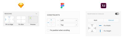
The object resizing and constraints UI in all three apps. (Large preview)

In Figma, constraints work only on elements inside a frame, not groups (like in Sketch and Adobe XD). It is mildly annoying because you can set constraints, but they just don’t work when you resize the group. But Figma does actively encourage you to use nested frames which are much more powerful than groups. Another advantage with Figma is that when using layout grids, constraints apply to the column or cell the element is inside.

In Figma, layout constraints apply to columns when a layout grid is added.

Summary

All three apps let you use grids and column layouts inside artboards. Figma’s implementation feels more powerful because you can nest frames and therefore have separate grids for sections of a screen. Support for constraints in all three is pretty good and more-or-less at par.

Drawing And Editing Tools

Neither of these apps have the advanced vector tools like Adobe Illustrator or Affinity Designer. What you get are the bare basics — rectangle tool, ellipse tool, polygon tool, and a free form vector drawing tool. Plus boolean capabilities to combine and subtract shapes. For most user interface design needs, these are just fine.

That is not to say that you cannot create complex vector artwork in any of these apps. The images below represent what each app is capable of, if you’re willing to spend the time learning all of the tools and features.

Examples of vector artwork in all three apps

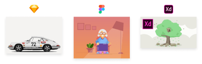
Examples of illustrations created in all three apps. From left to right: Nikola Lazarevic in Sketch, Mentie Omotejowho in Figma, and Matej Novak in Adobe XD (check each link to see the originals). (Large preview)

Sketch has been my staple design tool for a few years now and I’ve never felt the need to go to Adobe Illustrator for any of the icons and the occasional illustration I needed in my designs. You get the usual rectangle, ellipse and polygon shapes, a bezier tool for everything else, and even a freeform line tool that probably only makes sense if you use a tablet/stylus.

Figma has an advantage in this department due to what they call ‘vector networks’. If you ever used Adobe Flash to draw, this will seem very familiar. Rather than try to describe it though, I’ll just show you what it does…

Figma’s vector networks in action.

Figma’s shape tools also feel a step ahead of Sketch. For ellipses, there is now the ability to easily carve out pies and donuts — a great feature for anyone who has tried to use Sketch’s dash settings to create donut charts. Corners of a rectangle can be dragged in to set the corner radius without bothering with the Properties panel.

Creating a donut chart in Figma.

Adobe XD falls behind here given it doesn’t even come with a polygon tool as of now. You also cannot align individual bezier nodes on a path, or change the roundness of these nodes — something we use very often to create smooth line graphs in dashboards.

Once you have added elements to your design, all three apps let you group them, arrange them above or below each other, align and distribute selected objects evenly, and so on.

One standout feature in XD is something called Repeat grid. It lets you create one item and repeat it in a list or grid, each with similar properties, but unique content. Figma’s answer to this is Smart selection. Rather than specify something as a list or grid, Figma lets you select a bunch of elements that are already a list or a grid, then arrange them by spacing them out evenly and easily sorting them via drag-n-drop.

Comparing XD’s Repeat grid feature with Figma’s smart selection.

Summary

Although none of the apps can hold a candle to the power of Illustrator or Affinity Designer when it comes to illustrations, they do provide an adequate enough drawing toolset for day-to-day UI design stuff. Figma’s vector networks place it ahead of the other two in terms of flexibility.

Symbols

All three apps support symbols — elements that all share the same properties and can be updated in one go. How they implement them though, changes quite dramatically from app to app.

Sketch
In Sketch, converting something to a symbol will send it to a page called “Symbols” by default, creating an instance of it in place of the selected elements. This clear separation between the symbol and its instances is by design. An instance of a symbol can only be updated in certain ways — size, text, images; while nested symbols can be updated via the Inspector panel on the right. To edit the original symbol, you can double-click it to go to the “Symbols” page and make changes. Any changes you make there will be applied to all instances of the symbol.

“You can set it so that symbols don’t get sent to the separate page, but I don’t know anyone who does that. Symbols in Sketch are designed to live on their own page.”

Starting with Sketch version 53, you can now select elements inside a symbol instance and then use the Overrides panel to change the content for just that element. This is an improvement from earlier when you could only select the entire instance.

Editing a symbol instance in Sketch.

Figma
In Figma, symbols are called components. When you create a component, it stays in place and is denoted as the ‘Master Component’. Copying it elsewhere in the design creates instances by default. Instances can be edited in a place like you would do with any other group, with the exception that placement of elements cannot be changed. You can change text, color, size and even swap nested symbols — all inline. This definitely feels more flexible than Sketch’s approach while at the same time putting adequate constraints in place as to not mess with the original component. For example, deleting the master component does not affect the instances. You can simply ‘recover’ the master component at any time and continue making changes.

Editing a component instance in Figma.

Adobe XD
Adobe XD’s symbols are the least powerful at the moment. It does not have the concept of a master symbol and instances. Every instance is a clone of the symbol, so any changes to any instance is applied to all the others. They’re also extremely limited in what you can customize per instance — which is basically text and background images.

All three apps support reusing symbols across files.

In Sketch, any file can be added as a library, which enables you to add its symbols and styles to any other file you have open. Changes made in the original library document can be synced in the files that use those symbols, as long as you open them and click the notification.

Adobe XD takes a more simplistic approach for its ‘linked symbols’. Copying a symbol from one document to another automatically links the two. Changes made to the symbol in any document show up as notifications in the others, giving you the ability to review and apply them within the other documents.

Figma’s approach is a centralized repository of components called ‘Team Library’. Everyone on a team with the right access can add components to the team library. Any changes made to the components in the library show up as notifications, allowing you to review and update them in the files you have open.

Summary

All three apps support symbols, but XD’s version is so basic it might as well not exist. Figma’s approach to editing a symbol — or component — instance is much more intuitive and powerful than Sketch’s, although the latter has been catching up in recent versions. Both have strong library features for easy management and collaboration.

Styles

Styles are one of the most basic elements of a design system. The ability to save sets of element properties, apply them to multiple elements and apply changes across the boards, is extremely helpful when working on medium to large design projects. All three apps include support for styles, but the implementation varies a fair bit.

Sketch supports two style types — text styles and layer styles. Text styles include all font properties, color, and effects. Layer styles include fills, borders, and effects. As is obvious from the names, text styles apply only to text elements and layer styles to everything else. Starting with version 52, Sketch lets you override styles for elements inside of symbol instances. This is a huge upgrade to the utility of symbols in Sketch, eliminating a lot of hacky ways you would have to go through in the past for something as simple as changing icon colors inside symbol instances.

Layer and Text styles in Sketch

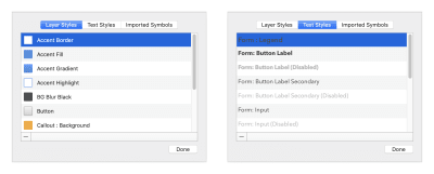
Layer and Text styles in Sketch. (Large preview)

Figma takes a dramatically different approach by making styles cascade. That means you can save styles for text (font, size, weight, line-height, etc.), colors or effects (drop shadows, blurs, etc.), and then mix and match them on elements. For example, the font properties and color on a text block are independently changeable. This makes it possible to have a different color for a word inside a paragraph, something you can’t do in Sketch.

Color, Text and Effect Styles in Figma

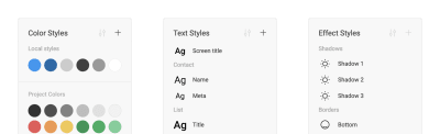
Color, Text and Effect Styles in Figma. (Large preview)

Styles in XD are limited to character styles for text elements. You can save colors and apply them from the library, but there is no way to save a set of characteristics (fill, border, shadow, and so on) as an individual style.

Summary

All three apps support text styles. Sketch also has layer styles that can be applied to non-text elements. Figma breaks styles down by characteristic and lets you mix and match them to get the result you need. It can be more flexible or too open-ended, depending on what your use case is.

Designing With Data

One of my most used Sketch plugins is Content Generator, which allowed me to quickly populate my designs with realistic dummy data instead of the usual lorem ipsum and John Doe and the likes. With the release of version 52, Sketch eliminated the need for that plugin by introducing built-in support for importing data. Now you can easily add realistic names, addresses, phone numbers, even photos in your design. A couple of sets are built in, but you can add more as you need.

External data source in Sketch

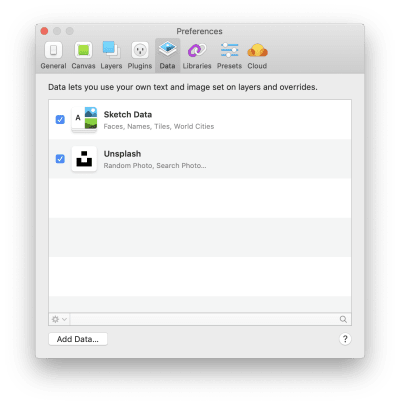
You can add and manage external data sets from Sketch preferences. (Large preview)

The Adobe XD team demoed some work-in-progress support for built-in functionality at Adobe’s MAX conference, but we don’t know when that will make it into the product itself. The one feature that has already made it in is the ability to drag-n-drop a TXT file onto an element in a repeat grid — or a bunch of images onto an image in a repeat grid — to populate all items in the grid with that data. What’s more exciting to me though, is the plugin ecosystem that is bringing in much more powerful ways of importing realistic and real-time data in XD. Case in point are the Airtable and Google Sheets plugins, which allow you to connect with the apps and pull in data from spreadsheets in real time.

Figma lags behind Sketch and XD in this regard. As of now, there doesn’t seem to be any way to populate realistic content inside elements in Figma, other than copy-pasting the bits of content one by one.

Summary

Adobe XD finally takes the lead with a much more capable API that lets you pull in live data, not just static data like Sketch does. Figma has a lot of catch up to do on this front.

Plugins And Integrations

This is where Sketch’s position as the most popular UI design application shines. With a huge library of plugins and new ones coming every few days, Sketch has no rivals when it comes to its ecosystem of plugins and integrations. From plugins for animation, prototyping and version control, helpers for managing text, styles, to connectors for popular apps, there is a plugin for everything you can think of. Here are some of my favorites:

Sketch Runner
Quick access to every tool and command inside the app, like Spotlight for Sketch.

Sketch Measure
Free, local alternative to developer handoff tools like Zeplin.

Craft
A suite of super useful plugins, including prototyping, external data and library management. (You can read more about Craft for Sketch in Christian Krammer’s article “Craft For Sketch Plugin: Designing With Real Data.”)

Angle
A quick way to add your designs to device mockups at various angles.

Artboard Tricks
A bunch of helpers for managing artboards in Sketch.

As the leader of the pack, Sketch also enjoys the largest list of integrations with third-party apps. Be it prototyping and sharing via InVision, developer handoff via Zeplin, version control via Abstract or Plant, most apps have direct integration with Sketch, with the ability to import, sync or preview Sketch files.

Plugin manager in Sketch

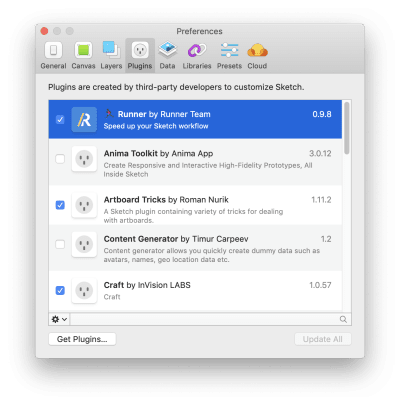
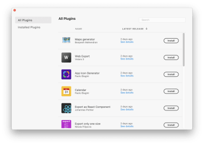
You can enable, disable, update and delete plugins from Sketch preferences. (Large preview)

Plugins in XD launched as recently as a few months ago, but things are already looking quite good. Adobe, with its marketing might, was able to get a lot of companies and developers onboard to launch their plugin ecosystem with a bang. Although not as vast as Sketch’s, the list of plugins for XD is pretty good and growing at a quick pace. Here are some highlights:

Dribbble
Post your designs to Dribbble right from inside XD.

Data Populator
Pull in live data from JSON files into your mockups.

Rename It
Powerful batch renaming for layers and artboards.

Content Generator
Generate random content for different elements in your design.

Airtable & Google Sheets
Bring real data from spreadsheets into your designs in real time.

The Airtable plugin I mentioned above is an example of app integrations that XD is quickly getting very good at. There are also integrations with usertesting.com, Cloudapp, Dribbble and more.

Plugin manager in XD

You can quickly browse and install plugins directly from inside XD. (Large preview)

As far as plugin management goes, XD does a much better job with a nice UI to find, read about and install all plugins. For Sketch, you need to find the plugin on the web, download it and launch the .sketchplugin file to install it. You can disable or remove them from the preferences screen, but not much else.

Figma falls short on the plugins front when compared to Sketch and even XD. It does not have a plugin API specifically, but Figma did open up some APIs for integrations with other apps earlier this year. Apart from built-in integration with Principle, Zeplin, Avocode and Dribbble, the result has been mostly things you can do with your files outside of Figma — like this PDF exporter, the ability to push assets from Figma to Github using Relay, and so on.

In March 2018, Kris Rasmussen from Figma said the following about the plans to add extensions:

“We have watched as our competitors added extension models which granted developers freedom at the expense of quality, robustness, and predictability. We’re eager to leverage the incredible collective brainpower of the Figma community in making our tool better, but we’re not going to introduce extensions until we are confident our extension model is robust. There’s no estimated date just yet, but we are actively exploring how to build this in a solid way.”

Summary

Again, Figma has some catching up to do on the plugins front, especially when compared to Sketch’s huge ecosystem, or Adobe’s powerful APIs and marketing might to get more developers onboard.

Prototyping, Interaction, And Motion Design

Sketch and Figma started off as static design apps, whereas Adobe XD launched with the built-in ability to link screens together to build low-fidelity prototypes. Figma added the prototyping functionality in mid-2017, while Sketch added prototyping in early 2018. As of today, all three apps let you create prototypes and share them with others.

Sketch and Figma’s prototyping tools were mostly limited to linking individual elements to other artboards on click/tap or hover, with a limited selection of transition effects. Figma just pulled ahead with the introduction of overlays in December 2018. This — combined with the fact that Figma’s frames are more flexible than Sketch’s rigid artboard structure — opens up the ability to prototype menus, dialog boxes and more. Both apps have support for other prototyping apps, though. Figma has an integration with Principle and Sketch with pretty much every prototyping tool out there.

While Figma lets you share the prototypes with a simple link (the perks of being in the cloud), with Sketch you need to upload your file to the Sketch cloud before you can share it with others.

Prototype controls in Sketch and Figma

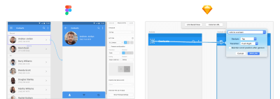
Comparing the prototype controls in Sketch and Figma. (Large preview)

Adobe XD’s October 2018 release pushed it way ahead in the race when it comes to prototyping. It now does everything I mentioned above, but includes two more powerful features:

Auto-animate
Where designers had to pull their designs into apps like Principle or After Effects to add motion design, some of it is built into XD now. It works by automatically moving elements with the same name when transitioning from one screen to another. This may sound simple, but the kind of effects you can generate are pretty spectacular.

Adding animations to prototypes using ‘Auto animate’ in XD.

Voice prototypes
You can now trigger interactions in XD by voice commands, and even include speech responses to triggers. This is a huge addition that makes it easy to prototype conversational user interfaces in XD, something that is not possible in Sketch, Figma, or any of the leading prototyping apps out there.

If animation is important to you, one app to look out for is InVision Studio. It has a timeline based animation workflow, something none of the other apps on this list can boast of. Or if you’re comfortable getting your code on, Framer’s code based interaction model is definitely something to explore.

Summary

Adobe XD has the most powerful prototyping toolset of the three apps, with voice and auto animate leading the way. Sketch has rudimentary prototyping capabilities, but Figma’s implementation feels more seamless when it comes to sharing and gathering feedback.

Collaboration

Sketch and Adobe XD are traditional desktop apps — built for designers to work in isolation and share their designs when ready. Figma, on the other hand, was built for collaboration in mind, more like Google Docs for designers.

In Figma, multiple users can work on the same document at the same time. You can see colored cursors moving around the design when others are viewing or editing the design you’re on. This can take some getting used to, but in situations where we have multiple designers working on a project, this can be a godsend. The cherry on top is the ability to view the design from another designer’s perspective. Just click the user’s avatar in the header and you can see exactly what she is seeing and follow along.

Collaborative design in Figma, à la Google Docs.

Going beyond collaborative editing, sharing your work is also more streamlined in Figma than in the other apps. You can either invite others to see or edit a design or simply send a URL to the design file or prototype preview.

Developers who are viewing the file can get specs for the design elements — a la Zeplin or Avocode — and export any image assets they need. The assets don’t even need to be set to export like in Sketch.

Note: For Figma designs, there are three levels of access: 1) owner 2) can edit, and 3) can view. We use “can view” to give developers access to all the specs, and the ability to export assets as and when they need them.

Figma also has a built-in commenting system which is important when reviewing designs with broader teams and clients. Today, I rely on a combination of Sketch and InVision to achieve this.

Sketch allows you to upload files to its cloud services, and then share a link for others to view. Ensuring that the latest version is in the cloud is up to you, though. This can be a big risk if you have developers working off of a design that may not be current. XD’s December 2018 release added the ability to save files to the cloud, and you can decide which files to save in the cloud and which ones locally. This addresses the problem with maintaining latest versions in the cloud.

Summary

This is where Figma’s web-based roots really shine. It leaves the other two far behind on the collaboration front with built-in sharing, commenting and the single-source-of-truth approach. Sketch and XD are adding sharing features at a good pace, but their file-first approach is holding them back.

Which One Is Right For You?

If you’re a user interface designer, you can’t go wrong with either of the three apps that I have covered here. Or the others that I touched upon just briefly. They all will get the job done, but with varying levels of productivity.

If a native desktop app is necessary for you, and you don’t care about a Windows — or a Linux — version, Sketch is the best bet right now. Adobe XD is getting better at breakneck speed, but it is not as good as Sketch yet for day-to-day design tasks.

If you’re on Windows though, or if motion design is part of your requirements, Adobe XD is your best shot. Sketch simply does not have any animation capabilities and it doesn’t look like that a Windows version could appear on the horizon any time soon. For animation, InVision Studio might also be something you can look at. And if you’re comfortable with code, Framer X provides the most flexibility of the lot.

For me though, at this moment Figma strikes the best balance between features, usability, and performance. Yes, you need to be online to use it (unless you have a file open, in which case you can edit it offline). No, it doesn’t have plugins or any animation capabilities. But if UI design mockups are your core requirement, Figma does a far better job for creating, sharing and collaborating with others than either Sketch or Adobe XD. It has a very generous free tier, it is available on any platform that can run a modern browser, and it’s very actively in development, with new features and updates coming in faster than I can keep up learning them all.

In my team, for example, there seems to be an even split between folks who prefer Sketch or Figma. I’m myself beginning to lean in on Figma myself, but also use Adobe XD every now and then for some quick motion design experiment.

And if you’re looking for an even shorter tl;dr summary — trust Meng To:

“My thoughts on design tools and why you should pick them.
Figma: collaboration and all-in-one
Sketch: maturity and plugins
Framer: code and advanced prototyping
Studio: free and animation
XD: speed and adobe platform”

References And Further Reading

Sketch

“A Look Back At Sketch In 2018,” Sketch, Medium
“Plugins,” Sketch
Sketch App Sources (Free and premium design resources for Sketch App)

Figma

“Figma Tips And Tricks,” Tom Johnson, Medium
“Best Practices: Components, Styles, And Shared Libraries,” Thomas Lowry, Figma Blog
“When To Use Groups Versus Frames In Figma,” Thomas Lowry, Figma Blog
“We Refreshed Figma’s UI: An Inside Look At Our Process,” Rasmus Andersson, Figma Blog

Adobe XD

“60+ Major Features In The Last Year,” Andrew Shorten, Twitter
“StudioAmigos (A curated collection of free resources for Invision Studio)

Smashing Editorial
(mb, yk, il)

90% Off: Get Lifetime License for Next Flipbook Maker Pro for Only $29

Original Source: http://feedproxy.google.com/~r/Designrfix/~3/sp5dzizYQHQ/90-off-get-lifetime-license-for-next-flipbook-maker-pro-for-only-29

Today, PDF is one of the most versatile document formats. Often, it is the format of choice for brochures, college papers, resumes, and more. If you’re using this format, you know what a bore they can be sometimes. With the right software, you can turn these boring PDFs into a digital flipbook with compelling images, […]

The post 90% Off: Get Lifetime License for Next Flipbook Maker Pro for Only $29 appeared first on designrfix.com.

Privacy UX: Better Notifications And Permission Requests

Original Source: https://www.smashingmagazine.com/2019/04/privacy-better-notifications-ux-permission-requests/

Privacy UX: Better Notifications And Permission Requests

Privacy UX: Better Notifications And Permission Requests

Vitaly Friedman

2019-04-18T17:00:49+02:00
2019-04-18T16:15:47+00:00

Part 1: Privacy Concerns And Privacy In Web Forms
Part 2: Better Cookie Consent Experiences
Part 3: Better Notifications UX And Permission Requests
Part 4: Privacy-Aware Design Framework

Imagine you are late for one of those meetings that you really don’t want to be late to. You hastily put on your shoes and your coat and fetch your door keys and grasp for the door handle — just to head out in time. As you are stepping down the stairs, you reach into your pocket and pull out your mobile phone to check the subway schedule or order a cab.

A brief glance at the screen is enough to have you breaking out in a sweat: you realize you’ve forgotten to charge your phone overnight, and it’s proudly running on its remaining 2% battery charge. As you rush down the street, full of hope and faith, you dim the brightness of the screen and hunt down the right app icon across the home screen. Of course, at that exact moment a slew of notifications cascades down your screen, asking for your undivided attention for new followers, updates, reminders, and messages.

Chances are high that you know way too well what this feels like. How likely are you to act on the cascading stack of notifications in that situation? And how likely are you turn off notifications altogether as another reminder reaches you a few minutes later, just when you missed your connection? That’s one of those situations when notifications are literally getting in a way in the most disruptive way possible, and despite all the thoroughly crafted user flows and polished, precious pixels.

With so many applications and services and people and machines and chatbots fighting for our attention, staying focused is a luxury that needs to be savored and protected, and so no wonder notifications don’t enjoy a decent reputation these days. More than that, often they feel off the point and manipulative, too.

“They often appear at times when they are least relevant, and they create a false sense of urgency, diluting focus and causing frustration.”

— Alex Potrivaev, Intercom

This goes for floating windows on the home screen as much as the almighty unread count in toolbars. This is also true for marketing messages masked as notifications, as well as social updates broken down in many small messages to permanently draw attention to the service.

All of these notifications demand immediate attention and feel incredibly invasive, playing on our desires not to miss out and stay connected with our social groups. In fact, they disrupt privacy in a way that no dark patterns can — by demanding and seizing attention unconditionally, no matter what the user is currently doing.

massgenie homepage

Can you spot anything weird in this particular design? It’s not common to see the notification count ‘0’, as it’s done on MassGenie in the top-right corner. (Large preview)

However, it’s not the fault of notifications that they feel invasive; it’s that we design them such that they often get in the way. Users don’t want to miss important notifications and miss out on timely messages or limited sales, but they don’t want to feel pestered by a never-ending tide of noisy updates either. If the latter happens too frequently, users turn off notifications altogether, often with a bitter aftertaste towards the app and brand due to its “desperate begging for attention”, as one user put it. A single culprit can ruin it for everybody else, and that despite the fact that no notification is like another.

The Many Faces Of Notifications

Notifications are distractions by nature; they bring a user’s attention to a (potentially) significant event they aren’t aware of or might want to be reminded of. As such, they can be very helpful and relevant, providing assistance, and bringing structure and order to the daily routine. Until they are not.

In general, notifications can be either informational (calendar reminders, delay notifications, election night results) or encourage action (approve payment, install an update, confirm a friend request). They can stream from various sources, and can have various impacts:

UI notifications appear as subtle cards in UIs as users interact with the web interface — as such, they are widely accepted and less invasive than some of their counterparts.
In-browser push notifications are more difficult to dismiss, and draw attention to themselves even if the user isn’t accessing the UI.
In-app notifications live within desktop and mobile apps, and can be as humble as UI notifications, but can take a more central role with messages pushed to the home screen or the notifications center.
OS notifications such as software updates or mobile carrier changes also get in the mix, often appearing together with a wide variety of notes, calendar updates, and everything in between.
Finally, notifications can find their way into email, SMS, and social messaging apps, coming from chatbots, recommendation systems, and actual humans.

You can see how notifications — given all their flavors and sources — could become overwhelming at some point. It’s not that we pay exactly the same amount of attention to every notification we receive, though. For the vast majority of users, it can take weeks until they eventually install a software update prompted by their OS notification, whereas it usually doesn’t take more than a few hours to confirm or decline a new LinkedIn or Facebook request.

Not every notification is equal, and the level of attention users grant them will depend on their nature, or, more specifically, how and when notifications are triggered.

In his article on “Critical Analysis of Notification Systems”, Shankar Balasubramanian has done remarkable research breaking down notification triggers into a few groups:

Event-triggered notifications
News updates, recommendations, state changes

OS-triggered notifications
Low battery, software update, or an emergency alert

Self-triggered notifications
Reminders or alarms

Many-to-one messaging notifications
Group messages from Slack or WhatsApp

One-to-one messaging notifications
Personal email from a friend or a relative

We can’t deduce that one group of triggers is always more effective than another, but some notifications from every group tend to be much better at capturing attention than others:

People care more about new messages from close friends and relatives, notifications from selected colleagues during working hours, bank transactions and important alerts, calendar notifications, scheduled events, alarms, and any actionable and awaited confirmations or releases.
People care less about news updates, social feed updates, announcements, new features, crash reports, web notifications, informational and automated messages in general.

Unsurprisingly, users tend to attend to low battery notifications or payment confirmations immediately; also, calendar reminders, progress updates (e.g. package delivery ETA) and one-to-one messages matter more than other notifications. In fact, in every single conversation we’ve had with users, a message from another human being was valued much higher than any automated notification. The priorities might change slightly, of course, if a user is impatiently awaiting a notification, but only few people would ever leave everything behind in a desperate rush to check the 77th like on their photo.

So notifications can be different, and different notifications are perceived differently; however, the more personal, relevant, and timely notifications are, the higher engagement we should expect. But what does it all mean for the design of notifications, and how can we make them less intrusive and more efficient?

Don’t Rely On Generic Defaults: Set Up Notification Modes

There is usually a good reason why customers have chosen to sign up for a service. Not many people wake up in the morning hoping to create a new account that day. In fact, they might feel like your service might help them in their daily tasks, or could improve their workflow. Hopefully they don’t need notifications to understand how a service works, but they might need to receive notifications to understand the value the service provides.

Perhaps they’ve received an important message from a potential employer, or perhaps there is a dating profile match that’s worth looking at. They might not want to miss these messages just because they’ve forgotten to check into the service for a while. As designers, we need to sprinkle just the right pinch of notifications into the mix to keep the customer motivated, while delivering only relevant and actionable pointers to them.

Unfortunately, with most services it’s not uncommon to sign up, only to realize a few moments later that the inbox is filling up with all kinds of messages (mostly purely informational), often sent immediately after another, and rarely actionable. Email notifications especially are often switched on by default, with the user’s consent implied by agreeing to lengthy and unmanageable terms and conditions. Nobody loves being bombarded with a stream of unsolicited messages, and that holds true for spam emails as much as for unwanted notifications.

Instead of setting up a default notification frequency for all customers by default, we could start sending just a few curated notifications very infrequently. As the customer keeps using the interface, we could ask them to decide on the kind of notifications they’d prefer and their frequency. The same goes for cookie consent prompts: we could provide predefined recommended options with a “calm mode” (low frequency), a “regular mode” (medium frequency), and a “power-user mode” (high frequency).

We could be more granular even than this, though. Basecamp, for example, has introduced “Always On” and “Work Can Wait” options as a part of their onboarding experience, so new customers can select if they wish to receive notifications as they occur (at any time), or choose specific time ranges and days when notifications can be sent. Or, the other way around, we could ask users when they don’t want to be disturbed, and suspend notifications at that time. Not every customer wants to receive work-related notifications outside of business hours or on the weekend, even if their colleagues might be working extra hours on Saturday night on the other side of the planet.

basecamp notifications settings

On Basecamp, new customers can select if they wish to receive notifications as they occur, or choose specific time ranges and days when notifications can be sent. (Large preview)

As time passes, the format of notifications might need adjustments as well. Rather than having notifications sent one by one as events occur, users could choose a “summary mode,” with all notifications grouped into a single standalone message delivered at a particular time each day or every week.

That’s one of the settings that Slack provides when it comes to notifications; in fact, the system adapts the frequency of notifications over time, too. Initially, as Slack channels can be quite silent, the system sends notifications for every posted message. As activities become more frequent, Slack recommends reducing the notification level so the user will be notified only when they are actually mentioned.

Another feature Slack offers is allowing users to highlight a selection of words so that the users only get notified when a topic they care about has been mentioned:

highlighting words for notifications in slack
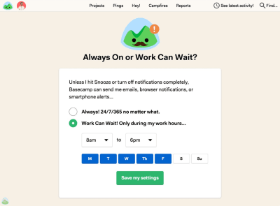
With this feature, it’s still important to remain selective about your choice of highlighted words in order to avoid getting too many notifications. (Image source: Slack) (Large preview)

It might sound like the frequency of notifications is receiving too much attention at this point, but when asked about common pain points with notifications, the most common issue was, by far, their high frequency, even if the messages were relevant or actionable.

The bottom line is: start sending notifications slowly but steadily; set up notification modes, and provide granular options such as a choice of triggers and the format of notifications. Better send too little than too much: you might not get another chance should the customer wish to opt out from numerous notifications that are getting on their nerves at just the wrong time.

Pick Timing Carefully

We might not like to admit it, but for many of us, the day doesn’t start with a peaceful, mindful greeting of the rising sun; instead, it starts with a tedious, reflexive glance at the glowing screen of our mobile phones. More specifically, the first thing we see every morning isn’t even the current time or our loved ones, but the stack of notifications that piled up tirelessly while we slept.

That state of mind isn’t necessarily the best opportunity to remind users of an updated privacy policy, shiny new features, or outstanding expenses that need finalizing. Personal notifications like new social shares and reactions from social circles might be way more relevant, though, just like upcoming appointments and to-dos for the day.

Timing matters, and so do timely notifications. You probably don’t want to disturb your customers in the middle of the night as they arrive at a remote destination with heavy jet lag. Therefore, it’s a good idea to track the change of time zones and local time, and adjust the delivery of notifications accordingly. On the other side, customers won’t be particularly happy about an important notification appearing when it’s no longer relevant, so if they are tracking an important event or announcement, you’ll have to decide if the event is critical enough to disturb them at an uncomfortable time.

Your analytics will tell you when your users are likely to act on your notifications, so it’s a good idea to study and track responses based on time, and trigger the dispatch of notifications around that time. For example, if a customer is most receptive to sharing a message in the mornings, hold off notifications until just the right moment at the local morning time.

generic format of notificationsThere are many ways to present a notification. Most common notifications are displayed within a designated area, usually in the right top corner of the screen. It is the format we are used to from apps such as Facebook, Airbnb or Dropbox. (Image source) (Large preview)

Avoid Stressful Situations By Design

With notifications, timing is not the only important attribute to consider. Remember the poor character hoping to catch their connection from the beginning of this section? Unleashing a deck of notifications at a critically low battery level isn’t a good idea, and it’s just as counterproductive when the user is struggling with connectivity or is focused on a task like driving a car. If you can assess the battery level and the quality of connection, it’s a good idea to avoid sending notifications when a user’s conditions are suboptimal. Of course, notifications also have to be relevant, so if you can assess user’s location too, avoid sending location-dependent notifications that are not applicable at all.

Sometimes it’s difficult to hold notifications as they might be critical for the user’s current activity. If the user is driving a car, following directions in a navigator app, you might need to provide a more persistent and humble notification about the recommended change of route due to an accident on the road. In that case, just like other critical notifications, we could display a floating button “New updates available. Refresh.” It’s much less invasive than a notification blocking access to the content, but it’s as effective in indicating that the page or state of the page might be outdated and new information is available.

In fact, instead of sending out notifications at specific default times, even if it’s based on the user’s past behavior, you could explore the other side of the coin and tap into happy and successful moments instead. A money transfer service, TransferWise, displays notifications when the customer receives a payment — and isn’t that wonderful timing to ask for an app review on App Store? We could track important milestones and notify users about advanced features as they are reached, just-in-time, as Luke Wroblewski calls them.

Reduce Frequency By Grouping Notifications

There is no golden rule for just the right amount of notifications on a given day. Just like every notification differs, so do the preferences and motivations of every customer. To keep a user’s engagement, you might need to gradually release blocks of notifications depending on the customer’s reach or preferences. That’s where gradual grouping comes into place, as explained in the article “Designing Smart Notifications” by Alex Potrivaev, product designer at Intercom.

The idea is simple. If you know your customers get less than five reactions per post on average, it might be a good idea to provide a unique notification for each of them. You might also trigger a notification if a message is coming from important events, such as a message from close friends, family, or influential people. Besides, as we know that notifications triggered by an action from another human being are valued more than automated notifications, prioritize and focus primarily on personal ones, for that particular customer.

Once the volume of notifications has increased, we can start grouping them and provide compact summaries at an appropriate time. For example, Facebook summarizes notifications in non-intrusive blocks, with every line highlighting exactly one type of event, such as reactions to a particular message (“Stoyan Stefanov and 48 other people reacted to your post…”). LinkedIn, on the other hand, seems to trigger almost every single event one by one (“Stoyan Stefanov commented on your post”), hence polluting the stream of notifications and making them difficult to scan and use.

comparison of Facebook and Quora’s notifications

The quality of notifications matters. While Facebook provides a compact summary view of notifications, on Quora they are lengthy and verbose, making scanning difficult. (Image source: Designing Smart Notifications) (Large preview)

Of course, based on a user’s history, we could customize more than just grouping of notifications. Once we know how a user reacts to new photo likes, whether they briefly glance at them or dive deep into each and every notification, we can provide better notifications next time. As Alex concludes:

“Based on the way you usually interact with content, better wording and structure choices could be offered, and depending on the default behavior you may see notifications structured differently.”

This, of course, also requires continuous feedback loops.

Allow Users To Snooze Or Pause Notifications

Hardly any company will dismiss the value of data about their customers. In fact, we can gain valuable long-term insights by introducing feedback loops; that is, continuously offering customers options to “See more” or “See fewer” notifications of a particular kind. But just like we tend to perceive disability as an on/off condition (you either have a disability or don’t), we often feel that we can accurately predict the user’s behavior based on their past behavior alone.

The reality, however, is rarely black and white. Our users might be temporarily hindered while holding a baby in one arm, or because of a recent unfortunate accident, and the conditions in which they find themselves can fluctuate in the same way. Quick actions such as snoozing in response to an incoming notification can help alleviate the issue, albeit temporarily.

The user’s context changes continuously. If you notice an unusual drop in engagement rate, or if you’re anticipating an unusually high volume of notifications coming up (a birthday, wedding anniversary, or election night, perhaps), consider providing an option to mute, snooze, or pause notifications, perhaps for the next 24 hours.

This might go very much against our intuition, as we might want to re-engage the customer if they’ve gone silent all of a sudden, or we might want to maximize their engagement when important events are happening. However, pressing on with the frequency of notifications is just too dangerous most of the time. It’s easy to reach a point when a seemingly harmless notification will steer a customer away, potentially even in the long term. There might be good reasons why the user hasn’t been or doesn’t want to be active for a while, and more often than not, it has nothing to do with the service at all.

Another option would be to suggest a change of medium used to consume notifications. Users tend to associate different levels of urgency with different channels of communication. In-app notifications, push notifications, and text messages are considered to be much more intrusive than good ol’ email, so when frequency exceeds a certain threshold, you might want to nudge users towards a switch from push notifications to daily email summaries.

Medium notification model

In the article “Designing Notifications For Apps”, Shashank Sahay explores different notification models and when to use which, e.g. notification center, with a few guidelines and recommendations along the way. (Large preview)

Set Thresholds And Build Up A Notifications Decision Tree

The thresholds aren’t easy to set properly, though. Important events should trigger immediate notifications to be received in time. Less important events could wait, but it might be useful to draw the customer’s attention to the service. Potentially irrelevant notifications have to be filtered out relentlessly to leave time and space for important notifications to be cherished and valued.

In general, shorter notifications, such as messages from friends and colleagues, are best suited as UI notifications if they aren’t urgent, or push notifications if they are. Lengthier notifications are better off as emails — whether they’re urgent or not. This rule of thumb would vary from service to service, so you could build up a notifications decision tree to track which medium works best for particular kinds of notification based on their urgency, length, and frequency. Additionally, you could define thresholds and trigger a prompt for snoozing or adjusting the settings if a threshold is reached.

Make Opting In And Opting Out Obvious

These days it’s almost expected for a service to go to extremes in making it ridiculously difficult for a customer to opt out from almighty notifications. Obscure wording and obscure labels skillfully hidden in remote corners of the interface are not uncommon. Few other design considerations can be more harmful and damaging for a brand. When users can’t adjust settings easily, they apply heavy artillery, marking email notifications as spam, or blocking notifications in OS settings or browser settings. For a website or an app, there is no easy way to recover from that, except begging for subscriptions yet again.

A much simpler way out is to provide very granular control over notifications, including their content, format, frequency, and do-not-disturb times. We could provide an option to reply to a recent notification with “Fewer emails” or “Stop” to change the frequency, bypassing website log-ins or app sign-ins (Notion.so does that). For apps, provide notification preferences integrated into the app rather than relying on OS native settings. There, you could also explain what the user can expect from every kind of notification, perhaps even with examples of how they would look.

In practice, many users will search for notification settings in both places if they really need to, but the longer it takes them to find that nebulous setting, the less patient they’ll be. In reality, most users seek a way of turning off notifications at the moment when they are actually frustrated or annoyed by recent notifications. That’s not a pleasant state of mind to be in, and as a service, you probably don’t want to unnecessarily extend that state of mind at the expense of feeling nagged and confused by your paying customers.

Don’t forget to explore the other side of the coin as well, though. Identify parts of the user journey when a user is more likely to subscribe to notifications; for example, once an order in an online shop has been successfully placed, or a flight booking has been confirmed. In both cases, notifications can help customers track delays or retrieve boarding passes in time. That’s also a good time to suggest real-time push notifications, which also means first asking the customer’s permission to send those reminders. And that topic deserves a separate conversation.

Asking For Permission, The Humble Way

Some websites are quite a character, aren’t they? Self-indulgent, impolite at heart, and genuinely unlikeable too. How often do you stumble on a seemingly modest, unpretentious page just to be greeted with a wondrous permissions prompt begging to send you notifications? You haven’t read a single word yet, but there it is, already asking for a long-term commitment — and frankly, quite an invasive one.

In terms of user experience, displaying a permission prompt on load is probably the best way to make a poor first impression, and in most cases an irreversible mistake. Starting from January 2019, Chrome has changed the options displayed when a native prompt is triggered. While users might be able to dismiss a notification to react to it later, now they have to choose whether they’d like to either “Accept” or “Block” notifications. The latter results in web notifications being permanently blocked for the entire site, unless the user finds their way through the wilderness of browser settings to grant access after all. No wonder the vast majority of users block such prompts right away, without reading their contents at all.

Strategically, it’s better to ask permission only when there is a high chance a user would actually accept. For that to happen, we need to explain to the customer why we actually need their permission, and what value we can provide them in return. In practice, this strategy is often implemented in form of the ‘double request pattern.’ Instead of asking for permission immediately, we wait for a certain amount of engagement first: perhaps a couple of page visits, a few interactions, a certain amount of time spent on the site. Eventually, we can highlight the fact that a user could subscribe to notifications and how they might be valuable, or that we need their permission for more accurate, location-aware search results. Sometimes the context of the page is enough, like when an interface would like to ask for geolocation when the user visits the store locator page.

In all of these cases, a prominent call-to-action button would wait for the moment when a user is most receptive to act on it. If the user chooses to tap on the button, we can assume they are likely to proceed with the action. So, once clicked, the button would prompt an actual native permission request.

Essentially, we are breaking down the permission prompt into two requests:

A request built into the UI,
A native request at the browser level.

As Adam Lynch notes, should the user still revoke permission, perhaps due to a mis-tap or mis-click in the native browser prompt, we need to display a fallback page that explains how to manually enable the permission via their browser settings (or link to an explanation). Obviously, it doesn’t make sense to display a request for notifications if the user has already granted permission. We can use the Permissions API to query the status of any permission through a single asynchronous interface and adjust the UI accordingly.

The same strategy could be applied to any kind of permission request, such as access to geolocation, camera, microphone, Bluetooth, MIDI, WebUSB, and so on. The wording and appearance of UI notification prompts is of critical importance here, though, so it’s a good idea to track engagement and acceptance ratios for each permission or feature, and act on them accordingly. And that brings us to the king of them all — tracking major metrics for your notifications.

Track Metrics For Notifications

Usually notifications aren’t sent for the sheer purpose of informing customers about an occurring or upcoming event. Good notifications are useful and actionable, helping both customers and businesses achieve their goals. For that, relevant metrics have first to be discovered and defined.

As a bare minimum, we might need to know if the notifications we send are relevant in the first place.

Do the wording, format, and frequency of notifications drive the desired action that we aim to achieve (be it social shares, time spent on the site, or purchases)?
What kind of notifications matter more than others?
Do the notifications actually bring users back to the application?
How much time passes between sending the notification and the user’s return to the site or app?
How much time is spent on average between the clickthrough notification and the user leaving the site?

notifications track

Track whether notifications actually work by exploring if they prompt a desired action, and if yes, when. (Image source: Designing Smart Notifications) (Large preview)

Experiment with wording, length, dispatch times, and grouping and frequency of notifications for different levels of user involvement — beginner, regular user, and power user. For example, users tend to be more receptive to conversational messages that feel more casual and less like system notifications. Mentioning the names of actual human beings whose actions triggered a notification might be useful as well.

It’s never a bad idea to start sending notifications slowly to track their potential negative impact as well — be it opt-outs or app uninstalls. By sending a group of notifications to a small group first, you still have a chance to “adjust or cancel any detrimental notification campaigns before it’s too late,” as Nick Babich remarks in “What Makes A Good Notification”.

All these efforts have the same goal in mind: avoiding significant disruption and preventing notifications fatigue for our customers, while informing them about what they want to know at about the time they need to know it. However, if cookie prompts are just annoying, and frequent notifications are merely a disturbance, when it comes to the security of personal data and how it’s managed, customers tend to have much more pressing concerns.

It’s worth noting that there are significant differences in how notifications are requested, grouped, and displayed on Android and iOS, so if you are designing a native or a hybrid app, you’ll need to examine them in detail. For example, on iOS, users don’t set up app notifications until onboarding or a later usage of the app, while Android users can opt-out from notifications during installation, with the default behavior being opt-in. Push notifications sent by a PWA will behave like native notifications on a respective OS.

Admittedly, these issues will not be raised immediately, but as customers keep using an interface and contribute more and more personal data, doubts and concerns start appearing more frequently, especially if more people from their social circles are involved. Some of these issues are easy refinements, but others are substantial and often underestimated blockers.

In the final article of the series, we’ll be looking into notifications UX and permission requests, and how we can design the experience around them better, with the user’s privacy in mind.

Part 1: Privacy Concerns And Privacy In Web Forms
Part 2: Better Cookie Consent Experiences
Part 3: Better Notifications UX And Permission Requests
Part 4: Privacy-Aware Design Framework

Useful Resources And References

“Designing Notifications For Apps,” Shashank Sahay
“Different Types Of Notifications: Websites, Apps And Beyond,” Joanna Martin
“It’s Time For Notifications To Get Smart,” Alex Potrivaev
“Improving User Experience With Real-Time Features,” Lauren Plews

Smashing Editorial
(yk, il)

7 Steps to Successfully Onboarding Design Clients

Original Source: https://www.webdesignerdepot.com/2019/04/7-steps-to-successfully-onboarding-design-clients/

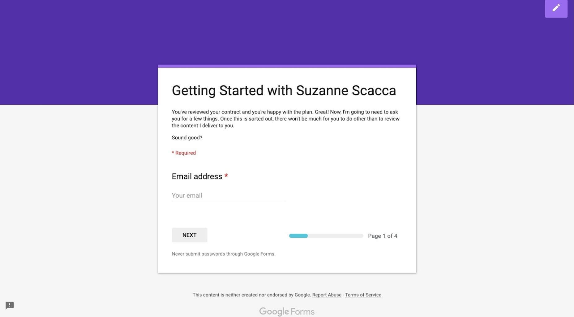
You’ve done the hard work: you’ve taken a lead and turned them into a paying customer. Congrats! Now, you have to build their website.

But is it that simple? The client signs the contract and you immediately get to work on designing the website?

You could certainly approach the kickoff of a web design project that way. However, you’d be missing out on the huge benefits of having a well-laid-out onboarding process.

By the time you have a signed contract in hand, you’ve already established some basic expectations with your client. That’s good. You never want to enter into a relationship with a client if they (or you) don’t know what they’re getting themselves into.

Onboarding further strengthens the basic groundwork you’ve laid down.

Use this onboarding checklist to ensure you give each of your web design projects as strong a start as possible.

Step 1: Duplicate Your Project Management Template

This first step assumes that you have a web design project template. If you haven’t created one yet, I’d strongly encourage you to do so. Each project you take on will have the same basic structure, so why not spare yourself the trouble of having to recreate it every time?

Regardless of which project management software you use, duplicating your template is easy.

In Trello, you’ll click “Show Menu”:

Then, “Copy Board”:

Name it with the new client’s name and click “Create”.

Or, in Asana, you’ll click on the “More” (three dots) icon:

Then, “Duplicate Project”:

Name it with the new client’s name and then click “Create New Project”.

Add any team members that will be working on the job to the folder now.

Step 2: Save Project Documents to the Folder

Centralize all of your documents, communications, and deliverables in the new project management folder. Start with the scope-of-work (SOW), proposal, and any notes you gathered on the client prior to the signing of the contract.

Step 3: Schedule a Kickoff Call with the Key Stakeholder

If you haven’t already done so, identify who the key stakeholder is on the client’s side. Ideally, this is one person. Is it the CEO? The marketing admin? A project manager? Whoever you will be dealing with throughout the project (i.e. the decision-maker) should be the one to attend the kickoff call.

This will streamline all communications during the project to ensure you’re not having to field requests or feedback from multiple parties.

Step 4: Reinforce Expectations During the Kickoff Call

Over the course of 30 minutes, it’s your job to briefly communicate what the client can expect from you over the course of the job while reinforcing what you need from them to make it happen.

This means talking about things like:

Your process;
Project timeline;
The feedback process;
Milestones and progress calls;
An introduction of your project management software (if you can do it through a live screen-share, that would be best).

This is also when you’ll reinforce the accountability piece by letting them know that “homework” will follow shortly.

Step 5: Send the Welcome Questionnaire

In the Welcome questionnaire you send after kickoff, explain to the client that they don’t have to worry about a thing in terms of building a beautiful website for their business. That’s your job. However, you do need certain things from them in order to do the job well.

Although I don’t build websites for clients anymore, I still use the same onboarding process for my copywriting clients. Here is the Welcome email I send to them (feel free to tailor this to your own needs):

Welcome aboard, [client name]!
I’m very excited to get started and hope you are, too!
I know what a pain it is to create content for your own brand, so I’m happy you’ve entrusted it to me.
As we get moving here, I’m going to ask you for just a few things: [link].
Please fill this out within the next seven days. If I have any questions, I’ll be in touch as soon as I can.

It’s succinct and let’s the client know I’m not asking for much. I then send them a Google Forms questionnaire to collect all the remaining details, documents, and logins I need from them:

Personally, I love Google Forms for onboarding copywriting clients, but you may want to use something like Content Snare if you expect to receive lots of design assets and content.

In terms of what you ask for? It depends on how much you’re doing for the website, but I’d suggest starting with these:

Logins to their content management system and control panel (plus, logins to third-party integrations if you need them)
Logo
Brand guidelines
3-5 websites they like the look of
Top 3 competitors’ websites
Images, videos, and other brand assets
Website pages (navigation)
Content (if they’re writing it)

Don’t start any work until you receive everything they owe you. One of the reasons you have an onboarding process is so they can’t drag their feet and cause delays later on.

Step 6: Generate the Creative Brief

Based on everything you know about the client, their target audience, and goals for the website, you now need to generate the creative brief.

This is a succinct document that lays out the details and plan for the website. It ensures that all parties — you, your team (if you have others working for you), and the client — are on the same page and in agreement of what’s to be done. That way, if questions or disagreements come up later, the creative brief will put any doubts to rest.

You should include the following:

Title (i.e. website name)
Project summary
Start date
Projected end date
Deliverables
Problems to be solved
Goals/objectives
Target audience
Project milestones and due dates

Also, if you’re in the habit of creating moodboards for clients, you can send that over with the creative brief.

Make sure to get a signature of approval before moving on. HelloSign can help you do this easily and cheaply.

Step 7: Schedule Progress Calls

One last thing to do is to schedule progress calls with the client. It might seem too early to do this, but it’s not really.

You have a project start and end date. You have projected milestones. By scheduling progress calls for each milestone now, you can put the website on everyone’s radar, which will keep everyone involved (including the client) accountable to the project.

Once your client has accepted the invitations, it’s time to start assigning tasks in your project management software and get to work!

The Benefits of Onboarding

Think about all those times a client failed to deliver something that was owed to you (like logins, logos, or content) — and how that set your project timeline back.

Think about all those times a client said, “I hate it” or asked for a fifth or sixth round of revisions despite clearly not knowing what they really wanted.

Think about all those times you missed a step and had to backtrack once you were hip-deep in the design process.

Onboarding web design clients helps you avoid common issues and strengthen your workflow by:

Documenting and storing everything in a centralized spot;
Setting and reinforcing client expectations;
Preventing scope creep;
Designing websites with better outcomes;
Boosting trust in your business.

As you refine this predictable onboarding process, you’ll be able to complete website projects more efficiently which, in turn, will lead to higher profit margins.


Featured image via Unsplash

Add Realistic Chalk and Sketch Lettering Effects with Sketch’it – only $5!

Source

p img {display:inline-block; margin-right:10px;}
.alignleft {float:left;}
p.showcase {clear:both;}
body#browserfriendly p, body#podcast p, div#emailbody p{margin:0;}

The best camera for creatives in 2019

Original Source: http://feedproxy.google.com/~r/CreativeBloq/~3/iIoQZTBcbaY/best-camera

Though you may be a creative working in many disciplines, you may not have considered the advantages a camera can bring you. Adding photography to your portfolio of skills can open up doors to many new opportunities, and apart from anything else is a lot of fun in its own right!

But then the question arrives: what's the best camera I can buy? Creatives and photographers have all sorts of different needs when it comes to tech. That's why we're here to help, with our round-up of all the best cameras that creatives can buy right now. 

So what's the best camera out there right now? We think it's the Fujifilm X-T30. It’s a camera for everyone, with fantastic image quality, top-notch 4K video and access to the terrific range of X-mount lenses. At its price, there's nothing else to touch it for performance, quality and handling. If video is your thing, our best 4K camera is the Panasonic Lumix GH5, with its impressive breadth of movie-making features. 

The best photo editing appsThe 5 best laptops for photo editing

Of course, the best camera for you depends on what you need it for. Whatever your creative output, we’ve got the right option here: you’ll find the best DSLR and our favourite cheap DSLR at the top of this list, with superb mirrorless and compact options further down. We’ve also covered the best action cameras, as well as the best travel camera for your holidays – and even the best camera phone, for those times when you don't want to carry a camera.

Here's our pick of the best cameras for photography out there…

A triumphant achievement by Fujifilm, the X-T30 is a mirrorless camera that packs an incredible amount of tech into a small camera body. It's the smaller sibling to the flagship X-T3, with a lower price tag to match, and this winning combination of power and price makes the X-T30, in our eyes, the best camera around for creatives right now. It sports the latest 26.1MP X-Trans CMOS 4 APS-C sensor and X Processor Pro 4, but where advancements have really been in made is in the super-sophisticated autofocus system, with 2.16 million phase detection pixels that cover 100% of the frame, able to work even in extreme low-light conditions.

The X-T30 uses an electronic shutter that allows the user to burst-shoot at up to 30fps with no viewfinder blackout, and it can capture 4K UHD video at a maximum frame rate of 30p. The camera's ergonomics are first-rate, making use of Fujifilm's signature dial-led controls for a tactile handling experience. It's an utterly superb camera by any standards, and the fact that it comes at a sub-£1000 price makes all this all the sweeter. If you’re feeling a little more flush, take a look at the Fujifilm X-T3, which is this camera's more powerful big brother.

The Nikon D850 is still top dog in the DSLR world, and unchallenged by Canon when you consider just how many things it gets right. Normally such cameras are intended to excel in one area, such as speed or resolution, but the D850 delivers in all of them. Its 45.7MP sensor produces richly detailed images, particularly as it lacks an anti-aliasing filter, while 7fps burst shooting can be boosted to 9fps with an optional grip and battery. The 153-point AF system, meanwhile, is still Nikon’s most comprehensive iteration. And naturally, 4K video is on board too.

Around its solid core, the camera is ready for unlimited creativity, with time-lapse shooting, slow-motion video output in Full HD, in-camera Raw processing and a raft of other post-capture adjustments all falling to hand. Shooting at night? Many of the camera’s controls light up, and the ISO range stretches to a setting equivalent to 102,400 – a rarity on a camera with such a populated sensor. Need to shoot silently? This is not possible on many other DSLRs, but here you can fire 30fps bursts in complete silence.

Targeted at pros – and as at home in the studio as it is in the field – the Nikon D850's body usually comes on its own. But if you don’t already own a lens you’ll be well served by partnering it with the excellent AF-S Nikkor 24-70mm f/2.8E ED VR for general use. Can’t quite stretch to the D850’s asking price? Good-quality examples of the older Nikon D810 can still be found online.

The Canon EOS 200D / Rebel SL2 is neither the cheapest entry-level DSLR nor the newest, but it gains a spot on our best camera for creatives list by breaking from entry-level DSLR norms to provide a particularly generous feature set. In essence, it feels like it’s designed with the entry-level user’s needs and desires in mind, rather than a particular price point. The 24.2MP appears fairly conventional, but it’s furnished with Dual Pixel CMOS AF technology to make focusing nice and swift in live view, and focusing transitions smooth and professional when creating videos. These are captured in Full HD rather than 4K quality, but the option to record to 60p and a mic input boost its potential for high-quality recordings. 

The flip-out LCD, meanwhile, is a boon for shooting from unorthodox angles, and its super-sensitive touch panel lets you focus effortlessly where you want by touch. The camera’s DIGIC 7 processing engine is one of the newest, and this allows for a range of Picture Styles and in-camera Raw processing, while the full Wi-Fi, NFC and Bluetooth trinity of connectivity options star alongside. 

You can grab it as a body-only option, although most people just getting started will no doubt want to spend a shade more to pair it with the EF-S 18-55mm f/4-5.6 IS STM lens. If you’re feeling adventurous, you can even opt for a kit with the all-encompassing EF-S 18-135mm f/3.5-5.6 IS STM instead, and if you fancy something similar but with a bit more powerful, take a look at the Canon EOS 800D. This is a great option for the first-timer, particularly if live view or video is your thing.

It’s difficult to know where to start with the Panasonic GH5; there’s simply so much to pique the videographer’s interest. 4K footage can be recorded in both DCI 4K and UHD 4K flavours without the heavy crop factors that plague other 4K models, and this is captured in high-quality 10-bit 4:2:2 (internally). You can also use focus peaking to get focus bitingly sharp, call on an anamorphic shooting option, capture at high speeds for slow-motion output and opt for a (paid-for) log option. Video aside, there’s plenty more to love, from the excellent 3.6 million dot viewfinder and articulating LCD through to 9fps shooting and 225 AF points, all inside a sturdy, weather-sealed body. 

Not quite what you need? The newer Panasonic GH5S variant opts for a 10.2MP sensor for better dynamic range and low-light performance, but misses out on sensor-based image stabilisation. Alternatively, the older Panasonic GH4 also provides 4K recording, and would make a good alternative if your budget doesn’t quite reach what’s being asked here. 

In 2018 we saw an explosion of full-frame mirrorless cameras as Canon, Nikon and Panasonic started muscling in on this territory. For our money, one of the best choices for creatives in this department is the Nikon Z6, which blends comprehensive functionality and top-notch image quality with fast autofocus and fantastic low-light performance, all wrapped up in a body that doesn't cost the earth. The larger, more sophisticated Z7 is pitched towards professional photographers, and we reckon this slimmed-down model is the better choice for creatives. You still get access to the exciting new range of Z mount lenses, and the 24.5MP of resolution is going to be more than enough for most purposes.

The wide ISO range (expandable to 204,800) makes the Z6 an extremely capable choice for low-light work, and the in-body image stabilisation and 4K video using the full width of the sensor both add to this tremendous package. If you're feeling especially flush you might want to consider the NIkon Z7, which boasts a considerable 45MP of resolution, but we think the balance the Z6 offers between price and power will be a winner with any creative.

Just as Nikon’s D850 quickly became the DSLR that everyone wanted to switch to, Sony’s A7 III has mirrorless users saving up their pennies. While many models have their specific focus and target audience, the A7 III really is a camera for all. A 24MP full-frame sensor, hybrid AF system that covers a staggering 93 per cent of the frame and 4K video from oversampled footage are just a sliver of the highlights. Sony has focused on the details too, installing the useful AF joystick that found fans on previous models, and boosting battery life to a very respectable (by mirrorless standards) 710 frames. 

The A7 III is a great all-rounder, with a versatile feature-set that makes it a great fit for a range of applications, but the older Sony A7 II is still very much on a sale and worth considering if you fancy something more keenly priced. Either way, grab it with the FE 28-70mm F3.5-5.6 OSS if you’re just getting started, unless you already own a lens or two.

Today’s compact cameras are incredibly advanced, and while the  RX100 Mark IV is now a couple of years old, it’s hard to think of a camera that offers the same great balance of price, specs and portability. Despite the powerful partnership of a large 1in sensor and 24-70mm f/1.8-2.8 optic at its heart, and a high-quality electronic viewfinder that pops up on demand, it somehow manages to be smaller and lighter than most other compacts. 

And for anyone looking to travel light, it delivers plenty. The rear LCD screen flips up and round to face the front, while a maximum shutter speed of 1/32,000sec (with the electronic shutter) permits super high-speed motion to be captured with clarity. On the other end of the shutter-speed scale, a built-in ND filter allows for longer exposure than would be otherwise possible, as well as video recording in bright light. And all of this is before we get to 4K video, with slow-motion footage recorded at up to 1000fps too. It’s also wirelessly connected and charges through its USB port. Really, there’s little it can’t or doesn’t do.

The camera has been updated by both the RX100 Mark V and the recently announced Mark VI model, and these are worth considering if action or travel photography are more your thing. For everyone else after a more everyday camera for photography, the Mark IV's more modest feature set and price tag will no doubt suit you better.  

The Sony RX10 III is another camera that has been updated since its launch but is still recommended for its price-to-spec sheet – particularly as it often subject to the odd cashback offer. So why is it so tempting for travel photography? The core combo of a stacked 1in sensor and an impressively bright 24-600mm (equiv) f/2.8-4 lens is mostly why it's so special, as you just don’t get that balance of sensor size, focal range and brightness in such a compact package anywhere else. But it’s the fact that these features are both excellent performers, rather than marketing highlights, that makes the camera such a pleasure to use.

Thankfully the lens is primed with a very effective image stabilisation system to keep everything crisp. Meanwhile, 4K video recording is augmented by a range of supporting technologies and recording options, including both headphone and microphone ports and a raft of slow-motion shooting options. The weather-sealed body is also a massive bonus for those traveling through the odd patch of inclement weather, while the ergonomics allow you to get the kind of purchase that you’d normally have to turn to to a DSLR for.  

Don't need such a humongous optic? The older Sony RX10 Mark II provides much the same but with a 24-200mm (equiv) lens. Feeling fancy and want something more powerful? The newer RX10 Mark IV boasts a superior 315-point phase-detect AF system and a touchscreen, and a faster 24fps burst rate on top of sundry changes.

With each new HERO model, GoPro has been perfecting its action camera formula, so much so that you could have been forgiven for wondering how on earth they would improve on the 4K-shooting HERO6. The answer, as it turned out, lay in video stabilisation. The GoPro HERO7 boasts an ultra-smooth stabilisation system that keeps your footage smooth and professional-looking even in the choppiest of environments, as though you had the camera mounted on a sophisticated gimbal.

This isn’t the only improvement. The HERO7 will shoot Full HD at a super-slow frame rate of 240fps, meaning you can capture smooth slow-motion footage, and on the stills side, new intelligent automated shooting technology allows the camera to analyse any given shooting situation and selectively apply HDR, noise reduction and local tone mapping to make the finished shot as good as it can be. 

If, however, you prefer to have complete control over the look of your shots, the GoPro HERO7 also shoots in RAW format. Alongside these, you’ve also got all the usual GoPro hallmarks – waterproofing down to 10m, built-in GPS and instant clip sharing (now with livestreaming capabilities).

All this tech doesn’t exactly come cheap. However, if budget is an issue, consider the Silver and White HERO7 models, which sacrifice a few features for a more affordable price point.

Also read: The best cheap GoPro deals for filmmakers

Smartphones may have shrunk the compact camera market to a fraction of its former size, but the presence of cameras like the PowerShot SX620 HS prove that there are still good reasons for the two formats to co-exist. After all, what smartphone offers a stabilised 25x optical zoom range that stretches from 25-625mm (in 35mm terms), together with the SX620 HS’s level of physical control? 

Despite its beefy focal range, Canon has designed the camera with a svelte body that will still slip inside your pocket without any bother. This makes it great for those after a basic travel camera that’s as happy to hone in on far-off details as it will capture sweeping landscapes. And with Wi-Fi and NFC on board, you can quickly get your creations out into the wider world without hassle.     

If you’re after something similar but don’t quite need that monstrous zoom, the arguably more handsome IXUS 285 HS is worth popping on your shortlist. 

The Google Pixel 3's smartphone camera may not boast the highest resolution or the largest aperture among its rivals, but you can’t argue with the images it produces. Its Android-powered smart learning means it gets better over time at optimising itself for different shooting situations, and the dedicated Pixel Visual Core chip that’s powering it gives the camera a real edge. The consistency of the Pixel 3’s camera is simply remarkable – to borrow an old saw from a rival company, it just works. It does well in low light, and has an impressive digital zoom mode that allows you to get closer with a minimal drop in quality.

You’ll be previewing your images on a gorgeous 5.5-inch screen, which is a nice size for one-handed operation. The downsides? Well, the battery life could be better – if you spend a day shooting, you’ll definitely want to bring along a portable charger – and 4GB of RAM is arguably a little underwhelming given that many rivals are providing 6GB. These are small gripes though, and if you have any interest in smartphone photography for your creative work, the Pixel 3 is a fantastic choice.

If you like things super-sized and don’t mind spending a little more, you can spring for the Google Pixel 3 XL. You do get a larger battery on the XL, however the effect is mitigated in real terms by the increased power drain of the larger screen. Ultimately we think that for price and comfort of operation, the Pixel 3 is your best bet.

Also read:

The 5 best laptops for photo editingThe 16 best photo editor appsThe designer's guide to image editing in Photoshop

Beautiful Web Design Concept for Ray-Ban

Original Source: http://feedproxy.google.com/~r/abduzeedo/~3/wTP2-U-MdNE/beautiful-web-design-concept-ray-ban

Beautiful Web Design Concept for Ray-Ban

abduzeedoApr 16, 2019

Alexander web-designer published a super cool web design concept for Ray-Ban. Ray-Ban is an American brand of sunglasses and eyeglasses created in 1937 by the American company Bausch & Lomb. The brand is known for their Wayfarer and Aviator lines of sunglasses. Alexander explored simple ways to make the product front and center. I am a fan of the simple, yet, elegant look of the site. I also love the little animation he did with the logo and the iconic form of the sunglasses.

Web Design Concept


Represent Your Business with a Free .design Domain Today

Original Source: http://feedproxy.google.com/~r/1stwebdesigner/~3/I_mbcKBZSH0/

The right domain name is a vital part of your overall branding strategy. It should be both easy to remember and reflect what you do. Yet, for years designers have settled for domain extensions that really don’t fit in. While .com, .net or .biz work well enough, do they really provide users with context?

Thankfully, we no longer have to settle. Now that .design domains have arrived, they offer a unique way to promote your business. They look great on all of your branding materials, such as business cards, resumes and even as your custom email address.

And, best of all, you can register your own .design domain for free! If you already have a website – not to worry. You can simply connect your new .design domain to your existing site. Or, use the available site builder to start from scratch.

Porkbun .design domain

Why .design Stands Out

Having your own .design domain name presents quite an amazing opportunity. After all, it’s rare that an industry has such an easily identifiable domain extension.

Not only that, but there are several other reasons to go with .design, such as:

Great Names Still Available
Because .design is fairly new, there are still plenty of outstanding names available to register. However, that won’t always be the case – so consider getting yours as soon as possible.

Unique Branding Opportunities
A great rule of thumb is that, the shorter your domain, the easier it is to remember. And since .design is so industry-specific, it allows for some clever name shortening.

For example, janedoedesign.com can become janedoe.design. Not only is this shorter in length, it also makes for more memorable branding.

Perfect for Redirecting
Even if you don’t use your .design domain for your main website address, it can still be a valuable resource for redirecting elsewhere.

If, for instance, you have a profile at a design community such as Behance or Dribbble, you can point your .design domain directly to your portfolio page. This makes sharing your profile with others super simple.

Get Your FREE .design Domain

We have teamed up with Porkbun to offer all 1stWebDesigner visitors a FREE .design domain name. The first year is free, and yearly renewals will be just $35 instead of the $70 offered at some registrars.

You also get:

Free Email Hosting
You can add an email address (or multiple!) that matches your domain name. For example, anne@goldsmith.design or info@goldsmith.design, or any other name you want.

SSL Security
An SSL certificate will encrypt your visitors’ sensitive data, and also display your site with “HTTPS” in your address bar, which will let visitors know that you’ve made their security your top priority. You’ll also avoid the “NOT SECURE” label from Google.

Free WHOIS Privacy
Your contact information will be private, and protected forever. Other registrars charge you for this. PorkBun won’t.

Free Website Builder
If you want to build your .design website with no code, you can build it for free using their site builder, powered by Weebly. And with this option you don’t have to pay for website hosting.

Free Domain Connection
Whether you built your website (or plan to build it) with other services like WIX, SquareSpace, or Weebly, you can easily connect your .design domain to your website platform. Your website content will stay exactly the same, but you’ll have a modern .design domain name for your website to show off!

Here’s your chance to get a free website domain name that reflects what you do and helps you showcase your work.

To claim your free domain:

Click to claim & search for your domain name
Click the pink + icon on the desired domain
Click the checkout button & complete the checkout process.

YES! I WANT MY FREE .DESIGN DOMAIN NAME!

This offer does not apply to premium names.