10 best static site generators

Original Source: http://feedproxy.google.com/~r/CreativeBloq/~3/03-_BPL_sY4/10-best-static-site-generators

Most sites you visit on the web are probably generated dynamically. That is, rather than having all their content encoded into the HTML stored on the server, they retrieve content from a database and construct pages to serve to you on the fly. 

Many also provide user interactivity through logins, forms and so on. Think of Facebook for an example of both of these things. To build this type of functionality yourself, you might look to a CMS such as WordPress.

21 best WordPress themes

For some use cases, however, this is overkill. Simple pages, such as a personal profile, information about a business or even a blog, really don’t need this sort of overhead or complexity. You could of course just build static HTML yourself in a text editor. And indeed many years ago this was how all sites were built, but this rapidly becomes cumbersome to maintain when you want to scale up or make changes. Static site generators offer a solution to this, by enabling you to build static HTML pages using templates.

Essentially, static site generators are command-line tools that shift the creation of the final HTML page forward from the point the user requests it to the point you write the content. When you make an update, you build the new page, which can then be served as-is to every user who requests it.

This offers several advantages. Performance will be greatly improved compared to a dynamic site, since serving static HTML and CSS has a very low footprint. Your server-side setup will be much simpler, which also means fewer security worries. Conversely, however, you’ll lose the opportunity to deliver real-time content or receive user input.

Static site generators have exploded in popularity in recent years, so navigating the wide range of choice can be difficult. Here, we’ve taken a look at some of the best options you should be considering.

01. Jekyll

Jekyll new release page

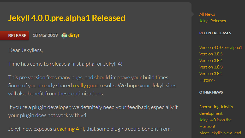
A first alpha for Jekyll 4.0 has just been released

First released in 2008 by Tom Preston-Werner, the co-founder of GitHub, Jekyll arguably popularised the concept of static sites and remains probably the most widely used static site generator. With Jekyll, you’ll typically work with content in Markdown, a lightweight markup language designed for text formatting.

The Liquid templating engine is used to place this Markdown content into a HTML template, and to combine templates representing various parts of a page (say, header, footer and content) in a modular and re-usable manner.

Support for Sass is built in for those with a preference for CSS preprocessing, and it’ll play fine with libraries like Bootstrap. Also included with Jekyll is an HTTP server which can be used to easily deploy and test your static pages locally.

Jekyll showcase page

Jekyll remains one of the most widely used static site generators

One of Jekyll’s key selling points is its wide range of ‘importers’, which enable an existing site to be migrated to Jekyll with relative ease. If you have a WordPress site, for example, you can switch to using Jekyll using one of the importers. It’s also trivial to convert existing static HTML sites to Jekyll, which can be great if you’ve been coding static HTML yourself or see a template you like the look of.

Notably, Jekyll is used to power GitHub pages, a static site hosting service which is provided with GitHub. If you have a GitHub repository, you’re able to create a GitHub pages site for free using Jekyll. This can be a convenient way to give a polished landing page to your GitHub project.

The big downside of Jekyll – and this applies to most generators – is that it can seem complex at first and is a new technology to master. You might not be up and running as quickly as with a CMS. However, it’s very well documented and the learning curve is quickly overcome.

02. Hexo

Hexo homepage

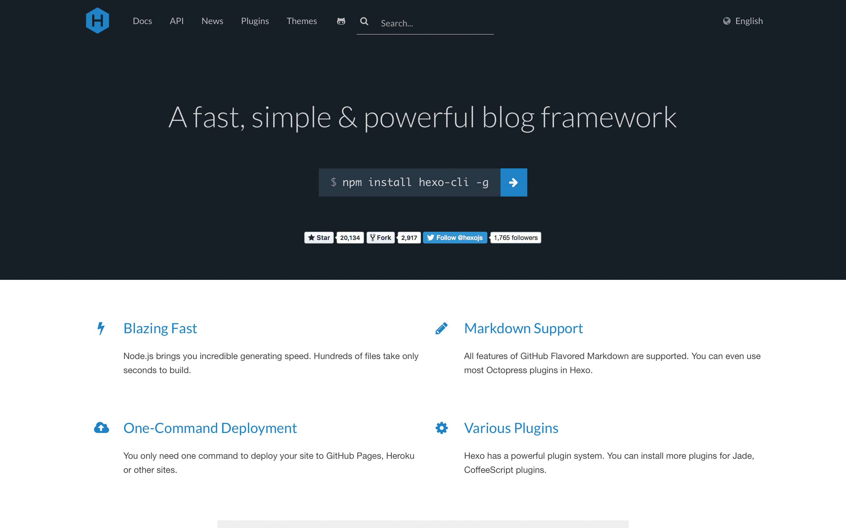
Be sure to write your content in Markdown for Hexo

Hexo is powered by Node.js and aimed at blogging. While the JavaScript implementation shouldn’t in theory make too much difference to how you work with it, since you’ll be using with markup and templating languages, it can make installation and configuration more familiar for JavaScript developers. If you’re already using npm and git then it’s extremely simple to get up and running.

Like many other general purpose generators, you’ll probably want to write your content in Markdown. The default templating engine is Swig, which is once again well suited for JavaScript developers. However, Hexo is extensible to allow other templating engines to be used if you want.

The Hexo website includes a range of pre-built themes for you to try out, and one especially popular feature of the tool is its support for single-command deployment.

03. Gatsby

Gatsby homepage

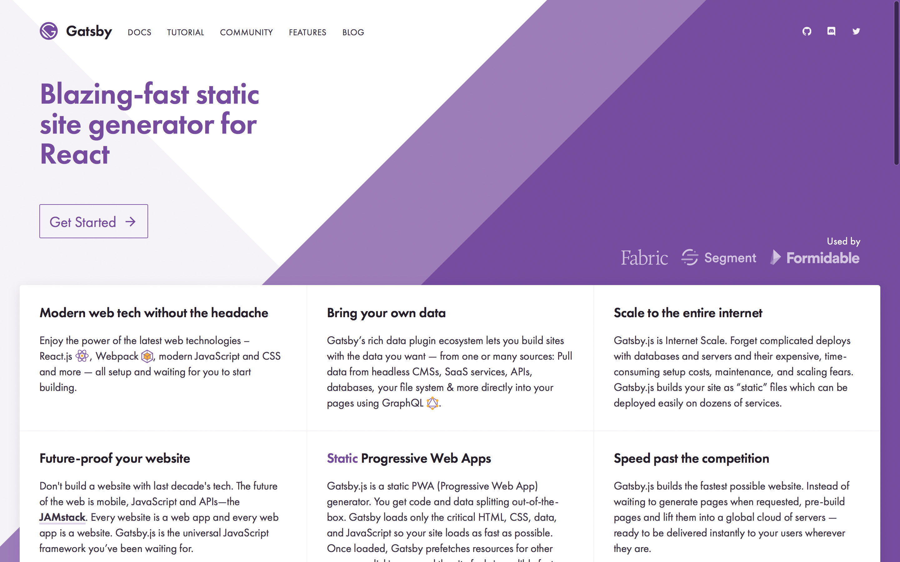
Gatsby can be picked up quickly by developers

Like Hexo, Gatsby is powered by Node.js and so will be more familiar territory for experienced JavaScript developers. However, several things set it apart from other similar tools.

Gatsby uses React, which means that everything is built with components, and allows it to benefit from React’s approach to DOM rendering. This means it can be picked up quickly by developers who have worked with React, but for those unfamiliar with it, learning React will be necessary.

It also utilises GraphQL at build time to retrieve data and content from data sources, which provides a modern, consistent interface to ensure that each page receives the exact data needed when it is built.

Finally, Gatsby will build pages as progressive single page apps, meaning that the entire site is downloaded and subsequent navigation is immediate.

04. Hugo

Hugo homepage

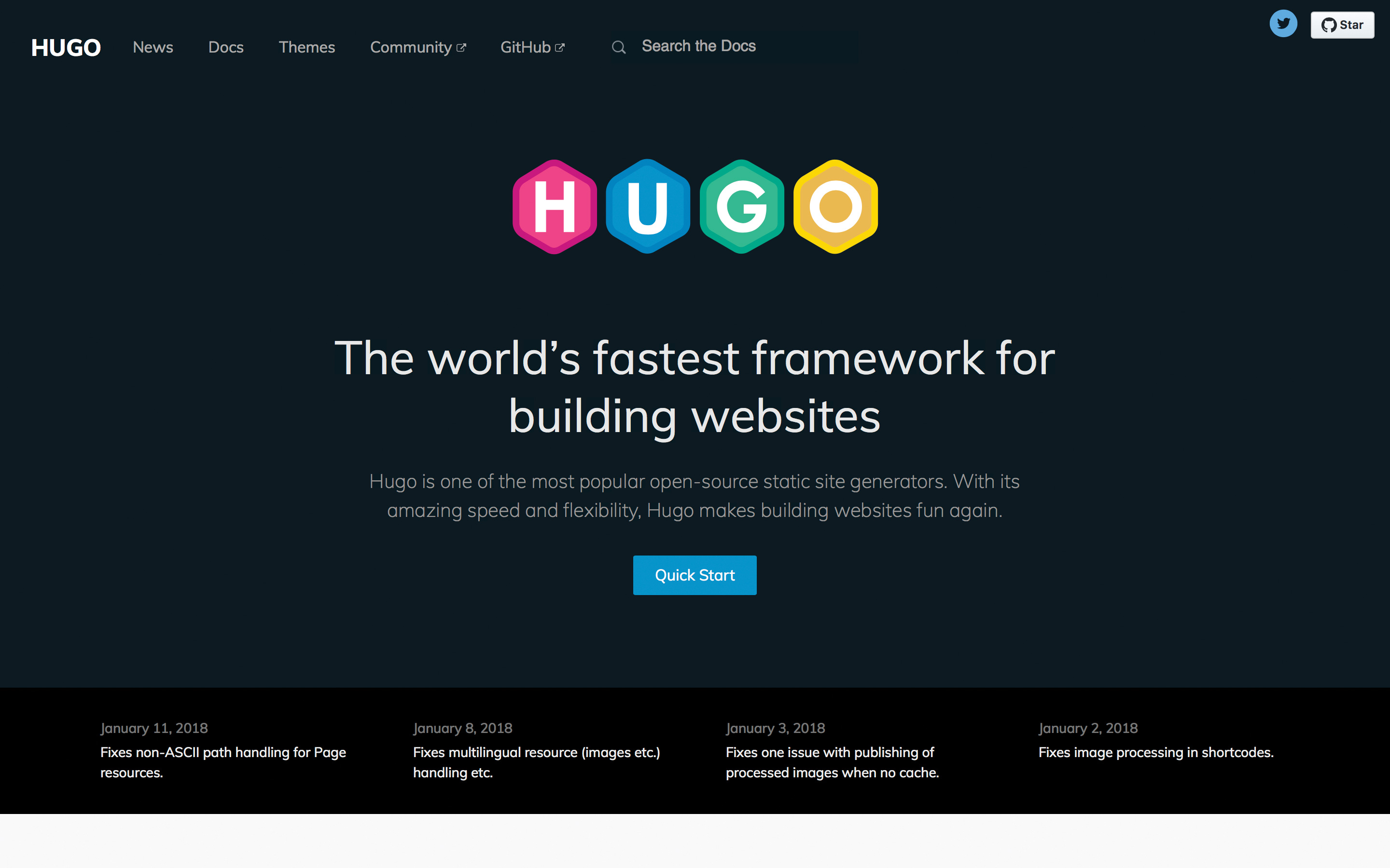
Whip up your site in milliseconds with Hugo

Widely regarded as the ‘other’ leading static site generator, it’s only natural to compare Hugo with Jekyll. Hugo is the newer of the two, and one of its key focus areas is speed, which for some has been a complaint with Jekyll. Nobody likes waiting for a site to build, and Hugo can put together a simple site from your markup and templates in milliseconds, or even blaze through thousands of pages in seconds. 

With Hugo it’s also typical to write content with Markdown, and the templating engine is based on Go templates since Hugo itself is implemented in the Go programming language. Like Jekyll, it ships with a lightweight HTTP server to quickly serve your pages locally. The two tools’ build workflows are overall fairly similar.

27 steps to the perfect website layout

For many, the key benefit of Hugo is its quicker, simpler path to getting started, with very little need for configuration and no dependencies other than the core binary. Its documentation and tutorials are very good, and it has an ethos of maintaining simplicity which makes for a very approachable learning curve.

One disadvantage Hugo has relative to Jekyll is that it lacks the extensive plugin ecosystem available for the latter. Given its wide range of built-in functionality, however, this is unlikely to be a problem for most users. It also may be marginally lighter on support on sites such as StackOverflow since it hasn’t been around as long; however, it continues to grow in popularity and many believe it may become the leading static site generator in the near future.

05. NUXT

NUXT homepage

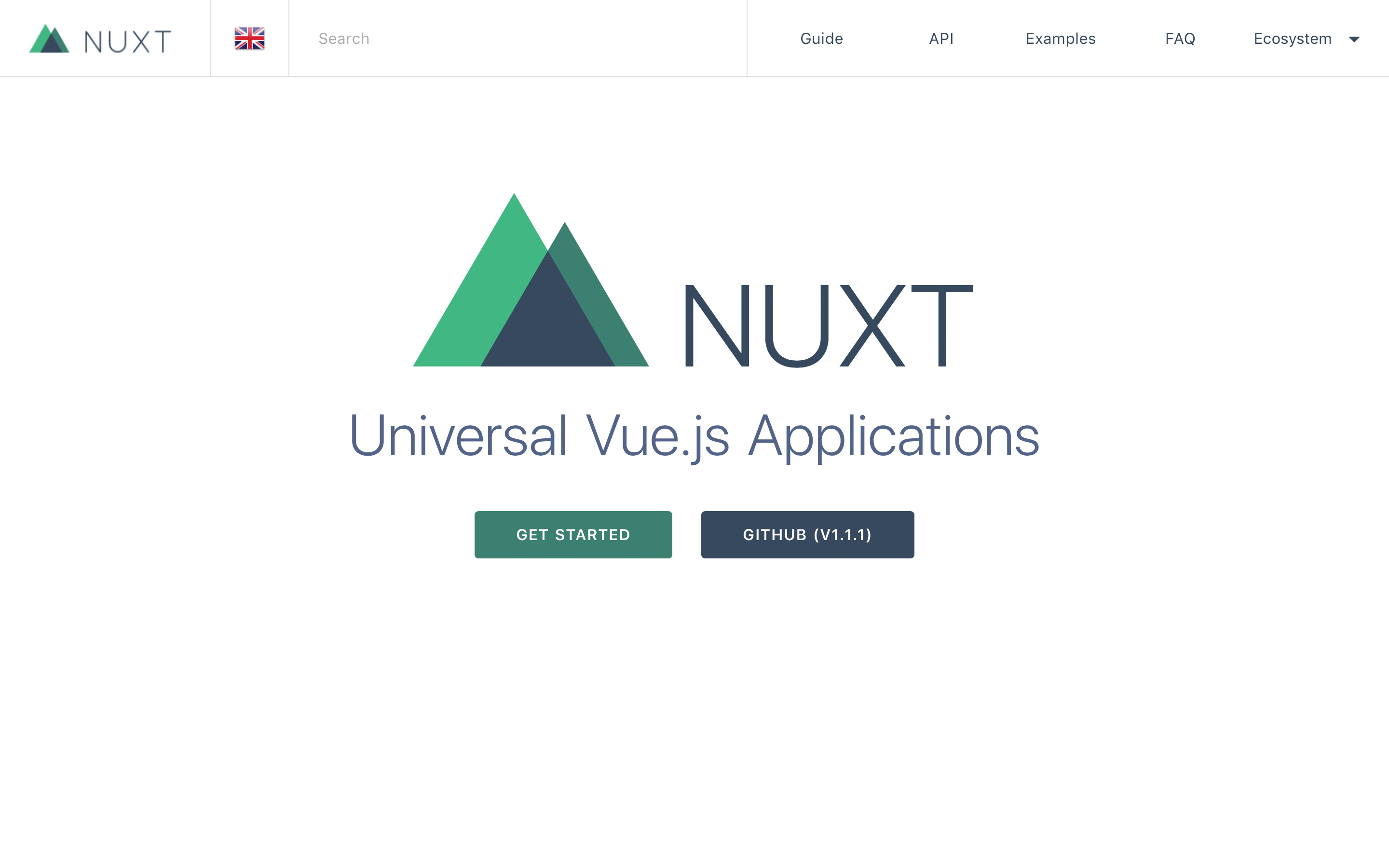
Nuxt brings a component-based approach to development

Vue.js has gained immense popularity as a front end framework in recent years, due to its combination of a gentle learning curve, high performance and powerful feature set.

Nuxt.js is actually a framework for creating server-rendered Vue applications – that is, dynamic pages which are rendered by the server before being passed in their completed form to the client to display. However, it can also be use to build static sites, with a command line parameter that will build static HTML pages for all routes through a Vue project.

Since Nuxt is a Vue framework, familiarity with Vue will be necessary to use it, but developers who have worked with Vue before will feel right at home. And, like Vue, it also brings a component-based approach to development of your sites.

06. MkDocs

MkDocs homepage

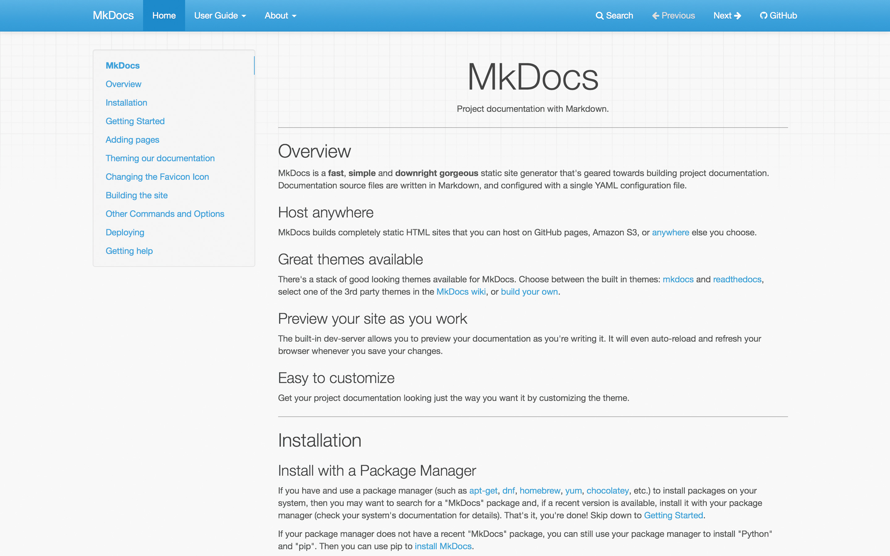
MkDocs specialises in project documentation sites

MkDocs is more specialised than the tools we’ve looked at up until now. It sets out with one very simple objective in mind: to provide a fast and easy-to-use way to generate HTML sites for project documentation. And it absolutely succeeds at doing this. It’s built in Python, so you’ll need Python and pip (Python package manager) installed to get it.

After that, getting started is easy. Documentation is written in Markdown, and the tool is configured using a single YAML file. The command-line build process is as simple as it could be.

The MkDocs GitHub page includes a number of themes which are specially designed for documentation, or you can build HTML for your own theme. MkDocs is one of the easiest static site generators to get started with, and if documentation is your use case, there really isn’t much cause to look at other tools.

07. Pelican

Pelican page

Pelican allows you to import your site from a variety of blogging platforms

Pelican supports content written in multiple languages, including the ubiquitous Markdown. It uses the Jinja templating engine, which is both easy to use and extremely powerful, meaning that while Pelican is primarily optimised for building blogs, it is also well suited to building a wide range of different types of other sites. It’s also fast, and can comfortably handle sites with thousands of pages without making you wait for them to build.

Like many of the leading static site generators, Pelican allows you to import your site from a variety of blogging platforms. This makes it trivial to convert an existing site built with WordPress or many other popular content management systems. If you’re familiar with Python, and especially if you’ve used Jinja templates before, Pelican is a very safe choice.

Conversely, however, it may be a little harder to get to grips with for developers who are more familiar with JavaScript or Ruby.

08. Metalsmith

Metalsmith homepage

Metalsmith is more customisable than other tools on this list

Metalsmith takes a different approach to many other static site generation tools, in that it doesn’t try to do very much at all. Essentially, static site generators take a set of source files, manipulate them, and then generate a set of output files which is the static site itself.

Metalsmith provides a framework for doing this, but leaves all of the actual manipulations to plugins. These manipulations are things which typically come out of the box with other static site generators, such as utilising templates, substituting variables, or interpreting languages like Markdown.

When run through Metalsmith, all source files are converted to JavaScript objects, which means that manipulations by plugins are essentially modifications to properties of these JavaScript objects. There is, for example, a markdown() plugin which transpires Markdown to HTML.

The result of this approach is that Metalsmith is immensely customisable, but requires a little more consideration during setup than some of the more monolithic tools. Don’t like Jekyll’s use of the Liquid templating engine? Here you can pick your own. On the Metalsmith page, you’ll find a lengthy list of plugins to provide a wide range of functionalities, ranging from compiling Sass to CSS through to computing a word count.

If you have a preference for unopinionated frameworks, Metalsmith is about as unopinionated as you can get.

09. Middleman

Middleman homepage

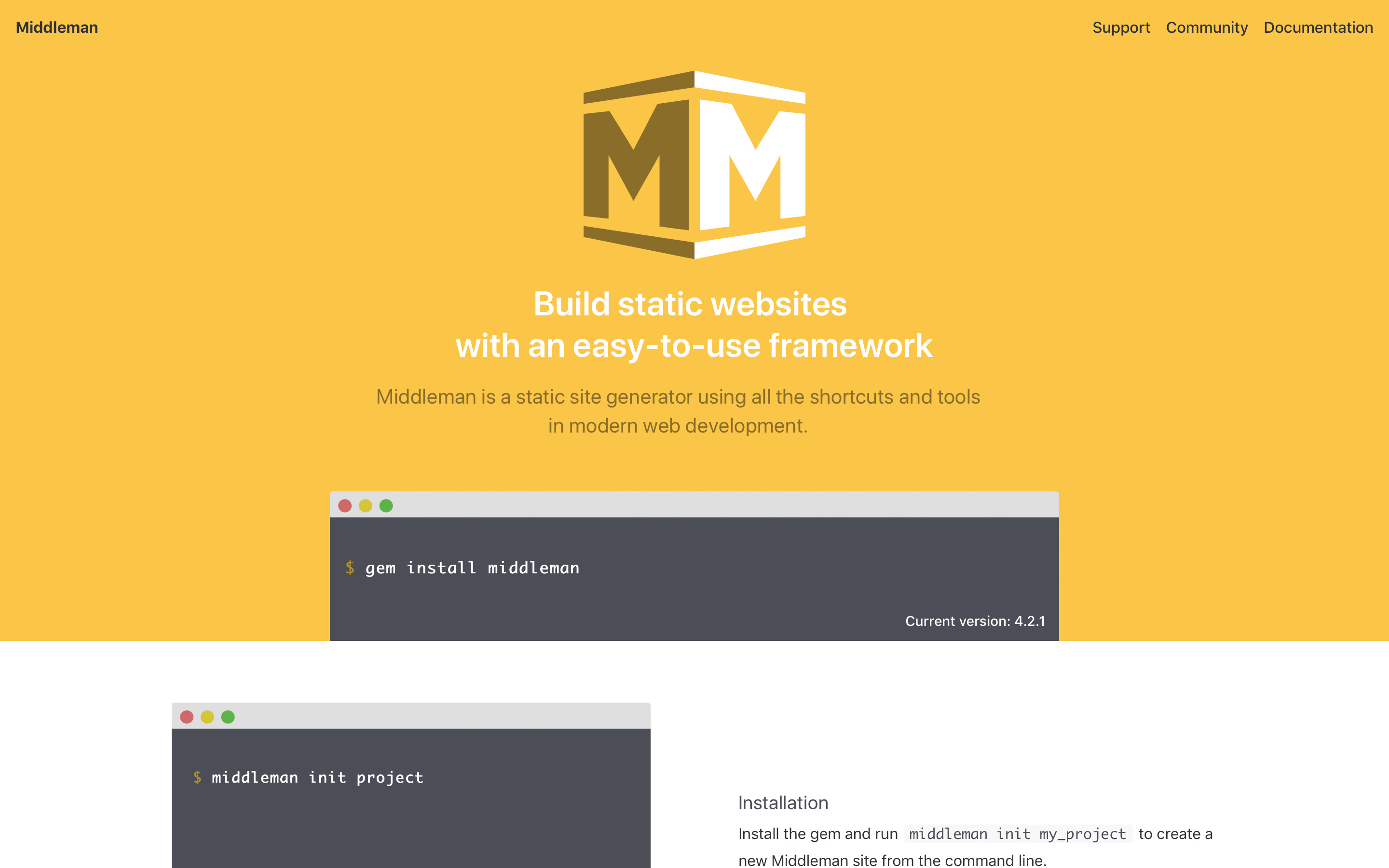
Middleman is flexible enough to build a variety of sites


Middleman was released around the same time as Jekyll, and will be most familiar to developers who have worked with Ruby on Rails. Its default template engine is ERB (Embedded RuBy) and it also includes built-in support for Haml, Sass, SCSS and Coff eeScript, and can be extended further to support more.

Some leading static site generators are heavily geared towards blogs, but Middleman sets its ambitions wider and aims to provide the flexibility to develop any type of site. It’s highly unopinionated and extensible. This means, if all you are doing is a blog, the setup is a little more complex since you’ll have to configure it.

10. Spike

Spike homepage

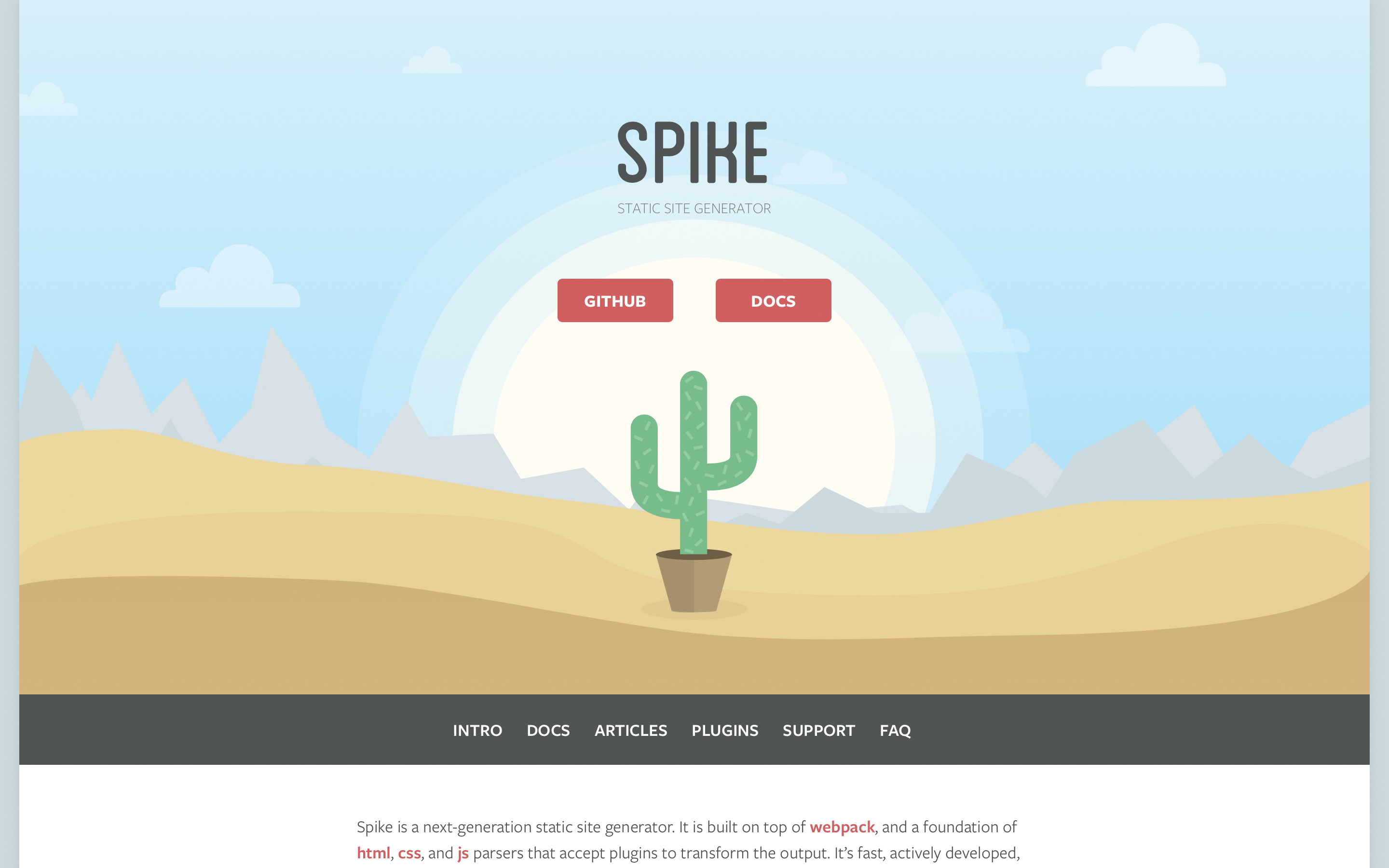
Spike is designed to create very simple frameworks

Spike is built by the same team as Roots, which saw great popularity while it was actively maintained. It provides a familiar ecosystem for JavaScript developers, utilising webpack, Postcss, Reshape and Babel. Much like Metalsmith, Spike is designed to provide a very simple framework and allow plugins to handle your transformations.

Generate NYC

Web design event Generate New York returns on 24-25 April 2019, offering a packed schedule of industry-leading speakers, a full day of workshops and valuable networking opportunities – don’t miss it. Get your Generate ticket now.

This article was originally published in creative web design magazine Web Designer. Subscribe to Web Designer here.

Related articles:

The 7 web design lessons you need to knowThe future of web designHow to survive as a web designer beyond 2020

Amazing Abstract Wallpapers by Dante Metaphor

Original Source: http://feedproxy.google.com/~r/abduzeedo/~3/eelHnG0Qstc/amazing-abstract-wallpapers-dante-metaphor

Amazing Abstract Wallpapers by Dante Metaphor

abduzeedoApr 24, 2019

Dante Metaphor shared an awesome set of beautiful wallpapers. They have all the elements of  great wallpaper: abstract art, 3D, light effects. That’s the reason to deserve the feature here on ABDZ. The cool thing about this project is not just the outcome, but the reason behind it. He took the time to learn Houdini and Redshift 3D.

A bunch of 4k wallpapers i did while experimenting with houdini, enjoy

Wallpapers


Design A Lead Gen Landing Page For Mobile That Converts

Original Source: https://www.smashingmagazine.com/2019/04/design-landing-page-mobile-conversion/

Design A Lead Gen Landing Page For Mobile That Converts

Design A Lead Gen Landing Page For Mobile That Converts

Suzanne Scacca

2019-04-22T12:00:16+02:00
2019-04-24T13:41:22+00:00

There is a huge difference between a website (which can generate leads) and a lead capture page (which is only supposed to generate leads).

Websites tell visitors:

This is all of the stuff we can do for you. Have a look around and let us know when you’re ready to spend some money!

Lead capture pages, instead, tell visitors:

We have this one super valuable thing we want to give you for free. Share your name, email address and maybe a couple of other details and we’ll hand it straight over!

There’s also a significant difference in how the two are designed.

Unbounce has a nice side-by-side comparison that shows this difference in design between the two:

Web page vs. lead capture page design

Unbounce contrasts the design of a web page with a lead capture page. (Source: Unbounce) (Large preview)

The only problem with this is that it depicts the design from a traditional desktop perspective. Just as you would consider the differences in conversion between a desktop and mobile website, you have to do the same for their landing pages.

In the following post, I’m going to give you some points to think about as you design lead capture pages for mobile audiences. I’ve also analyzed a number of landing pages on mobile so you can see how the design criteria may change based on what you’re promoting and who you’re trying to promote it to.

The Difference Between A Website And Lead Capture Page

This is the SnackFever website:

SnackFever home page

The home page of the SnackFever website. (Source: SnackFever) (Large preview)

It takes a few scrolls to get through all of the content:

SnackFever product highlights

The SnackFever website highlights their products. (Source: SnackFever) (Large preview)

And some more scrolling…

SnackFever descriptions

More information from the SnackFever website. (Source: SnackFever) (Large preview)

This is a content-packed home page, even for mobile. A page like this must mean that they’re prepared to have visitors wade through all of the options and opportunities available on the website. As you know, this can be a gamble on mobile what with conversion rates historically lower on those devices.

Then, compare this to SnackFever’s free gift lead capture page:

SnackFever lead capture form

The lead capture form on the SnackFever website. (Source: SnackFever) (Large preview)

Only one swipe of the screen is needed to see the full page:

SnackFever lead capture page

The lead capture page on the SnackFever website. (Source: SnackFever) (Large preview)

Technically, this is a lead capture pop-up. However, on mobile, SnackFever has turned this into a full page design (which is a much better choice).

This is a pretty awesome example of why you should be designing different experiences for different devices.

You can see that this is much more succinct and easy to stay engaged with as it has a singular purpose. The goal here is to capture that lead ASAP. This is not designed to give them room to walk around the site and ponder other decisions.

This is exactly why you should be building lead capture pages away from the website. It doesn’t matter what kind of lead generation you’re using to lure visitors there:

eBooks, white papers and other custom reports
Courses or webinars
Checklists
Calculator or quiz results
Discounts or coupons
Demos or consultations
Free trials

By moving potential leads over to a distraction-free landing page full of highly targeted messaging and visuals, you can improve your chances of converting them into leads. It might not be a purchase, but you’ve helped them take that first step.

Design Tips For Lead Capture Pages On Mobile

Before you do anything else, I’d urge you to take a look at your website’s Google Analytics data. Specifically, go to Audience > Mobile > Overview and look for this:

Google Analytics mobile sessions

Google Analytics Mobile Session Duration data. (Source: Google Analytics) (Large preview)

This is the average amount of time your mobile visitors spend on your website.

This data point will be helpful in determining, realistically, how long you have to capture and hold the attention of your mobile visitors.

An even better way of doing this is to go to Behavior > Site Content > All Pages. Then, set the Secondary Dimension to Mobile (including Tablet) and click on the new dimension filter so that the “Yes” values go to the top:

Google Analytics mobile visitors per page

Google Analytics mobile visitor page- and time-related data. (Source: Google Analytics) (Large preview)

This lets you see how individual pages perform in terms of time on page with mobile visitors.

Look closely at any pages that have a strong and singular CTA, like a dedicated service or product page. You can use those times as an average benchmark for how long mobile visitors will stay engaged with a page that’s similarly structured (like your lead capture page).

Now that you have an idea of what your mobile visitors’ threshold is, you’ll be better prepared to design a lead capture page for mobile. The only thing is, though, it’s not that cut-and-dried.

I wish it were as easy to say:

Write a headline under 10 words.
Write a memorable description under 100 words.
Add a form.
Design an eye-catching button.
You’re done.

Instead, you’ll have to think dynamically about how your lead capture page will best convert visitors to it.

Here are the various things to consider as you design each part of your mobile landing page:

#1: Navigation

The navigation menu is a critical part of any website. It allows visitors to move around the site with ease while also gaining a better understanding of all that’s available within the walls of it.

But lead capture pages don’t exist within a website’s navigation. Visitors, instead, encounter promotional links or buttons on web pages, in emails, on social media and via paid ads in search. Upon clicking, they’re taken to a landing page that’s reminiscent of the website, but has a unique style of its own.

Now, the question is:

Should your lead capture page include the main website’s navigation atop it?

If the goal of a lead capture page is to capture leads, then it should have just one clickable call-to-action, right? Wouldn’t logic dictate that a navigation menu with links to other pages would serve as too much of a distraction? And what about the brand logo? After all, any other links will send the signal:

“Hey, it’s okay if you want to abandon this page.”

Instead of saying:

“We weren’t kidding. Look at how amazing this offer is. Scroll down and claim yours now.”

I’d say that the navigation should only be included when the website is already successfully converting visitors into paying customers/subscribers/members/readers. If the lead gen is merely there as a bonus element, then it’s not a big deal if visitors want to backtrack to the site.

The logo should be fine to keep as it’s more of a branding element than a competing link in this context though. Take, for instance, this sweepstakes giveaway on the Martha Stewart website:

Martha Stewart sweepstakes

Martha Stewart promotional ad for sweepstakes giveaway. (Source: Martha Stewart) (Large preview)

This clickable promotional element takes visitors to the lead capture page where the navigation element has disappeared and only the logo remains:

Martha Stewart lead capture page

Martha Stewart’s lead capture page for its sweepstakes giveaway. (Source: Martha Stewart) (Large preview)

In general, if you need this lead gen offer to truly be a vehicle to grow your email list, the navigation should not be there. Nor should other competing links that draw them away from conversion.

#2: Copy

All of the usual rules for typography in mobile web design apply here — that includes size, spacing, color and font face. All of the rules you’d adhere to in terms of formatting a page for mobile apply as well. For example:

Very succinct headlines;
Short and punchy paragraphs;
Bulleted or numbered lists to describe points quickly;
Header tags to break up large swaths of text;
Bolding, italics, hyperlinks and other stylized text to call attention to key areas.

What about the amount of copy on the page though? Typically, the answer for mobile is:

Write only as much copy as you need to.

That is indeed the case with mobile lead capture pages… but there’s a catch.

Some lead gens are easier to “sell”, which means you shouldn’t need much more than the following to get people to convert:

A short and descriptive headline;
A paragraph explaining why the lead gen is so valuable;
Three to five bullets breaking out the benefits;
A short form asking for the basics: name, email and maybe a phone number.
A brightly colored and personally worded call-to-action button.

There are other cases where the lead gen offer requires more convincing. Or when the brand behind it decides to use the page’s copy as a way to qualify leads. You’ll see this a lot if the lead gen is something that requires an investment of time on the part of the brand. For instance:

Product demos
Consultations or audits
Webinars (sometimes)

In these cases, it makes more sense to write a lengthy lead capture page. Even then, I go back and forth on this because I’m just not sure that’s the smartest move for mobile visitors. So, what I’m going to suggest is this:

If you’re building a lead capture page for a well-established brand that’s known for overly-long pages and whose leads are valued at over $1,000 each, a super lengthy lead capture page is fine.

If you’re building a lead capture page for a newish brand that simply wants to grow their email list fast, don’t make visitors wait to convert.

Get a look at this landing page from Nauto for a free eBook:

Nauto eBook

Nauto’s eBook lead capture page. (Source: Nauto) (Large preview)

It does a great job summarizing the lead gen offer above the fold. Scroll down one screenful and you’ll find this eye-catching form:

Nauto lead capture form

Nauto’s eBook lead capture form. (Source: Nauto) (Large preview)

It could’ve been as simple as that. However, Nauto continues on with more copy after the CTA:

Nauto post-form copy

Nauto includes additional copy after its lead capture form. (Source: Nauto) (Large preview)

What’s interesting here is that this part of the page essentially rewrites the intro at the top of the page. My guess is that they did this to strengthen the SEO of the page with a longer word count and a reiteration of the main keywords.

Either that or they found that visitors weren’t immediately filling out the form and needed a little more encouragement. That would explain why a couple more scrolls down take you through a closer look at the content of the eBook as well as another link to download it (which just returns you to the form):

Nauto post-form CTA

Nauto includes another CTA for the lead capture form. (Source: Nauto) (Large preview)

Clearly, you can still write a whole bunch of copy after the lead gen form, so long as there’s a good reason for it.

#3: Lead Capture Form

Nick Babich has a great piece on how to design forms for mobile. Although the guide pertains more to e-commerce checkout forms, the same basic principles apply here, too.

There are a number of other factors you should consider when designing forms to capture leads on a dedicated landing page.

Where should you place the form?

I’ve mostly answered that question in the above point about copy. But, if we want to be more specific, the lead capture form should always appear within no more than three swipes on mobile.

Realistically, the initial glance at a lead capture page should be an engaging visual element and headline. The next swipe down (if needed) should be an explainer paragraph and short list of benefits. Then, you should take them right to the form.

This is an example from GoToMeeting’s eBook lead capture page:

GoToMeeting engaging header design

GoToMeeting lead capture image and headline. (Source: GoToMeeting) (Large preview)

They’ve truncated all of those key intro elements into the top header design.

Can you write the labels differently?

No, labels should never be tampered with, especially on mobile. Keep them clear and to the point. Name. Email. Business. # of employees. Etc.

What you can and should do differently, though, is to create more engaging form titles and CTAs. Or you can encapsulate the form within brightly-colored borders.

The whole point of this page is to convert visitors on a single element. While you can’t play with the field labels, you can increase their engagement with the outlier text and design.

How many fields should you include?

The answer to this is always “only the ones that are necessary”. However, you don’t want to go too far towards the simple side if the purpose of the lead gen is to qualify leads.

If all you’re doing is growing an email list, sure, Name and Email will suffice. If your goal is to provide something of value to the people who really need it and, later, follow up and start them on the sales journey, the lead capture form needs to be longer.

Here’s another look at the GoToMeeting landing page:

GoToMeeting lead capture form

GoToMeeting’s lengthy lead capture form. (Source: GoToMeeting) (Large preview)

You can tell right away they’re not trying to give this eBook out to any and everyone. This is for a specific kind of business and they’re likely going to filter the leads they receive from it based on job title and country, too.

Don’t feel as though this is only something you can use for B2B websites either. Get a look at this custom wedding checklist lead capture form from Zola:

Zola lead capture form - your name

The first page of Zola’s lead capture form. (Source: Zola) (Large preview)

The first page of the form asks for your name. The second page of the form asks for your spouse-to-be’s name:

Zola lead capture form - spouse’s name

The second page of Zola’s lead capture form. (Source: Zola) (Large preview)

The final question then asks for your scheduled or tentative wedding day:

Zola lead capture form - wedding day

The third page of Zola’s lead capture form. (Source: Zola) (Large preview)

On the final page, Zola let’s you know that you can receive your custom wedding checklist if you’re willing to create an account:

Zola lead capture form - account required

Zola requires an email address and password before sending the custom checklist. (Source: Zola) (Large preview)

It’s a simple enough series of questions, but also not the kind you would find on most lead capture forms. So, don’t be afraid to break outside the norm if it improves the value of the lead gen offer for the visitor and helps your client collect better data on their leads.

#4: Trust Marks

Trust marks are often used around mobile e-commerce checkout forms. That makes a lot of sense since the goal is to make mobile visitors comfortable enough to buy something from their smartphones.

But are trust marks necessary for lead capture pages?

I think this boils down to what kind of lead gen you’re giving away and what kind of communication you intend to have with the lead after they’ve filled out the form.

Take the SnackFever example above. It’s a fun little game they’ve put on their site that exchanges a discount for an email address. There’s no reason for SnackFever to put a Norton Security or SSL trust mark next to the form. It’s very low stakes.

But when the lead gen’s value is dependent on the knowledge and skills of the company behind it, it’s very important to include trust marks on the page.

In this case, you want to demonstrate that there are satisfied customers (not leads) who are willing to vouch for the capabilities and prowess of the company. If you can leverage well-known brand logos and flattering testimonials from individuals, your landing page will more effectively capture the right kinds of leads (i.e. the ones willing to enter the sales funnel after they get their lead gen).

It’s no surprise that someone like Neil Patel would leverage these kinds of trust marks — he has a lot of high-profile and satisfied customers. It would be silly not to include them on his lead capture page.

This is the top of his “Yes, I Want More Traffic” lead capture page:

Neil Patel lead capture page

Neil Patel’s lead capture page sets the stage. (Source: Neil Patel) (Large preview)

It goes on and on like this for about a dozen scrolls. (As I mentioned before, if you’re known for writing overly long content on your site, you can get away with this.)

Neil Patel lead capture data

Neil Patel provides valuable data to demonstrate the value of his offer. (Source: Neil Patel) (Large preview)

Eventually, he gets to a point where he lets others tell the visitor why they should pursue this offer. The first block of trust marks come in the form of short quotes and logos from well-known companies:

Neil Patel customer quotes

Neil Patel shows off his high-profile clients and quotes they’ve provided about him. (Source: Neil Patel) (Large preview)

The next section puts the spotlight on “smaller” clients that are willing to divulge what kinds of impressive results Neil has gotten for them:

Neil Patel customer data and testimonials

Neil Patel includes data-driven testimonials from other clients. (Source: Neil Patel) (Large preview)

While I wouldn’t suggest the length or style of this page for your clients, I do think there’s a great lesson to be taken away here in terms of leveraging the words and reputations of a satisfied client base to build trust.

#5: Footer

While I have a hard time justifying the use of a navigation on a lead capture page, I actually do think a footer is a good idea. That said, I don’t think it should be the same as your website’s footer. Again, we want to avoid any design element stuffed full of links that can distract from the goal of the page.

Instead, you should use the footer to further establish trust with leads. Terms of Use, Privacy Policy, and other data management policy pages belong here.

I’m including this final example from Drift because, well, it’s the most unique lead capture “page” I’ve encountered thus far — and because the footer is as simple as they come.

This page promotes Drift’s upcoming and previous webinars:

Drift webinar link

A link to an older webinar by Drift. (Source: Drift) (Large preview)

If you attempt to “Watch the Recording” of an old webinar, it’s fair to assume that Drift is going to want to capture your email address. However, Drift is in the business of developing conversational marketing tools for business. While they could’ve created a conversational landing page (sort of like what Zola did with its form above), it went a different route:

Drift mobile chatbot

Drift’s chatbot asks visitors for their email address to get to the webinar. (Source: Drift) (Large preview)

Visitors interested in the webinar lead gen are taken to a DriftBot page. It’s very simple in design (as any chat interface should be) and includes the simplest of footers. While Drift’s link is there, the only other competition for attention is the “Privacy Policy” and it’s clear that Drift wants that to be an afterthought based on the font color choice.

One more thing I want to note about this example is that if you were to go through these same steps on the desktop website, DriftBot doesn’t ask you for an email address. It simply gives you a link:

Drift desktop chatbot

Drift’s desktop chatbot doesn’t ask for an email address. (Source: Drift) (Large preview)

This is further proof that you should be designing different experiences based on the expected outcomes on each device. In this case, they probably have data that shows that desktop visitors watch the webinar right away while mobile visitors wait until they’re on a larger-screened device.

Wrapping Up

While adhering to basic mobile design principles is the best thing to do when designing something new for your clients, be mindful of the purpose of the new element or page too.

As you can see in many of the examples above, there’s a stark difference between the kinds of lead gen offers your clients may want to share with visitors.

The simpler exchanges (e.g. give me your email/get this checklist) don’t require much deviation from the designs of other mobile web pages. More high stakes exchanges (e.g. give me your information/get a custom quote, consult or demo) may require some non-mobile-friendly design techniques.

I would suggest you do your research, see how long you can realistically hold your visitors’ attention on mobile and design it. Then, start A/B testing your design to experiment with form construction, page length, and so on. You may be surprised at what your mobile visitors will go for if the lead gen offer is juicy enough.

Smashing Editorial
(ra, yk, il)

Building A Node.js Express API To Convert Markdown To HTML

Original Source: https://www.smashingmagazine.com/2019/04/nodejs-express-api-markdown-html/

Building A Node.js Express API To Convert Markdown To HTML

Building A Node.js Express API To Convert Markdown To HTML

Sameer Borate

2019-04-23T12:30:16+02:00
2019-04-23T18:34:13+00:00

Markdown is a lightweight text markup language that allows the marked text to be converted to various formats. The original goal of creating Markdown was of enabling people “to write using an easy-to-read and easy-to-write plain text format” and to optionally convert it to structurally valid XHTML (or HTML). Currently, with WordPress supporting Markdown, the format has become even more widely used.

The purpose of writing the article is to show you how to use Node.js and the Express framework to create an API endpoint. The context in which we will be learning this is by building an application that converts Markdown syntax to HTML. We will also be adding an authentication mechanism to the API so as to prevent misuse of our application.

A Markdown Node.js Application

Our teeny-tiny application, which we will call ‘Markdown Convertor’, will enable us to post Markdown-styled text and retrieve an HTML version. The application will be created using the Node.js Express framework, and support authentication for conversion requests.

We will build the application in small stages — initially creating a scaffold using Express and then adding various features like authentication as we go along. So let us start with the initial stage of building the application by creating a scaffold.

Stage 1: Installing Express

Assuming you’ve already installed Node.js on your system, create a directory to hold your application (let’s call it “markdown-api”), and switch to that directory:

$ mkdir markdown-api
$ cd markdown-api

Use the npm init command to create a package.json file for your application. This command prompts you for a number of things like the name and version of your application.

For now, simply hit Enter to accept the defaults for most of them. I’ve used the default entry point file as index.js, but you could try app.js or some other depending on your preferences.

Now install Express in the markdown-api directory and save it in the dependencies list:

$ npm install express –save

Create an index.js file in the current directory (markdown-api) and add the following code to test if the Express framework is properly installed:

Const express = require(‘express’);
var app = express();

app.get(‘/’, function(req, res){
res.send(‘Hello World!’);
});

app.listen(3000);

Now browse to the URL http://localhost:3000 to check whether the test file is working properly. If everything is in order, we will see a Hello World!’ greeting in the browser and we can proceed to build a base API to convert Markdown to HTML.

Stage 2: Building A Base API

The primary purpose of our API will be to convert text in a Markdown syntax to HTML. The API will have two endpoints:

/login
/convert

The login endpoint will allow the application to authenticate valid requests while the convert endpoint will convert (obviously) Markdown to HTML.

Below is the base API code to call the two endpoints. The login call just returns an “Authenticated” string, while the convert call returns whatever Markdown content you submitted to the application. The home method just returns a ‘Hello World!’ string.

const express = require(“express”);
const bodyParser = require(‘body-parser’);

var app = express();
app.use(bodyParser.urlencoded({ extended: true }));
app.use(bodyParser.json());

app.get(‘/’, function(req, res){
res.send(‘Hello World!’);
});

app.post(‘/login’, function(req, res) {
res.send(“Authenticated”);
},
);

app.post(“/convert”, function(req, res, next) {
console.log(req.body);
if(typeof req.body.content == ‘undefined’ || req.body.content == null) {
res.json([“error”, “No data found”]);
} else {
res.json([“markdown”, req.body.content]);
}
});

app.listen(3000, function() {
console.log(“Server running on port 3000”);
});

We use the body-parser middleware to make it easy to parse incoming requests to the applications. The middleware will make all the incoming requests available to you under the req.body property. You can do without the additional middleware but adding it makes it far easier to parse various incoming request parameters.

You can install body-parser by simply using npm:

$ npm install body-parser

Now that we have our dummy stub functions in place, we will use Postman to test the same. Let’s first begin with a brief overview of Postman.

Postman Overview

Postman is an API development tool that makes it easy to build, modify and test API endpoints from within a browser or by downloading a desktop application (browser version is now deprecated). It has the ability to make various types of HTTP requests, i.e. GET, POST, PUT, PATCH. It is available for Windows, macOS, and Linux.

Here’s a taste of Postman’s interface:

Postman interface

(Large preview)

To query an API endpoint, you’ll need to do the following steps:

Enter the URL that you want to query in the URL bar in the top section;
Select the HTTP method on the left of the URL bar to send the request;
Click on the ‘Send’ button.

Postman will then send the request to the application, retrieve any responses and display it in the lower window. This is the basic mechanism on how to use the Postman tool. In our application, we will also have to add other parameters to the request, which will be described in the following sections.

Using Postman

Now that we have seen an overview of Postman, let’s move forward on using it for our application.

Start your markdown-api application from the command-line:

$ node index.js

To test the base API code, we make API calls to the application from Postman. Note that we use the POST method to pass the text to convert to the application.

The application at present accepts the Markdown content to convert via the content POST parameter. This we pass as a URL encoded format. The application, currently, returns the string verbatim in a JSON format — with the first field always returning the string markdown and the second field returning the converted text. Later, when we add the Markdown processing code, it will return the converted text.

Stage 3: Adding Markdown Convertor

With the application scaffold now built, we can look into the Showdown JavaScript library which we will use to convert Markdown to HTML. Showdown is a bidirectional Markdown to HTML converter written in Javascript which allows you to convert Markdown to HTML and back.

Testing with Postman

(Large preview)

Install the package using npm:

$ npm install showdown

After adding the required showdown code to the scaffold, we get the following result:

const express = require(“express”);
const bodyParser = require(‘body-parser’);
const showdown = require(‘showdown’);

var app = express();
app.use(bodyParser.urlencoded({ extended: true }));
app.use(bodyParser.json());

converter = new showdown.Converter();

app.get(‘/’, function(req, res){
res.send(‘Hello World!’);
});

app.post(‘/login’, function(req, res) {
res.send(“Authenticated”);
},
);

app.post(“/convert”, function(req, res, next) {
if(typeof req.body.content == ‘undefined’ || req.body.content == null) {
res.json([“error”, “No data found”]);
} else {
text = req.body.content;
html = converter.makeHtml(text);
res.json([“markdown”, html]);
}
});

app.listen(3000, function() {
console.log(“Server running on port 3000”);
});

The main converter code is in the /convert endpoint as extracted and shown below. This will convert whatever Markdown text you post to an HTML version and return it as a JSON document.


} else {
text = req.body.content;
html = converter.makeHtml(text);
res.json([“markdown”, html]);
}

The method that does the conversion is converter.makeHtml(text). We can set various options for the Markdown conversion using the setOption method with the following format:

converter.setOption(‘optionKey’, ‘value’);

So, for example, we can set an option to automatically insert and link a specified URL without any markup.

converter.setOption(‘simplifiedAutoLink’, ‘true’);

As in the Postman example, if we pass a simple string (such as Google home http://www.google.com/) to the application, it will return the following string if simplifiedAutoLink is enabled:

<p>Google home <a href=”http://www.google.com/”>http://www.google.com/</a></p>

Without the option, we will have to add markup information to achieve the same results:

Google home <http://www.google.com/>

There are many options to modify how the Markdown is processed. A complete list can be found on the Passport.js website.

So now we have a working Markdown-to-HTML converter with a single endpoint. Let us move further and add authentication to have application.

Stage 4: Adding API Authentication Using Passport

Exposing your application API to the outside world without proper authentication will encourage users to query your API endpoint with no restrictions. This will invite unscrupulous elements to misuse your API and also will burden your server with unmoderated requests. To mitigate this, we have to add a proper authentication mechanism.

We will be using the Passport package to add authentication to our application. Just like the body-parser middleware we encountered earlier, Passport is an authentication middleware for Node.js. The reason we will be using Passport is that it has a variety of authentication mechanisms to work with (username and password, Facebook, Twitter, and so on) which gives the user the flexibility on choosing a particular mechanism. A Passport middleware can be easily dropped into any Express application without changing much code.

Install the package using npm.

$ npm install passport

We will also be using the local strategy, which will be explained later, for authentication. So install it, too.

$ npm install passport-local

You will also need to add the JWT(JSON Web Token) encode and decode module for Node.js which is used by Passport:

$ npm install jwt-simple

Strategies In Passport

Passport uses the concept of strategies to authenticate requests. Strategies are various methods that let you authenticate requests and can range from the simple case as verifying username and password credentials, authentication using OAuth (Facebook or Twitter), or using OpenID. Before authenticating requests, the strategy used by an application must be configured.

In our application, we will use a simple username and password authentication scheme, as it is simple to understand and code. Currently, Passport supports more than 300 strategies which can be found here.

Although the design of Passport may seem complicated, the implementation in code is very simple. Here is an example that shows how our /convert endpoint is decorated for authentication. As you will see, adding authentication to a method is simple enough.

app.post(“/convert”,
passport.authenticate(‘local’,{ session: false, failWithError: true }),
function(req, res, next) {
// If this function gets called, authentication was successful.
// Also check if no content is sent
if(typeof req.body.content == ‘undefined’ || req.body.content == null) {
res.json([“error”, “No data found”]);
} else {
text = req.body.content;
html = converter.makeHtml(text);
res.json([“markdown”, html]);
}},
// Return a ‘Unauthorized’ message back if authentication failed.
function(err, req, res, next) {
return res.status(401).send({ success: false, message: err })
});

Now, along with the Markdown string to be converted, we also have to send a username and password. This will be checked with our application username and password and verified. As we are using a local strategy for authentication, the credentials are stored in the code itself.

Although this may sound like a security nightmare, for demo applications this is good enough. This also makes it easier to understand the authentication process in our example. Incidentally, a common security method used is to store credentials in environment variables. Still, many people may not agree with this method, but I find this relatively secure.

The complete example with authentication is shown below.

const express = require(“express”);
const showdown = require(‘showdown’);
const bodyParser = require(‘body-parser’);
const passport = require(‘passport’);
const jwt = require(‘jwt-simple’);
const LocalStrategy = require(‘passport-local’).Strategy;

var app = express();
app.use(bodyParser.urlencoded({ extended: true }));
app.use(bodyParser.json());

converter = new showdown.Converter();

const ADMIN = ‘admin’;
const ADMIN_PASSWORD = ‘smagazine’;
const SECRET = ‘secret#4456’;

passport.use(new LocalStrategy(function(username, password, done) {
if (username === ADMIN && password === ADMIN_PASSWORD) {
done(null, jwt.encode({ username }, SECRET));
return;
}
done(null, false);
}));

app.get(‘/’, function(req, res){
res.send(‘Hello World!’);
});

app.post(‘/login’, passport.authenticate(‘local’,{ session: false }),
function(req, res) {
// If this function gets called, authentication was successful.
// Send a ‘Authenticated’ string back.
res.send(“Authenticated”);
});

app.post(“/convert”,
passport.authenticate(‘local’,{ session: false, failWithError: true }),
function(req, res, next) {
// If this function gets called, authentication was successful.
// Also check if no content is sent
if(typeof req.body.content == ‘undefined’ || req.body.content == null) {
res.json([“error”, “No data found”]);
} else {
text = req.body.content;
html = converter.makeHtml(text);
res.json([“markdown”, html]);
}},
// Return a ‘Unauthorized’ message back if authentication failed.
function(err, req, res, next) {
return res.status(401).send({ success: false, message: err })
});

app.listen(3000, function() {
console.log(“Server running on port 3000”);
});

A Postman session that shows conversion with authentication added is shown below.

Final application testing with Postman

Final application testing with Postman (Large preview)

Here we can see that we have got a proper HTML converted string from a Markdown syntax. Although we have only requested to convert a single line of Markdown, the API can convert a larger amount of text.

This concludes our brief foray into building an API endpoint using Node.js and Express. API building is a complex topic and there are finer nuances that you should be aware of while building one, which sadly we have no time for here but will perhaps cover in future articles.

Accessing Our API From Another Application

Now that we have built an API, we can create a small Node.js script that will show you how the API can be accessed. For our example, we will need to install the request npm package that provides a simple way to make HTTP requests. (You will Most probably already have this installed.)

$ npm install request –save

The example code to send a request to our API and get the response is given below. As you can see, the request package simplifies the matter considerably. The markdown to be converted is in the textToConvert variable.

Before running the following script, make sure that the API application we created earlier is already running. Run the following script in another command window.

Note: We are using the (back-tick) sign to span multiple JavaScript lines for the textToConvert variable. This is not a single-quote.

var Request = require(“request”);

// Start of markdown
var textToConvert = `Heading
=======
## Sub-heading

Paragraphs are separated
by a blank line.

Two spaces at the end of a line
produces a line break.

Text attributes _italic_,
**bold**, ‘monospace’.
A [link](http://example.com).
Horizontal rule:`;

// End of markdown

Request.post({
“headers”: { “content-type”: “application/json” },
“url”: “http://localhost:3000/convert”,
“body”: JSON.stringify({
“content”: textToConvert,
“username”: “admin”,
“password”: “smagazine”
})
}, function(error, response, body){
// If we got any connection error, bail out.
if(error) {
return console.log(error);
}
// Else display the converted text
console.dir(JSON.parse(body));
});

When we make a POST request to our API, we provide the Markdown text to be converted along with the credentials. If we provide the wrong credentials, we will be greeted with an error message.

{
success: false,
message: {
name: ‘AuthenticationError’,
message: ‘Unauthorized’,
status: 401
}
}

For a correctly authorized request, the above sample Markdown will be converted to the following:

[ ‘markdown’,
`<h1 id=”heading”>Heading</h1>
<h2 id=”subheading”>Sub-heading</h2>
<p>Paragraphs are separated by a blank line.</p>
<p>Two spaces at the end of a line<br />
produces a line break.</p>
<p>Text attributes <em>italic</em>,
<strong>bold</strong>, ‘monospace’.
A <a href=”http://example.com”>link</a>.
Horizontal rule:</p>` ]

Although we have hardcoded the Markdown here, the text can come from various other sources — file, web forms, and so on. The request process remains the same.

Note that as we are sending the request as an application/json content type; we need to encode the body using json, hence the JSON.stringify function call. As you can see, it takes a very small example to test or API application.

Conclusion

In this article, we embarked on a tutorial with the goal of learning on how to use Node,js and the Express framework to build an API endpoint. Rather than building some dummy application with no purpose, we decided to create an API that converts Markdown syntax to HTML, which anchors or learning in a useful context. Along the way, we added authentication to our API endpoint, and we also saw ways to test our application endpoint using Postman.

Smashing Editorial
(rb, ra, il)

98% Off: Get the Project Management Certification Bundle for Only $49

Original Source: http://feedproxy.google.com/~r/Designrfix/~3/5fltLL4fyuo/98-off-get-the-project-management-certification-bundle-for-only-49

They say great leaders are born, not made. While there is some truth to that, it isn’t always the case. An effective project manager is a good decision maker, has effective communication skills and strong leadership skills. All of these skills can be learned and harnessed over time. The Project Management Certification Bundle offers some […]

The post 98% Off: Get the Project Management Certification Bundle for Only $49 appeared first on designrfix.com.

30+ Useful Chrome Extensions for Web Designers

Original Source: https://www.hongkiat.com/blog/google-chrome-extensions-designers/

A list of most handy Chrome extensions specifically for web designers and developers.

The post 30+ Useful Chrome Extensions for Web Designers appeared first on Hongkiat.

Visit hongkiat.com for full content.

Collective #510

Original Source: http://feedproxy.google.com/~r/tympanus/~3/aYXqTy6zs64/

C510_whatisdesignsys

What is a Design System?

Varun Vachhar and Catherine Maritan take the conversation of Design Systems past style guides and component libraries and get into breaking down silos between development and design.

Read it

overview-bottom

Our Sponsor
Divi: Build Anything Visually

Divi is powered by the Divi Builder, an insanely fast and incredibly intuitive front end editor like nothing you have seen before. It will change the way you build websites forever.

Try it

C510_Glicky

Glicky

Glicky is an in-browser task runner for modern web development.

Check it out

C510_svelte

Svelte 3: Rethinking reactivity

Read all about the new Svelte 3, the component framework that runs at build time.

Read it

C510_commit

Commit messages guide

A guide to understanding the importance of commit messages and how to write them well.

Read it

C510_3dscan

Only CSS: 3D Scan

A stunning demo of a 3D scan animation made only with CSS. By Yusuke Nakaya.

Check it out

C510_names

Inclusively Hidden

Scott O’Hara highlights the methods of hiding content that are most appropriate for modern web development, and notes the accessibility impacts of each.

Read it

C510_figma

Sketch vs Figma, Adobe XD, And Other UI Design Applications

Ashish Bogawat summarizes the unique features of the new Sketch alternatives.

Read it

C510_mockit

MockIt

MockIt gives you an interface to configure and create mock APIs for your applications.

Check it out

C510_cors

CORS Tutorial: A Guide to Cross-Origin Resource Sharing

Learn all about Cross-Origin Resource Sharing, how it protects you, and how to enable CORS in your applications. By Steve Hobbs.

Read it

C510_TinyMirror

Tiny Mirror

Davy Wybiral made an insane little webcam, right inside of a favicon! Check out the demo.

Check it out

C510_things

Introducing Mozilla WebThings

Ben Francis introduces Mozilla WebThings, an open platform for monitoring and controlling devices over the web.

Read it

C510_hovercard

Fading out siblings on hover in CSS

Trys Mudford shows how to make a special hover effect with a neat trick.

Read it

C510_christools

Getting started with Javascript – The right tools and resources

Chris Heilman talks about how to get started with Javascript, and where to find the right resources. You can read the transcript here.

Watch it

Screen-Shot-2019-04-22-at-22.47.25

Mouse Trail

Noah Yamamoto explains how to create an artsy mouse trail animation.

Read it

C510_GB

GB Studio

A free and easy to use retro adventure game creator for your favourite handheld video game system.

Check it out

C510_genart

Giving Generative Art Its Due

Jason Bailey writes about Automat und Mensch, a show on the history of generative art.

Read it

C510_names

Naming things to improve accessibility

Hidde de Vries explains how browsers decide on the names for links, form fields, tables and form groups.

Read it

C510_AI4Animation

AI4Animation – for JavaScript & Three.js

A port of the AI4Animation project, for use with Three.js on the web. It explores the possibilities of using artificial intelligence to generate realtime character animations.

Check it out

C510_directionhover

Direction aware hover effect

Tobias Reich made this great hover effect that starts from where you hover with the mouse.

Check it out

C510_rotatedoverlays

From Our Blog
How to Create and Animate Rotated Overlays

A tutorial on how to create and animate rotated overlays, or “reveal” elements, for interesting page transition effects.

Read it

Collective #510 was written by Pedro Botelho and published on Codrops.

20 Freshest Web Designs, April 2019

Original Source: https://www.webdesignerdepot.com/2019/04/20-freshest-web-designs-april-2019/

Welcome to our roundup of the best new sites to be launched (or relaunched with significant updates) in the last four weeks.

After last month’s flirtation with monochrome, this month’s set of sites return to the overriding trend of 2019: color. Huge images are still popular, and parallax is still finding its way into our scrolling experiences. Enjoy!

Middle Fork Rapid Transit

Middle Fork Rapid Transit is an adventure vacation company that transports you over 100 miles down the Middle Fork river in Idaho. Its site packs in as much as one of its trips, and there’s tons of little details to get you fired up; I love the animated raft, and the grub looks amazing.

To Taste

To Taste is my favorite recipe site of the moment. Packed with food ideas for every occasion and palette, the simple site is laid out perfectly for browsing, and choosing something to make is a culinary treat. What really makes it, as with all food sites, is the mouth-watering photography.

The Face

Style bible The Face returned from oblivion this month, with a new team behind the iconic publication. Its site opens as daringly as you’d expect, before slowing to a more traditional, and more usable blog format.

Kia ProCeed

The site for the new Kia ProCeed is precisely the type of site we used to build back in the day. With interactive video, a unique navigation system based on established design patterns, and carefully designed usability, it’s an enticing experience.

Hiraeth

Co-founded by Rooney Mara, Hiraeth is a fashion label that produces desirable clothes free from any animal product. Its elegant site exudes quality with generous white space, and an almost Scandinavian minimalism, matching the garments perfectly.

Future of Sustainability

According to some estimates, we have just 12 years until we face not just climate change, but climate breakdown. Future of Sustainability wants to inspire you to change the 2020s, before it’s too late. It communicates a complex, and difficult message engagingly.

Nicholas Jackson

Nicholas Jackson is a New York based designer and art director. His portfolio site is a bold, confident expression of the work he loves to do for clients including Canon, The Wall Street Journal, The NY times, and Siemens.

Mansi

Mansi makes some of the best pasta this side of Naples, and it has an equally delicious website. Dotted throughout the site are pasta shapes, some of them animated, making Mansi’s site the most appropriate exponent of the blob trend I’ve seen to date.

Azab

Azab is an architecture firm with a love of mouse trails. Despite most designers abandoning them more than a decade ago, Azab’s site is built entirely around the path of your mouse on the screen. It’s surprisingly compelling.

Corpus

Corpus is an all-natural, all-vegan company producing deodorants that don’t harm you, or the planet. Its site intriguingly turns a standard e-commerce layout on its head, by presenting products up front, and the traditional hero video, down below.

Calidad Beer

Calidad Beer is a Mexican-style beer, brewed in California. With Levis-worthy art direction, and brand appropriate animation, its site is ideal for an unknown company trying to tap into a saturated market. Constantly reinforced, the brand identity is key here.

DEMO

The Design in Motion Festival, or DEMO for short, takes place in Amsterdam in November, when 80 screens in the central train station will showcase the best motion design work. The site itself features beautiful interactive lettering that Saul Bass would be proud of.

Camille Pawlak

The online portfolio of Camille Pawlak is based around a beautiful central animation that rotates as it transforms into the next project. It’s a simple, but elegant way to navigate between projects, and the work that she’s showcasing is excellent too.

Green Chameleon

Green Chameleon’s site is only temporary, with a full website redesign on the horizon. But with a portfolio like this, packed with parallax effects, and dead simple navigation, I think the Bristol agency should stick with what it’s got.

Flwr

Flwr is a New Zealand based florist with a modern approach. Its site uses text to mask its beautiful photography, creating an intriguing and inviting mini-site. It even embraces the split-screen trend to great effect.

Daly

Daly is a PR agency founded by Alex Daly, from her contacts built helping some of the world’s most successful crowdfund campaigns reach their targets. Its site is bold, colorful, and fun. The period after its name isn’t new, but I love the way it follows you down the page as you scroll.

Pacto Navio

When the finest Cuban rum is introduced to French wine making traditions, you get Pacto Navio. The rum, distilled near Havana, is served by a beautifully art directed site, featuring brand illustrations, and a distinctly Caribbean feeling.

Cheval Blanc

The French have a reputation for refined hospitality, and that trend is reflected in their love of sophisticated web sites. The site for Cheval Blanc is no exception, with a just-right level of parallax scrolling and refined typography.

Staat

Staat is a design agency specializing in event design for some of the world’s best known names. Its site features video case studies of its work, and the site itself takes a step backwards and allows the portfolio to shine.

Festa da Francofonia 2019

The 2019 festival for Francophones, is a festival celebrating the 220 million people worldwide who speak the French language. Celebrated from Morocco to Canada, the event’s site is a colorful, international feeling affair, appropriate for a multi-cultural event.

Add Realistic Chalk and Sketch Lettering Effects with Sketch’it – only $5!

Source

p img {display:inline-block; margin-right:10px;}
.alignleft {float:left;}
p.showcase {clear:both;}
body#browserfriendly p, body#podcast p, div#emailbody p{margin:0;}

Fully-Immersive Brand Identity for The Revolution Hotel

Original Source: http://feedproxy.google.com/~r/abduzeedo/~3/dkWDtybVq2Q/fully-immersive-brand-identity-revolution-hotel

Fully-Immersive Brand Identity for The Revolution Hotel
Fantastic & Experimental Brand Identity for The Revolution Hotel

abduzeedoApr 19, 2019

Adam&Co. is a Boston-based multi-disciplinary creative consultancy founded and led by award-winning creative director, Adam Larson in partnership with executive producer, Allison Doherty. With 20+ years working with clients across nearly every industry, The Revolution Hotel is Adam&Co.’s first fully-immersive brand identity project.

The Revolution presented Adam&Co. the opportunity to build a new, dynamic hotel brand from the ground up, extending their expertise into the physical realm through a multifaceted approach to experiential branding. Adam&Co. created and managed the strategic vision, branding, design, and art curation for the first-of-its-kind, boutique hotel in Boston’s historic South End.

About the Project

Boston has a unique way of defining and breaking convention, dating back to the American Revolution in 1775. It’s rich history is why so many people travel from all over the world, to visit the city that started it all. Adam&Co.’s creative vision for the hotel celebrates the city’s vibrant past and it’s continued efforts toward shaping the future.

Catering to today’s experience-seeking global travelers, The Revolution was built to evoke the city’s revolutionary spirit through the integration of art and installations, showcasing historical figures, innovations, and events specific to Boston, recontextualized and juxtaposed through modern applications, creating a balanced mix of the old and the new. Featured artists include Tristan Eaton, The Individuals Collective, and Adam&Co.

The Revolution was built to evoke the city’s revolutionary spirit through the integration of art…

About The Revolution Hotel

The Revolution boasts a variety of room options, including standard king with private bath, quads and triples with bunk beds and shared bathrooms, and long-term stay lofts with kitchenettes, and oversized bathrooms. The hotel also features a cafe, a gym, a large co-working space with a bar, as well as a forthcoming restaurant with outdoor patio for dining and events.

Also in the works is a proprietary augmented reality app that will allow visitors a chance to navigate the content of the hotel in more depth through curated video content.

The building’s history and architecture became a great source of inspiration when approaching the design of the hotel. An adaptive reuse project, the building itself dates back to the 1880’s when it became one of the first YWCAs in the country, a place dedicated to the empowerment of women. In 1953, a Mid-Century Modern addition was added to serve as a dormitory for young women who were joining the workforce after WWII. The developers, architects and design team all took great care to celebrate its original use as well as to embrace, preserve, and expose its original architecture.

Adam&Co. commissioned world-renown Los Angeles’ street artist Tristan Eaton to create a 65 ft. mural that is the centerpiece of the hotel’s lobby, and the first Boston mural by Tristan. Inspired by the famous murals at the nearby Boston Public Library, and created entirely by freehand spray paint, the mural combines carefully rendered portraits of influential Bostonians with various excerpts of the city’s history, and contributions to pop culture. Tristan also designed custom carpeting that lines the halls of the guest floors.

Here is an exclusive BEHIND THE SCENES VIDEO INTERVIEW WITH TRISTAN EATON  

To celebrate our lineage in science, technology and innovation, Adam&Co. partnered with Boston-based Individuals Collective to create a three-story sculptural installation featuring objects that represent significant inventions from the area. The “Innovation Tower” includes everything from microwaves and car parts, to old computers, microchips, transmitters, telephones, safety razors, Converse sneakers, basketballs, volleyballs, and typewriters.

Additional art throughout the hotel includes custom wallpapers, custom stencil murals, and framed art installations all designed by Adam&Co. Adam&Co.

The Revolution Hotel is the first hotel on the east coast to be managed by the boutique hotel management company Provenance Hotels. It is owned and was developed by the Mount Vernon Company, with Creative Direction provided by Adam&Co., designed in partnership with PCA Architects.

Fully-Immersive Brand Identity

Hotel Photos

Screen Shot 2019 04 09 At 9.35.59 PMHttps   Hypebeast.com Image 2018 12 Revolution Hotel Boston Inside Look Tristan Eaton 5Screen Shot 2019 04 09 At 9.36.40 PM CopyHttps   Hypebeast.com Image 2018 12 Revolution Hotel Boston Inside Look Tristan Eaton 4IMG 9795Screen Shot 2019 04 09 At 9.36.08 PMMerlin 148292406 3c9e80b7 Bcf0 4ed5 B25d C627371aa9c0 SuperJumboIMG 9803000 Garden Level 0810Screen Shot 2019 04 09 At 9.35.33 PMScreen Shot 2019 04 09 At 9.33.49 PMHttps   Hypebeast.com Image 2018 12 Revolution Hotel Boston Inside Look Tristan Eaton 10Https   Hypebeast.com Image 2018 12 Revolution Hotel Boston Inside Look Tristan Eaton 14Https   Hypebeast.com Image 2018 12 Revolution Hotel Boston Inside Look Tristan Eaton 12Https   Hypebeast.com Image 2018 12 Revolution Hotel Boston Inside Look Tristan Eaton 8Https   Hypebeast.com Image 2018 12 Revolution Hotel Boston Inside Look Tristan Eaton 11Https   Hypebeast.com Image 2018 12 Revolution Hotel Boston Inside Look Tristan Eaton 13Screen Shot 2019 04 09 At 9.34.14 PMScreen Shot 2019 04 09 At 9.33.18 PMScreen Shot 2019 04 09 At 9.34.31 PMBunker RoomBunk Beds

Behind the scenes: Art Instalations – tristaneaton.com

09252018 Revolution Hotel 160309252018 Revolution Hotel 036009252018 Revolution Hotel 045609252018 Revolution Hotel 055609252018 Revolution Hotel 153909252018 Revolution Hotel 032309252018 Revolution Hotel 147809252018 Revolution Hotel 014009252018 Revolution Hotel 0616Screen Shot 2019 04 09 At 11.17.01 PM09252018 Revolution Hotel 031709252018 Revolution Hotel 0118Screen Shot 2019 04 09 At 11.18.17 PM09252018 Revolution Hotel 010909252018 Revolution Hotel 814109252018 Revolution Hotel 816546315082 2247083241992961 4481749153050787840 O44522822 2210212819013337 2710343003381170176 N46445253 2247083448659607 8353651321307398144 O
 

Branding

Screen Shot 2019 04 09 At 11.21.25 PMScreen Shot 2019 04 09 At 11.21.34 PMScreen Shot 2019 04 09 At 11.25.52 PMScreen Shot 2019 04 09 At 11.23.12 PMScreen Shot 2019 04 09 At 11.21.55 PMScreen Shot 2019 04 09 At 11.26.39 PMScreen Shot 2018 02 27 At 12.40.39 AM


Behind the scenes: Design Process

IMG 0224IMG 0545IMG 0042IMG 3002IMG 4806IMG 0365IMG 6952IMG 6949IMG 1272IMG 3205IMG 6955IMG 5080IMG 5082


How to Create and Animate Rotated Overlays

Original Source: http://feedproxy.google.com/~r/tympanus/~3/p3DSKDxEkMw/

Today we’d like to explore a specific reveal effect with you. If you saw the Crossroads Slideshow a while back, you might have noticed the page transition when the content is shown after an image gets clicked. We call this type of transitions a “reveal” animation because some content is already there while an overlay element animates out, revealing what’s underneath.

To make such an effect is pretty straightforward: simply place an overlay with the same or different color of the page background and animate it out of the viewport; whatever is under it will show. But there are two challenges here: one is if you’d like the overlay itself to have some content which you want to conceal, i.e. which you want to get cut off while hiding it and not simply move along with the parent when animating it out. The other challenge is to add a rotation and guarantee that the overlay covers the whole screen so that no gaps are shown when you move it out. When combining these two effects, things get really interesting.

So let’s tackle these two challenges in this little tip today and show some of the many possibilities for how to use these techniques in a page design.

The demos are kindly sponsored by Northwestern: Earn your MS degree entirely online. If you would like to sponsor one of our demos, find out more here.

Attention: Highly experimental prototyping, please view in a capable browser.

The reveal effect

The beauty of the reveal effect is that the technique is very simple, yet the result is so interesting: take any element that has its overflow set to “hidden” and animate it in some direction, while animating its child in the opposite direction. This creates a “cut off” look, the content appears to be steady in one place, as if we’re animating some kind of clipping mask. Yet we are only translating elements.

Under the hood, you can see what’s happening here:

Reveal_step1.2019-04-18 15_09_21

We simply move a container up. Now, let’s keep the content in place by reversing that movement and translating it in the opposite direction:

Reveal_opposite.2019-04-18 15_09_21

One last step is to add overflow: hidden to the parent:

Reveal_final2019-04-18 15_09_21

And that’s it! Now, if you want to spice things up a bit, you can add a different duration or easing to the reverse element or other animations to the inner elements.

Adding a rotation

The effect becomes a little bit more complicated when we want to add a rotation. When we rotate an element it will create gaps and not cover the background entirely anymore. So we need to make sure that it’s width and height is set in such a way that when rotated, there are no gaps.

Technically, we’re want the (minimum) bounding box of a rotated rectangle.

The following Stackoverflow thread gave us the right formula for our case: How to scale a rotated rectangle to always fit another rectangle

We only need to find the correct width and height, so the following bit is interesting to us:

“When you rotate an axis-aligned rectangle of width w and height h by an angle ɸ, the width and height of the rotated rectangle’s axis-aligned bounding box are:

W = w·|cos ɸ| + h·|sin ɸ|
H = w·|sin ɸ| + h·|cos ɸ|

(The notation |x| denotes an absolute value.)”

Additionally, we have to make sure that we keep the previous structure in place and that we show the content straight. So we need to rotate the content back. To ease our animation and not tinker with calculations we avoid moving the rotated content, but instead we’ll use the resized container for the motion.

In total we will use three containers to achieve all that:

<div class=”content content–first”><!– only rotated –>
<div class=”content__move”><!– resized and moved –>
<div class=”content__reverse”><!– reverse rotation –>
<!– … –>
</div>
</div>
</div>

If you look at the x-ray view of one of the demos, you can see the rotation and calculation of the new width and height:

Revealers_xray

Given this structure, there are really endless possibilities for rotated reveal and overlay animations.

Reveal2.2019-04-18 16_26_24

Think of multiple overlays. Think of matching animations of the elements that are being revealed or the ones that get hidden.

Reveal3.2019-04-18 16_28_20

There’s so much to explore!

Reveal5.2019-04-18 17_56_58

Have a look at our little compilation, we hope you enjoy it!

How to Create and Animate Rotated Overlays was written by Mary Lou and published on Codrops.