Original Source: https://www.smashingmagazine.com/2018/10/gutenberg-testimonials-sliderblock/
Getting Started With Gutenberg By Creating Your Own Block
Getting Started With Gutenberg By Creating Your Own Block
Muhammad Muhsin
2018-10-08T13:50:00+02:00
2018-10-09T09:40:13+00:00
WordPress is the most popular Content Management System (CMS) by far —powering more than 30% of the web. It has undergone a huge metamorphosis during its 15 years of existence. Its latest addition is Gutenberg which is to be released in version 5.0.
Named after Johannes Gutenberg (the inventor of the printing press), Gutenberg is going to fundamentally change WordPress, further helping reach its goal to democratize publishing.
WordPress usually releases its major features as a plugin to test the waters before baking them into the core. Gutenberg is no exception. In this article, we will learn how to go about building your first Gutenberg block. We will be building a Testimonials Slider Block while dwelling on the basics of Gutenberg.
Here is an outline for this article:
Installing The Gutenberg Plugin
Installing The Testimonials Slider Block
Getting Started With The Configuration
Registering A Block
Introducing Gutenberg Specific Syntax
The attributes Object
The edit And save Functions
Continuing Development
Starting A New Gutenberg Block
Conclusion
This article assumes the following:
Some knowledge of WordPress such as how content is saved and basic plugin development;
Basic understanding of React and ES6;
Knowledge of both npm and webpack.
Recommended reading: The Complete Anatomy Of The Gutenberg WordPress Editor
Front-end is messy and complicated these days. That’s why we publish articles, printed books and webinars with useful techniques to improve your work. Even better: Smashing Membership with a growing selection of front-end & UX goodies. So you get your work done, better and faster.
Explore Smashing Membership ↬

Installing The Gutenberg Plugin
If you are a WordPress user, you will know that installing a plugin is pretty straightforward. Installing Gutenberg is no exception.
However, the recommended way of installing Gutenberg is by cloning the development version from the GitHub repository since you can get the latest changes. Head on over to the GitHub repository and clone it to your plugins folder in your local WordPress setup. You can make updates to this repository later on when there are changes to the Gutenberg project.
Now when you go and create a page or a post, you will be able to edit using the Gutenberg Editor.

Gutenberg Editor Demo (Large preview)
Since this article is about creating a Gutenberg Block, we will not go into the introduction to the Editor, For a complete understanding of what is Gutenberg and how to use it, please refer to Manish Dudharejia’s article on Smashing Magazine.
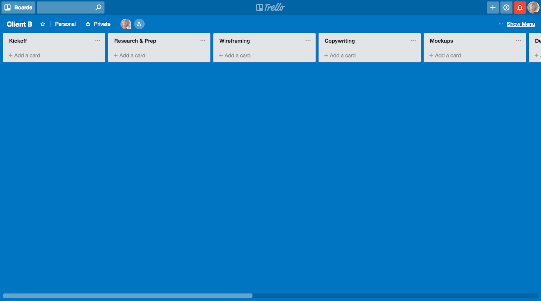
Installing The Testimonials Slider Block
The plugin in question — the one we are going to go through is already published to the WordPress repository.
Please install the Testimonials Slider Block plugin to your local WordPress instance so that you have a feel for how the plugin works.
You can also fork or clone the project from GitHub.
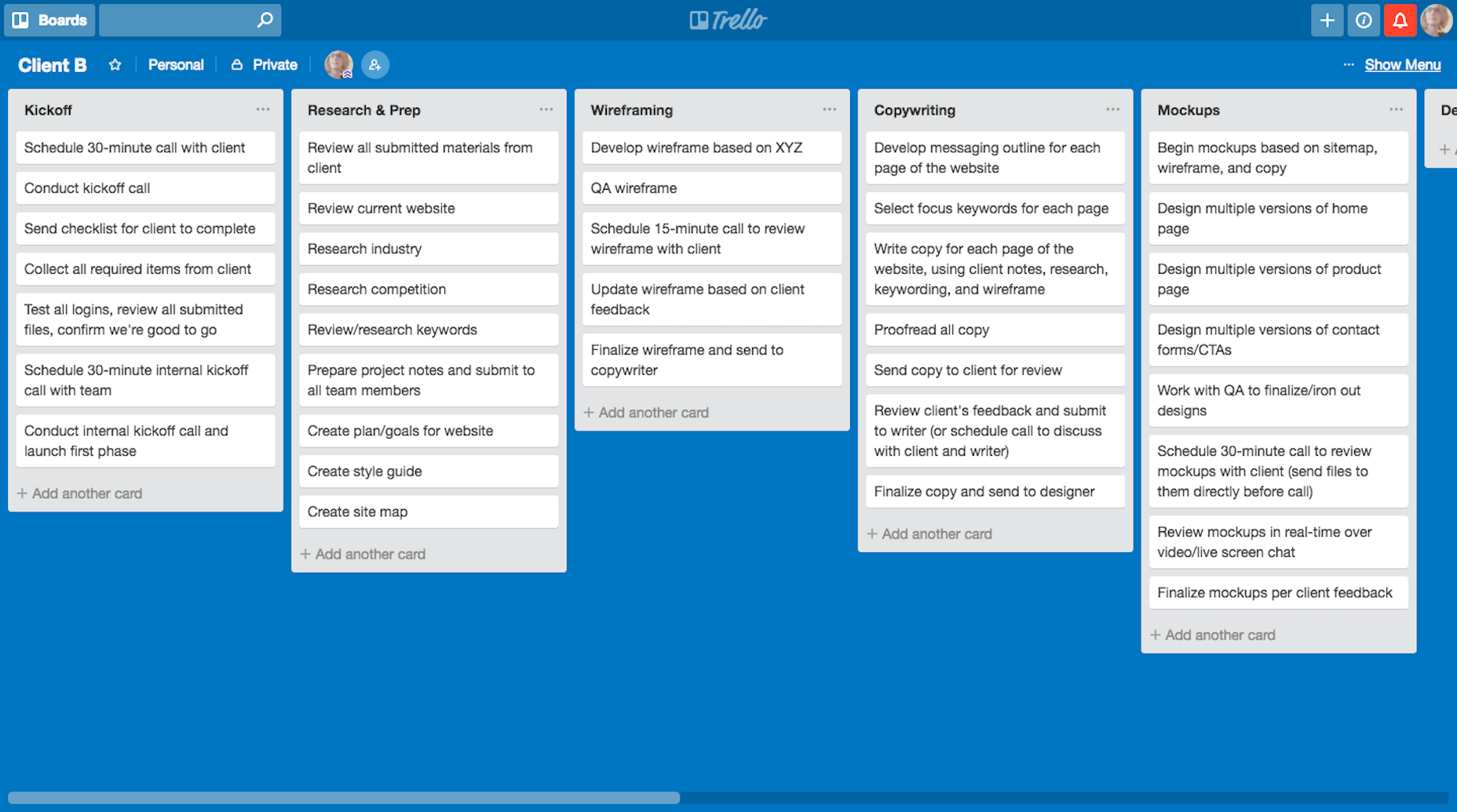
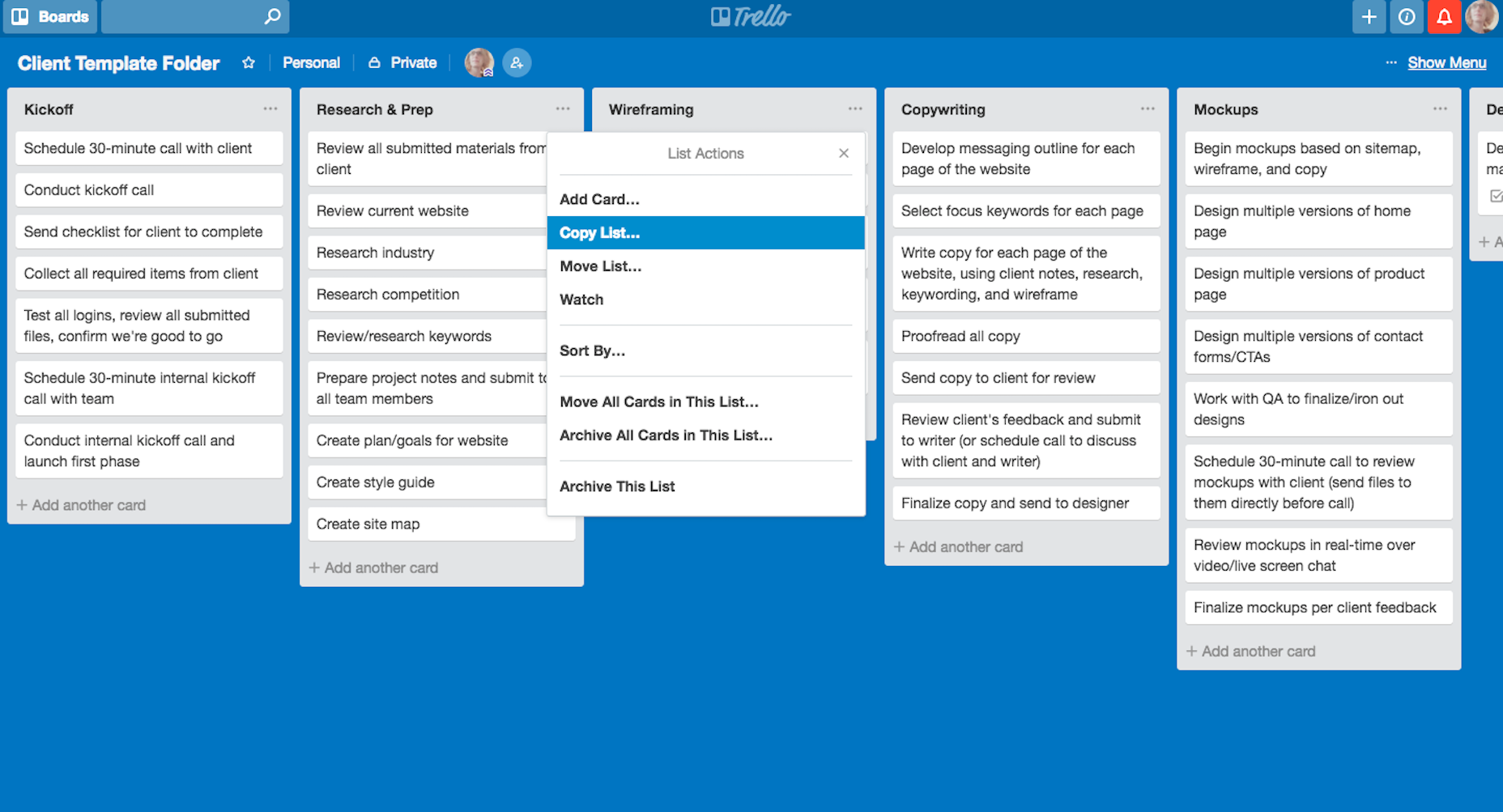
After activating the plugin, you can go to your Gutenberg Editor and add a Testimonials Slider to your content:
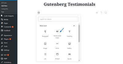
Selecting the Testimonials Slider Block (Large preview)

Adding content to the Testimonials Slider Block (Large preview)

Testimonials Slider Block in the frontend (Large preview)
Now I will go through how I built the plugin and how you too can build a similar one. To keep the article concise, I will not share the entire code in here. However, after reading this you should be able to create your own Gutenberg block.
Getting Started With The Configuration
A Gutenberg block is generally created as part of a plugin. Our plugin is not going to be any different.
Navigate to the plugins directory in your local WordPress instance. Move to the testimonials-slider-block. Notice the following files and folders:
gutenberg-testimonials-slider.php is the main file which has details of the plugin, such as name, description, author details and license. These details will be used in the plugin description in the Plugins menu in the dashboard. You will see that this file calls the init.php file.
The init.php file enqueues the different JavaScript and CSS files. This includes both the external libraries like Bootstrap and Font Awesome and our build files.
The .babelrc file instructs webpack what kind of JavaScript files we are writing.
The package.json file contains all the npm modules that are used in the plugin. You will use the npm install command to install all those packages.
webpack.config.js file contains the configuration for webpack to build our JavaScript and CSS. if you did not know, webpack is a package bundler mainly used for bundling our JavaScript modules and putting them into one file that is then enqueued by WordPress.
That was a lot of configuration files. Now we can go about actually building our Gutenberg block.
Registering A Block
Within the src folder you will see the index.js file. This is the fle that webpack looks for, to bundle the JavaScript. You can see that this file imports the slider.js file within the block folder.
The block folder has the following styles:
slider.js: contains the actual code for the block
editor.scss: the styles file describing the block within the Gutenberg Editor
style.scss: contains styles pertaining to how the block is displayed in the frontend.
Please open the slider.js file in your editor.
This file first imports both the editor and style scss files. Then it imports internationalization component, registerBlockType and the MediaUpload and PlainText components. The last two components will be used to upload the author image and to take in the different text inputs to save in the database.
Next you will see how a block is registered.
It takes in a name as the first parameter. The name must be prefixed with a namespace specific to your plugin in order to avoid any conflicts with another block with the same name.
The second parameter is an array with the following properties and functions:
Title
The name of the block which will appear when you add a new block in the Gutenberg Editor.
Icon
The block’s icon which will be picked up from dashicons. You can also specify your own SVG icons if you want to.
Category
Under which category of blocks will the block appear. Some of the categories are: common, formatting, layout widgets and embed.
Keywords
An array of strings that describe the block, similar to tags.
Attributes
A JavaScript object which contains a description of the data that is saved by the block.
Edit
The function that provides an interface for the block within the Gutenberg Editor.
Save
The function that describes how the block will be rendered in the frontend.
To learn more, please refer to this documentation.
Introducing Gutenberg Specific Syntax
Gutenberg is built with React and the blocks that we build for Gutenberg use a similar syntax.
It certainly helps to know a bit of React to build custom Gutenberg blocks though you don’t have to be an expert.
The following things are useful to know before starting the block development:
The HTML class is replaced with className like in React.
The edit and save methods return JSX, which stands for JavaScript XML. If you are wondering, JSX is syntax exactly like HTML, except you can use HTML tags and other components like PlainText and RichText within it.
The setAttributes method works similar to React’s setState. What it does is, when you call setAttributes the data in the block is updated and the block within the editor is refreshed.
The block uses props in the edit and save functions, just like React. The props object contains the attributes object, the setAttributes function and a ton of other data.
The attributes Object
The attributes object that was mentioned previously define the data within the Gutenberg block. The WordPress Gutenberg Handbook says:
Attribute sources are used to define the strategy by which block attribute values are extracted from saved post content. They provide a mechanism to map from the saved markup to a JavaScript representation of a block.
Each source accepts an optional selector as the first argument. If a selector is specified, the source behavior will be run against the corresponding element(s) contained within the block. Otherwise, it will be run against the block’s root node.
For more details on how to use attributes, please refer to this guide.
The following is the attributes object that is used in the Testimonials Slider Block:
attributes: {
id: {
source: “attribute”,
selector: “.carousel.slide”,
attribute: “id”
},
testimonials: {
source: “query”,
default: [],
selector: “blockquote.testimonial”,
query: {
image: {
source: “attribute”,
selector: “img”,
attribute: “src”
},
index: {
source: “text”,
selector: “span.testimonial-index”
},
content: {
source: “text”,
selector: “span.testimonial-text”
},
author: {
source: “text”,
selector: “span.testimonial-author span”
},
link: {
source: “text”,
selector: “.testimonial-author-link”
}
}
}
},
The source tells Gutenberg where to look for data within the markup.
Use attribute to extract the value of an attribute from markup, such as the src from img element. The selector and attribute tell what element to look for and what exact attribute to pick the data from respectively. Notice that the selector string picks up an HTML element from the save function.
Use text to extract the inner text from markup and html to extract the inner HTML from markup.
Use query to extract an array of values from markup. Entries of the array are determined by the selector argument, where each matched element within the block will have an entry structured corresponding to the query argument, an object of attribute and text sources.
You can access the attributes in the edit and save functions through props.attributes.
When you use console.log(props.attributes.testimonials) in the edit function, you get the following result:
▼(2) [{…}, {…}]
▼0:
author:”Muhammad”
content: “This is a testimonial”
image: “http://localhost/react-gutenberg/wp-content/uploads/2018/08/0.jpg”
index: 0
link: “https://twitter.com/muhsinlk”
▶__proto__: Object
▼1:
author: “Matt”
content: “This is another testimonial”
image: “http://localhost/react-gutenberg/wp-content/uploads/2018/08/767fc115a1b989744c755db47feb60.jpeg”
index: 1
link: “https://twitter.com/photomatt”
▶__proto__: Object
length: 2
▶__proto__: Array (0)
Therefore, in the above code, id is a text that uniquely describes each testimonial block whereas testimonials is an array of objects where each object has the properties as shown in the above screenshot.
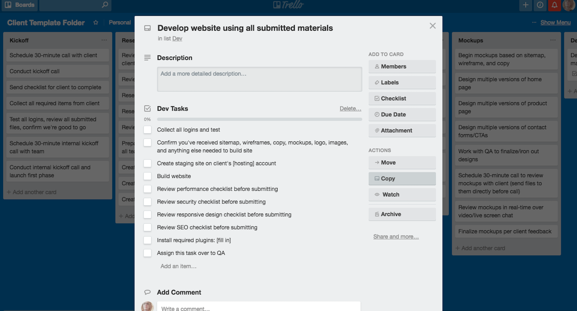
The edit And save Functions
As mentioned above, these two functions describe how the block is rendered in the editor as well as in the frontend respectively.
Please read the full description here.
The edit Function
If you look at the edit function, you will notice the following:
I first get the props.attributes.testimonials array to a const variable. Notice the ES6 Object Destructuring to set the const value.
Then generate an id for the block which will be used to make each block unique when you add more than one Testimonials Slider Block to your content.
Then the testimonialsList is generated, which is got from sorting then mapping the testimonials array that we got in step 1.
Then, the return function gives out JSX, which we discussed earlier. The testimonialsList, which we constructed in step 3 is rendered. The + button is also rendered, pressing which will create a new testimonial inside the block.
If you dig into testimonialsList, you will see that it contains the PlainText and MediaUpload components. These provide the interface for entering the different texts and uploading the author image respectively.
The PlainText component looks like this:
<PlainText
className=”content-plain-text”
style={{ height: 58 }}
placeholder=”Testimonial Text”
value={testimonial.content}
autoFocus
onChange={content => {
const newObject = Object.assign({}, testimonial, {
content: content
});
props.setAttributes({
testimonials: [
…testimonials.filter(
item => item.index != testimonial.index
),
newObject
]
});
}}
/>
The attributes I have used for the PlainText component are:
className
The CSS class of the component in order to style it.
style
To give a minimum height so that the content does not look like a one-line text. Specifying the height using the class selector did not work.
placeholder
The text that will be displayed when no content is added.
value
The value of the component from the object within the testimonials array.
autoFocus
To tell the browser to focus on this component (input field) as soon as the user adds a new testimonial by clicking the + button.
onChange
What looks like the most complex attribute in this list. This function first gets a copy of the current testimonial and assigns the changed content to newObject. Then it spreads the array of objects, filters out the current object using index and then replaces the newObject within the array. This is set using the the props.setAttributes function to the testimonials array.
The save Function
This function does the following:
I first get the props.attributes.testimonials array and props.attributes.id string to const variables. Again, notice the ES6 Object Destructuring being used to set the values for the two const variables id and testimonials.
Then I create the carouselIndicators variable, which is essentially JSX constructed from the testimonials array.
Then the testimonialsList is created from the testimonials array. The snippet below is from the mapped function callback return.
{testimonial.content && (
<p className=”testimonial-text-container”>
<i className=”fa fa-quote-left pull-left” aria-hidden=”true” />
<span className=”testimonial-text”>{testimonial.content}</span>
<i class=”fa fa-quote-right pull-right” aria-hidden=”true” />
</p>
)}
Notice the conditional rendering. The markup will not be rendered for content if the content is not set.
Next, if the testimonials array has objects within it, the HTML is rendered. This is what will be serialized and saved to the database, and this is what will be shown in the frontend (not verbatim).
Continuing Development
I’m sure you want to tinker around this plugin and see what happens. You can continue developing the plugin:
Open up the terminal
Navigate to the plugin’s root directory
npm install
npm start
This will install all the packages, build the files and watch for changes. Every time you make a change to the files, webpack will rebuild the JS and CSS files.
Please note: Markup changes to the blocks will mess up the block in the Gutenberg Editor if you had added it before. Don’t be alarmed — you simply have to remove the block and add it again.
If you are done with developing you can npm run build to minify the files to make it ready for production!
Hopefully, you are now convinced Gutenberg block development is more approachable than it sounds.
I have the following plans in mind for this plugin:
Allow users to select color of text, background and accent.
Allow users to select the size of slider and font.
Avoid depending on libraries like Bootstrap and Font Awesome.
I encourage you to make a pull request with your improvements and extra features.
Starting A New Gutenberg Block
There are many ways to develop a Gutenberg block. One of the recommended ways is to use create-guten-block created by Ahmad Awais. In fact, this project was built based on guten-testimonial-block which was bootstrapped from create-guten-block.
You can also check out Zac Gordon’s repository where he shows how to use the different Gutenberg components in your new block.
Conclusion
We covered the following in today’s article:
Installing and using Gutenberg and Testimonials Slider Block plugins
Configuration for a typical Gutenberg block plugin
Registering a Gutenberg block
How to use the attributes object
The edit and save functions and how to use them.
I hope this article was useful for you. I can’t wait to see what you will build with and for Gutenberg!

(dm, ra, yk, il)


 I know I know: Content is king! You’re already sick to the back-teeth of hearing it.
You’ve made your content, you know your target audience—you just want to build some links and get some darn traffic to that content, am I right?
I know I know: Content is king! You’re already sick to the back-teeth of hearing it.
You’ve made your content, you know your target audience—you just want to build some links and get some darn traffic to that content, am I right?
 Last year, Rachel McPherson shared 9 ways to organize successful creative projects. It’s a very useful article that highlights the main things to do if you want to bring greater control and organization to your web design workflow.


 This abrupt change feels unnatural and leads to unnecessary brain work (the brain has to scan entire layout to understand what has just happened). (Image: Adrian Zumbrunnen via Smashing Magazine)
 A simple animated transition maintains context, making it easy to understand what has changed about a screen. (Image: Adrian Zumbrunnen via Smashing Magazine)
 Animated transition between preview and details. (Image: Tympanus)
 Using animation, it’s possible to define object relationships and hierarchies when introducing new elements.
 The Yeti character responds to user input.
 Large preview
 Don’t animate everything at the same time. It will make the objects compete for attention and divide focus. (Image: Google)
 An example of bouncing animation. Avoid bouncing animation in forms that collect bank account details. Users might hesitate to provide their data. (Image: Joel Besada)


 Every week users submit a lot of interesting stuff on our sister site Webdesigner News, highlighting great content from around the web that can be of interest to web designers.


 Hello Readers! Can you believe that I have not found one single Halloween-themed portfolio? I guess no one wanted to base their entire site on a one-day holiday. While understandable, this disappoints me.
 , kids. If you find an idea you like and want to adapt to your own site, remember to implement it responsibly.