Original Source: http://feedproxy.google.com/~r/1stwebdesigner/~3/ooPWe4w1k8M/
Consider the routes that may have led you to a product page. Perhaps you Googled a specific camera and navigated directly to the product links, skipping the home and about pages.
Maybe you clicked a link shared by a friend on social media or found the product thanks to ad retargeting. Whatever the case, you bypassed the traditional ecosystem and raised the stakes of your interaction with the product page. It has, in effect, become the homepage.
If you land directly on it without any context, the page must be engaging enough to hold your attention, but detailed enough to capture the sale. And achieving that is no easy feat.
A Multi-Faceted Approach
Consider the effort that goes into writing product descriptions. Each item requires a unique blurb of at least 250 to 400 words. That may not sound like much at first, but if you offer 1,000 products, you’re looking at 400,000 words of copy – twice the length of “Moby Dick.” And Herman Melville didn’t have to orchestrate a photo shoot, take inventory, and assign related products after he was done writing.
Getting a product page right requires input from developers, designers, writers, photographers, and a project manager. Every element should center around the content, amplifying the message through complementary buttons, color schemes, fonts, and functionalities.
Product page optimization requires a significant investment of time and resources, but provides an almost immediate return on investment. Here’s what a high-performing product page includes:
1. Engaging Product Descriptions:
Compiling a full product catalog is the only way to gain serious organic traffic. 95% of people interviewed in an eCommerce survey said that product descriptions played an important role in their purchase decisions.
Every description should include a well-crafted, informative take on the product, along with sizing charts for each specific item where applicable. For instance, ASOS offers sizing guides that are specific to different subcategories, such as “Men’s Jumpers and Cardigans.” This resource prevents people from navigating away to look up sizes elsewhere or simply abandoning the sale in frustration.
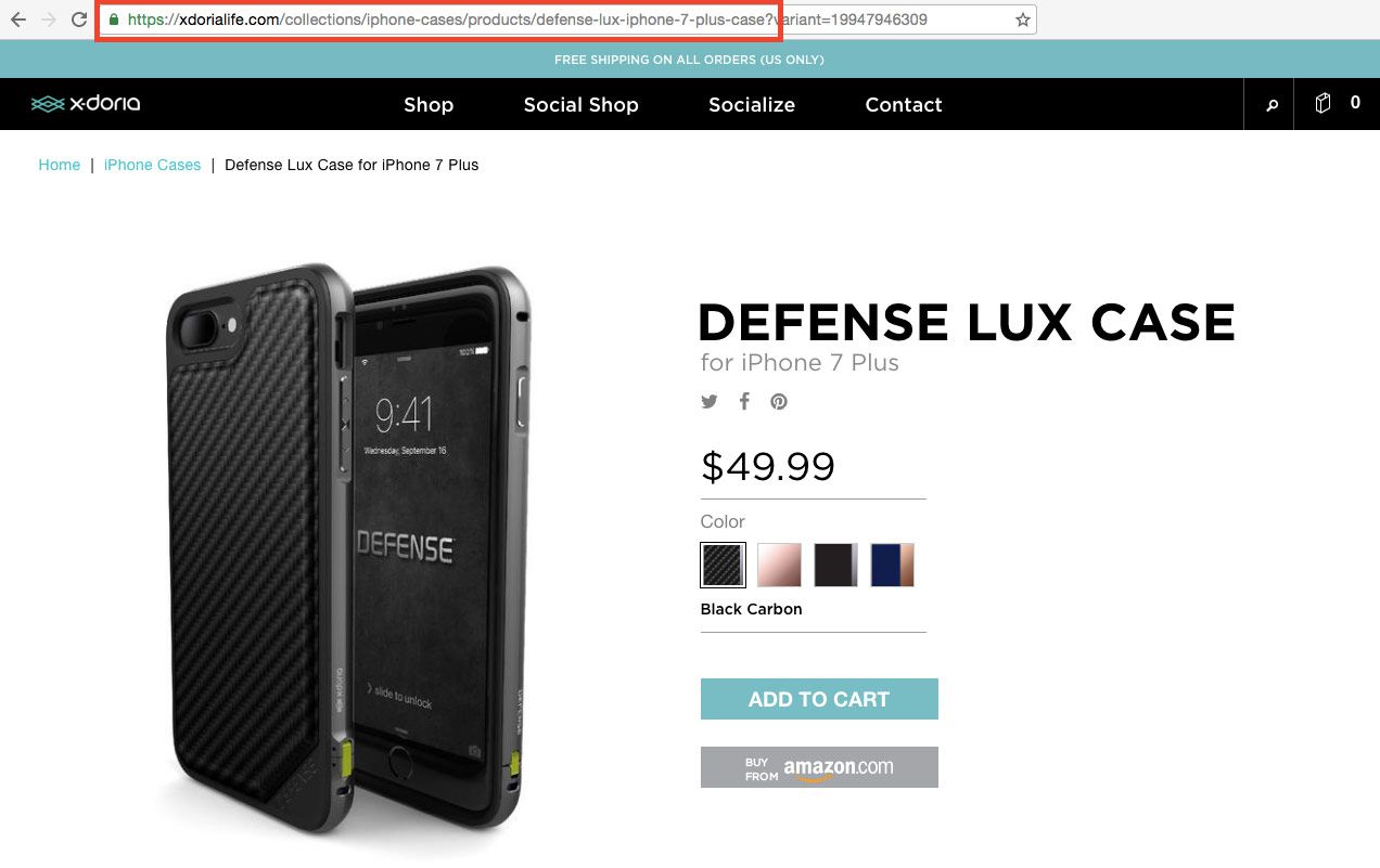
Aside from its shipping, this is where Amazon really succeeds. Their product pages will never win a design award, but that’s secondary to them: It’s not glamorous, but a customer is highly unlikely to leave their product pages because they’re missing information.
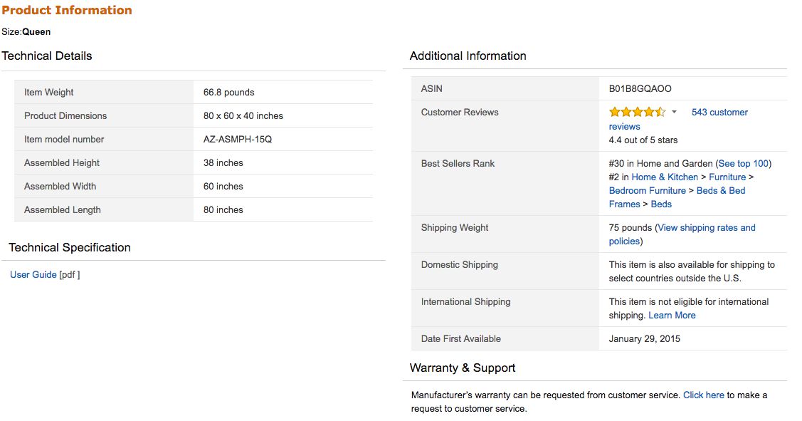
One eCommerce study showed that in 20% of cases in which users failed to complete their purchases, incomplete or vague product data was to blame. Customers should never have to Google additional information about an item or feel unclear about what the purchase includes. Effective product descriptions tell them everything they need to know in conversational, relatable language.
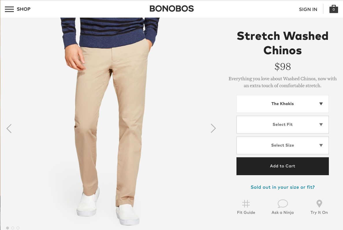
2. High-Resolution Product Photos
Images are essential. Large, attractive photos can boost eCommerce sales by up to 9%, and 63% of consumers told Nielsen Norman Group that pictures were “very important” when shopping online.
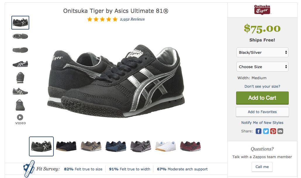
One company, Skinner Auctions, saw a 63% jump in conversion rates after it increased its image sizes. Zappos uses images especially effectively, offering large pictures of its shoes from several different angles. Customers can click through a range of photos and watch a video for additional information. Photos tell prospective buyers what they can expect from a product and reassure them of its value and quality.
3. Sound SEO Elements
Top-performing product pages offer engaging content, high-resolution photos, a clear call to action, and solid SEO. Product pages must have thoughtful keywords in the title tags and body copy so that search engines can pick them up. All data should be marked up so that pricing, shipping, reviews, and other details appear logically in the code. This also impacts search engine rankings.
Product page URLs should include relevant keywords so people know they’re in the right place when they land there. Optimizing product page links can increase conversions by 76%. If all of these technical aspects are in order, the site will rise in search rankings every time a new product is added. They also make for an enjoyable customer experience, so people are more likely to buy from the brand in the future.
Good SEO practices should be built into the page design from the outset. It’s very difficult and time-consuming to tweak these performance elements once the page has been launched. Before completing the design, companies should partner with SEO specialists who know how to strategize for eCommerce: building content, descriptions, messages for out of stock and seasonality, 301 strategies, link building and architecture, and user-generated content. This article can give you a good starting point.
4. Fast Load Times
The numbers don’t lie – a 10-second delay in page loading could cause 50% of would-be buyers to abandon their purchases. Amazon estimates that it stands to lose $1.6 billion in sales per year if its site suffers a one-second slowdown. Even for smaller sites, a lagging page can cost millions of dollars in revenue.
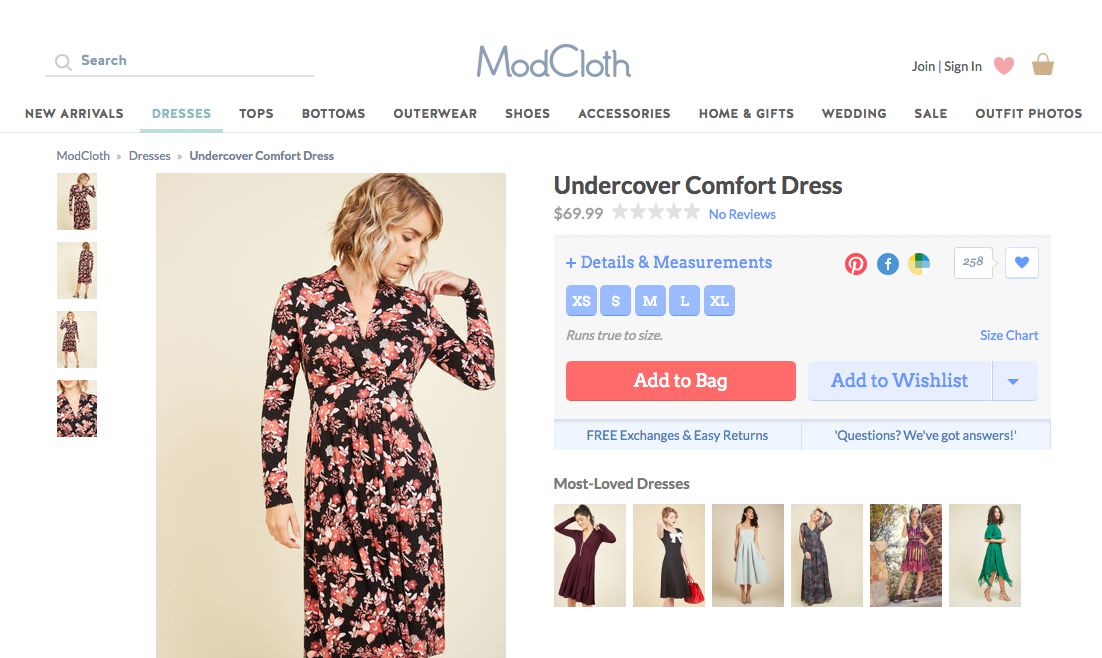
Modcloth is a good example. Their site doesn’t just look great: It loads more than 15 megabytes of content in under three seconds and gets more than an 80% performance grade.
There are several ways to improve load times, such as boosting server response rates, enabling compression, and allowing for automatic image optimization. Development teams should also minify their websites, which means removing any unused or unnecessary code. They can also edit out redundancies to decrease the number of processes the server has to run. Google Pagespeed can automatically optimize different elements to shorten loading times as well.
5. Customer Reviews
People need reassurance before they buy, especially if they’re unfamiliar with the brand. A Figleaves study found that products with reviews had 12.5% higher conversion rates than those without reviews. More importantly, the conversion rate for individual products rose by about 35% after adding customer feedback.
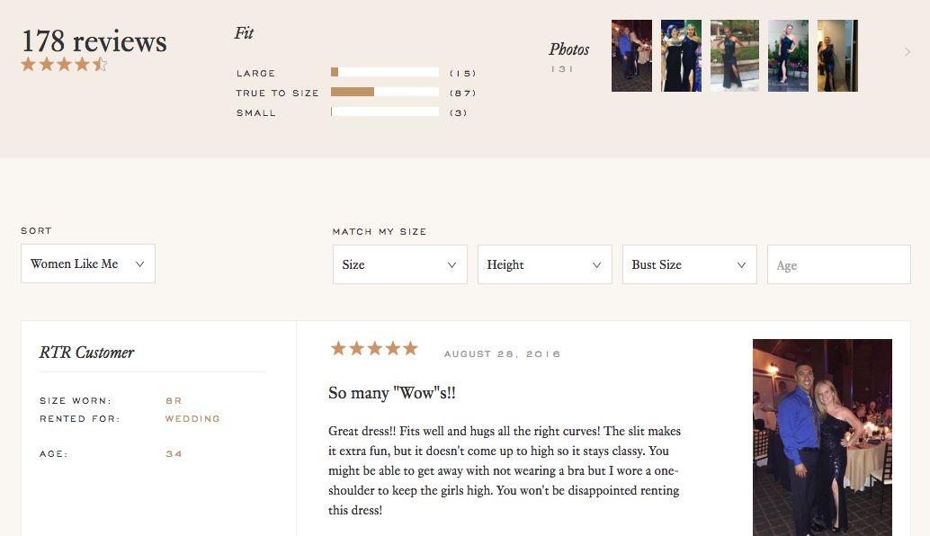
Rent The Runway made the determination that reviews had to be a pillar of the business, and went all in – customers share product reviews and rate by size and share height, age and photos.
Consumers conduct their due diligence before purchasing. They’ll seek out reviews on forums and other sites to determine which brands are trustworthy and compare products. Businesses that include reviews have a better chance of keeping prospects on their product pages because all of the information consumers need is right in front of them. Review pages also rise faster in search rankings than product pages, so they’re a useful way to generate more traffic.
6. Prominent Pricing
Customers might be charmed by engaging copy and a sleek interface, but eventually they want to get to the bottom line – what does the product cost? Companies should make prices visible in the initial impression, along with how much consumers can save by buying from them instead of another business. People like to know that they’re getting a good deal, so it’s important to spell out the savings.
Amazon includes this information on the right side of every product page. Customers can see how much Amazon is charging and how much more they might pay on another site. Amazon also incentivizes recurring sales by listing its subscription rates on different products. The pricing section is a perfect place for these types of upsells. Recommending popular items, related goods, and subscription deals is especially effective when people are already in shopping mode.
But the checkout process shouldn’t be cluttered with additional offers. It should be easy for consumers to check out quickly and without hassle. Because people are concerned about identity theft and credit card fraud, the site should include a message about the brand’s security protocols before a sale is made. The product page should also serve as a 24/7 customer service representative, answering potential questions and offering plenty of contact options.
Conclusion
From descriptions to pricing to SEO, product pages are masterpieces of collaboration and good design. They should appear seamless to customers, offering a blissful shopping experience that leaves them eager to hand over their money. Invest in optimization strategies to create an effect that makes these pages immediately convert browsers to buyers.


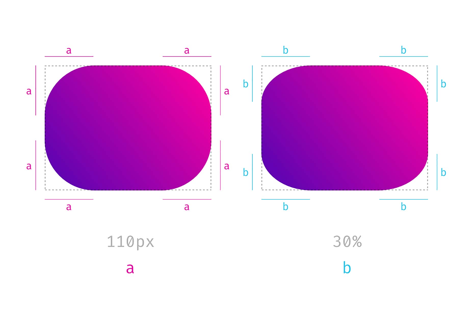
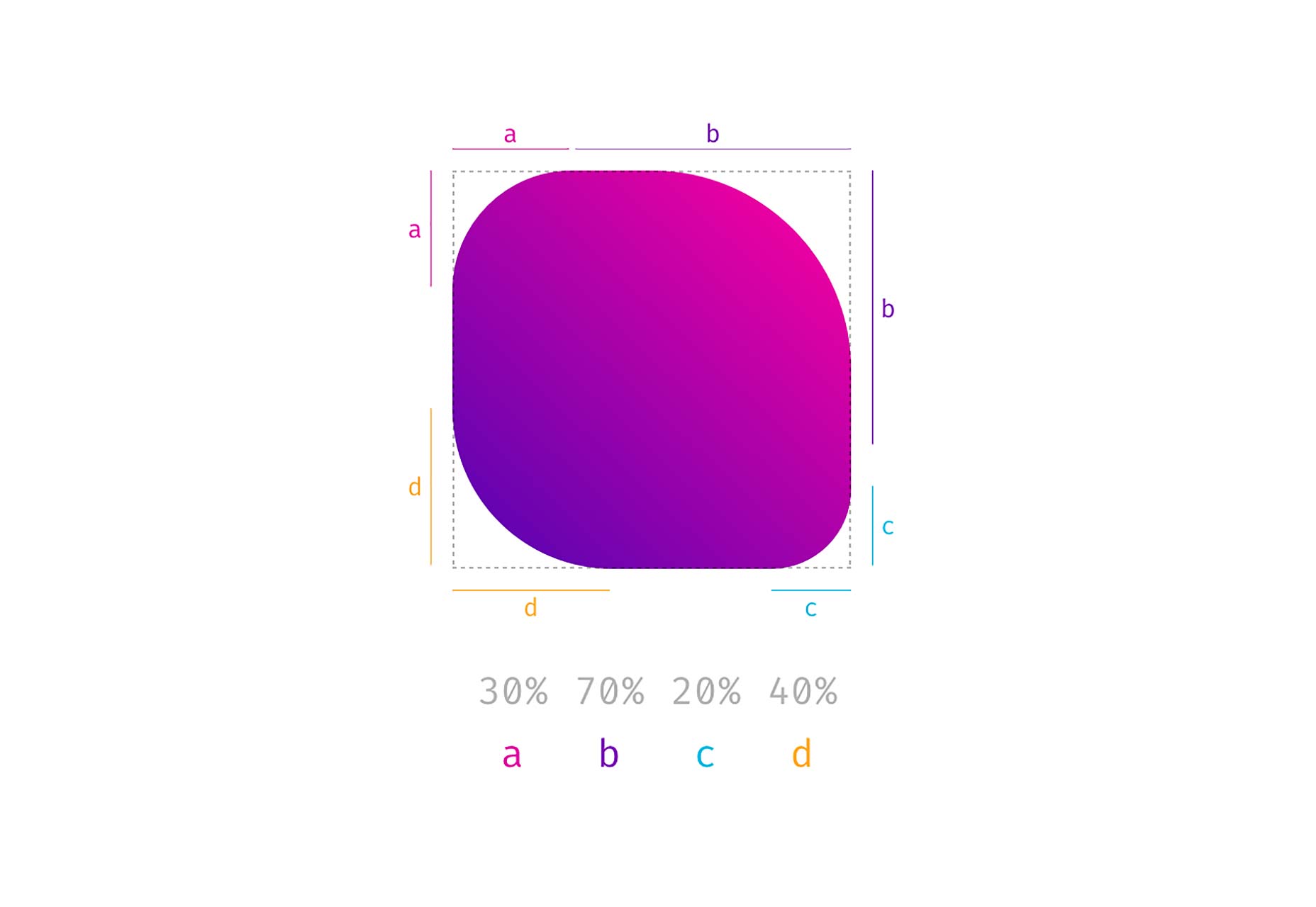
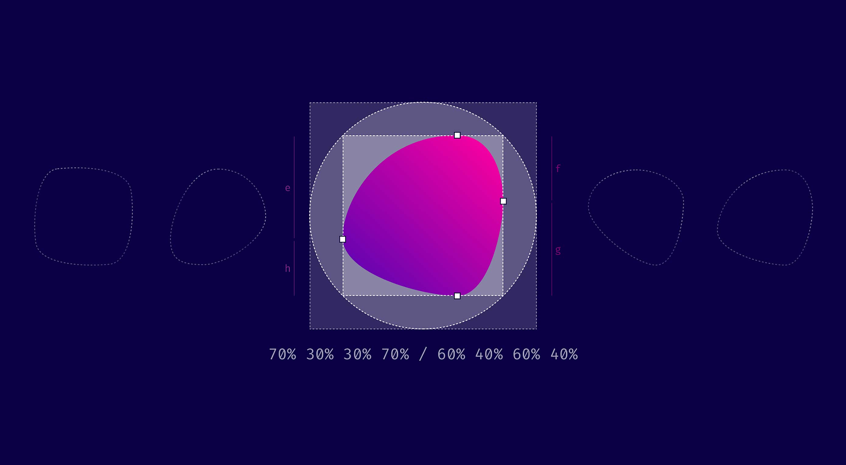 TL/DR: When you use eight values specifying border-radius in CSS, you can create organic looking shapes. WOW. No time to read it all ? — we made a visual tool for you. Find it here.
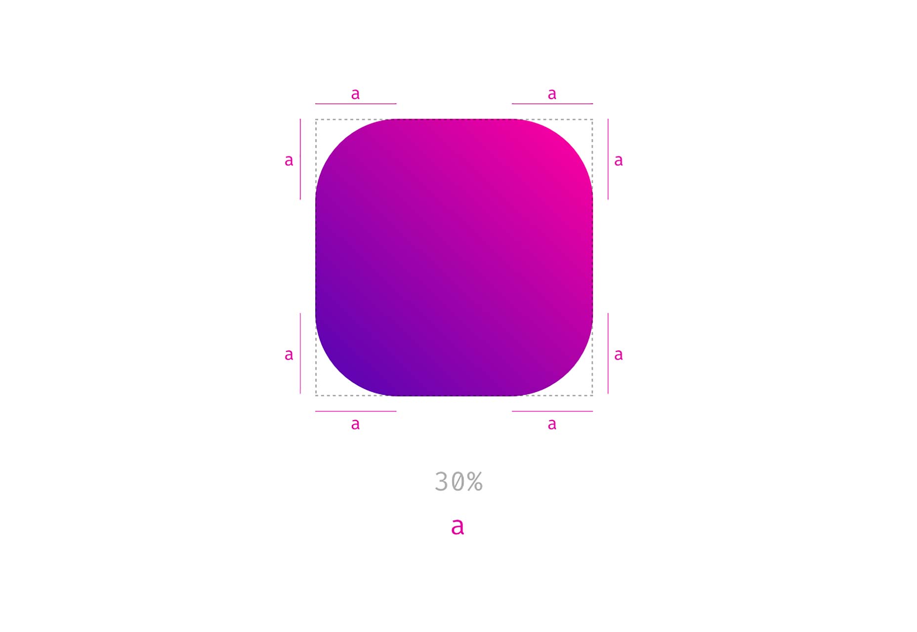


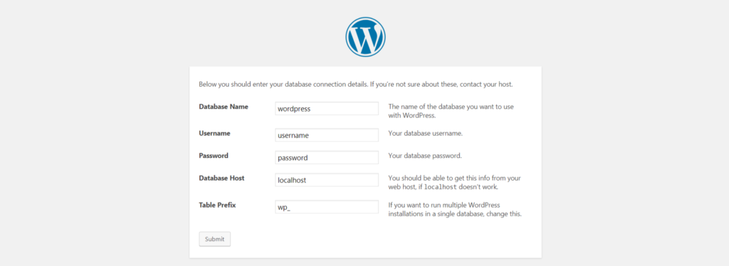 WordPress database defined during installation
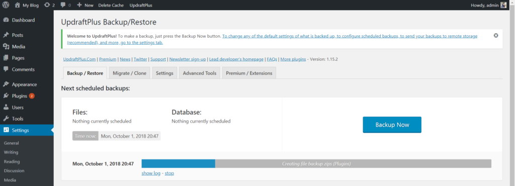 Udraft Plus creating a backup