7 times you should turn a design job down

Original Source: http://feedproxy.google.com/~r/CreativeBloq/~3/IbR8q2uwsM4/7-times-you-should-turn-a-design-job-down

You know it’s a mistake to accept every job that you’re offered – but when should you say no? When you start out as a freelancer, the temptation is to say yes to every job that's offered to you. But not every job is a good career move – and some could even end up costing you more than it’s worth in terms of work-life balance, stress, or even actual money. Here, seven designers explain where they draw the line.

9 things nobody tells you about going freelance
01. When expectations are unrealistic

Designer Anna Negrini has some clever ways of spotting when a client is going to be trouble. “Situations that are deal-breakers for me include when the proposal has the words ‘superstar’ or ‘ninja’ in it – you probably won’t get paid; if the client estimates the time you’re going to spend on the project; or when the expectations are entirely unrealistic – £1,500 for a website like Gucci’s… really?” she smiles. 

“Sometimes, though, it’s just a gut feeling: I start sweating and I feel ‘trapped’. In these circumstances, I’ve learned to trust my instincts and just say no.”

02. When it’s in the wrong location

If the job is in-house, make sure you consider where the job is, and the time and money required to get there. Location is the biggest deal-breaker for digital designer John Taylor – so much so, he’ll look into this before even discussing the project and looking at the brief. 

“Travel time and costs aren’t usually billable, so I need to ensure the job’s financially viable before agreeing,” he explains. “Travelling can also be tiring and stressful, so to ensure I maintain a good work-life balance I factor in what time I’ll have to get up in the morning and get home in the evening.”

03. When you won’t learn anything

Krisztina Toth doesn’t say yes to every job – and her portfolio looks great as a result

When it comes to projects, full-stack developer Krisztina Toth looks for work that will help her advance her skills. “I draw the line at copy-paste sites and ‘coming soon’ pages, because even though they’re easy money, they offer no professional or personal development,” she says.

04. When the client is dismissive

You can tell a lot about a potential client by the way they speak to you when they first get in touch. “Going beyond basic politeness, I look for people committed to their goals, with a clear vision of what they want to accomplish,” says Toth. “I instantly reject the ‘I could do it myself but don’t have the time’ type.”

Creative director Stephen Dawe agrees. If a client thinks design is just about knowing how to use Photoshop, that’s a big red flag. “It’s our role as industry professionals to educate new clients on exactly what it is we do. Design is about problem solving, not just aesthetics. Moving forward comes down to whether they’re open to learning that or not.”

05. When the contract causes problems

Any project should start with a clear contract that outlines everyone’s expectations, costs, and an estimated timeline. If the client gets funny about signing, step back. “When you don’t have that, the project often stalls and doesn’t get completed in a timely fashion – and as a business owner, that can get costly,” says designer Shelby Sapusek. 

She points out that if you’ve already created a development site, you’ve done the work regardless of whether it’s live or not. “I’ve experienced project stalls that have lasted for months – that’s a lot of extra cost if you don’t have an agreement beforehand,” she adds.

06. When the client doesn’t respect copyright

Graphic designer Ranjit Sihat has no tolerance for clients wanting to use images where the copyright is held by someone else. “The relationship between client and designer should be based on trust, creating a unique design and selling the identity of the individual business, not someone else’s,” she says. While often these issues can be resolved, occasionally a client will refuse to listen, and push to include the image anyway. At that point, it’s time to walk away.

07. When it’s underpaid

It should go without saying that for any professional designer, pay should be a major decider in the jobs you take – even when you’re at the start of your career. “If I’ve learned anything in life, it’s to not undervalue yourself,” says designer Cliff Nowicki. “The low-paying jobs and freelance gigs I took on earlier in my career were the most soul-sucking times of my life. However great a position seems in terms of environment and benefits, I can’t accept it if it’s paying half the market value.” 

While you might have family or loved ones that can help you out with financial responsibilities, taking on an underpaid job for ‘exposure’ or ‘experience’ rarely pays off – and has knock-on effects for the health of the entire industry.

This article was originally published in net, the world's best-selling magazine for web designers and developers. Buy issue 308 or subscribe.

Web design event Generate London returns on 19-21 September 2018, offering a packed schedule of industry-leading speakers, a full day of workshops and valuable networking opportunities – don’t miss it. Get your Generate ticket now.

Read more:

8 portfolio mistakes that drive clients madHow to write the perfect brief10 time-sucks for creatives and how to minimise them

Designing For Micro-Moments

Original Source: https://www.smashingmagazine.com/2018/08/designing-for-micro-moments/

Designing For Micro-Moments

Designing For Micro-Moments

Suzanna Scacca

2018-08-17T13:50:09+02:00
2018-08-17T11:59:10+00:00

A couple of years ago, Google announced a new mobile-first initiative it wanted web designers and marketers to pick up on. This was our introduction to micro-moments.

These are not to be confused with micro-interactions, which are miniscule engagements websites have with visitors when they “touch” key points of the interface. A mouse changes its appearance when a user hovers over a clickable element. A display error appears after a field is incorrectly populated. A checkbox briefly enlarges and changes color after it’s been ticked off. These are micro-interactions.

A micro-moment, however, originates with your visitor. In Myriam Jessier’s “Things Designers Should Know About SEO In 2018”, she sums up Google’s four micro-moments:

“I want to know.”
“I want to go.”
“I want to do.”
“I want to buy.”

Basically, these are four key moments in every consumer’s life when they decide to pick up their mobile device for a specific purpose. As such, it’s your job to know how to specifically design for these micro-moments.

Recommended reading: What You Need To Know To Increase Mobile Checkout Conversions

How You Should Be Designing For Micro-Moments

When a visitor arrives at a mobile website (or app), they’ve come with a clear motivation:

“I want to know.”
“I want to go.”
“I want to do.”
“I want to buy.”

Seems pretty simple, right? However, as Google launched this initiative a couple of years ago, its had time to quietly observe users in these micro-moments as well as the websites that have most aptly responded to them. As you will soon see, consumers have incredibly high expectations for what the mobile web can do for them. Basically, they want you to be a mind reader and anticipate their every need (and even their location) without them having to say a word.

Is your pattern library up to date today? Alla Kholmatova has just finished a fully fledged book on Design Systems and how to get them right. With common traps, gotchas and the lessons she learned. Hardcover, eBook. Just sayin’.

Table of Contents →

Is that intimidating? It shouldn’t be. You already have all the information you’d ever need to answer that question.

Here is how you should be designing your mobile website to respond to and draw in consumers as they experience these micro-moments:

1. Start With The Data

Google Analytics will help you decipher where they’re spending the most time productively on your website.

Google Analytics Behavior breakdowns

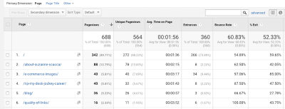
An example of Google Analytics’ visitor behavior breakdowns. (Source: Google Analytics) (Large preview)

Google Search Console will tell you which keywords are most effective in driving high-quality leads to the site.

Google Search Console keywords

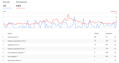
An example listing of keywords and associated clicks and impressions for a website. (Source: Google Search Console) (Large preview)

Once you know where exactly visitors see the greatest value in your product, you can then turn to third-party tools like Answer the Public to give you some insights into what relevant questions your users may be asking about you.

Answer the Public sample answers

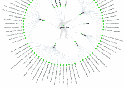
An example of how Answer the Public provides micro-moment answers. (Source: Answer the Public) (Large preview)

Ultimately, this data needs to tell you all about your customers’ journey before they ever reach you. What exactly was the question that triggered them to pick up their smartphone and do that search? If you can identify those micro-moments, you can start using various design elements to respond to these questions.

2. Respond With Immediacy

According to Google:

People are searching at the exact moment they need something and are looking for places that can meet their immediate need. In other words, when making these on-the-spot decisions, they are more loyal to their need than to any particular place.

Although we’ve heard a lot about customer loyalty to brands in the past, it’s interesting to get Google’s take on this matter.

While consumers may indeed still remain loyal to brands that take very good care of them and produce a high-quality product nearly 100% of the time, this opportunity to steal attention from those customers in one of their micro-moments is real. Do that enough times and your brand and website could realistically win that customer over so long as you are there every time they go searching to fill that need.

One of the ways you can do this is by providing users with instant solutions. Is your business open now? Can you mail out that new product same-day? Will there be an open table at your restaurant tonight? Answer that immediately and you could find conversions increase dramatically.

Take the Delaware State Fair website, for example.

Delaware State Fair gives users what they need to know

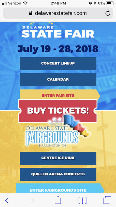
The top of the Delaware State Fair home page gives users easy access to everything they want to know and do. (Source: Delaware State Fair) (Large preview)

Look at the top of the homepage. There are the dates of the fair, which probably answer one of the most commonly searched questions. There is a link to the concert lineup as well as calendar, which answers anything people would want to know about special events they might want to go to. And then there’s a button to buy tickets right away. It’s all right there.

Office Depot is a company that also explicitly addresses immediate needs:

Office Depot includes time-driven design elements

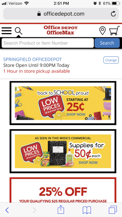
The Office Depot mobile site uses a variety of time-driven design elements to satisfy visitors’ needs. (Source: Office Depot) (Large preview)

As you can see in the example above, Office Depot uses a number of design tactics and elements to play into this need for immediacy.

There is a search bar at the very top. Consumers don’t have to even bother with navigation or scrolling through pages if they don’t want to/have the time to.
You’ll also see that the closest store’s hours are posted and boldly tell me how quickly I can have any products available in store.
Finally, you have the promotional categories for upcoming needs for parents that are about to send kids back to school.

Another website is Universal Studios Orlando; it does a great job sparing mobile users the trouble of sifting through irrelevant information and instead gets them to exactly what they need:

Universal Studios provides immediate research and booking options

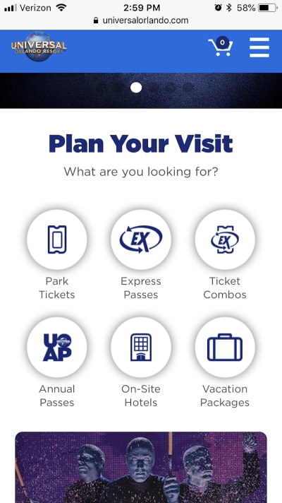
Universal Studios includes immediate options for research and booking on the home page and navigation. (Source: Universal Studios) (Large preview)

Aside from a single banner at the top of the home page, the Universal Studios website design gives visitors exactly what they want right away. The navigation includes only the most pertinent links to information and booking as does this succinct section on the home page. There’s really no time to waste when the options are so clear.

And here is one final example of a website that deals in immediacy, albeit with a more subtle design technique: Nordstrom:

Nordstrom uses color for immediacy

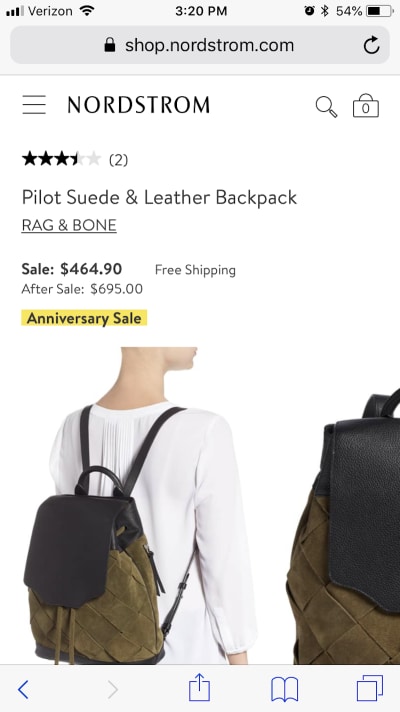
Nordstrom appeals to immediacy with this one subtle trick. (Source: Nordstrom) (Large preview)

As you can see, this is a pretty typical e-commerce product page. However, there’s one key difference: Nordstrom is subtly calling attention to its Anniversary Sale and the main reason why there is a significant price drop for this purchase. Rather than use an obtrusive pop-up to announce the sale and pester users to shop, it’s made the price change directly on the page and drawn attention to it with the highlighted text.

3. Respond With Relevant Content

According to Google:

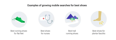
Not only have mobile searches for ‘best’ grown over 80% in the past two years, but searches for ‘best’ have shown higher growth among ‘low-consideration’ products than ‘high-consideration’ products. In other words, we’re all becoming research-obsessed, even about the small stuff.

We understand that the opinions of family, friends, and colleagues matter greatly in the minds of consumers. But as more and more of them to turn the web to make their purchases, it means being open to trusting other opinions online as well — ones that may be more conveniently expressed from a company’s website, from an influencer’s blog, or from social media.

Wherever those words of wisdom happen to come from, it’s important to take Google’s research to heart. With so many consumers now obsessed with this idea of having the best of everything and being able to get it in a pinch, your website needs to be the answer to that question.

But that’s the tricky part. According to Google, it’s not as simple as being a dog food manufacturer and configuring your site to be the answer to:

“Best Dog Food”

Consumers experience these micro-moments at a granular level. Sure, there may be some who think, “What is the best dog food?” But isn’t it more likely that question would be more specific in nature? For instance:

Best puppy food?
Best grain-free dog food?
Best vegan dog food?

Let’s take a look at Google, for example. Here’s a variety of searches for a singular “best of” concept:

Best searches example from Google

Example of the variety in “Best” searches in Google. (Source: Google) (Large preview)

As you can see, it goes beyond the basic questions. Through your design and your content, you must be ready to answer the most relevant questions your users have about your product or service.

With content, you’ll be able to answer many of the “I want to know” questions that are related to the brand with things like:

Informational pages regarding services and products.
Whitepapers, ebooks, case studies, reports, and other long-form content that provide heavily researched answers on related matters.
Blog posts, vlogs, podcasts, and other shorter content that can dabble more in appealing to the emotions of consumers.
Tutorials and guides that directly answer questions that consumers are asking.

As far as the design piece is concerned, it’s your responsibility to highlight these pages, so visitors don’t have to dig through various parts or layers of the site (like the footer or secondary navigation) to find their answers.

Google told them it was here, so it’s your job to get them right to it.

The navigation will play a big part in this, as evidenced by Globus Journeys:

Globus answers users in the navigation

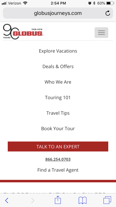
Globus Journeys provides answers to micro-moments in the navigation. (Source: Globus Journeys) (Large preview)

As you can see in this example, Globus Journeys answers many of those micro-moments right within the navigation: tips on touring (Touring 101), tips on travel best practices (Travel Tips), deals available for travel (Deals & Offers), etc.

Another way to use navigational design to inform visitors on what they’ll learn/know from this experience can take place on the blog. Salesforce has an interesting example of this:

Salesforce has informative blog navigation

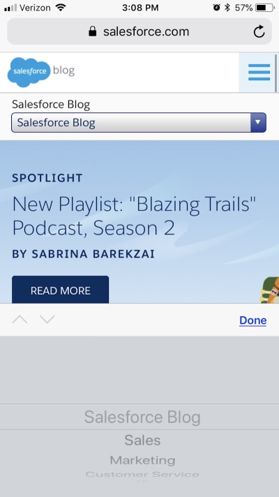
Salesforce includes a navigation menu for the blog. (Source: Salesforce) (Large preview)

There is the standard navigation for the Salesforce website, and then there is the navigation that’s specific to the Salesforce blog. This gives you — as the designer and planner of the site’s layout — a chance to better and more clearly organize content found within it. So, when visitors show up and want to know tips specific to one of those categories, it doesn’t require random searches or (even worse) endless scrolling through a full blog feed.

Another way you can more quickly and thoroughly inform visitors on topics of interest to them is by using strategically placed sections within blog posts.

While you likely won’t have anything to do with the writing of a website’s blog content, you will have control over its layout and formatting. The first thing you can do to expedite the knowledge acquisition process is by using callouts to detail and link to the various sections covered on the page as Be Brain Fit does:

Be Brain Fit has an index of topics

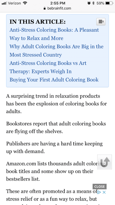
Be Brain Fit calls out a linkable index of topics from the blog post. (Source: Be Brain Fit) (Large preview)

Of course, the post itself is easy to scan, so readers could guide themselves to the most relevant parts. However, by placing this towards the top of the piece, you’re enabling them to get right to the information they seek.

I’m also going to suggest that pop-ups would be helpful in this matter.

I know, I know. Mobile pop-ups can be annoying, but not when they’re used properly as Fit Small Business has done here.

Fit Small Business uses a helpful pop-up

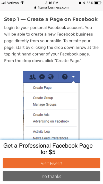
Fit Small Business not only provides all the information needed, but also offers an alternative solution to what they seek. (Source: Fit Small Business) (Large preview)

I encountered this blog post after doing a search for the best way to create a Facebook page. This was one of the links on the first SERP. I was actually quite pleased with the post as a whole. It broke it up into easy-to-follow steps, attractive and informative visuals, and got me the answer I needed.

However, I was especially pleased to see the bottom banner pop-up after I finished getting through the post. Not only has Fit Small Business attempted to reach its audience by providing helpful content, but it’s also providing an alternative solution to anyone who got here and realized, “Eh, I really don’t want to bother with this on my own.”

4. Respond With Geotargeting

According to Google:

Looking for something nearby — a coffee shop, noodle restaurant, shoe store — is one of the most common searches we do. In fact, nearly one-third of all mobile searches are related to location.

Here’s the thing though: users aren’t using “near me” qualifiers as much anymore.

Near me qualifiers dropping in use

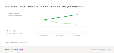
Google demonstrates how location qualifiers are decreasing in use. (Source: Google) (Large preview)

According to Google, this is because many consumers now assume that search engines, websites, and mobile apps are tracking this sort of information already. They expect that if they search for something like “dog food,” Google will automatically serve them the most relevant results — and that includes taking into account location proximity.

In Google’s research, it found that about two-thirds of mobile consumers are more likely to buy something from a website or app if information is geographically personalized. There are a plethora of ways to communicate this local-friendliness to visitors — through the copy, through various design elements, and even photos.

Google is a pioneer in this space and so I want to give it a special shout-out in this section for what it does with search results:

Google auto-populates search questions.

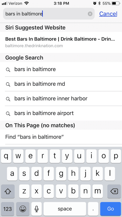
Google’s auto-populated search results aren’t just for Google. (Source: Google) (Large preview)

The biggest thing to take away from here is the fact that Google provides its users with auto-populated search recommendations. These are based on the users’ geography, behavior, history, as well as what Google knows about the query itself. As you can see here, it expands on Baltimore to provide more specific results based on the area of the city in which the user wants to drink.

With AI-assisted search functionality, any website can offer this same level of smart search for its users.

Of course, you first need to get access to visitors’ geographic data before you can provide them with these kinds of smart and geographically relevant results. One way to do this is to require them to sign in and fill out a profile with these details. Another way, however, is by serving them with this geotargeting request as Best Buy has done:

Best Buy asks for geo access

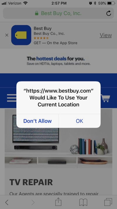
Best Buy requests for access to users’ geographic location. (Source: Best Buy) (Large preview)

Once you have access to a visitors’ current location, however, you can start providing them with information that helps them with the “I want to go”, “I want to do”, and the “I want to buy” micro-moments that caused them to reach for the phone in the first place.

Here is what the Best Buy website shows me after I granted it permission:

Best Buy provides geo-specific details

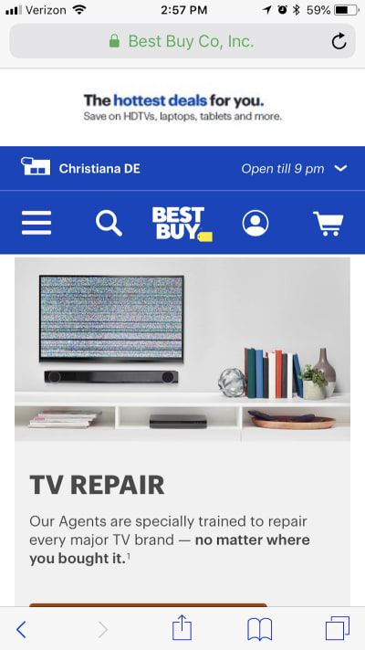
Best Buy uses its visitors’ location to provide helpful in-store visit details. (Source: Best Buy) (Large preview)

The top of the page now displays the nearest location to me as well as opening hours. As I peruse the rest of the site, I will receive relevant information regarding in-store product availability, buy-online-pick-up-in-store options, and so on. This is a really great option for businesses with a sales website and brick-and-mortar location that want to merge the two experiences.

You could also benefit from using this on websites that offer services, appointments, and reservations. Here is an example of what The Palm Restaurant does with my information:

The Palm Restaurant geotargeting

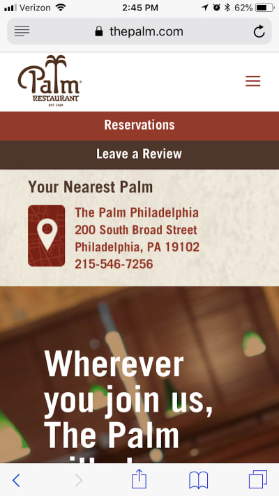
The Palm Restaurant streamlines the reservation process with geotargeting. (Source: The Palm Restaurant) (Large preview)

To start, it uses my information to let me know right away if there even is a location close to me. Philadelphia isn’t too far, but it’s still nice to have the address fully displayed so I can make up my mind about whether I want to dine there. And, if I do, I can choose the “Reservations” button above it.

What’s especially nice about this is that the reservation form is pre-populated:

The Palm Restaurant streamlines conversion

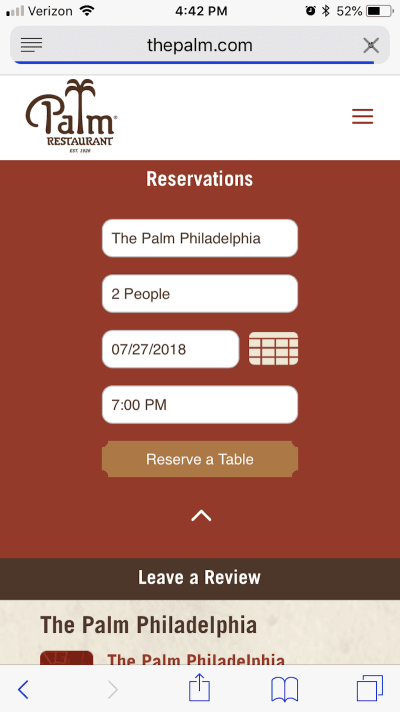
The Palm pre-populates its reservation form based on user information. (Source: The Palm Restaurant) (Large preview)

As you can see, it’s used a mixture of my geographic location along with the most popular reservation types (i.e. two people at 7 p.m.) to pre-populate the form. This saves me, as the user, time in filling it out and making my reservation.

5. Respond With Convenience

According to Google:

Every day, people are becoming more reliant on their smartphones to help make last-minute purchases or spur-of-the-moment decisions. In fact, smartphone users are 50% more likely to expect to purchase something immediately while using their smartphone compared to a year ago.

Recently, I wrote a post about what you need to know to increase mobile checkout conversions. The underlying message was that mobile consumers have certain expectations that need to be met if you intend on converting them there (as opposed to switching back to desktop).

Convenience in getting the information they want is one of them.
Speed in getting to and through checkout is another.
Handling their contact and payment information securely is the final piece.

Clearly, web designers are doing something right as over half of smartphone users reach for their phone to buy something and subsequently do. But it can’t stop with the 10 tips offered in that article. You need to be able to predict what they’re going to purchase and what exactly they want to do when you catch them in those exact micro-moments.

Let’s use UPack as one example.

UPack shows a price quote form first thing

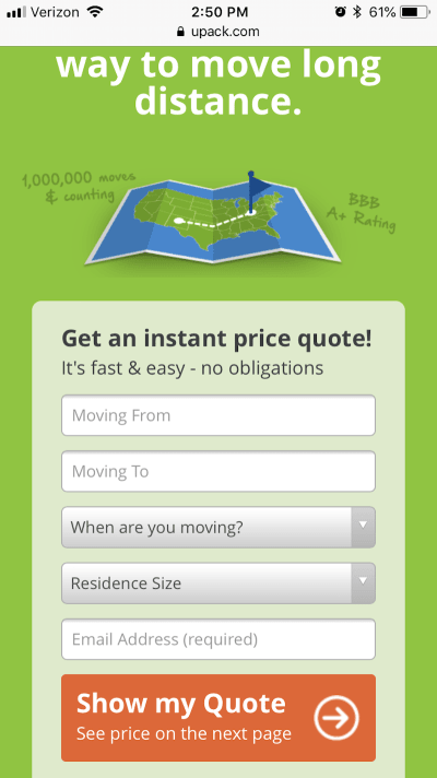
UPack includes a price quote form at the very top of the website. (Source: UPack) (Large preview)

At the very top of every page is a short price quote form that asks only the most pertinent details they need in order to provide a quote to interested customers. By anticipating that’s what they’re looking to do when they visit a moving company’s website, UPack likely experiences very high conversion rates.

However, if someone should arrive at this form and wonder, “Should I even bother with a quote from UPack?”, they’ve provided an answer to that on the next step down on the home page:

UPack’s explainer graphic reaches users on the fence

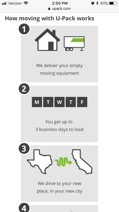
UPack uses an explainer graphic to sell the value of its service right away. (Source: UPack) (Large preview)

This explainer graphic is simple. It includes four points and shows how exactly someone uses the UPack service to move their home from one destination to another. When someone arrives there with the intention of getting help with their move, UPack has already made it all the more simple in just one scroll and two panels of the home page.

Then, you have a company like HostGator that doesn’t waste any time at all:

HostGator provides shortcut to purchase

HostGator’s home page includes smart design callouts that sum up its services. (Source: HostGator) (Large preview)

If someone shows up on a web hosting company’s website — especially one that is well known as they are — of course they know what they want to do. Now, they could hop into the navigation and dig deeper into the various hosting plans (which some may do). However, HostGator is probably hoping to appeal to two specific audiences with these “Buy Now!” callouts on the home page:

The web developer who knows exactly which plan he or she needs, and doesn’t need a full page to explain the benefits to him.
The small business owner who doesn’t know a thing about web hosting, but trusts HostGator’s good name and just wants to get their web hosting purchases ASAP.

This is a really good choice of design techniques if you know that a good portion of your audience will be immediately ready to buy upon entering the site. If they don’t have to click through to another site, don’t make them do it.

And, of course, CTAs, in general, are an important element to use when designing for micro-moments. When they’re designed well — colorful, large, well-labeled — you’re essentially giving your users a shortcut to conversion.

BarkBox uses a number of these right on its home page:

BarkBox’s CTA shortcuts

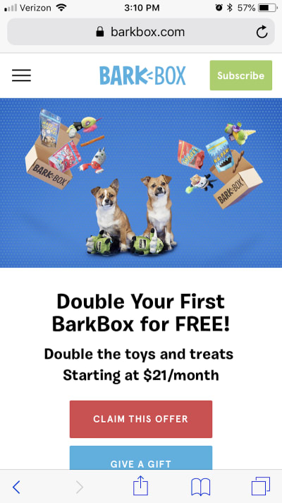
BarkBox has a number of CTA shortcuts available on its website. (Source: BarkBox) (Large preview)

Since the brand is particularly well-known among dog owners, this is a good move. While there are some people who enjoy scrolling through the site to see the funny dog pictures and find out more about what’s in this month’s BarkBox, if they’ve arrived here on mobile, they shouldn’t have to wait to subscribe. BarkBox provides those shortcuts in a number of locations, ensuring there’s no friction between its customers and their goals.

Wrapping Up

It’s pretty amazing to watch the web change so quickly as consumers become more trusting of their mobile devices. Now, nearly two years after Google first began recommending that we design with micro-moments in mind, it appears that these suggestions have really paid off.

Designing for micro-moments gives us the opportunity to more effectively reach consumers in their moment of need. This, consequently, means reaching consumers who are in a more purchase-intent mindset as opposed to ones casually browsing the web. If you can use your data and design to actively reach consumers in their micro-moments, you can effectively increase your mobile site’s conversion rate in the years to come.

Smashing Editorial
(lf, ra, yk, il)

Slide Out Box Menu

Original Source: http://feedproxy.google.com/~r/tympanus/~3/sn24b4trlqo/

Today we’d like to share a little menu with you. The idea is to reveal the boxes of a grid individually from the top right corner of the page similar to the Expanding Grid Menu we did a while back. The inspiration for this effect and for the slideshow layout comes from Adrián Somoza’s design and Zhenya Rynzhuk’s Dribbble shot. The animations are powered by TweenMax.

SlideOutBoxMenu_featured

Attention: Note that we use modern CSS properties that might not be supported in older browsers.

SlideOutBoxMenu_01

For showcasing the menu, we’ve created a little slideshow. The menu opens when clicking on the + details button on the right side:

SLideOutBoxMenu02

We hope you like this little menu effect and find it inspirational!

References and Credits

Images from Unsplash.com
TweenMax by Greensock
imagesLoaded by Dave DeSandro

Slide Out Box Menu was written by Mary Lou and published on Codrops.

MacBook Pro (13-inch, 2018) and Blackmagic eGPU review

Original Source: http://feedproxy.google.com/~r/CreativeBloq/~3/ZR-OPtrj2FI/macbook-pro-13-inch-mid-2018-and-blackmagic-egpu-review

Portability or power? For decades, we’ve been wrestling with the same problem: portable computers can’t be powerful, and powerful computers can’t be portable. Well, the MacBook Pro (13-inch, mid 2018) is one attempt at squaring that circle: a small, light, slim computer for use on the road or in ‘third spaces’ such as coffee shops, which you can pair with an external graphics card (eGPU) to dramatically boost its power when you’re at your desk.

Best laptops for graphic design in 2018

And as you’ll discover as you read this review, the new MacBook Pro and Blackmagic eGPU broadly deliver on that promise: it’s okay to be excited about this, even though there are caveats.

First, to be clear, these are two separate new products from two different companies (even if Apple did collaborate with Blackmagic Design on the eGPU), and you can buy one without the other. We’re reviewing them together here, because we think the pairing is interesting and compelling.

Blackmagic eGPU review

Blackmagic Design eGPU

The Blackmagic Design eGPU is engineered around a powerful Radeon Pro 580 graphics card

The 13-inch MacBook Pro, we’ll get to, but it’s worth starting with a quick bit of background on eGPUs in general. Historically, the graphics card inside your computer simply drove the display; it worked out what to show, and passed that to the monitor. 

The best 4K monitors for designers

Broadly, there are two types of graphics card: ‘discrete’, which are their own self-contained mini-computers, and tend to be both powerful and power-hungry (impacting battery life in laptops); and ‘integrated’, which draw less power (and so are better for battery life in laptops) but are less powerful.

You might quickly surmise, then, that a good solution would be to use an integrated graphics card on a laptop and plug in a discrete graphics card when you need more power. But while this has been possible on Windows for years, it was only with a recent update to macOS High Sierra that Apple supported it.

eGPUs are great, then, because since they’re not constrained by the same power and temperature restrictions as inside a laptop, they can be hulking great monsters. This can be inelegant, though; traditionally, you got an eGPU setup by buying an empty case, then buying a graphics card to fit inside it. Because the chassis doesn’t know what you’ll put in it, it has to default to the ‘worst-case scenario’ in terms of heat, power and size, which can lead to needless noise and power draw as it tries to vent.

The Blackmagic Design eGPU, by contrast, is engineered around a specific card, a powerful Radeon Pro 580, so it can be smaller, quieter and more elegantly engineered. There are downsides, though: the card is fixed, and can’t be upgraded; it’s basically the Mac vs PC argument writ small.

There’s one other major thing you need to know about eGPUs, too. While the operating system now supports it, this doesn’t mean apps can actually access its power. Currently, the state of support for eGPUs is messy and ad-hoc. More on this later, but let’s start on familiar ground with the MacBook Pro…

MacBook Pro 13-inch (2018) review

Apple’s laptop line had languished for longer than many were happy with, and while the older versions that don’t have the dynamic Touch Bar above the keyboard remain un-updated, both the 13- and 15-inch Touch Bar models are updated to be more powerful now. We’re focussing on the 13-inch here, but it’s worth saying that the 15-inch MacBook Pro (mid 2018) models get 6-core processors, a doubling of the max SSD size to 4TB, and, thanks to a switch to DDR4 RAM, a higher RAM ceiling of 32GB.  

With the 13-inch, though, we’re talking a 2.3GHz eighth-gen Intel Core i5 (with Turbo Boost up to 3.8GHz), or a 2.7GHz eighth-gen Intel Core i7 with Turbo Boost up to 4.5GHz. We’re reviewing the latter; the £270 upgrade is worth it for creative pros. The base config is 8GB RAM, though our review model is maxed out to 16GB (£180+); 256GB SSD is standard, though ours has had a whopping £1,400 extra spent on it to take the capacity to its max of 2TB. Graphics card is a Intel Iris Plus Graphics 655, and this can’t be changed.

MacBook Pro 13-inch (2018): power

MacBook Pro 13"

The 13- and 15-inch MacBook Pro Touch Bar models are more powerful now

Performance is generally very strong, even if you don’t make allowances for this being the ‘baby’ laptop. It’s responsive (in part thanks to the ridiculously fast, circa-3GB/sec SSD), and with eight virtual cores, it didn’t creak with anything we threw at it. 

Of course, where the performance trade-off is most obvious is with exports and renders, but even there, it actually has nothing to be ashamed of; a 4:10 4K project in Final Cut Pro with effects, colour grading, titles and more exported using the Apple Devices 4K preset in 4:44, a little over real time. 

It gets hot and noisy when under load, though, and, compared to the iMac Pro, its thermal recovery – how quickly the fans can die down after heat has been generated – is much poorer. This is part of that power/portability trade-off.

There are other improvements away from raw specs too. New to Apple’s laptop line is the T2 chip, its custom silicon controlling the system. This might sound esoteric, but it’s in part responsible for that SSD speed, and it dramatically improves the security of the system, with, for example, hardware-level encryption and tougher barriers to circumventing security policies.

MacBook Pro 2018: features

We also welcome True Tone to the Mac for the first time, a system that debuted on iOS for reading the ambient light around you and adjusting the display’s temperature to blend in. While this might strike you as the last thing creative pros working in colour-critical applications might want, note first that it can be turned off, and second that, actually, you probably don’t want to. 

Unless you have a proper process of regularly calibrating your display and creating/sharing profiles – and that’s part of a chain all the way from clients to output – then colour is always going to be a bit of a crapshoot. And honestly, allowing the display to blend with the ambient light temperature in your broader field of vision throughout the day instead of forcing it to stay fixed is likely to deliver an overall truer colour into your brain. 

Your mind does constant adjustments itself, analogous to True Tone in a way, and it’s probably wise to go with the flow. In short: True Tone looks natural, and you should try it. (It won’t affect external displays, except for the Apple Thunderbolt Display and LG UltraFine 4K and 5K Displays.)

The Touch Bar puts all the controls at your fingertips

Some folks hate the Touch Bar – a dynamic, long touch screen that replaces the function keys – and in particular the absence of a physical escape key, but try it before you swallow this received wisdom. Apps need to support it – most significant developers do, by now – but the constantly changing, context-sensitive way it puts controls at your fingertips can be, if you rewire your muscle memory, a significant productivity boost. The Touch ID button sits to the right, allowing for Apple Pay and unlocking – though if you have an Apple Watch and let it unlock the MacBook Pro, it’s done pretty much by the time the lid is open.

The keyboard has been tweaked. It’s still the ultra low-travel butterfly mechanism, which takes a little getting used to, but there’s now a thin membrane under each key. Officially, Apple tells us this is to make it quieter – it feels like it succeeded in that – but it’s as likely to be related to widespread reports of failures with the previous generation keyboard, thought to be caused by debris getting under the keys.

There are four USB-C-style Thunderbolt 3 ports, two on each side. And while you might take umbrage at having to dongle-up to do something as simple as plugging in a USB stick, they do offer some welcome flexibility (being able to plug power into either side, say), not least because unlike the previous generation MacBook Pro, all four ports are full speed.

MacBook Pro with Blackmagic ePU

Besides, one of the handy thing about the Blackmagic Design eGPU is that it doesn’t just house a graphics card – it also acts as a dock. There is one additional Thunderbolt 3 port (supporting the LG UltraFine 5K, and likely Apple’s upcoming display), an HDMI 2.0 port for UHD and 4K DCI at 60fps and four USB 3.1 port. 

Blackmagic eGPU

The Blackmagic eGPU doesn’t just house a graphics card, it also acts as a dock

Plug it in, therefore, and you could be hooking up storage, peripherals, displays and more with one cable, and it also charges your MacBook Pro. The only significant omission is networking; it would be nice to have had a Gigabit or faster Ethernet jack there too. As it is, you’ll have to buy a USB to Ethernet adapter if you want a wired connection.

It’s big, too, though designed with some flair; it looks good on a desk, and though it makes an impact visually, there’s little aural impact. Even left running overnight at 80%-plus load, the fan was nothing more than a soft hum, and would be inaudible in a working studio. It also barely got warm; impressive.

But the eGPU computational boost is key, and it’s not a simple answer. While some power gains can come free, apps really have to be adapted to be able to tap into the full power of the eGPU, and in any case, a graphics card is only used for certain types of task, with the main CPU doing most of the grunt work. We need to remember, too, that though Thunderbolt 3 is fast, at 40Gb/sec, it’s slower than internal interconnects.

Faster framerate

One area where it’s easy to see gains is in the traditional job of GPUs: displaying stuff on a screen. If, for example, we run Rise of the Tomb Raider: 20 Year Celebration at 1920×1200 on the internal display using the Iris Plus integrated graphics, we get a frame rate of 6.76fps on the Very High preset. 

These numbers are emblematic of the dramatic improvements an eGPU can add, say, for previewing VR content hooked up to the HDMI port.

If we plug a 1080p display into the HDMI port on the eGPU and use the same quality preset (albeit driving 10 per cent fewer pixels), this jumps to over 50fps. Indeed, if we turn everything to the maximum we can, we only drop a little below 47fps.

Few people will buy an eGPU just to run games – especially since this Tomb Raider title is one of the few that explicitly supports it – but these numbers are emblematic of the dramatic improvements an eGPU can add, say, for previewing VR content hooked up to the HDMI port. However, its more general effect on pro apps is harder to measure. 

Benchmarking

eGPUs on the Mac can accelerate apps that use Metal, OpenGL, and OpenCL, and we can get a sense of this using synthetic benchmarking apps such as LuxMark and Cinebench. For LuxMark, which tests OpenCL performance, rendering the LuxBall with the MacBook’s own internal GPU scored 2,693, and that score more than quintupled to 13,685 with the eGPU.

The gains were much less dramatic in Cinebench, which is measuring OpenGL. The internal GPU scored 33.7, and the external seemed to give different result depending on whether the window was on the internal display or a display connected to the HDMI port on the eGPU; 60.2 and 75.4 respectively.

Unigine’s benchmarking tool – especially useful for getting an idea of performance in VR authoring environments – gave 8.6fps (scoring 358) on the internal GPU/screen, rising dramatically to 35.1fps (1468 score) on an external display connected to the eGPU’s HDMI port.

Tomb Raider: 20 Year Celebration

Even when maxed out, the Blackmagic eGPU still runs Rise of the Tomb Raider: 20 Year Celebration at just under 50fps

Going further, and trying to get genuine benchmarks for real world use in pro apps, it gets messier. You might think Apple’s flagship pro app, Final Cut Pro, would take good advantage. But even though we can see in Activity Monitor that both the internal and external Blackmagic eGPU are being used in exporting, albeit not at full capacity, the difference in our test export wasn’t dramatic; 4:38 versus 4:44 without the eGPU.

There is a little script that can force apps to use the eGPU even if they don’t officially support it, called set-eGPU; but it made no appreciable difference to the final FCP export time. These exports, though, were all running from clips that have been pre-rendered, and actually, we did see a speed-up in the time to generate these background render files in this scenario; 9:24 with the eGPU forced, down from 15:36 without it. 

It’s worth saying that, of course, this eGPU solution from Blackmagic works very well with its own colour grading, FX and editing tool, DaVinci Resolve. We weren’t able to test it, but Blackmagic claims speedups of 4× to 7× depending on task, and indeed you could likely boost any improvements further, since in theory you could connect up to three of these eGPUs to the MacBook Pro at once. Note, mind you, that they’re not supported at all in Boot Camp.

MacBook Pro and Blackmagic eGPU: verdict

Ultimately, we love this pairing, at least in theory. The Mac is decently powerful in its own right, and small, slim and light enough to get work done in awkward spaces; sometimes it’s not practical to work on a desktop, though that will still give you the absolutely best power possible if you need it. The addition of a meaty external graphics card is wonderful here, so long as the apps you’re using support it, but at the moment, that picture is just too fuzzy. 

If you’re thinking of buying, look at the bottlenecks in your workflow, and try to ascertain if they can be sped up with an eGPU. Talk to whoever makes the tools you rely on to find out their roadmaps before you commit, and remember that an eGPU on the Mac can accelerate apps that use Metal, OpenGL, and OpenCL. Badger folks till you get an answer, because the potential here is huge.

Also read: 8 must-have products for a smarter studio


Agile development: why and how to use it in your web and app workflow

Original Source: http://feedproxy.google.com/~r/CreativeBloq/~3/RiCMtln21Uw/agile-development-why-and-how-to-use-it-in-your-web-and-app-workflow

Agile development has evolved quickly over the last 20 years, thanks to new methods and tools that make it easier to innovate rapidly.

Top tips for nailing project management

It provides a way for developers, designers and managers to focus on providing the best product to their customers through feedback, iteration, collaboration and adaptability.

For the web, the agile process has provided a fundamental shift in how we deliver products to our users. Let's examine what's involved.

Traditional waterfall process

The waterfall process is often cumbersome, costly, time-consuming and demeaning to the real people who need the product: the customers

Most of us are familiar with and have experience of the traditional waterfall approach to creating a website, where the stages are defined as milestones, with a clear start and end date. 

Waterfalls usually consist of four phases: discovery, design, development and deployment. In the discovery phase, we tend to talk with the client's stakeholders, usually staff or board members that wanted to give input and examples of what they liked for us to follow. Rarely does this stage involve talking with actual customers to get their input.

The design phase uses the outcomes of the discovery to create compositions, usually of a complete page design with often limited rounds of revisions. This is followed by the development phase, which takes the completed page-design comps and builds them to spec, making sure that every pixel is in the proper place in order to execute the masterful vision of the designer.

And finally the deployment phase starts, usually with a beta launch in which quality assurance is carried out on the site for a few weeks. It then launches to the public, sometimes with a beta signifier on the logo as a badge of honour.

The problem with this is that all of your discovery happens weeks, maybe even months, before anything is actually put in front of a customer. Often the features that we assumed would be awesome fall flat once the users are able to interact with them, making our entire effort a partial waste of time and money.

This waterfall process is often cumbersome, costly, time-consuming and demeaning to the real people who need the product: the customers.

Enter the Agile Manifesto

Another popular ingredient used in the creation of working software is to approach it in small cycles. This gives the opportunity to build, test and ship the product every one to two weeks

The modern-day agile development process was sparked by the 2001 Agile Manifesto. It was penned by 17 developers who were fed up with over-controlling management and outdated feature requirements that didn't focus on what the user wanted or needed.

The Manifesto has four key beliefs that provide the foundation of the agile movement as we know it today:

Individuals and interactions over processes and toolsWorking software over comprehensive documentationCustomer collaboration over contract negotiationResponding to change over following a plan

Even though the Manifesto was born in the early 21st century, it grew from previous development methodologies as far back as the mid-20th century that were agile in nature, such as feature-driven development (FDD), extreme programming (XP) and even Scrum.

Each of these beliefs have tools and resources that make it easy for you to put them in place right now.

01. Individuals and interactions

A focus on the people that use our products and how they use them is extremely important. In the past, other methods like waterfall have neglected the user and outright ignored their humanity. Human-centred design, also known as design thinking or agile design, focuses on making us get out of our chairs to interact with people and see how individuals use our product.

There are three key areas of human-centred design: observation, analysis and ideation. Within these areas are some examples that might be familiar, like one-on-one interviews (observation), personas (analysis), or prototyping (ideation), to name a few.

Companies such as Ideo and Luma Institute provide vast resources on how to conduct qualitative exercises with real customers.

02. Working software

Trello offers a clear way of managing sprints using a Kanban style of task management that is popular in Silicon Valley

We shouldn't wait for a product to be perfect before sharing it with the world. Customers value transparency and collaboration. Make them happy by giving them working software quickly and improving it consistently.

An often-used buzzword you'll hear that embodies the ideals of working software is minimum viable product or MVP. The concept is that we should ship early and often so the product gets in front of real users to test and improve.

Using agile principles has offered me a creative problem-solving method at work. In addition to directly impacting business performance, applying agile to my IT projects has driven team collaboration and effectiveness in achieving business results.

Victoria Nwobodo, IBM

Another popular ingredient used in the creation of working software is to approach it in small cycles. This gives the opportunity to build, test and ship the product every one to two weeks while continuously making improvements. These cycles are called 'sprints'.

Sprints also reinforce your brand in the eyes of consumers. They'll feel content, sometimes even excited, to know you'll regularly be adding new features.

The project-management application Trello, offers a clear way of managing sprints using a Kanban style of task management that is popular in Silicon Valley.

Version control systems such as Git also complement the sprint workflow by being able to commit code, branch it off to try new features, merge it to push to production and even go back in time to bring back previous solutions or see why something didn't work before.

03. Customer/team collaboration

Your users want to feel heard and acknowledged, especially when your product frustrates them. Creating a culture of collaboration can help you connect to these customers in ways you never thought possible.

A great way to start collaborating with users is to invite them to provide feedback on features that have not been released to the general public yet. This gives you the chance to get an assessment of how well the features work while giving the customer a sense of inclusion.

The development methodology is sensitive to design decisions and ideally, said decisions would be best made as teams.

Henri Helvetica, web performance analyst

Another important way to collaborate is to ensure your team and customer testing segments are a diverse group of people. Create a culture of inclusion that focuses on all ethnicities, genders and abilities. There have been many horror stories in the tech industry where a lack of inclusion ended up alienating a core demographic and ultimately causing the death of a product. Create a culture of inclusion from the beginning and always keep working at improving it.

At the Generate New York conference, Dan Mall made an excellent presentation on the importance of creating a common language and trust between your designers and developers. In his talk, Dan equated a roller coaster to the importance of creating a shared experience among the team to design, build and test together – both early and often.

Designers and developers work best in an agile environment when they understand each other’s struggles. Educating each other through lunch-and-learns, story reviews and check-ins, allows your team to grow by learning from each other.

Tessa Kriesel, Pantheon
04. Respond to change

Hotjar provides heatmaps, user recordings and several other features that shows how a customer interacts with your product

The needs of our customers are ever evolving. What worked last year will need to work even better and faster this year. Customers come to expect improvement.

To handle this, the agile process forces us to measure what works. Tools like Google Analytics provide a quantitative understanding of where users are going on your site, while something like Hotjar reveals how your visitors are clicking and scrolling. Hotjar provides heatmaps, user recordings and several other features that shows how a customer interacts with your product.

Launching a product is only half the story; the other half is continuously reviewing analytics and user feedback to make sure the thing you built is actually accomplishing your goals.

Mario Pabon, Underdog

Another practical tool is UserTesting. This tests real users, either yours or ones the tool supplies. They run through questions and talk to you with their microphone as their screen is captured on video. This can become an invaluable asset to gather feedback from a wide array of customers.

Keep in mind that your budget should focus on user testing and measurement as much as design and development. It's the only way we can see how users are interacting with a product.

One of the greatest things about digital product design is that we get to make educated guesses about the way people will use what we dream up. We get to be wrong, and we get to improve upon our mistakes.

Dan Mall, SuperFriendly

Elise Chant provides a free template on Trello to start your own Scrum board

An important part of responding to change is managing expectations of when new features can be completed or bugs squashed. The Scrum Framework combined with a tool like Trello, Jira, or Asana can handle this.

Scrum is an agile framework that outlines the roles of team members, assembles a list of needs called a backlog, defines how to handle sprints, sets a method of reviewing sprints after completion and many other useful tools.

Agile design systems

Systems like Atomic Design focus on simple components that can be iterated upon

The movement in web and app design to utilise systems for easier prototyping and testing of smaller pieces of content is another expression of agile design.

Systems like Atomic Design or the Bootstrap Framework focus on simple components that can be iterated upon.

Design systems also make the product future-proof, unlike waterfall designs. They can keep evolving; even across different devices and use-cases, the design system has the capacity to grow.

The best thing about agile is that it shook up the practice of design… Agile broke the stranglehold of waterfall, and since then, many of us continue to reinvent the way we work, just as we reinvent what our digital medium can be and do.

Jeffrey Zeldman, studio.zeldman
Your agile future

We've outlined several ways you can utilise agile methodologies in your work but keep in mind that it's more important you focus on processes than allegiance to specific tools. Take it upon yourself to seek out ways to introduce more collaboration, testing, and measurement into your work. Outline what you want to accomplish and the tools will fall into place as necessary to help you iterate your way to success.

This article was originally published in issue 308 of net, the world's best-selling magazine for web designers and developers. Buy issue 308 here or subscribe here.

Related articles:

Get started with an agile workflowBest project management software10 top tips for project delivery

Collective #441

Original Source: http://feedproxy.google.com/~r/tympanus/~3/VV1-42EoQ-E/

C441_pramp

Our Sponsor
Practice Makes Perfect – Free coding interviews

Can you ace a coding interview? Make sure you can. Use Pramp – practice your coding skills with peers and get job offers from top companies.

Practice for free

C441_hsl

On Switching from HEX & RGB to HSL

Learn all about the powerful color format HSL in this article by Sara Soueidan.

Read it

C441_csscolor

Switch Font Color for Different Backgrounds with CSS

Fucando Corradini’s pure CSS solution to the problem of changing the text color according to the background.

Read it

C441_vidualgrid

GRID: A simple visual cheatsheet for CSS Grid Layout

A great visual reference to all CSS Grid properties. By Chris Malven.

Check it out

C441_decock

Motion & Playfulness

Benjamin De Cock shares real-world examples and best practices on how to deliver efficient and enjoyable user experiences.

Watch it

C441_polygon

Reuleaux Polygons

A great exploration of Reuleaux polygons: learn how to construct them, morph them and rotate them within a square. By Varun Vachhar.

Check it out

C441_tinyeditor

TinyEditor

A very small functional HTML/CSS/JS editor made by Tom Ross.

Check it out

C441_js13

Create a 13 JavaScript game in 30 days with js13kGames

Read about this year’s js13Kgames challenge and how to participate.

Read it

C441_fake3d

Fake 3D effect with depth map

Robin Delaporte’s replication of a “fake” 3D effect using a depth map as seen on Epicurrence.

Check it out

C441_electronfiddle

Introducing Electron Fiddle

Felix Rieseberg introduces Electron Fiddle that lets you create and play with small Electron experiments.

Read it

C441_cssgame

CSS Snake & Ladders

A multiplayer game developed only in HTML/CSS. By Alvaro Montoro.

Check it out

C441_vue

Vue CLI 3.0 is here!

Learn all about the third version of Vue CLI with all its new features.

Read it

C441_amp

Google AMP – A 70% drop in our conversion rate.

Nathan Kontny shares the results of rebuilding pages in Google AMP.

Read it

C441_homebrew

How I gained commit access to Homebrew in 30 minutes

A very interesting article by Eric Holmes on how he could gain access to Homebrew’s GitHub repositories.

Read it

C441_slide

SuperSlide.js

A flexible, smooth, GPU accelerated sliding menu for your next PWA.

Check it out

C441_motion100

100 days of Motion Design

Read how Tiantian Xu created 50 beautiful animations in 100 days.

Read it

C441_typesetting

What is Typesetting?

An excerpt from Chapter 1 of Tim Brown’s “Flexible Typesetting” book.

Read it

C441_gridfallback

Let’s serve everyone good-looking content

Hidde de Vries shares his thoughts on using CSS Grid fallbacks.

Read it

C441_designres

Neede Design Resources

A collection of useful online resources for designers.

Check it out

C441_csssystem

Creating the “Perfect” CSS System

Lindsay Grizzard’s high level guide for designers and developers on how to create and maintain a CSS system.

Read it

C441_redux

Data Fetching in Redux Apps – A 100% Correct Approach

Ohans Emmanuel shows how to do data fetching in Redux apps the right way.

Read it

Collective #441 was written by Pedro Botelho and published on Codrops.

Popular Design News of the Week: August 6, 2018 – August 12, 2018

Original Source: https://www.webdesignerdepot.com/2018/08/popular-design-news-of-the-week-august-6-2018-august-12-2018/

Every week users submit a lot of interesting stuff on our sister site Webdesigner News, highlighting great content from around the web that can be of interest to web designers. 

The best way to keep track of all the great stories and news being posted is simply to check out the Webdesigner News site, however, in case you missed some here’s a quick and useful compilation of the most popular designer news that we curated from the past week.

Note that this is only a very small selection of the links that were posted, so don’t miss out and subscribe to our newsletter and follow the site daily for all the news.

20 Must-Have Wireframe Templates and UI Kits for your Design Library


Common Webpage Design Mistakes


5 Extensions that Transform Google Chrome into a Modern Browser


SimpleBar – Custom Scrollbars Made Simple


Clockify for Mac – The Only Truly Free Time Tracker & Timesheet for Teams


Everything Bad About Facebook is Bad for the Same Reason


Site Design: Bill Hinderman


Framer X Preview


Asora Clickbait Detector – Detects Clickbait Posts on Social Media


Acct.Watch – Monitors Accounts so You Can Have the @username You Want


Oilist 2.0 – Ground-breaking Generational Art App


Racism in Design, Who’s To Blame?


Turn Designs to Native Mobile Apps


UX Case Study: Google Maps Vs. Waze Mobile Apps


Take Another Look at Tumblr


The Doomed Toys “R” Us Rebrand that Never Came to Be


Drawser – Free Browser-based Vector Graphics Editor and Design Sharing


Be Better: Process


How to Design an Effective Welcome Email


Design Trends for Fixed Navigation Menus in Web Design


Designing Charts – Principles Every Designer Should Know


Adobe has Added 665 New Monotype Fonts to Creative Cloud


Linked: Space Force Logo Vote


Building Fluid Interfaces


How to Land a Remote Freelance Web Development Job in 21 Days Without a Fleshed Out Portfolio


Want more? No problem! Keep track of top design news from around the web with Webdesigner News.

Add Realistic Chalk and Sketch Lettering Effects with Sketch’it – only $5!

Source

p img {display:inline-block; margin-right:10px;}
.alignleft {float:left;}
p.showcase {clear:both;}
body#browserfriendly p, body#podcast p, div#emailbody p{margin:0;}

“there’s good inside” – Method’s Inspiring New Brand Campaign

Original Source: http://feedproxy.google.com/~r/abduzeedo/~3/8y6QdxCBUI0/theres-good-inside-methods-inspiring-new-brand-campaign

“there’s good inside” – Method’s Inspiring New Brand Campaign

“there’s good inside” - Method’s Inspiring New Campaign

abduzeedo
Aug 13, 2018

Today, Method Products, pbc – a pioneer in design-driven, people and planet-friendly home and personal care products – launches a new integrated brand campaign, “There’s Good Inside.” It spotlights the good inside its products, its people and its state-of-the-art, sustainable soap factory in Chicago. Brought to life with an uplifting, clean-centric cover anthem of the popular ‘90s earworm “I’m Gonna’ Be (500 Miles),” by The Proclaimers, the whimsical, smile-inducing campaign centers around the notion that most people don’t believe cleaning can be fun, creative or connected to their values. True to the brand’s disruptive nature, method® playfully disagree.

“When people think of method®, they often think of our beautiful designs and wonderful fragrances, but there’s so much more depth to the brand,” said Doug Piwinski, method®’s Global Chief Marketing Officer. “This campaign is meant to draw attention to the beauty of what’s inside our bottles–not only how our products are made and who makes them–but ultimately how we are connected to the homes and people who use and love method. We’re reminding everyone we can all be planet, people, and pet-friendly, and look good doing so.”

“There’s Good Inside” 2-minute video


Playing a starring role in the campaign and commercial are a handful of actual method employees, aka the Movers and Makers. The spot takes place inside method®’s factory  which is the first-ever LEED Platinum Certified manufacturing plant—affectionately known as the South Side Soapbox—and located on the south side of Chicago in the historic community of Pullman. The boldly colorful, delightfully sustainable factory provided the perfect setting to spotlight the brand’s iconic design, color and whimsy alongside industry-leading practices that exemplify what manufacturing and urban revitalization look like in the 21st century.

The method® brand’s two-minute anthem video features a harried father of twins thankful that method® is both stylish and sustainable; a chef who swoons over plant-derived ingredients and sweet-smelling soap; and a cat lady who appreciates putting the hurt on dirt without harming her furry friend. The spot culminates with some of method’s very own Chicago factory Movers and Makers dancing and singing a rousing chorus of “Scrub a dub, yeah!”

method® partnered with independent creative agency Mekanism and Mekanism’s in-house Social Media Agency Epic Signal to conceptualize and produce the content which includes the two-minute anthem video, a mix of connected TV and digital ads, social, influencer and experiential media. Directed by Chicago native Greg Brunkalla, the spot is designed to introduce method® to a larger audience than ever before. Social media activations will compel people to join the fun and creativity online using #mymethod.

“We built an idea that’s about doing good together. To show that “clean” doesn’t have to be all about elbow grease and sparkly white floor —it’s individual personalities, bold colors, vibrant factory workers, and a ‘90s track we all know and love,” said Mekanism Creative Director Laura Wimer. “Method’s “there’s good inside” campaign showcases how we clean isn’t just a reaction to a mess. There’s a way to it—whether we’re cleaning for loved ones, pets, a passion, or ourselves, we all aim to make the world a little bit better.”  

The campaign, while integrated across multiple channels, is method’s latest significant campaign driven to reach the people who love method®where they live and shop online. The ads will run from August 13th – through October in top US markets including Chicago, Washington D.C. and Denver. To view the campaign ads and learn more, visit www.methodhome.com/mymethod.

advertising


“Coming Soon” Pages: Be Successful or Die Trying

Original Source: https://www.hongkiat.com/blog/coming-soon-pages/

Some useful tips for creating effective ‘Coming Soon’ page for your upcoming website along with live examples.

The post “Coming Soon” Pages: Be Successful or Die Trying appeared first on…

Visit hongkiat.com for full content.

What’s New for Designers, August 2018

Original Source: https://www.webdesignerdepot.com/2018/08/whats-new-for-designers-august-2018/

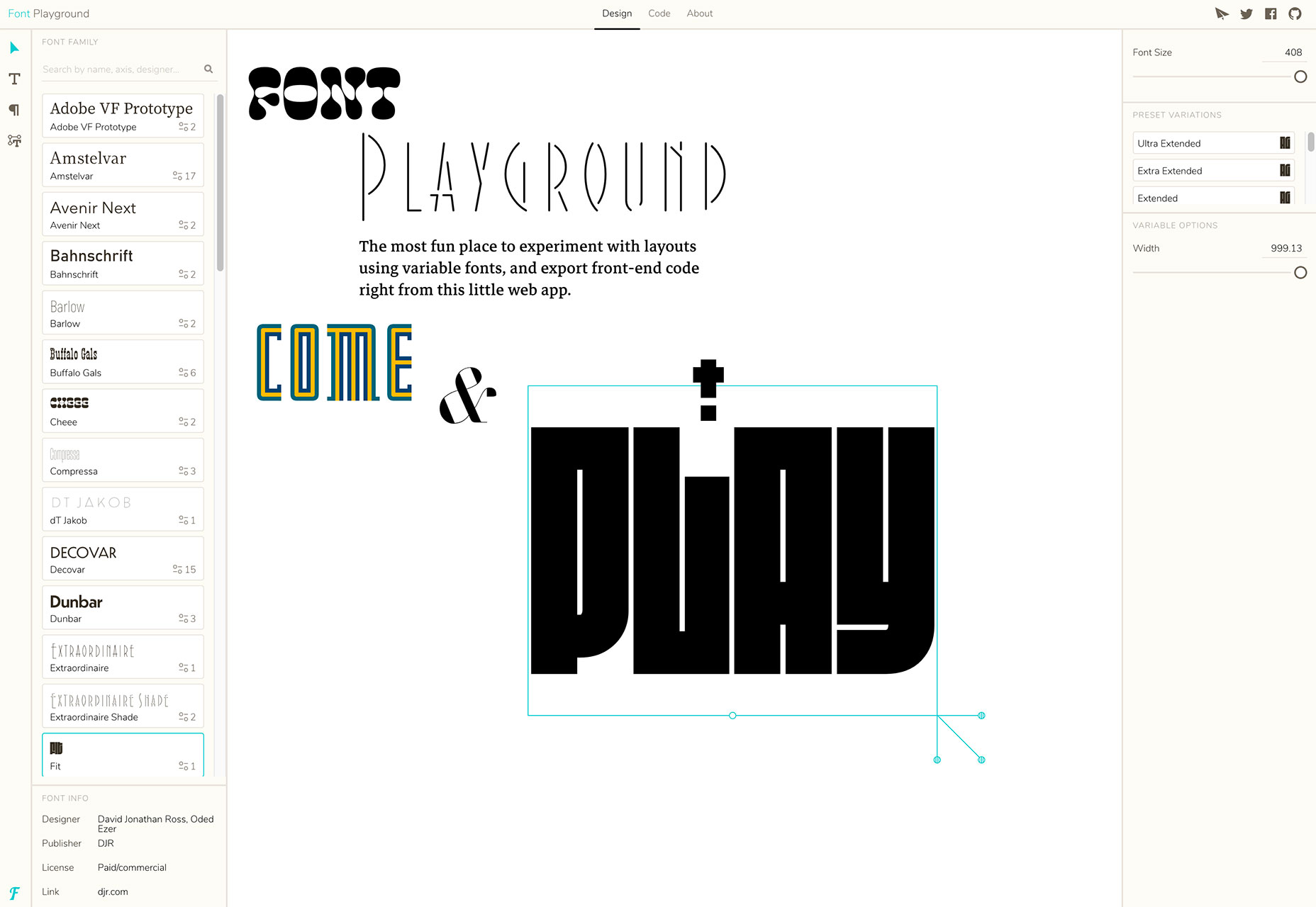
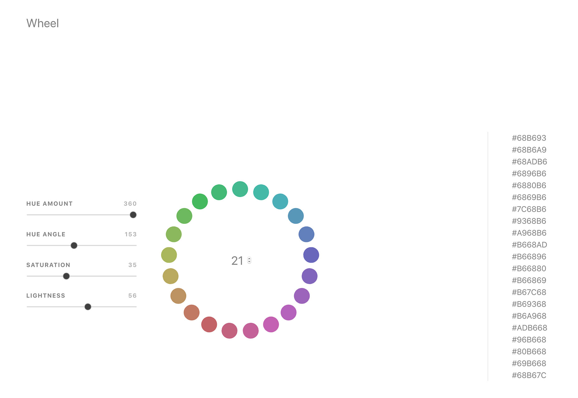
What’s old is new again; that’s the theme this month with new tools for designers with a few new tools that are rooted in the “old” concepts of design theory. From working with typefaces, to a color wheel, this roundup is packed with goodies. And then there are some new “new” tools as well, including a couple of cool 3D elements.

If we’ve missed something that you think should have been on the list, let us know in the comments. And if you know of a new app or resource that should be featured next month, tweet it to @carriecousins to be considered!

Font Playground

Font Playground is a tool to help you experiment with variable fonts and even export front-end code. Variable fonts, which are single font files that behave like multiple fonts, are gaining popularity, making this something you should probably experiment with.

Color Wheel Generator

Color Wheel Generator provides color-perfect matches for all hues around the color wheel in HEX format. Adjust settings such as hue, angle, saturation and lightness to see perfect matches from every location on the wheel.

Scale

Scale is a tool to help you see a color scale for actual use. See tints of a color in steps so you know exactly what colors will look like.

Rockstar

Rockstar is a dynamically typed Turing-complete programming language. It is designed for creating computer programs that are also song lyrics, and is heavily influenced by the lyrical conventions of 1980s hard rock and power ballads. (So, it is a super-fun programming language to experiment with.)

Fondu

Fondu is a smart contract building tool. The open-source contract is designed for launching an initial coin offering or crowdfunding campaign. Fill out the questionnaire and download your contracts.

Font Memory Game

The Font Memory Game can help you train your eyes to notice details in typography and better identify different typefaces. (It’s harder than you think!)

Fusion.js

Fusion.js is now available for public use. The Uber project is described as “is a good choice for someone looking for an open source boilerplate to build a modern, non-trivial web app.” It is a MIT-licensed JavaScript framework that supports popular libraries like React and Redux, and comes with modern features like hot module reloading, data-aware server-side rendering, and bundle splitting support. It provides a flexible plugin based architecture.

StyleURL

StyleURL lets you export and share CSS changes directly from Chrome DevTools so you can use it with an existing workflow. It generates a link which loads CSS changes into existing webpages automatically so that you can share tweaks visually.

Keyframes

Keyframes is a new online hangout for animators. You can chat about and share projects, ask questions and use the community as a learning tool to up your animation game.

Brandcast Team Edition

Brandcast Team Edition makes it easy for teams to work on code-free website design projects together. The tool allows marketing teams to create completely custom websites and interactive sales and marketing collateral without a single line of code. The release allows everyone – from designers to copywriters – to work on projects together within the interface.

Pair & Compare

Pair & Compare lets you find and preview font pairs. Test Google fonts (and more) right on the screen and change settings to match your project needs — background, text width, font size, line height and more.

Emoji Tweeter

Emoji Tweeter lets you create tweets from a desktop computer complete with emojis. It’s basically an emoji keyboard.

3D Cube Form

3D Cube Form makes you say “that’s cool.” The form tool is interactive and starts with a color picker — engaging, right? Then the user enters details based on form fields. It’s fun and different; it might not work for every project, but is definitely worth your time.

3D Toggle

3D Toggle is a cool animation that changes how you think about toggle actions. You’ll want to click it into action.

Malvid

Malvid is a tool to help you develop components with an interactive user interface so that you can preview and document web components as you create them. The tool analyzes your folder structure to turn files into a visual UI and it works using an API or CLI tool.

Podmap

Podmap is a cool data visualization tool that maps the world’s podcasts so you can find something new to listen to near you. Search by geolocation, podcast name or filter by country.

CoolHue

CoolHue is a JSON-rendered gradients palette. It includes 60 gradient options so you can add a trendy color effects to projects with ease. You can also grab CoolHue palettes for Photoshop or Sketch.

Tutorial: Animated SVG Neon Light Effect

The Animated SVG Neon Light Effect tutorial allows you to take a cool custom effect that you create in Adobe Illustrator and then move it to Sketch and export a sleek SVG image that is lightning fast for websites and apps. The step-by-step guide shows you how to do everything from creating the nifty effect to applying it for use (no more heavy gifs!). Plus, the tutorial includes downloadable project files to get you moving through the project with ease.

Aunofa Serif

Aunofa Serif is a tall and distinct serif typeface for display. The free version includes only uppercase characters. The paid version includes a script option as well.

Calibre

Calibre is a super-condense font that’s a fun choice for display with just a few words. The x-height is incredibly high in this uppercase font. It also includes numbers and a few glyphs.

Cleon

Cleon is a round sans serif appropriate for a variety of uses. It includes upper- and lowercase letters, numerals and some punctuation.

Deansgate Condensed

Deansgate Condensed is a clear and distinctive typeface that resembles the type used on street name signs in Manchester. Distinct characters include a point Z and points on the M and W.

Facon

Facon is a trendy display font in a ragged style. The letterforms include distinctive cutouts. It is an uppercase font with numbers and some special characters.

Mercy

Mercy is a highly readable sans serif with interesting curves for some of the letters – note the “M” in the image. It comes with a limited character set – just 69 elements – but does include italics of each.

Add Realistic Chalk and Sketch Lettering Effects with Sketch’it – only $5!

Source

p img {display:inline-block; margin-right:10px;}
.alignleft {float:left;}
p.showcase {clear:both;}
body#browserfriendly p, body#podcast p, div#emailbody p{margin:0;}