22 free ebooks for designers and artists

Original Source: http://feedproxy.google.com/~r/CreativeBloq/~3/vVj1XPqFvx0/free-ebooks-designers-7133700

There's always been a healthy market for commercial graphic design books, illustration books and student books written by experts, and this isn't likely to change any time soon. Sometimes there's just no substitute for splashing your cash and getting high quality content in return. 

That said, there's a growing movement towards free and 'freemium' content on the web. And the quality of the content is often on a par with the books you'd part with cash for.

Clearly nobody can afford to print and distribute free physical books (with the exception of the excellent World Book Night movement). But in this age of tablets, smartphones and laptops the electronic book offers a fantastic, and very cheap, way to spread this content.

So with all that in mind, what content can you get for free in the field of design? A quick search on your favourite search engine will reveal hundreds of offerings, making it difficult to sift the wheat from the chaff. But we've saved you the trouble, so here goes…

01. The Shape of Design

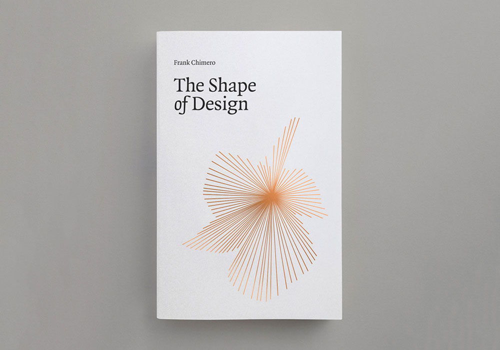
Frank Chimero’s book will inspire you to look at what you do in a whole new light

Starting life as a talk in 2010, Frank Chimero's self-published The Shape of Design was an early design community Kickstarter success, getting funded on its first day, and has since become essential foundational reading, not just in design education but in other creative practices, too. 

Focusing on the mindset of making rather than tools and methods, it asks: what are the opportunities, problems and possibilities of the creative practice? And once the work is done, what happens when it is released into the world?

02. The DesignBetter.co library

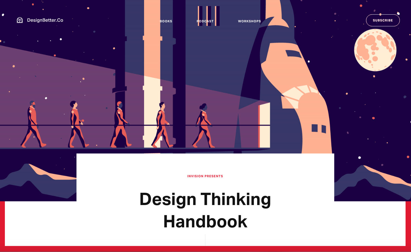
These three books cover product design, design thinking and design leadership

Why settle for just one free ebook when you can have three? The DesignBetter.co library from InVision aims to help you build a strong design practice. 

This collection of definitive books, written by Aarron Walter and Eli Woolery, explores how the best companies approach product design, design thinking, design leadership and more.

03. Practical Responsive Typography

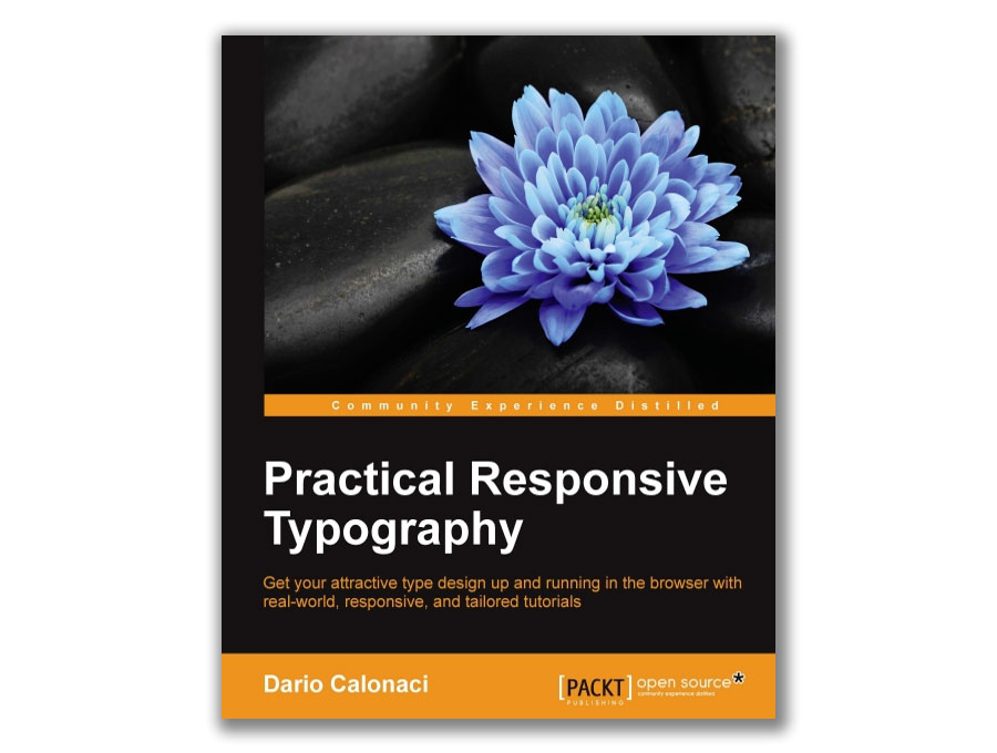
Nail your web typography with this free in-depth volume

Getting your typography right is a key part of having a great-looking website that helps you stand out from the crowd, communicate with clarity, and cultivate a distinctive identity. The best way to learn is to roll up your sleeves and just get on with it, and this book by Dario Calonaci enables you to do just that. 

Practical Responsive Typography will take you from the basics of scaling and optimising screen spaces, through to using a range of different web fonts and customising typography designs to suit your identity, and while it'll normally cost you over £20, it's free for Creative Bloq readers.

04. 50 Must Read Tips From Designers, To Designers

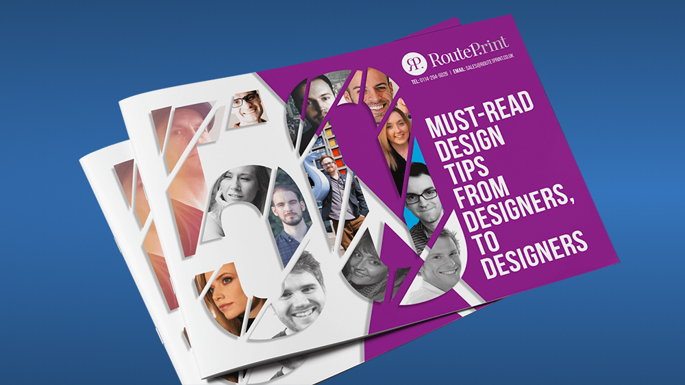
Experienced designers share their tips

As the title suggests, this free ebook from Route One Print brings together key pieces of advice from experienced graphic designers – including Jacob Cass (aka Just Creative) and Brent Galloway – to make your life easier. "From client management to typography, brand identity to finding alternative textures in Photoshop, this ebook offers practical tips for designers and showcases new ways to think about design," says the blurb. 

It also promises to reveal which fonts the designers never use. Is it Comic Sans? Helvetica? We guess you'll have to download it to find out. Route 1 offers a whole range of ebooks for designers in fact, including The Freelancer’s Bible (below) and The Design Comedy: How to deal with the 9 stages of client hell.

05. Brand House Book

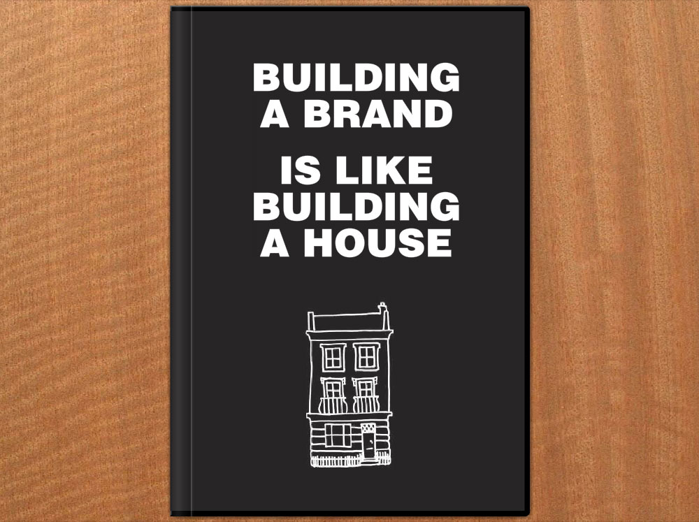
The Brand House Book breaks branding down into six manageable stages

If you're having problems getting to grips with the world of branding, this free ebook by Roger Lindeback can help you out by taking away all the jargon and relating it to everyday experience.

In the Brand House Book, Lindeback aims to make branding tangible by comparing it to building a house, breaking it down into six manageable stages – dreaming, planning, starting work, designing, building and finally getting the details right – with a branding summary at the end of each stage, setting out all the important issues to think through in your brand building process.

06. The Practical Interaction Design Bundle

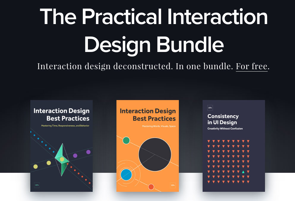
Get three helpings of interaction design advice for the price of none

Not one but three free ebooks in one handy bundle, The Practical Interaction Design Bundle consists of three free volumes from UXPin, comprising over 250 pages of design best practices and with over 60 examples of the best UX design. 

Volumes 1 and 2 of Interaction Design Best Practices will take you through techniques, theories and best practices relating to the tangibles of interaction design – words, visuals and space – while volume 2 tackles the intangibles: time, responsiveness and behaviour. 

Topping off the bundle is Consistency in UI Design, covering how and when to maintain consistency in your design, and when to break it to draw attention to elements without suffering the drawbacks.

07. An Introduction to Adobe Photoshop

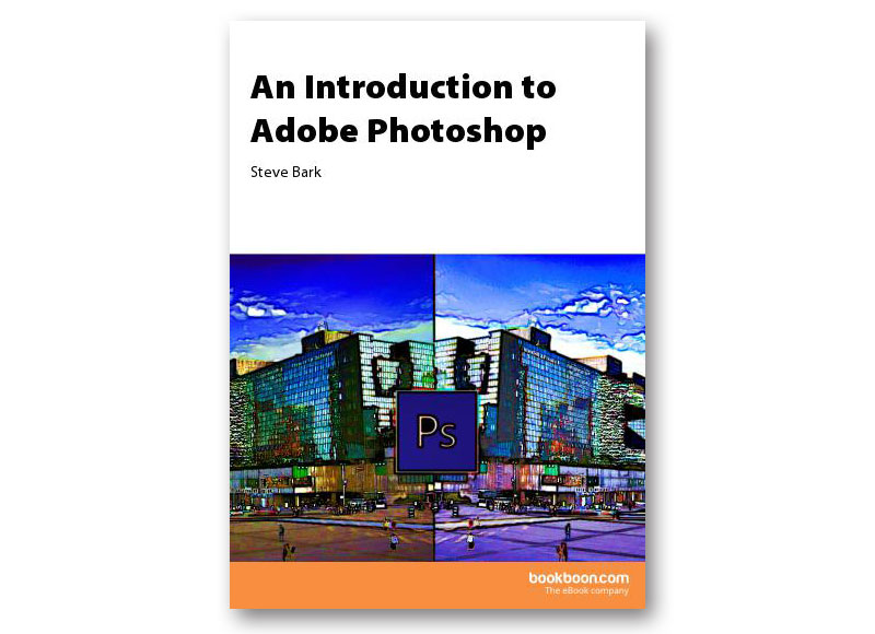
What’s a Photoshop? This book will tell you

If you're after a beginner-friendly guide to getting started with Photoshop, this free ebook by Steve Bark will explain the fundamentals for you, from panels and tools to layers and basic printing.

If it's just a little too basic for you, never fear; there's also an intermediate guide available that covers more advanced subjects such as vector tools, smart objects and clipping masks.

08. The Building Blocks of Visual Hierarchy

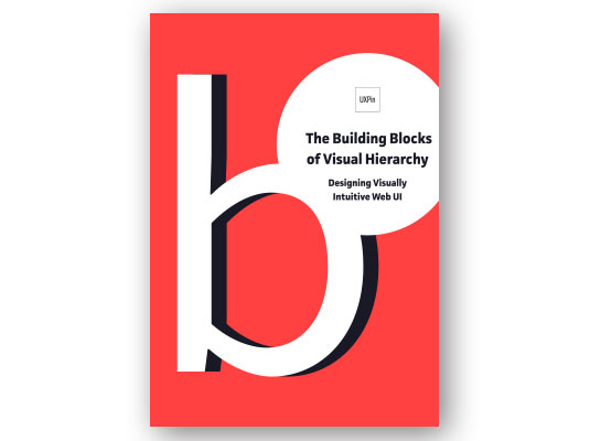
Learn to create accessible, intuitive layouts

If you're designing for the web and want your layouts and interfaces to be accessible and visually intuitive, this free ebook from UXPin is an invaluable resource. 

It explains how size, colours, space, layout, and style affect visual understanding, provides tips for designing clear visual hierarchies, and includes 18 examples of great sites including MailChimp and RelateIQ.

09. The Freelancer's Bible

From marketing to tax, plan out your freelance career with this book

Whether you're already freelance or thinking of making the jump, this ebook from Route One Print is full of useful freelance advice, with tips on how to market your business, find your USP, licence your work, manage client relationships, complete tax returns and much more.

10. Flat Design & Colors

free ebooks

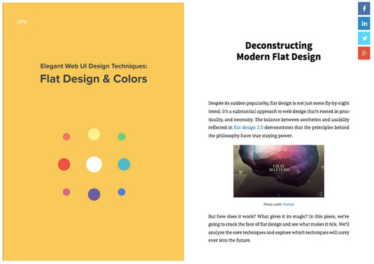
Love flat design but don’t know where to start? Download this freebie

The free ebook Flat Design & Colors by UXPin dives deep into the most powerful techniques for creating highly usable yet visually interesting web designs. 

The design team compiled advice from experts and illustrated their points using examples from 40 companies such as Google, Squarespace, and others.

11. Houdini Foundations

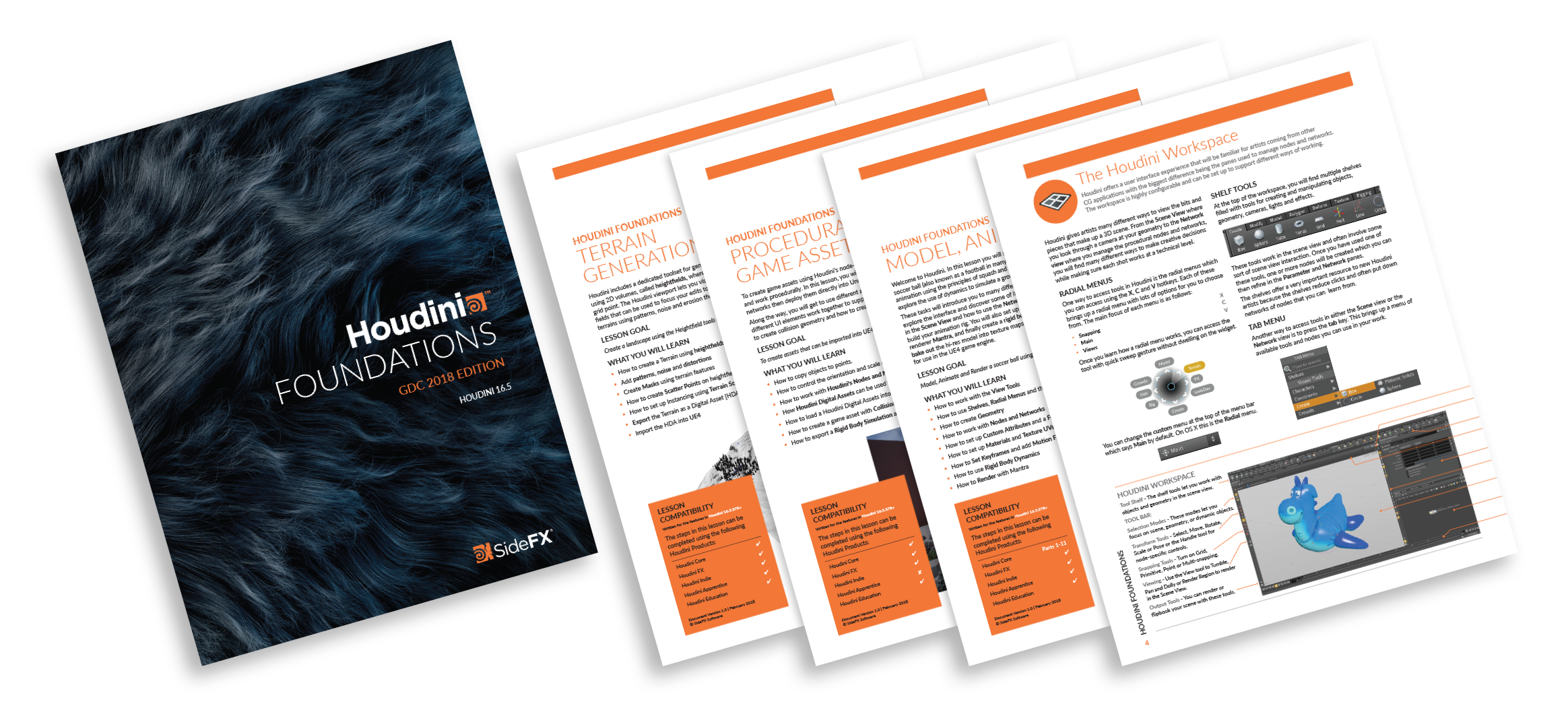
Add that extra dimension to your designs with this free ebook on Houdini 

If you're looking to add a touch of 3D art to your designs, this free ebook on Houdini will help get you started. Learn all about the tools and techniques you will use as a Houdini artists then run through three lessons that teach you how to build simple projects from scratch. 

12. The Future of Product Design

free ebooks for designers

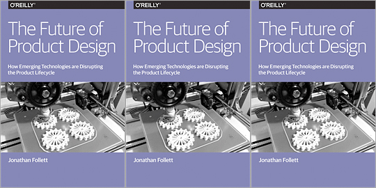
Learn the ins-and-outs of product design with this immersive ebook

In this report, Jonathan Follett from Invo examines from a designer's perspective the ways emerging technologies are affecting the product lifecycle, and explores various options for companies looking at new ways of approaching product design and development. 

Even if you're not specifically in the business of product design, this freebie is an eye-opener.

13. Everything There is to Know About Logo Design

free e-books for designers

This handbook to logo design gives you a quick and thorough introduction

Whether you're new to logo design or just want to swat up on some tips and tricks, the Everything There is to Know About Logo Design ebook is a great little guide to get you going.

In this 25-page guide, you’ll learn the basics of what a logo is, rules for creating a logo and other things to consider, such as colours and typography.

14. Design's Iron Fist

free e-books for designers

This free ebook will help you get the best out of yourself

Jarrod Drysdale is a designer writer who focuses his articles on getting the best out of your work. This is a sort of continuation of his previous book Bootstrapping Design (now discontinued), in which he collects all of his previous essays into one, free ebook. 

Topics such as 'Think like a designer' and 'Get out of a creative rut' are just some of the titles on offer in this selection.

15. Pixel Perfect Precision Handbook

free ebooks for designers

The Pixel Perfect Precision ebook has had an important update

The Pixel Perfect Precision (PPP) Handbook from leading digital design agency ustwo has come a long way since it was first released. What started as a 108-page simple guide to best practice with pixels and Photoshop has grown into handbook number 3 – a whopping 214-page designer bible.

16. The Creative Aid Handbook

free ebooks for designers

The Creative Aid book aims to be a mini resource for your creative projects

Created by Kooroo Kooroo, The Creative Aid is a free book jam packed full of inspiration and available to download today.

Co-founders Nicole Smith and Richard Tapp explain the concept: "It's a mini resource for your creative projects and food for your creative thoughts. We’ve included our own valuable references and resources we know and trust as a means to help you get your projects done. 

"We want to give you the creative push from a direction you may not have thought of, be it informative, inspirational, or simply entertaining."

17. The Vignelli Canon

Learn from one of the greats of design, Massimo Vignelli

Iconic designer Massimo Vignelli didn't just like to create good design: he was also passionate about sharing its principles, rules and criteria so others could do the same. 

His landmark book The Vignelli Canon uses numerous examples to convey applications in practice from product design via signaletics and graphic design to corporate design. And best of all, in 2009 he made it available for free as a PDF.

18. Type Classification eBook

Grasp the fundamentals of type selection

This excellent 27-page ebook details the 10 key classifications for typography, providing the basic understanding you'll need to gain a grasp of the fundamentals of type selection. The book covers a brief history for each of the classifications, as well as the core characteristics of the style.

19. Creative Suite Printing Guide

Wave goodbye to bad printing by following this guide

This handy book from Adobe provides all the information you'll need to get the best-quality results possible when printing from Adobe Photoshop, Illustrator, InDesign and Acrobat.

Over the course of 149 pages the different tools and options within each package are broken down, illustrating how to produce files for print that will provide accurate colour reproduction, pixel-perfect transparency matting and sharp lines.

20. Breaking the Time Barrier

Time is money, and this helpful tome won’t take up too much of it

This ebook tells a parable, using a semi-fictional scenario to illustrate the importance of pricing your work at the right level. The book itself will take an hour or two to read, and really focuses only one core message, but it’s a valuable lesson for designers starting out in business for themselves.

21. Graphic Design for Non-profit Organizations

free ebooks for web designers: Graphic Design for Non-profit Organisations

Graphic Design for Non-profit Organisations

The book focuses mainly on design and best prac­tices for non-profit orga­ni­za­tions, but the con­tent is a great resource in gen­eral and the teach­ings can be applied pretty much any­where.

22. The Design Funnel

Learn to turn client input into something that’s actually useful

Another manifesto from the ChangeThis.com website, this offering from author Stephen Hay provides a methodology for converting client input (which may often be extremely vague!) into a meaningful design approach. As with Hugh MacLeod's book, this free PDF offers a personal insight into the process, demonstrating its value.

Related articles:

5 must-read books for design studentsHow to design a book in InDesign9 indie mags you should read

10 Free Wireframe Kits To Speed Up Your Design Workflow

Original Source: http://feedproxy.google.com/~r/1stwebdesigner/~3/X_vQY4hr7mw/

The wireframing process is crucial to every new UI project. Before you get into the colors and typography you have to consider the user experience first. And this all starts with great wireframing.

Many designers prefer working on paper, but wireframing kits let you work digitally too. I’ve curated the best wireframing UI kits on the web that you can download for free and reuse for all mobile and web interface projects.

Jolly UI

jolly ui

The Jolly UI kit offers both a free and premium resource for designers. It’s the best hand-drawn wireframing kit you’ll find with an extensive collection of navigation menus, sliders, buttons, and common page elements.

If you just need something basic to get you started then grab the free version. It comes in both PSD and AI formats and all the elements are full vectors.

Basic Wireframe Kit

dark wireframe kit

Wireframing should be a very simple process. Black and white works best and that’s why this Basic Wireframe Kit is a great choice for Sketch users.

All the elements are rigidly designed, and they blend nicely into any type and style of website. It’s also one of the simpler UI kits for Sketch, so it’s a must-have resource for anyone moving away from Adobe software.

Teracy

teracy uikit

For a more complete collection of Sketch elements take a look at the Teracy Wireframe Kit.

This completely free Sketch asset offers dozens of common UI elements including dropdowns, input fields, breadcrumbs, and slideshow widgets. Teracy focuses more on website elements, but it also has plenty of mobile app elements too.

Blue Wireframes

blue ui wireframes

Some designers look at wireframes as blueprints for the entire project. That’s why this blue wireframing kit is a great choice both for aesthetics and practicality.

It’s another Sketch UI kit, and it’s free to use for all projects. The unique design of each element brings some pizzazz into your wireframing. And since all of the elements are vectors you can resize them with no quality loss.

Savvy Sketch iOS Wireframe Kit

savvy wireframing kit

Mobile apps need to be wireframed just like websites and the Savvy Sketch iOS Kit is perfect for iPhone app designers.

This UI kit is frequently updated with new features, with the latest release focusing on iOS 10. It’s completely free to use, and this UI kit is accurate which makes it easy to convert wireframes into full applications.

Basiliq

basiliq wireframe kit

Wireframing is popularly done on paper but it can be easier when done digitally. That’s why UI kits like Basiliq bring the best of both worlds.

You get a fully digital UI kit for Photoshop where all the elements look like sketched-out items on paper.

This kit works best with website mockups so if you’re building a website in Photoshop consider grabbing a copy of this kit before getting into the details.

Responsive Wireframes

wireframing design lofi

What I like most about these wireframe elements is their simplicity. True low-fidelity wireframes show you how the UI should look & behave without giving any specifics.

The PSD file is available for free on Dropbox. It’s a fun wireframing kit for any project and it relies on very simple shapes for common page elements.

BeTheme Free UI Kit

betheme ui kit

BeTheme is a full-scale premium WordPress theme created by a team called MuffinGroup. But they released a free wireframing kit called BeTheme UI which is just as valuable to designers.

This is a high-fidelity kit that uses blue throughout. Still an excellent choice because of the sheer volume of items you get in the pack.

The Ultimate Wireframe UI Kit

ultimate wireframing kit

MediaLoot offers a bunch of premium items but they do have one freebie called The Ultimate Wireframe UI Kit.

Technically there is a premium license which has a no attribution clause for commercial use. However, most designers can get by using the free pack since it contains the same elements.

And based on the massive file size of this PSD, I think it deserves to be called the “ultimate” wireframing kit.

App Mockup UI

app mockup ui kit

Another freebie resource from a premium site is this app wireframing kit from Pixeden. Each screen comes in the size of a typical iPhone where you can rearrange the page elements at will.

Each item is a vector shape, super easy to resize and restyle.

If you’re designing for the iPhone or any iOS device, there’s no better resource to start with—especially if you like starting with low-fidelity wireframes.

Bootflat UI Kit

bootflat ui it

Named after the famous Bootstrap framework is this free Bootflat UI kit. It comes in one large PSD file and offers dozens of common website elements you can reuse over and over again.

Bootflat is colorful, well-designed, and intricate with many dynamic elements like dropdowns and pricing tables. This works well in both wireframing and final mockup designs. You might even pair this with another PSD wireframing kit to use this as the final high-fidelity mockup later in the design process.

But whether you’re a Photoshop lover, Illustrator user, or Sketch enthusiast, there’s a wireframing kit here for everyone.


14 Top Sci-Fi Designs to Inspire Your Next Interface

Original Source: https://www.sitepoint.com/14-top-sci-fi-designs-to-inspire-your-next-interface/

Interface design has been around for more than 50 years.


Image Credit

The first ever GUI was designed for the NLS computer collaboration system in late 1968. Since then the hardware has gotten more and more advanced, allowing us to make GUIs as awesome as they are today, or will be someday…

Do you remember this scene from the Matrix?

Or the terrific interfaces Tony Stark manipulates with his bare hands…

But even in the 60s and 70s people were dreaming of interfaces like those we have today, and they found their place in sci-fi movies like in “2001: A Space Odyssey” released in 1968.

Sci-fi movies are known to be a sort of a window into the future. Many of the fantastical technologies filmed only decades ago are already available, and can be found in our pockets or on our wrists.

Computer interfaces in sci-fi movies can be real masterpieces. Let’s look at some movies, and I’ll show you examples of interfaces you can use as an inspiration while designing another dashboard or website template.

Let’s begin.

BLIND

The first on my list is the design studio BLIND.

They’re known to be one of world’s top creative design studios with extensive expertise in UI design. They’ve created interfaces for movies that all of us have seen. Check them out:

Justice League

“People are so slow…” — I wonder how many years will pass until we get interfaces resembling these?


The Dark Knight Rises

When you’re a billionaire you can afford to have your own UX department, can’t you?

The Fifth Estate

Perhaps we’ll take a page from the typical hacker’s desktop in the future.


The Dark Knight

When you’re hunting criminals and are feeling tense 24/7, a green, soothing color scheme should definitely help you.


Doom

Even though the game Doom 4 was released almost 12 years after this movie, the interfaces look like the ones you can see in this movie.


Rogue One

The iconic interfaces in the Star Wars saga were really minimal. Maybe George Lucas was right and minimal interfaces are the future?

Continue reading %14 Top Sci-Fi Designs to Inspire Your Next Interface%

The Best Ways to Quickly Publish a Blog or Website

Original Source: https://inspiredm.com/the-best-ways-to-quickly-publish-a-blog-or-website/

Every business needs an online presence. A blog or a website is necessary, and it is preferable to have both at once. Social media is optional, although some would have you think otherwise.

The principle purpose of your social media, if you have it, should be to help boost the profile of your blog or website. The opposite is not true.

The importance of having a website or blog is so determinative in terms of reaching the full potential your business can achieve that it’s really not something you should delay implementing for too long.

Before you can sell or persuade, people need to be able to find you. The easiest way to get found is to have a website telling people who you are, where you are, what you have, and why they should do business with you.

You need that online presence established now. So what’s the best way to achieve that goal as quickly as possible? That’s the topic of this article.

First, have some idea of what you want to say

Far too often business owners rush to get their website online without actually having anything meaningful to say. As mentioned above, the minimum your website should contain is:

Who you are – the company name, and optionally the names behind the name
Where you are – the physical location of your business (city, at least)
What you have – description and images of the goods and services you offer
Why people should do business with you – there are thousands of other businesses competing with yours for attention. You must have some competitive advantage to help you stand out from others, and you’ll need to make it as obvious as you can.

illustration courtesy of deomis ?

Those are the bare minimums you should include on your website or blog, but you can certainly include more information. You can never have too much content on your site, you can only have too little.

But quantity of content is not what you’re really aiming for. Quality is the most important factor, and that is in terms of:

The usefulness of the information to your audience
The presentation of the information
The user experience (UX) factor

Should you fail on any of these criteria, the success of your site will suffer, and in turn the success of your business will be affected.

The golden rule of business websites is you should publish quickly, but never without a plan.

Site should be adapted to fit the content

Another common mistake many people make is to choose pre-made templates and then massage their content to fit the style of the template. This is a wrong approach for many reasons.

The main reason is because it limits what you can show, which will diminish the usefulness and presentation of the information (two of our main criteria listed above). The other reason is because your site risks being too generic. It won’t stand out because it lacks sufficient customization.

If you’re not great at coding and design, go ahead and use a generic template, but choose one that is very open and easy to modify later. A template that is too complex may look “impressive” but it will make it much more difficult for you to update your site in the future.

illustration courtesy of DAN Gartman

Keep your focus on the content

Everyone wants a good looking website, but that should not be your priority in the initial stages. Your priority should be to get your content online so Google can start indexing your content as soon as possible.

Once your content is published, you can go back in and add things to make it look more beautiful. Getting page rank is more important because Google is more likely to see your page before any humans do, and the robots from Google care more about things like quality content and accessibility than they do about aesthetics.

In fact, they’ll possibly rank you higher initially for a website that doesn’t have a lot of background design because the page will load that much faster. After genuinely improving the look of the site, it’s unlikely you will lose rank.

Getting attention from Google early is good for you because apparently Google keeps the rank of a new site artificially low for some time after it is created. Once your site has been online for sufficient time, Google allows it to rank naturally. For some reason, Google equates longevity with trust.

In general it takes around six months for Google to stop thinking of your site as a “new” site, and at that point you will normally see some improvement in your page rank as long as you haven’t ignored any other SEO factors that would be detrimental to your rank.

Choose an appropriate publishing technology

There are plenty of different ways to publish a website, but remember that our goal is to get our site online as quickly as possible. You don’t want to rush it too hastily and publish without a plan, but you also don’t want to be waiting weeks to get online because every day counts.

With it taking approximately six months to attain rank, every extra day is costing you potential business and page position. So let’s cut to the chase.

You need to choose a publishing platform that will allow you to get up and running in the fastest time. Currently the two leading contenders in this category are SquareSpace and WordPress.

Rather than going through all the details of comparing them here in this article, we’ll just link you to a comparison that already exists. Go check out this excellent side-by-side comparison of SquareSpace vs WordPress and then come back to read the rest of this article to find out what to do next.

illustration courtesy of Kevin Yang

Build the site

Now that you’ve chosen an appropriate technology to help you get your site online quickly, and you have a solid plan of what you’re going to create, it’s time to actually build it.

This doesn’t have to be your final website design. In fact, what you create at this stage may look nothing like your eventual website will look. The important thing is getting your content online and indexed by Google. All the beautification can be done at a later time.

You’ll simply begin adding your content in an appropriate way to the site template you’re using. Ideally we think it should be the simplest and least feature-rich template possible, so you can come back later and customize it heavily (and you’ll avoid that generic website look), but it’s fine if you find some awesome template that you can’t resist.

Just remember to make it sufficiently different to what everyone else using the same template has done, or you’ll look like you don’t care about creating a good site.

If you have skills to design and code the site yourself, go right ahead and do it. If you don’t have much confidence in your skills, consider hiring people to help you out

You’ll save time by getting help, so your site will be online faster. You’ll also have the chance to use the time you save to learn the skills you need to learn, which could be valuable in the future.

Test the site

Launching without testing is a fatal mistake. This doesn’t just mean opening it up in a browser and looking at it. You need to actually have somebody read the site and give you feedback. The more people who do this, the better.

Take notes at this stage, but don’t do anything with them. That’s for your redesign stage that comes after launching your site.

illustration courtesy of Anton Fritsler (kit8)

Launch the site

Congratulations, you are ready for your site to go live. Remember this is not your actual site that you’ll be keeping in perpetuity. It is your early version site that you’re just publishing as quickly as possible for a robot to read.

Once you’ve launched the site, the clock starts ticking on your first robot read, and the six month wait to get a proper Google rank begins reducing from that point forward. But this is no time to rest on your laurels.

Start your redesign immediately after launch

This is the time you will return to the feedback you received and start making improvements. You’ll update the design, add new content, fix and extend the navigation, create internal and high value external links, and you’ll do all this while following the best practices to avoid the wrath of Google from descending upon you.

The three reasons you waited until now to do the redesign include:

You need the content up quickly. That’s the priority every time, as long as the content itself is correct and not full of errors. Do spend some time to craft that, and also consider hiring a professional copywriter to create compelling content for you.
Google rewards you for updating your content, and the more regularly it’s updated, the better. The exception is if you update your content with duplicate content that was lifted from another site. That will have negative consequences.
You have plenty of time now to relax and do the job properly, crafting an incredibly good design with no pressure. You’ll get the best result and you can easily slide that clever background design and extra functionality in behind your existing content.

Publishing your website quickly is a great idea, and if you follow the advice above, you’ll get the best results while avoiding the common mistakes that lead to failure.

header image courtesy of Sean Farrell

The post The Best Ways to Quickly Publish a Blog or Website appeared first on Inspired Magazine.

The Rise Of Intelligent Conversational UI

Original Source: https://www.smashingmagazine.com/2018/04/rise-intelligent-conversational-ui/

The Rise Of Intelligent Conversational UI

The Rise Of Intelligent Conversational UI

Burke Holland

2018-04-05T13:00:48+02:00
2018-04-05T15:49:05+00:00

For a long time, we’ve thought of interfaces strictly in a visual sense: buttons, dropdown lists, sliders, carousels (please no more carousels). But now we are staring into a future composed not just of visual interfaces, but of conversational ones as well. Microsoft alone reports that three thousand new bots are built every week on their bot framework. Every. Week.

The importance of Conversational UI cannot be understated, even if some of us wish it wasn’t happening.

The most important advancement in Conversational UI has been Natural Language Processing (NLP). This is the field of computing that deals not with deciphering the exact words that a user said, but with parsing out of it their actual intent. If the bot is the interface, NLP is the brain. In this article, we’re going to take a look at why NLP is so important, and how you (yes, you!) can build your own.

Speech Recognition vs. NLP

Most people will be familiar with Amazon Echo, Cortana, Siri or Google Home, all of which have an interface that is primarily conversational. They are also all using NLP.

Large preview

Aside from these intelligent assistants, most Conversational UIs have nothing to do with voice at all. They are text driven. These are the bots we chat with in Slack, Facebook Messenger or over SMS. They deliver high quality gifs in our chats, watch our build processes and even manage our pull requests.

Getting workflow just right ain’t an easy task. So are proper estimates. Or alignment among different departments. That’s why we’ve set up ‘this-is-how-I-work’-sessions — with smart cookies sharing what works well for them. A part of the Smashing Membership, of course.

Explore features →

Smashing TV, with live sessions for professional designers and developers.

Large preview

Conversational UIs built on text are nice because there is no speech recognition component. The text is already parsed.

When it comes to a verbal interaction, the fundamental problem is not recognizing the speech. We’ve mostly got that one down.

OK, so maybe it’s not perfect. I still get voicemails every day like a game of Mad Libs that I never asked to play. iOS just sticks a blank line in whenever they don’t know what exactly was said.

Large preview

Google, on the other hand, just tries to guess. Like this one from my father. I have absolutely no idea what this message is actually trying to say other than “Be Safe” which honestly sounds like my mom, and not my dad. I have a hard time believing he ever said that. I don’t trust the computer.

Large preview

I’m picking on voice mail transcriptions here, which might be the hardest speech recognition to do given how degraded the audio quality is.

Nevertheless, speech recognition is largely a solved problem. It’s even built right into Chrome and it works remarkably well.

Large preview

After we solved the problem of speech recognition, we started to use it everywhere. That was unfortunate because speech recognition on it’s own doesn’t do us a whole lot of good. Interfaces that rely soley on speech recognition require the user to state things a precise way and they can only state the limited number of exact words or phrases that the interface knows about. This is not natural. This is not how a conversation works.

Without NLP, Conversational UI can be true nightmare.

Conversational UI Without NLP

We’re probably all familiar with automated phone menus. These are known as Interactive Voice Response systems — or IVRs for short. They are designed to take the place of the traditional operator and automatically transfer callers to the right place without having to talk to a human. On the surface, this seems like a good idea. In practice, it’s mostly just you waiting while a recorded voice reads out a list of menu items that “may have changed.”

Large preview

A 2011 study from New York University found that 83% of people feel IVR systems “provide either no benefit at all, or only a cost savings benefit to the company.” They also noted that IVR systems “score lower than any other service option.” People would literally rather do anything else than use an automated phone menu.

NLP has changed the IVR market rather significantly in the past few years. NLP can pick a user’s intent out of anything they say, so it’s better to just let them say it and then determine if you support the action.

Check out how AT&T does it.

AT&T has a truly intelligent Conversational UI. It uses NLP to let me just state my intent. Also, notice that I don’t have to know what to say. I can fumble all around and it still picks out my intent.

AT&T also uses information that it already has (my phone number) and then leverages text messaging to send me a link to a traditional visual UI, which is probably a much better UX for making a payment. NLP drives the whole experience here. Without it, the rest of the interaction would not be nearly as smooth.

NLP is powerful, but more importantly, it is also accessible to developers everywhere. You don’t have to know a thing about Machine Learning (ML) or Artificial Intelligence (AI) to use it. All you need to how to do is make an AJAX call. Even I can do that!

Building An NLP Interface

So much of Machine Learning still remains inaccessible to developers. Even the best YouTube videos on the subject quickly become hard to follow with subjects like Neural Networks and Gradient Descents. We have, however, made significant progress in the field of Language Processing, to the point that it’s accessible to developers of nearly any skill level.

Natural Language Processing differs based on the service, but the overall idea is that the user has an intent, and that intent contains entities. That means exactly nothing to you at the moment, so let’s work up a hypothetical Home Automation bot and see how this works.

The Home Automation Example

In the field of Natural Language Processing, the canonical “Hello World” is usually a Home Automation demo. This is because it helps to clearly demonstrate the fundamental concepts of NLP without overloading your brain.

A Home Automation Bot is a service that can control hypothetical lights in a hypothetical house. For instance, we might want to say “Turn on the kitchen lights”. That is our intent. If we said “Hello”, we are clearly expressing a different intent. Inside of that intent, there are two pieces of information that we need to complete the action:

The ‘Location’ of the light (kitchen)
The desired state of the lights ‘Power’ (on/off)

These (Location, Power) are known as entities.

When we are finished designing our NLP interface, we are going to be able to call an HTTP endpoint and pass it our intent: “Turn on the kitchen lights.” That endpoint will return to us the intent (Control Lights) and two objects representing our entities: Location and Power. We can then pass those into a function which actually controls our lights…

function controlLights(location, power) {
console.log(`Turning ${power} the ${location} lights`);

// TODO: Call an imaginary endpoint which controls lights
}

There are a lot of NLP services out there that are available today for developers. For this example, I’m going to show the LUIS project from Microsoft because it is free to use.

LUIS is a completely visual tool, so we won’t actually be writing any code at all. We’ve already talked about Intents and Entities, so you already know most of the terminology that you need to know to build this interface.

The first step is to create a “Control Lights” intent in LUIS.

Large preview

Before I do anything with that intent, I need to define my Location and Power entities. Entities can be different types — kind of like types in a programming language. You can have dates, lists and even entities that are related to other entities. In this case, Power is a list of values (on, off) and Location is a simple entity, which can be any value.

It will be up to LUIS to be smart enough to figure out exactly what the Location is.

Large preview

Large preview

Now we can begin to train this model to understand all of the different ways that we might ask it to control the lights in a different location. Let’s think of all the different ways that we could do that:

Turn off the kitchen lights;
Turn off the lights in the office;
The lights in the living room, turn them on;
Lights, kitchen, off;
Turn off the lights (no location).

As I feed these into the Control Lights intent as utterances, LUIS tries to determine where in the intent the entities are. You can see that because Power is a discreet list of values, it gets that right every time.

Large preview

But it has no idea what a Location even is. LUIS wants us to go through this list and tell it where the Location is. That’s done by clicking on a word or group of words and assigning to the right entity. As we are doing this, we are really creating a machine learning model that LUIS is going to use to statistically estimate what qualifies as a Location.

Large preview

When I’m done telling LUIS where in these utterances all the locations are, my dashboard looks like this…

Large preview

Now we train the model by clicking on the “Train” button at the top. Do you feel like a data scientist yet?

Now I can test it using the test panel. You can see that LUIS is already pretty smart. The Power is easy to pick out, but it can actually pick out Locations it has never seen before. It’s doing what your brain does — using the information that it has to make an educated guess. Machine Learning is equal parts impressive and scary.

Large preview

If we try hard enough, we can fool the AI. The more utterances we give it and label, the smarter it will get. I added 35 utterances to mine before I was done and it is close to bullet proof.

So now we get to the important part, which is how we actually use this NLP in an app. LUIS has a “Publish” menu option which allows us to publish our model to the internet where it’s exposed via a single HTTP endpoint. It will look something like this…

https://westus.api.cognitive.microsoft.com/luis/v2.0/apps/c4396135-ee3f-40a9-8b83-4704cddabf7a?subscription-key=19d29a12d3fc4d9084146b466638e62a&verbose=true&timezoneOffset=0&q=

The very last part of that query string is a q= variable. This is where we would pass our intent.

https://westus.api.cognitive.microsoft.com/luis/v2.0/apps/c4396135-ee3f-40a9-8b83-4704cddabf7a?subscription-key=19d29a12d3fc4d9084146b466638e62a&verbose=true&timezoneOffset=0&q=turn on the kitchen lights

The response that we get back looks is just a JSON object.

{
“query”: “turn on the kitchen lights”,
“topScoringIntent”: {
“intent”: “Control Lights”,
“score”: 0.999999046
},
“intents”: [
{
“intent”: “Control Lights”,
“score”: 0.999999046
},
{
“intent”: “None”,
“score”: 0.0532306843
}
],
“entities”: [
{
“entity”: “kitchen”,
“type”: “Location”,
“startIndex”: 12,
“endIndex”: 18,
“score”: 0.9516622
},
{
“entity”: “on”,
“type”: “Power”,
“startIndex”: 5,
“endIndex”: 6,
“resolution”: {
“values”: [
“on”
]
}
}
]
}

Now this is something that we can work with as developers! This is how you add NLP to any project — with a single REST endpoint. Now you’re free to create a bot with some real brains!

Brian Holt used the browser speech API and a LUIS model to create a voice powered calculator that is running right inside of CodePen. Chrome is required for the speech API.

See the Pen Voice Calculator by Brian Holt (@btholt) on CodePen.

Bot Design Is Still Hard

Having a smart bot is only half the battle. We still need to account for any of the actions that our system might expose, and that can lead to a lot of different logical paths which makes for messy code.

Conversations also happen in stages, so the bot needs to be able to intelligently direct users down the right path without frustrating them or being unable to recover when something goes wrong. It needs to be able to recover when the conversation dies midstream and then starts again. That’s a whole other article and I’ve included some resources below to help.

When it comes to language understanding, the AI platforms are mature and ready to use today. While that won’t help you perfectly design your bot, it will be a key component to building a bot that people don’t hate.

Great UI Is Just Great UI

A final note: As we saw from the AT&T example, a truly smart interface combines great speech recognition, Natural Language Processing, different types of conversational UI (speech and text) and even a visual UI. In short, great UI is just that — great UI — and it is not a zero sum game. Great UIs will leverage all of the technology available to provide the best possible user experience.

Special thanks to Mat Velloso for his input on this article.

Further Resources:

“Principles Of Bot Design,” Microsoft Azure (Doc written by Mat Velloso, Kamran Iqbal, and Robert Standefer)
“Conversational Design Essentials: Tips For Building A Chatbot,” Anton Skorniakov, Smashing Magazine
“Language Understanding Tutorials,” LUIS, Microsoft Azure

Smashing Editorial
(rb, ra, yk, il)

How to Change macOS Screenshot File Format

Original Source: https://www.hongkiat.com/blog/change-macos-screenshot-file-format/

Learn how to change the default .PNG file format of macOS screenshots into any other format.

Visit hongkiat.com for full content.

Collective #403

Original Source: http://feedproxy.google.com/~r/tympanus/~3/FEbYiJbkAIo/

C403_designres

Public Design Vault

Public Design Vault is a curated directory of 500+ design tools and resources for public good.

Check it out

C403_Udemy

Our Sponsor
Ever find yourself thinking “I wish I could do that?”

With Udemy, you can. From web development to digital marketing to cooking courses, Udemy has something for everyone for as low as $10.99. Plus, each course comes with a 30-day money-back guarantee for risk-free learning.

Pick your course

C403_palette

Site Palette

A browser extension that extracts the essential colors of a website.

Check it out

C403_console

Consola

An easy-to-use console logger with a fancy output style.

Check it out

C403_logical

Understanding Logical Properties And Values

A great article by Rachel Andrew where she explains logical properties and values in CSS.

Read it

C403_Tensorflow

Introducing TensorFlow.js: Machine Learning in Javascript

Read about TensorFlow.js, an open-source JavaScript library for defining, training and running machine learning models in the browser.

Read it

C403_customprop

Contextual styling with custom properties

An interesting article that describes how to have multiple themes on the same page using custom properties.

Read it

C403_rssrevival

It’s Time for an RSS Revival

A nice reminder on how great RSS is by giving us updates on the content that we really care about.

Read it

C403_lineheight

Cropping Away Negative Impacts of Line Height

In case you missed it: Kevin Powell shows how to get rid of pesky space above and below HTML text.

Read it

C403_glitch

Glitch Opens Up: Welcome!

Read about the future of Glitch which is now out of beta.

Read it

C403_hackernewsapp

Building a HackerNews Clone in VueJS

Learn how to build a simplistic version of HackerNews in VueJS from scratch in this tutorial series.

Read it

C403_jsml

11 JavaScript Machine Learning Libraries To Use In Your App

Jonathan Saring shares some libraries which bring JavaScript, Machine Learning, DNN and even NLP together.

Read it

C403_instagram

Instagram Terminal Feed

A fun project made by Bill Cheng.

Check it out

C403_robots

The Famous Robots Icon Set

A fantastic freebie of 20 robot icons in AI, SVG and PNG. Designed by Iconshock.

Get it

C403_radial

Animated SVG Radial Progress Bars

Dave Rupert shows how to create a circular progress indicator.

Read it

C403_goo

Transitioning Google URL Shortener to Firebase Dynamic Links

Read about Google’s plan to retire its URL Shortener service.

Read it

C403_font

Free Font: Riviera

Rachel Woodby designed this interesting display typeface.

Get it

C403_define

Define

A command-line dictionary (thesaurus) app with access to multiple sources, written in Go.

Check it out

C403_Backgroundcolor

Solved With CSS! Colorizing SVG Backgrounds

Una Kravets shares a CSS trick for coloring background images using filters.

Read it

C403_listmindmap

Text2MindMap

An online tool for making mind maps by writing indented lists.

Check it out

C403_GridMenu

From Our Blog
Expanding Grid Menu

A CSS Grid powered menu with a box look inspired by the effect seen in the “Ableton Live 10: What’s New” video.

Check it out

Collective #403 was written by Pedro Botelho and published on Codrops.

ES6 in Action: New String Methods — String.prototype.*

Original Source: https://www.sitepoint.com/es6-string-methods-string-prototype/

In my previous article on ES6 array methods, I introduced the new methods available in ECMAScript 6 that work with the Array type. In this tutorial, you’ll learn about new ES6 methods that work with strings: String.prototype.*

We’ll develop several examples, and mention the polyfills available for them. Remember that if you want to polyfill them all using a single library, you can employ es6-shim by Paul Miller.

String.prototype.startsWith()

One of the most-used functions in every modern programming language is the one to verify if a string starts with a given substring. Before ES6, JavaScript had no such function, meaning you had to write it yourself. The following code shows how developers usually polyfilled it:

if (typeof String.prototype.startsWith !== ‘function’) {
String.prototype.startsWith = function (str){
return this.indexOf(str) === 0;
};
}

Or, alternatively:

if (typeof String.prototype.startsWith !== ‘function’) {
String.prototype.startsWith = function (str){
return this.substring(0, str.length) === str;
};
}

These snippets are still valid, but they don’t reproduce exactly what the newly available String.prototype.startsWith() method does. The new method has the following syntax:

String.prototype.startsWith(searchString[, position]);

You can see that, in addition to a substring, it accepts a second argument. The searchString parameter specifies the substring you want to verify is the start of the string. position indicates the position at which to start the search. The default value of position is 0. The methods returns true if the string starts with the provided substring, and false otherwise. Remember that the method is case sensitive, so “Hello” is different from “hello”.

An example use of this method is shown below:

const str = ‘hello!’;
let result = str.startsWith(‘he’);

// prints “true”
console.log(result);

// verify starting from the third character
result = str.startsWith(‘ll’, 2);

// prints “true”
console.log(result);

A live demo of the previous code is shown below and also available at JSBin.

ES6 in Action: New String Methods on jsbin.com

The method is supported in Node and all modern browsers, with the exception of Internet Explorer. If you need to support older browsers, a polyfill for this method can be found in the method’s page on MDN. Another polyfill has also been developed by Mathias Bynens.

String.prototype.endsWith()

In addition to String.prototype.startsWith(), ECMAScript 6 introduces the String.prototype.endsWith() method. It verifies that a string terminates with a given substring. The syntax of this method, shown below, is very similar to String.prototype.startsWith():

String.prototype.endsWith(searchString[, position]);

As you can see, this method accepts the same parameters as String.prototype.startsWith(), and also returns the same type of values.

A difference is that the position parameter lets you search within the string as if the string were only this long. In other words, if we have the string house and we call the method with ‘house’.endsWith(‘us’, 4), we obtain true, because it’s like we actually had the string hous (note the missing “e”).

An example use of this method is shown below:

const str = ‘hello!’;
const result = str.endsWith(‘lo!’);

// prints “true”
console.log(result);

// verify as if the string was “hell”
result = str.endsWith(‘lo!’, 5);

// prints “false”
console.log(result);

A live demo of the previous snippet is shown below and is also available at JSBin.

ES6 in Action: New String Methods on jsbin.com

The method is supported in Node and all modern browsers, with the exception of Internet Explorer. If you need to support older browsers, a polyfill for this method can be found in the method’s page on MDN. Another polyfill has been developed by Mathias Bynens.

Continue reading %ES6 in Action: New String Methods — String.prototype.*%

14 magically meticulous design style guides

Original Source: http://feedproxy.google.com/~r/CreativeBloq/~3/SQkekewhOro/great-examples-design-style-guides-3132070

This is heading directly into geek territory. But we are self-confessed geeks, particularly when it comes to logo design and typography. And that leads us to the meticulously regulated world of brand style manuals…

A style manual, or style guide, is a set of standards for the design of documents, signage, and any other form of other brand identifier. The reason for their existence is to ensure complete uniformity in style and formatting wherever the brand is used.

We've gathered 14 of the best to inspire you when you create your own brand style guide…

01. easyGroup

easyGroup’s brand guidelines try to keep things as straightforward as possible

It's hard not to love a brand identity that's based around the colour orange (Pantone 021 C to be precise) and Cooper Black, surely the most 1970s of typeface. 

Stelios Haji-Ioannou's easyGroup keeps things simple with its branding, but its brand manual still manages to run to 36 pages, covering matters such as the company strapline, do's and don'ts of using the logo, and a guide to easyGroup lingo.

02. Urban Outfitters

Urban Outfitters changes its logo often but has strict rules about its display

The average branch might look as though a bunch of squatters decided to hold a jumble sale in a derelict factory, but hipster bazaar Urban Outfitters takes its visual identity very seriously, as a quick flick through its brandbook will reveal.

The 42-page guide covers everything from Urban Outfitters' history and philosophy through to logo usage, typography, photography methodology and guidelines on the tone of voice to be used in communications.

03. I Love New York

We’re sure Milton Glaser approves of these cute treatments

Milton Glaser's I Love New York logo is a wonderfully simple and iconic piece of design, so you might not expect there to be a 50-page set of brand guidelines attached to it. However there's more to I Love New York than Milton Glaser's logo; that's just the most memorable aspect of a campaign launched in 1977 and refreshed in 2008. 

The scrupulously detailed brand guidelines cover all the bases for a campaign that represents the whole state of New York and not just New York City; there's a mission statement and brand pyramid, consistency and typography guidelines, plus a whole load of thematic logo treatments and logo usage guidelines to follow.

04. NASA 

style guides

This beautiful reissue is available to buy now

The National Aeronautics and Space Administration's Graphics Standards Manual was created by Danne & Blackburn in 1974 when NASA changed from its original crest-based logo to the 'worm' logotype that we are now familar with.

The manual has recently been revived thanks to a Kickstarter campaign to fund its reissue. Jesse Reed and Hamish Smyth's glorious new 220-page version of the case-bound NASA document comes with 'static shielding' packaging and can be purchased over at standardsmanual.com.

05. British Rail 

Bring it back!

Certain members of the Creative Bloq team have spent hours poring over the British Rail corporate identity manual (okay, it's me) and it is easy to see why. Epic levels of obsessive behaviour abound in the guide, which dates back to 1965, and some of the pictograms are a delight. Want to own your own copy? You're in luck; after a successful Kickstarter campaign, designer Wallace Henning has created a high-specification recreation of the original manual that you can order now; find out more here.

06. Channel 4 

The Channel 4 style guide is simple, clean and uncluttered for ease of use

Channel 4’s comprehensive style guide leaves no room for confusion on how its brand is used. The guide is 46 pages long, each of which is clean and clear, stating a single guideline per page, often accompanied by a graphic for visual reference.

07. Skype 

The Skype style guide lets illustration do all the talking

The Skype style guide is brilliant for many reasons – its pages of cool illustrations being one of them. The communication network hasn’t filled its guide with pages of industry jargon, it simply employs easy-to-understand explanations and graphics to get its point across.

08. Apple 

The Apple style guide is made up of 48 pages detailing exactly how the company’s branding is to be used

One of the biggest companies in the world, Apple has a comprehensive style guide detailing how its branding is to be used. Clean, clear and concise, this 48-page guide explains exactly how to use Apple assets – even where to apply stickers to your Smart car.

09. Adobe 

Adobe’s style guide goes into great detail about how you can use the branding, with some strict rules

Adobe is one of the design industry's strongest brands, and protecting that cast-iron integrity is this style document. So beware – do not use the red tag logo, it is for Adobe use only. (We do love it when you're forceful, Adobe!)

10. New York City Transit Authority 

The images of the New York City underground standards manual are a frustrating joy

We love this collection of photos of the New York City Transit Authority Graphics Standards Manual, designed by Massimo Vignelli of Unimark International, which feature a font that looks very much like Helvetica and some great pictograms. 

11. Barbican 

The Barbican has ultra-specific instructions for the use of its circle logo

The Barbican theatre’s identity “is not just a logo. It is a design scheme composed of a number of core elements that come together to create a distinctive look and feel that makes the Barbican brand instantly recognisable”. Which is why this guide is so important.

Having said that, the Barbican allows a degree of creative flexibility for designers tasked with using its identity, and takes you through exactly how to achieve that. Which is nice.

12. Firefox 

The Mozilla Foundation has introduced a new design language, Photon, for Firefox

Mozilla has ditched its old style guide for Firefox and introduced a whole new design language, Photon, to help designers create beautiful products for Firefox users. As well as useful guidelines and principles, the Photon Design System features reusable UI components, templates, and other resources for building consistent and recognisable products across all platforms.

13. Macmillan 

Macmillan’s guidelines focus on the charity’s brand values as well as style

Cancer charity Macmillan is another organisation that's dropped its brand document in favour of an online guide. So instead of having to comb through 67 pages, you're only ever a couple of clicks away from helpful identity design rules for everything from signage to infographics, as well as tips on how to use the brand's familiar green colours and which photos are best used as the image silhouettes you'll find in the charity's marketing material.

14. Boy Scouts of America 

No surprise that the Boy Scouts of America style document has strict guidelines for badge design

Dib dib dib! The quickest way to achieve your logo design badge is to follow the Boy Scouts of America's mildly militaristic manual. Just don't think of writing the scouts' tagline "Prepared. For. Life." without those all-important full-stops…

Related articles:

10 commandments of logo designHow to create a design style guide: 25 pro tipsSpeed up your web workflow with style guides

Incorporating Videos and Animation Into Your Website

Original Source: http://feedproxy.google.com/~r/1stwebdesigner/~3/yP_Mz1F2nyQ/

Do you feel like your website is static and boring? From small effects to gorgeous video backdrops, there are many ways to add flair to a still site.

But it isn’t to be taken lightly. Used incorrectly, you may bloat your storage, lock out users, or massively slow down loading times. Whether animation is meant to be the core design of your site or just a small decoration, this guide has a few tips and best practices for you.

Virtual Worlds

Types of Animation and Interactivity

There are many types of web animation, from fully interactive elements to simple hover animations or embedded gifs. With all these options, taking your website to the next level is easy.

CSS Animation

The most difficult part of CSS animation is knowing when to use it. It might be tempting to add a hover effect for every single button on the site. However, this can not only cause lag, but also serve as a distraction. Use small animations to draw the eye, help users navigate the site and find interactive elements.

Here are a few examples of animations you could incorporate – but it doesn’t end with these. The sky’s the limit!

Sliders, showcases and slideshows for photography, products or navigation
Hover effects such as buttons lighting up, text fading in, links appearing, etc.
Loading animations for large elements
Smooth animated side and dropdown menus
Welcome animations such as fading into the site or a greeting appearing
Transitions like elements sliding or floating in
Unique scrolling; scrolling may take you straight to different sections, move a layered background image or other parallax effects.

And you don’t need Flash, Silverlight or other plugins to run CSS animations. They’re very compatible and suitable for most websites. However, mobile users may not get to enjoy some effects, such as hovering.

FireWatch

Videos and GIFs

GIFs aren’t just for social media. A well-placed animation can look great even in a professional environment. Stock videos are gaining traction, so you don’t even have to take the videos yourself.

Videos and gifs can be used to showcase a product, tell a story or simply for design. You can embed videos into the website, have them play when interacting with certain elements, or even use it as a stylish background. A bit of movement can turn a static site into a fun, interesting one.

Just remember that large videos and GIFs can take up a lot of storage space. Run them through an optimizer if you encounter problems. And though it’s less fun, you may wish to use YouTube to display product videos. Avoid epilepsy triggers like flashing or repetitive patterns – especially for large elements. Finally, remember that overusing animation can slow down a webpage, so utilize videos sparingly.

Artist View

Full Animation

If you want your website to be an animated experience, you’ll need knowledge of JavaScript’s Web Animations API and CSS. And if you want to create interactive animations, things are going to get tough.

There’s also the issue that some browsers and older computers either won’t be able to run your animations, or will get overloaded when they visit your website. Interactive animations that are too taxing might even slow down modern computers.

If you’re a new animator, CodePen is a great place to experiment. An animation-centric website is a huge investment, especially if you have no experience, so think carefully before you make that choice.

Blues Design

Creating an Interesting User Experience

By now, you should have a good idea what sort of animations you wish to incorporate into your site. Remember to follow animation best practices, watch the CPU usage and you’ll be ready to make your webpage a fun and exciting experience – not a slow, choppy mess.