Solo movie posters are a typographic treat

Original Source: http://feedproxy.google.com/~r/CreativeBloq/~3/bJMDZEOwjNY/solo-movie-posters-are-a-typographic-treat

There's not long to wait now until cinema goers get to return to a galaxy far, far away with Solo: A Star Wars Story. A recently launched trailer (below) follows hot on the heels of a teaser trailer that premiered during the Super Bowl, along with four new poster designs.

Whereas the last Star Wars spin-off movie, Rogue One, went for a more serious and gritty tone, judging by the looks of the promotional material released so far, Solo looks like it will be more of a lighthearted and humorous romp.

Accompanying these trailers are the vibrant teaser posters, which put bold typography at the centre of their design. Masking the visuals of the characters inside the lettering makes use of a trend we've seen before with typography in motion graphics, and its inclusion here sets an extravagant tone for the film.

We're also really enjoying the blend of old and new design elements. A flaking paper background is a striking contrast to the painted images in the sci-fi fonts.

Scroll through the set of four Solo teaser posters by clicking left to right in the gallery below.

It's important to remember that these aren't the theatrical posters for Solo: A Star Wars Story. Instead, they're a nice bit of extra promotional material that also contain a tidbit of exclusive information by revealing the name of Emilia Clarke's character.

The saturated colours also call to mind the poster of another recent fantasy cinematic epic, Thor: Ragnarok. We're pleased that the posters for Solo take a strong yet simple approach in terms of composition, though, instead of the cluttered photo montages that left us asking if we were in the middle of a movie poster design crisis.

As for the official theatrical poster, we probably won't have to wait long to see that either given that Solo: A Star Wars story is scheduled for release on Memorial Day (28 May 2018).

Related articles:

4 classic movie poster designs making a comeback10 best movie posters from the 1990sAre these vintage concept movie posters better than the originals?

New Trend is Visual Design and Motion Design for the Web?

Original Source: http://feedproxy.google.com/~r/abduzeedo/~3/qkpGD2afp8Q/new-trend-visual-design-and-motion-design-web-0

New Trend is Visual Design and Motion Design for the Web?
abduzeedo
Feb 05, 2018

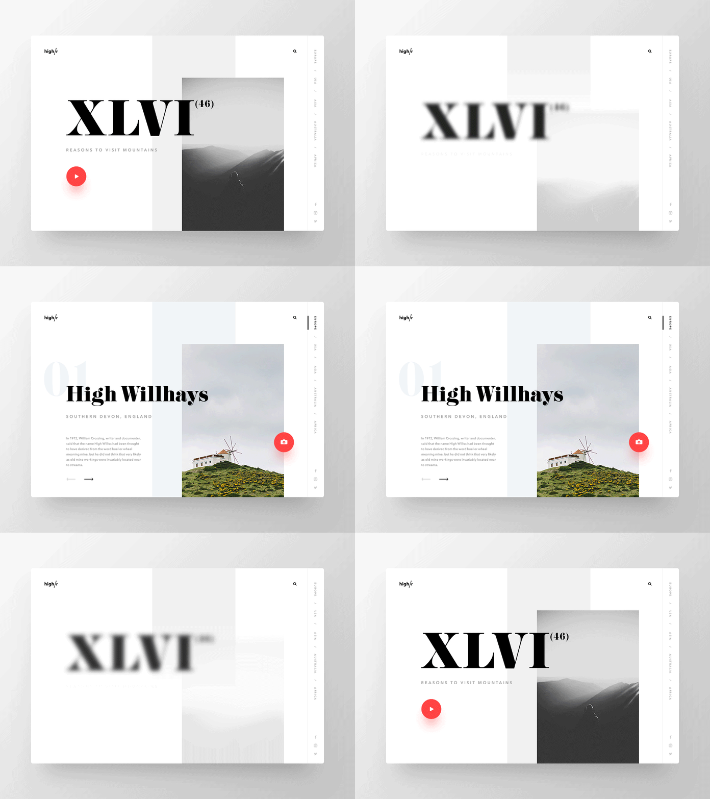
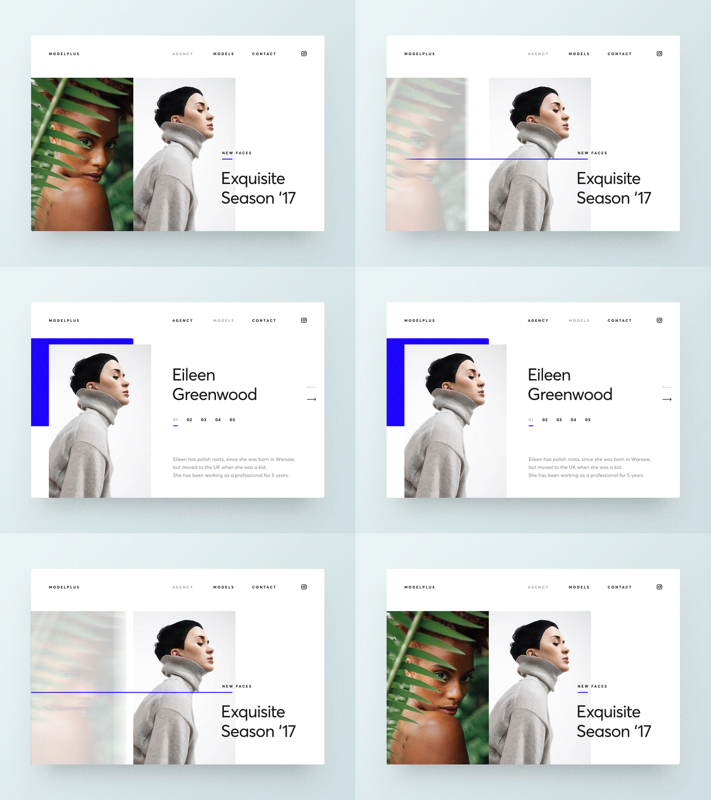
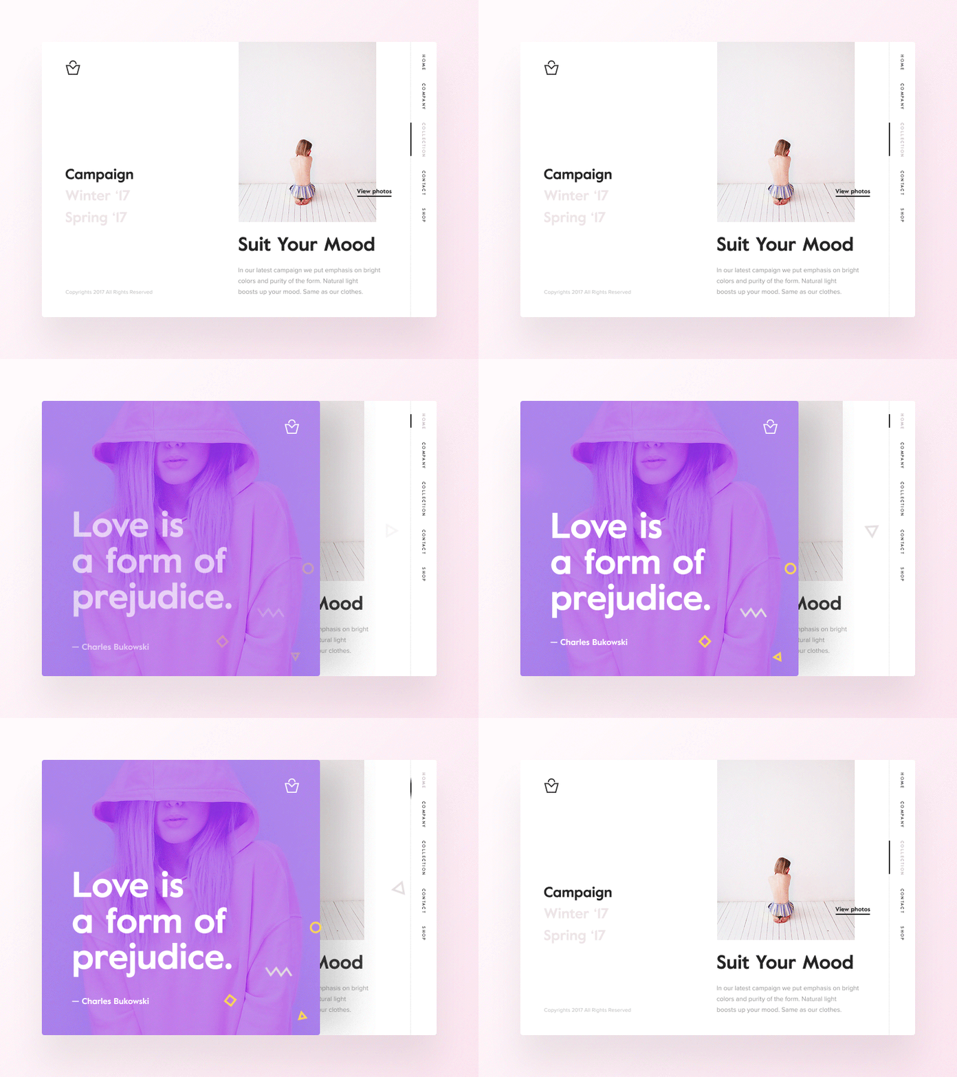
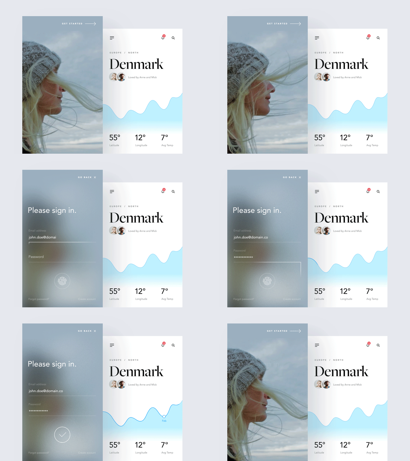
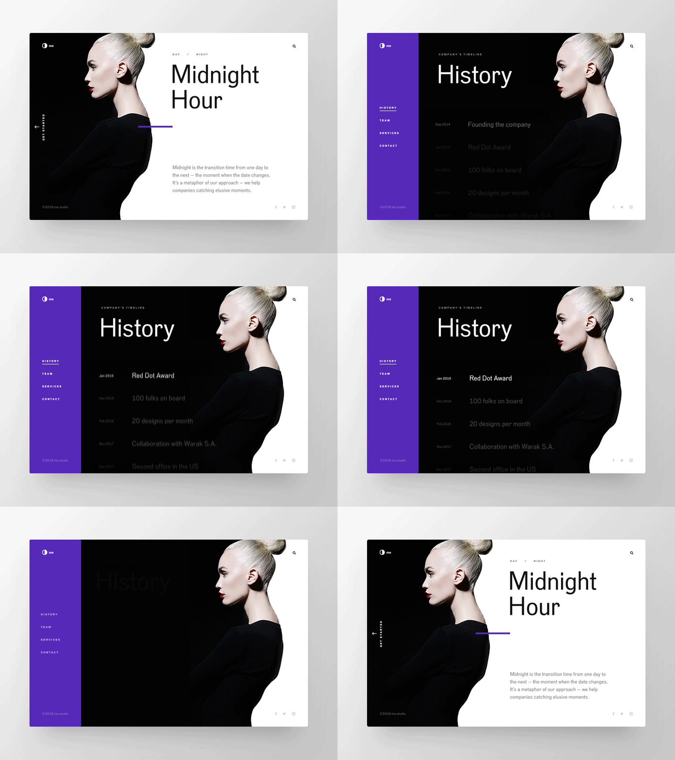
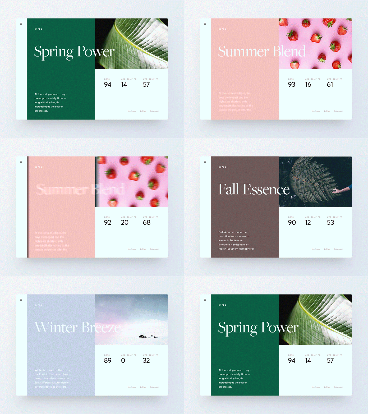
I love browsing through sites like Behance and Dribbble for visual design inspiration. It’s amazing to see how much the field has evolved. We can see highly editorial designs that look more and more like beautiful magazine pages. I know that most of these designs are just static mocks beautifully animated, but the important thing is that with today’s technology there are many ways to translate all of these well-crafted visual design work to real products. Apple has shown us that, then other follows like Google, Microsoft and many others.

For this post I’d like to share a few designs from Adam Zielonko, a designer based in Gdynia, Poland. He has a quite solid portfolio but what I liked about these screens were the sort of pattern of solid blocks of color and transitions. It seems like a new trend coming up, so let’s wait and see. Below you can see what I am talking about. Also make sure to check out Adam’s work at https://dribbble.com/adamzielonko/click?type=site

Visual Design

High r2 dribbble.com adamzielonko 06 03Love is a form of prejudiceButelki z benzyna i kamienie14 01 2018You are so cool

visual design
UI/UX


Gradient Topography Animation

Original Source: http://feedproxy.google.com/~r/tympanus/~3/2XtrRdDppS0/

Today we’d like to share a shape layer animation with you. The inspiration for this effect comes from the fantastic work by Diana Hlevnjak (Polar Vector) “Gradient Topography”. We use anime.js for the animations and Charming for the letter effects.

GradientTopographyAnimation_Featured

After seeing the artwork, we thought it would be awesome to animate these kind of gradient layers of an organic shape in an interesting way. For this we’ve created a little layout that has several shapes spread on the page and when a menu item is clicked, the associated shape group will expand to full screen and some content is shown.

The demo is kindly sponsored by monday.com: The perfect project management tool for designers. If you would like to sponsor one of our demos, find out more here.

Attention: We’re using CSS variables, grid and flexbox for the demos, so please view this with a modern browser.

The organic shapes consist of path layers where each one has the same gradient but a decreasing fill opacity. This creates an interesting look and when animated, fills the entire screen with the semi transparent layers until it’s fully opaque after the last layer enlarges. The other shapes scale down.

Have a look at some screenshots:

GradientTopographyAnimation_01

GradientTopographyAnimation_02

GradientTopographyAnimation_03

We hope you enjoy this little effect and find it useful!

References and Credits

Based on the artwork “Gradient Topography” by Diana Hlevnjak
Anime.js by Julian Garnier
Charming by Yuan Qing

Gradient Topography Animation was written by Mary Lou and published on Codrops.

Why Employee Advocacy Must Be Part of Your Social Media Marketing Plan

Original Source: http://feedproxy.google.com/~r/1stwebdesigner/~3/NKiyn4kWX5g/

In the competitive business world, new companies have plenty of disadvantages. One of the biggest is shaky consumer trust; no one wants to give money to a group that has no reviews or well-known entities to vouch for them.

There are plenty of solutions to this problem, one of the most potent being social media marketing. Employee advocacy is one newer form of this solution. People are more likely to trust non-celebrity endorsements, especially from peers, so getting employees to talk about your business can be very helpful.

But how does it work? And how can you implement this lucrative technique effectively? An employee advocacy plan is easy to put in place but difficult to master, so it’s important to gather all the info you can from the start.

What Is Employee Advocacy?

When your employees reblog or retweet your posts, endorse you on social media, or discuss your business with others online, that is employee advocacy in our modern world. It also encompasses when employees share content published by the employer or when they share content published by others that’s also about the employer.

In short, it is when the workers publicly support the company from their personal profiles, rather than celebrities, branded profiles or managers doing so.

It’s no news that the internet has empowered and changed the way businesses approach marketing, though rarely do they turn to employees for help. Which is a shame, because this practice increases customer trust and website traffic.

How Do You Use It?

While some companies have informal programs to encourage social media support, this approach is more difficult to track if not less effective. You can keep an eye on employees’ accounts, but it’s difficult to track the influence, user engagement, and overall success of many workers.

Luckily, there are “mini social media” platforms with the aim of employee advocacy, such as LinkedIn Elevate, Smarp, Sociabble, or Dynamic Signal, which provide many useful features and analytics. Link tracking allows you to see whose posts get the most clicks, what content is the most popular, and so forth. Employees can even compete on leaderboards or earn points to spend on prizes.

These platforms make it easier to publish articles since everything is managed in one convenient location, which is key if you want to take your company’s employee advocacy program seriously. And this way, once the content is published, employees can quickly and easily share across multiple social media platforms. That’s a lot easier than having to send out daily memos reminding employees to post to Twitter or Facebook.

Lastly, this sort of tool provides an easy way for both employers and employees to communicate, collaborate, and stay up to date. Email may not quite be outdated yet, but being able to place relevant information right in the app, rather than mass-emailing a large team, is certainly more convenient.

Using an employee advocacy tool is an all-around better option than skipping it altogether.

Why Do You Need it?

If you wished to, you could create a few Twitter accounts for the leaders of your company, set up some bots to tweet out links to anything you post on your blog, log out forever, and call it a day. This certainly wouldn’t be anything out of the ordinary.

However, most users can spot a strictly automated account a mile away and won’t be very impressed with your company. Fans may subscribe to you just to be notified when there’s a new blog post, but there will be nothing in the way of audience engagement. New prospects who visit your social media accounts may be turned away by the obviously automated content.

However, an interesting feed with a human touch and lots of user interaction is something that people will appreciate. You may be too busy to stay active on social media, but your employees might not be.

Consumers are less likely to trust CEOs nowadays, so the spotlight turns to the average person. Not to mention, average folks may have their own network of friends and peers their content can reach. A long reach is the key to brand success.

It’s fairly clear: this is a profitable marketing tool that produces more natural and appealing content. The internet has wised up to clickbait and automated accounts, so it’s now necessary to put a bit more effort in. And when it comes to social influence, employees are the ones who have the public’s trust.

Encouraging Advocacy

Now that you know what employee advocacy is and why you need it, how do you get employees motivated? If the program provides no reward incentives or positive effect on their career, they won’t waste their time. You’ll have to give some encouragement.

Firstly, forcing employees to speak about your brand on social media is not the way to go. Morale goes down the drain quickly when you make people do something they’re not interested in. Instead, get them interested! Offer incentives to get them excited. Implement a rewards system, or use a leaderboard to challenge competitive workers.

And instead of giving huge paragraphs of intricate rules, regulations, and expectations, set short and clear guidelines and allow the workers to take control, producing and sharing content that they enjoy. Consumers know when an employee loves what they do, and you’ll earn the trust of them both.

The important thing: don’t dictate their every move. Rules are important, but don’t overdo it. It may seem risky to give someone free reign over your company’s image, but the rewards are far greater. This employee-first doctrine creates content that sounds more real, and less like it was written by an SEO bot or produced in a factory.

Perhaps you could even allow them to create their own content. Talented authors, artists, and image/video editors could prove to be a huge asset if you can discover them. And who can say no to extra career opportunities?

Produce Relevant Content

When your staff has nothing to share, what will they talk about? If you’re not already in full social media mode, then it’s time to get started. Get on Twitter, write on Facebook, and start creating blog posts.

Besides drawing extra attention to your company, it’s both effective repostable material and opens up avenues for discussion by your employees. Don’t forget to have some fun, though! If your company hosts a party, get everyone together for a picture. Content like that provides a breath of fresh air and gives consumers a look into the company atmosphere.

In short: Everything you post on social media should either be insightful, memorable, or fun. Engaging articles with snappy titles, relevant but interesting images, or quick videos are all appropriate. After all, most people on Twitter wants to watch a 20-minute video about the stock market or read a 10,000 word digest on tax returns. Sticking to this general idea will benefit both your social media popularity and your employee advocacy plan.

Improve Your Marketing Strategy With an Advocacy App

The definite way to implement this marketing plan is by using a networking platform. There are many apps out there that can connect your company online, but it’s best to choose one that’s designed around employee advocacy.

Apps like these cover the features most business connection apps provide, while also giving you access to relevant analytics. This information will let you know what content to target and how interested consumers are in your brand. Without this valuable intel, you’ll have to rely on follower and like counts to gauge effectiveness — which can often be unreliable.

Start small. Loop in the best of your employees, the ones who seem eager and willing to try new things. Run contests and set goals for them to meet. If you find success, you can roll it out to willing workers, and continue until you have a stable platform.

And in time, you’ll have a successful program that’s both boosted your visitors and given your employees chances to further their skills and careers. If nothing else, it’s worth trying! The risks are minimal, but the benefits are immense.


7 Places to Find Micro-Gigs for Designers

Original Source: https://www.webdesignerdepot.com/2018/02/8-places-to-find-micro-gigs-for-designers/

As a freelancer, there are times when you need to fill the gap between clients, or up your income a bit by completing micro-gigs. Micro-gigs can be ideal freelance projects because they typically don’t take much time. It’s also relatively easy to impress the client, and you may even wind up developing a long-term relationship with them. At the very least, you’re sure to learn some new skills.
Micro-gigs also work well for parents who are trying to do a bit of design work on the side while staying home with kids. These short projects are very doable, and you can take on as many or as few as you’d like between other tasks.

Micro-gigs can also be a good way for a designer to dip his or her toes into freelance design work to see if the freelance world is something they want to take on.

There are many ways to find micro-gigs for design work. You can, of course, seek out your own clients and let them know what types of gigs you are available for. You also can use various websites to find micro-gigs. Here are seven to get you started:

1. Upwork

Upwork started out as Elance-oDesk and is a platform that connects businesses with freelance designers and professionals around the globe. There are about 12 million registered users and about 5 million registered clients. On average the site posts out 3 million jobs per year, but the pay, and the scope of those tasks, can vary widely.

One of the advantages of Upwork is that you can bid on gigs only when you want extra work. Adding a profile allows businesses to see at a glance just how well suited you are for work with them.

2. Gigbucks

This is another micro-gig site that offers jobs from $5 to $50 per gig. It’s set up similar to Fiverr in that the freelancer lists the services they are willing to provide and the cost of those services. Individuals can then hire the freelancer. If you are looking for a one-off gig, then this type of setup is not exactly conducive to that, but if you are looking for ongoing filler work, then this is the perfect platform for you.

Gigbucks works well to find new customers and clients who otherwise might not know what services you offer.

3. Fourerr

Fourerr is set up for buying and selling micro-jobs, but they also try to connect businesses with professionals so you can find a long-term position if you want. One thing that’s kind of unique about this particular micro-jobs site is that you earn rewards when you buy, sell or connect with others, turning the entire process into a fun game with badges and rewards.

Fourerr works both as a micro-gig finder and entertainment. If you’re looking for gigs with a hip vibe, then this is a great place to start.

4. Taskr.in

Taskr.in is another micro-gig site that works well for freelance designers. Some of the tasks you can complete on this site include banner design, image editing and web design. There are other business services as well, of course, but these are some of the specific design-related tasks available.

The site is the best of the various platforms in that freelancers can both create tasks to offer businesses to, or they can bid on existing jobs.

5. Zeerk

Zeerk is set up more like a classified ad site but also allows freelancers to offer tasks for a set amount. In addition, businesses can list what they are looking for, and freelancers can shoot off a custom quote for the gig. One of the keys with this type of site is to make sure your profile shows off what you’re capable of and then to gather some positive reviews by keeping your clients happy.

One of the benefits of Zeerk is that you can connect with businesses looking for specific skills and send them a quote based on a fair market price.

6. Damongo

Damongo offers numerous micro-jobs, including work for freelance designers. If you are in a financial pinch, or your design business is having serious cash flow issues, you might enjoy a site that offers all different types of tasks for pay, though, so that you aren’t limited in what you can do to earn money. On this site, you set the price for the job you’re willing to complete.

One way you can use Damongo effectively is to figure out what others are not yet offering and how you can offer that service to businesses. Where can you fill the gap?

7. Gigblasters

On Gigblasters, you can sell products and services for between $5 and $500, depending on where you want to set your price point. Like many of the other micro-gig sites, they have various categories including a graphics section that designers will find interesting. The gigs that pop up on that page include product label design, logo creation and business card design.

Conclusion

If you’re looking for fresh clientele, then getting your services listed on new sites is a smart choice. You can pick up work here and there on each site, but overall you’ll have a steady amount of micro-gigs coming in from your various sources.

These are eight of the micro-gig sites out there that work particularly well for designers. Of course, you’ll also want to keep an eye on Craigslist and job search websites for more short-term gigs.

LAST DAY: Bundle of 625+ Beautiful High-Quality Design Elements and Fonts – only $21!

Source

p img {display:inline-block; margin-right:10px;}
.alignleft {float:left;}
p.showcase {clear:both;}
body#browserfriendly p, body#podcast p, div#emailbody p{margin:0;}

Do Website Builders Allow You to Create a Unique Design?

Original Source: http://feedproxy.google.com/~r/Designrfix/~3/joxP7Hu7fFo/website-builders-create-unique-design

Creating and launching your own website no longer requires the ability to program and code using languages such as HTML, CSS, and JavaScript. With the advent of website builders and monthly services available, anyone is now capable of building a website in no time regardless of its purpose. If you are interested in having your […]

The post Do Website Builders Allow You to Create a Unique Design? appeared first on designrfix.com.

Examples of Unorthodox Mobile App Designs

Original Source: http://feedproxy.google.com/~r/1stwebdesigner/~3/moKaz85vJmc/

Mobile apps should generally follow the same format and guidelines. Whether it’s Material Design or iOS Human Interface Guidelines, pushing designers to follow a design system ensures consistency across an entire operating system. This makes it easier for the end user to switch between apps with familiarity and ease. However, some mobile app designs break free of these constraints for the sake of experimenting with new styles and layouts. It enables us to envision new solutions to issues like navigation structures and work on general user experience design improvements.

In this article we are going to look at a selection of the most interesting and unorthodox mobile app designs. They each reconsider almost every aspect of a typical design.

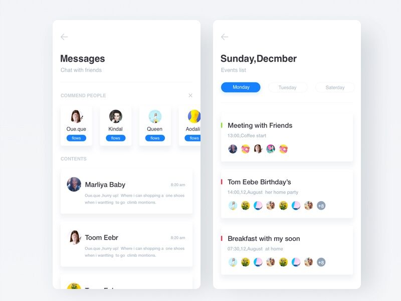
Messages

Messages

This messaging app moves away from the traditional header and tab bar associated with iOS. Instead it focuses on using simple navigation items, in-line tabs and depth to provide visual separation of elements.

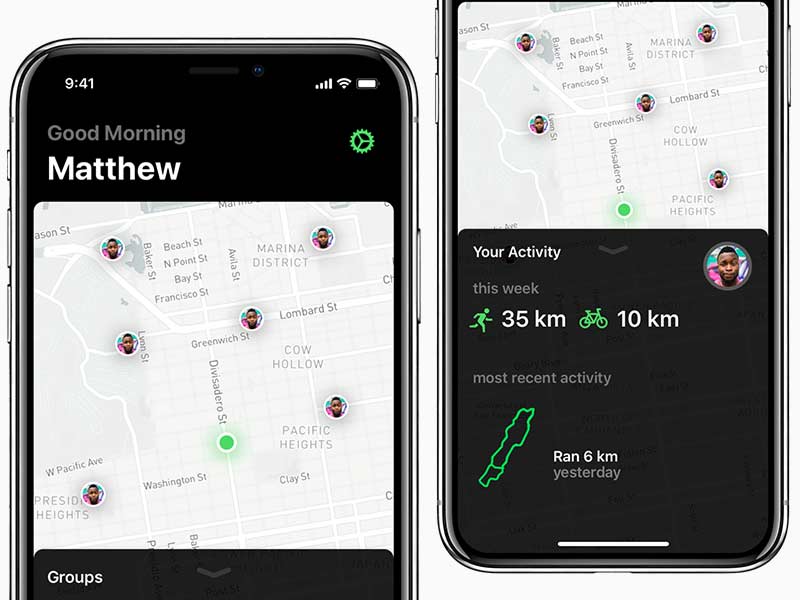
iOS 11 Activity App

iOS 11 Activity App

This activity app for iOS 11 goes against Apple’s advice to embrace the iPhone X notch. However, the result of using a black background is both visually impressive and less harsh on battery life. The bright green iconography contrasts beautifully against this background.

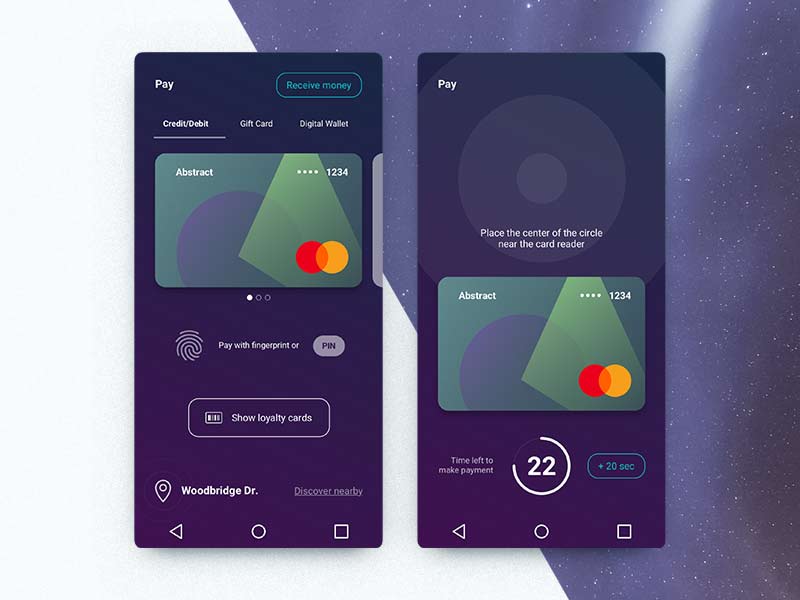
Pay App

Pay App

This Android app design offers a new take on primary action buttons, positioning the ‘Receive Money’ button on the top right. The tab bar has also been tweaked and the overall design looks cohesive with its singular background color.

Crypto Trading

Crypto Trading

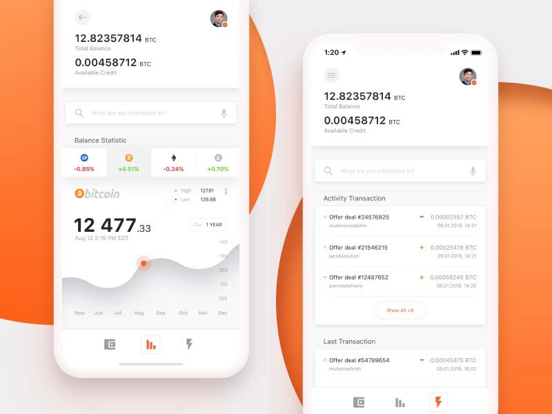
Using an abundance of depth, this iOS design takes visual cues from Material Design and implements them for iPhone. The design language is not associated with iOS styles but is wonderfully simple and offers a rethink of how added contrast and separation can enhance a design.

Events App

Events App

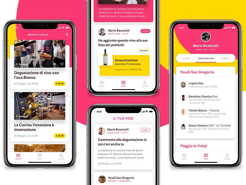
This events app is unique in the way it uses a colorful title bar background. It brings the edge-to-edge display to life and adds a great deal of design merit and feeling to the product.

Urban Timetable

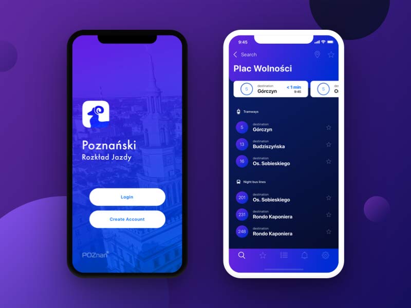
Urban Timetable

Using bright purples and blues, this timetable app moves away from the minimalist white that has become so popular across iOS. The result is visually stunning and ties into the brand perfectly.

Settings Interface

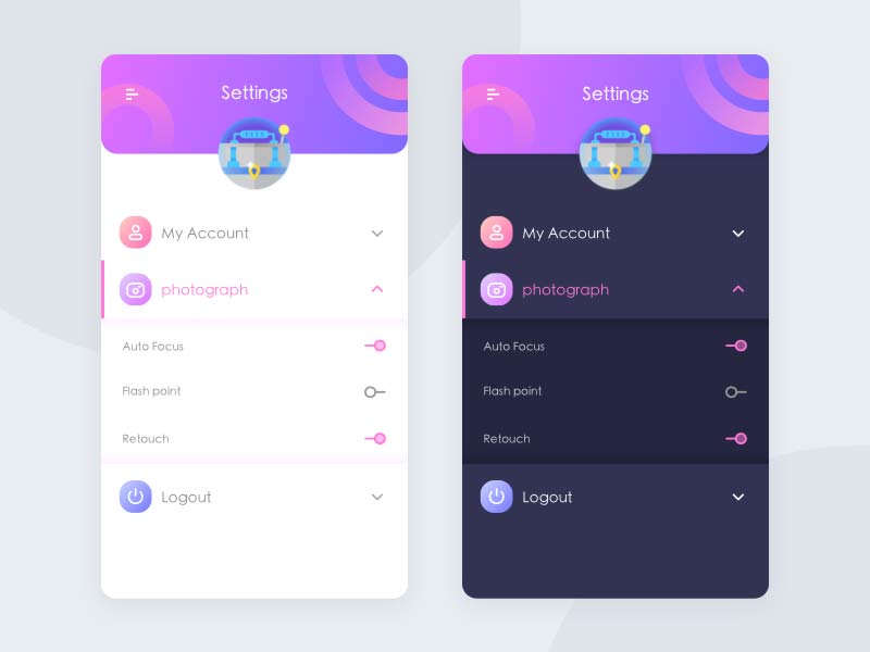
Settings Interface

This settings interface takes on a more radical rethink of how a mobile app could look. From the colorful, graphic-intensive title bar, to the minimal switches, it’s a visually impressive design which looks easy to use and understand.

Kilpi Interactive

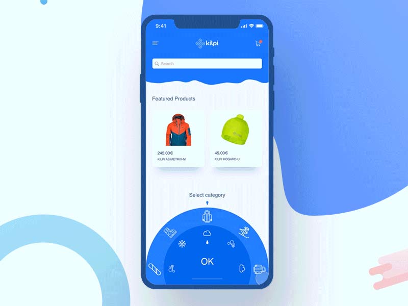
Kilpi Interactive

Not only does Kilpi use a completely redesigned title bar and header section, it also introduces an entirely new type of navigation system. It relies on rotating a wheel as opposed to using dropdowns, tabs and other traditional components. It looks visually impressive and easy to use with one hand.


The Wix Code Database and Data Modeling

Original Source: https://www.sitepoint.com/the-wix-code-database-and-data-modeling/

This article was created in partnership with Wix. Thank you for supporting the partners who make SitePoint possible.

One of the cool features of Wix Code is the ability to separate your site’s design and layout from its content. This means you can create and maintain your information in a database and then have your pages dynamically retrieve and display this information in whatever way you like.

Let’s take an in-depth look at what you can do with the Wix Code database, including the types of information you can store, ways you can manipulate data with code, and how you can dynamically display the information on your site.

Throughout this article, we’ll use a simplified example of an art school that stores and displays information about its courses and teachers.

The Wix Code Database

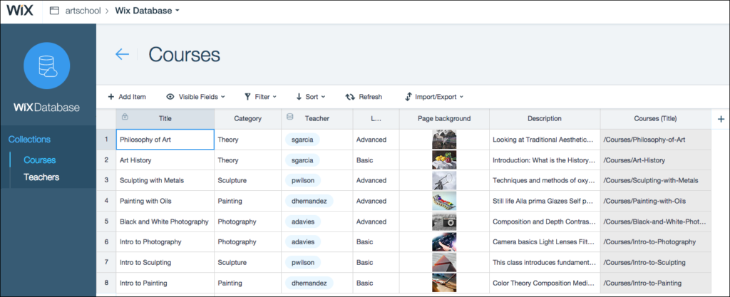
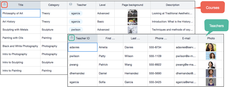
Like all databases, the Wix Code database is made up of individual tables, which we call collections. In our example of the art school (see image below), we have two collections, one each for the courses and teachers.

art school

You can create as many collections as you need and populate them with a near unending amount of data. A robust permissions model means you have complete control over who can access your information and what they can do with it.

You can work directly in your Live data, which is the information your visitors see when they view your pages. You can also work with Sandbox data, so you can try stuff out without affecting your live site. You can sync between them at any time.

Populating Collections

You have several options for populating your collections. You can manually enter data directly in the Wix Content Manager, either to your Live data or your Sandbox data.

If you’re an Excel ace, you can do all the work in Excel (or whatever spreadsheet program you prefer), save your sheet as a CSV file, and then import it into the Wix Code database. In fact, you can create your entire collection this way, schema and all. You can import to your Live data or your Sandbox data.

You can also export your Wix data to CSV files. If you make sure to include the built-in ID system field, you will be able to modify your content in your spreadsheet and then re-import it into your Wix Code database so that each record, or what we call item, is updated.

A third option is to build a form to capture user input and store it in your database.

Using External Databases

If you already have a database somewhere, you might be thinking that you don’t want to recreate it in Wix. The good news is that you don’t have to. As long as your database exposes an API, you can access it from your Wix site.

For simple applications, you can use the wix-fetch module—an implementation of the standard JavaScript Fetch API—to access your external database with an HTTP request and use that data in your Wix site’s pages.

You can also pair the wix-fetch module with another Wix module, wix-router, that lets you control the routing of incoming requests. Using the functionality provided by both of these modules, you can create SEO-friendly dynamic pages that show different data depending on the URLs used to reach them.

For example, you can design a single member profile page that can be used by all of your site’s members.

Using wix-router and wix-fetch you can write code that pulls information from incoming requests for the profile page, queries an external database to retrieve the information for the page, and then injects that data into the profile page. You can even add security to your page by using the wix-users module.

So if you create another page for users to update their profile pages, you can check who is trying to access it and only allow users to update their own profiles.

Data Hooks

You can add hooks to actions on your collections using the wix-data API.

For example, in our Teachers collection, we have two separate fields: First name and Last name. To make displaying names on our pages easier, we also want to have one field that has both names together. To do this, we can add a beforeInsert hook to our Teachers collection that hooks into the insert action, reads the contents of the First name and Last name fields, and then concatenates them and populates the Full name field.

Modeling Your Data

Now that we’ve covered the database itself, let’s talk about modeling your data in the Wix Code database.

Collection Schemas

Like all databases, each collection has a schema to define its fields. All standard field types are supported, including text, image, boolean, number, date and time, and rich text.

There is also a field type specifically designed for URLs. It automatically formats the URL into clickable links that you can add to your pages. For example, teachers in your school could supply the URL of their portfolio website, and you could include that link on their dynamic page.

You can also use the document field type to store a wide range of file types. You can allow your users to download files stored in your collections (such as reading lists for each course) or to upload their own files.

ID Fields and Primary Fields

Each collection has an _ID field, which is the primary key for that table. Collections also have a primary field (indicated by a lock icon), which is the display key for each item.

When you create joins using reference fields (see the next section), the values come from the primary field. The reference itself uses the _ID field, of course. If you plan on using reference fields, it’s a good idea to make sure the data you store in the primary field is unique.

ID field

Reference Fields

Reference fields create a connection between collections that is defined in the collection schema itself. This is similar to foreign keys in relational databases.

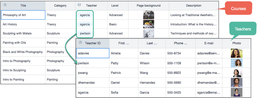
Each reference field points to a specific collection. The value that is displayed in the reference field in each item in the collection is taken from the value of the primary field of the referenced collection.

Reference fields

In our example, we created a reference field in our Courses collection that points to our Teachers collection so that we can indicate who teaches each class.

The advantage of reference fields is three-fold. First, they help maintain data integrity because their value is taken directly from the referenced collection. Second, they help eliminate data duplication, which we all know is the enemy of good database design. And third, when we create our page layouts, reference fields let us access information in the referenced collection as well as in the main collection we are using. This allows us to create master-detail pages, such as a list of all the courses taught by each teacher.

Creating Pages from Your Content

Of course, storing and maintaining data is nice, but the real point of having a website is displaying content to visitors. So let’s talk about how that works with Wix Code.

Back to our art school example. We have two different types of information: courses and teachers. So you could start by designing a page layout to display all the information about each of the courses. Then you might want to create a master-detail page that lists all of your teachers and the courses they teach.

Continue reading %The Wix Code Database and Data Modeling%

Collective #387

Original Source: http://feedproxy.google.com/~r/tympanus/~3/HBHTyNMqrDs/

C387_wotw

Inspirational Website of the Week: Antoni

Super smooth transitions and a great design. Our pick this week.

Get inspired

C387_treehouse

Our Sponsor
Gain new skills to boost your career – Learn CSS with Treehouse

Add to your creative tool box. You can push pixels, but can you build a responsive web design? Start your path to becoming a front-end web developer, or brush up on your skills with our CSS course. We’ll walk through everything you need to know to build web pages.

Claim your free trial

C387_pigment

Pigment

One of the fantastic design tools made by ShapeFactory.

Check it out

C387_emeyer

CSS: The Definitive Guide, 4th Edition

An excerpt from Chapter 19, “Filters, Blending, Clipping, and Masking”, of “CSS: The Definitive Guide” by Eric Meyer and Estelle Weyl.

Read it

C387_icons

Let’s make multi-colored icons with SVG symbols and CSS variables

A great technique by Sarah Dayan for multi-colored SVG icon symbols.

Read it

C387_BEM

Grandchild elements in BEM

Luke Whitehouse writes about the unpleasant issue of grandchild elements in BEM and some options for dealing with it.

Read it

C387_cssgrid

Grid Examples

A place to get inspiration for CSS Grid layout examples in the wild.

Check it out

C387_browsercomp

mdn-browser-compat-data

A repository that contains browser compatibility data that describes which platforms support particular Web APIs. Read more about it in this article.

Check it out

C387_Caire

Caire

Caire is a content aware image resize library that leaves the most important part of the image.

Check it out

C387_stimulus

Stimulus 1.0: A modest JavaScript framework for the HTML you already have

Read about the Stimulus JavaScript framework in this article by David Hansson.

Read it

C387_browsersketching

Sketching in the Browser

Mark Dalgleish shares the great journey of the work that aims to bridge web design and development.

Read it

C387_serverless

The Power of Serverless for Front-End Developers

Useful info and resources on serverless for web developers.

Check it out

C387_Snakes

I shall resist

A beautiful demo for snake lovers by Gerard Ferrandez.

Check it out

C387_shittiest

Shittiest Project Ever

Smile Studio presents the shittiest project ever to waste your time 😉

Check it out

C387_4billion

Digital in 2018: World’s internet users pass the 4 billion mark

Some very interesting report insights from We Are Social and Hootsuite.

Read it

C387_palette

Dribbble Color Palette Generator

Generate a .sketchpalette file from any Dribbble shot’s color palette to be loaded in the Sketch-Palette plugin. By Amie Chen.

Check it out

C387_varfonts

One File, Many Options: Using Variable Fonts on the Web

Ollie Williams shows how to use variable fonts in your web projects.

Read it

C387_easytimer

EasyTimer.js

An easy-to-use timer library compatible with AMD and NodeJS.

Check it out

C387_pwa

An introduction to Progressive Web Apps

A great guide to Progressive Web Apps (PWA) by Flavio Copes.

Read it

C387_vr

Web AR with smart plugs using A-frame

First part of an article series about using Web AR using A-Frame to visualize energy consumption using Wemo smart plugs connected to home appliances. By Gemma Vincent.

Read it

C387_jscopy

Deep-copying in JavaScript

An interesting guide for copying an object in JavaScript.

Check it out

C387_varfontsuse

How to use variable fonts in the real world

An interesting article by Richard Rutter on the challenges of using variable fonts.

Read it

C387_sun

GLSL: Underwater Sun

A great GLSL demo by Liam Egan.

Check it out

Collective #387 was written by Pedro Botelho and published on Codrops.