Original Source: http://feedproxy.google.com/~r/CreativeBloq/~3/vRnc3r-Dn_A/professional-fonts-31619557
There's no shortage of paid-for and free fonts available for designers to choose from these days. But what if you want a typeface that's really special and stands out?
Whatever the project, these professional fonts are certain to give your designs an air of sophistication.
01. FF Din
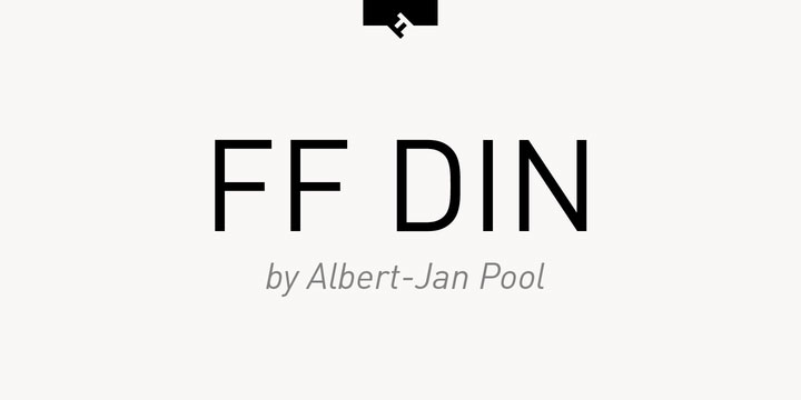
FF Din is a popular choice among designers
Price: From $65/£51.99 per fontFormat: OTF
Added to MOMA's digital typefaces for its Architecture and Design collection back in 2011, FF Din is a popular choice among designers. Created by Dutch type designer Albert-Jan Pool between 1995 and 2009, this sans serif is ideally suited to advertising and packaging, logos and branding.
02. Oswald
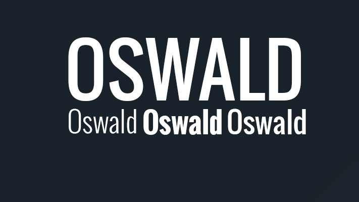
We’re big fans of professional font Oswald here at Creative Bloq
Price: FreeFormat: Google web font
Oswald has become a popular choice of font for designers, especially for those working in the world of of the web. A reworking of the classic style historically represented by the 'Alternate Gothic' sans serif typefaces, this professional font has been re-drawn and reformed to better fit the pixel grid of standard digital screens.
03. Brandon Grotesque
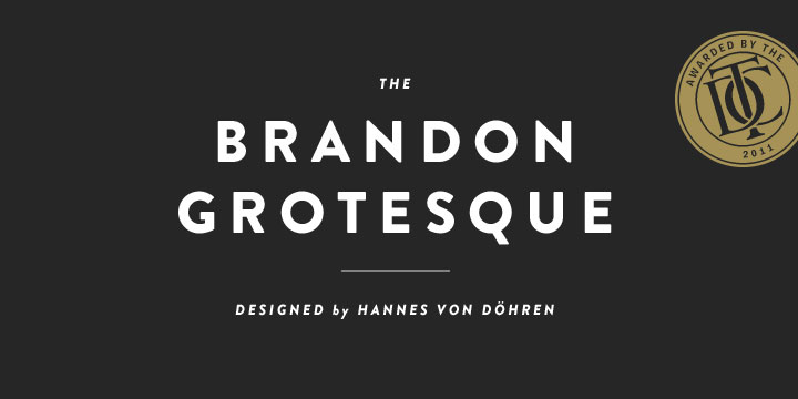
Brandon Grotesque won the Type Directors Club Award in 2011
Price: $40/£27.99 per fontFormat: OTF
Designed by Hannes von Dohren in 2009, Brandon Grotesque was influenced by the popular geometric-style, sans serif typefaces of the 1920s and 30s. Equipped for complex, professional photography, Brandon Grotesque won the Type Directors Club Award in 2011.
04. Aviano
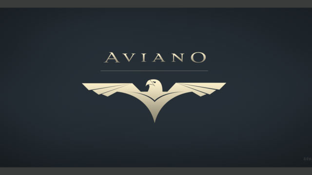
Aviano typeface is inspired by the power and timeless beauty of classic letterforms
Price: $24.99/£15.99 per fontFormat: OTF
Named after a small town at the base of the Alps in Northern Italy, Aviano typeface is inspired by the power and timeless beauty of classic letterforms. A gorgeous design, Aviano was created by type designer Jeremy Dooley, owner of one-man foundry Insigne.
05. Proxima Nova
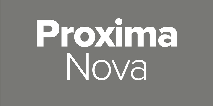
Proxima Nova is used by over 25,000 websites, including Buzzfeed, Wired and Mashable
Price: $29/£19.99 per fontFormat: OTF/TTF
Used by over 25,000 websites, including Buzzfeed, Wired and Mashable, Mark Simonson's professional font Proxima Nova is an extremely popular choice amongst designers. The extensive family is available in seven weights (thin, light, regular, semi-bold, bold, extra-bold and black), with matching italics, small caps and condensed and extra-condensed widths.
06. Rockwell
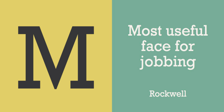
An updated Rockwell was published in 1934 by Monotype
Price: $35/£22.99 per fontFormat: OTF/TTF
Geometric slab serif Rockwell was inspired by a 1910 font titled Litho Antique. Designer Morris Fuller Benton revived Rockwell in the 1920s before it was redesigned and published in 1934 by Monotype, in a project headed by Frank Hinman Pierpont.
07. Trojan
Trojan’s design is based on classic Roman structures
Price: $25.80/£20 for 1 fontFormat: OTF
Trojan is one of many stand-out designs by creative genius Alex Trochut. Created back in 2012, professional font Trojan was used extensively throughout Wallpaper after its initial release. Based on classic Roman structures, Trojan has a very sophisticated set of glyphs, which, in turn, gives this font a classic contemporary appearance.
08. Le Havre
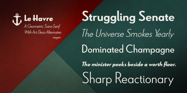
Le Havre lends itself to all manner of creative projects
Price: $24.99/£15.99 per fontFormat: OTF
Art deco-inspired typeface Le Havre was named after the port where many a famous luxury cruise liner was launched in the 1930s. Compressed capitals, a low x-height and geometric construction give this beautiful typeface a retro look and feel, with the new contemporary update in 2009 lending itself to all manner of creative projects.
09. Mallory
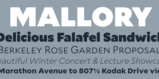
Mallory is the work of s type designer and teacher Tobias Frere-Jones
Price: $50 per fontFormat: OTF
The product of type designer and teacher Tobias Frere-Jones, Mallory is a beautiful professional font, which began as an experiment in mixing typographic traditions, building a new design with British and American traits.
Frere-Jones has a number of best-selling type designs under his belt, but Mallory was the first font he created after splitting with long-time creative partner Jonathan Hoefler.
He comments on his website: "Mallory was built to be a reliable tool, readily pairing with other typefaces to organise complex data and fine-tune visual identities. Each style contains over 1250 glyphs, to anticipate a wide range of content: small caps and old-style figures for running text, lining figures and uppercase punctuation for headlines, tabular figures and over a dozen currency symbols for financial data."
10. FF Meta
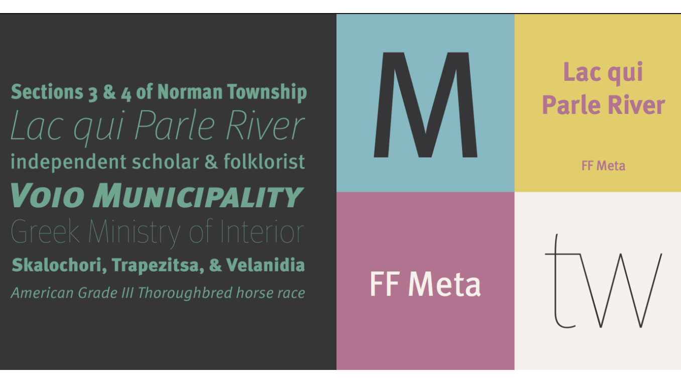
FF Meta was designed by Erik Spiekermann
Price: $59/£45 per fontFormat: OTF
Created by outspoken type designer Erik Spiekermann, FF Meta was first called PT55, a typeface made for easy reading at small sizes for West German Post Office in 1985. Spiekermann continued work on his design to include more weights and styles, later releasing it as FF Meta, one of the first and truly foundational members of the early FontFont library.
With a clean, cheery and distinctive aesthetic, professional font FF Meta flourished in the early 1990s and has been a firm favourite ever since. In 2011, the Museum of Modern Art in New York added FF Meta to its permanent collection, one of only 23 fonts selected to represent typography of the digital era.
11. Soho
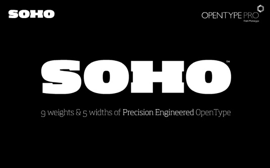
Soho is a beefy slab-serif by Seb Lester
Price: $65 per fontFormat: OTF
Beefy slab serif Soho is the product of renowned type designer Seb Lester. The super-family has over 40,000 glyphs and represents three years' worth of work.
"As a type designer I'm preoccupied with finding ways in which I can address modern problems like good legibility in modern media, and create fonts that work precisely and efficiently in the most technically demanding of corporate and publishing environments," he comments on the Monotype website.
12. Davison Spencerian

Davison Spencerian is a remains a benchmark of the ornamental script genre
Price: $75Format: OTF/web font
American letter designer Meyer 'Dave' Davison was arguably one of the most distinguished lettering artists of the 20th century. With a library of Spencerian designs, Davison Spencerian typeface made its first appearance in Photo-Lettering’s 1946 catalogue and remains a benchmark of the ornamental script genre.
Tireless hours have been spent by Mitja Miklavčič and House Industries designers Ben Barber and Ken Kiel to preserve the poise and precision of Davison’s masterwork in this faithfully-rendered digital incarnation.
The House Industries website states: 'From automotive exhaust accessories and pirate-themed wedding invites to New Orleans sissy bounce hip-hop CD covers and upmarket bivalve ambrosia packaging, Davison Spencerian offers sober sophistication and unparalleled flexibility'.
Related articles:
20 perfect font pairingsWhat is DPI? The ultimate guide to image resolution30 books every graphic designer should read


 “It looks great, but can you make it ‘pop’ more?”
