The Anatomy of a Perfect Landing Page for Your Business
Original Source: http://justcreative.com/2017/08/07/anatomy-of-a-perfect-landing-page/
This is a guest article contributed by Matt Janaway.
Having a landing page exit-rate that stinks can be quite depressing. This is especially true if you and your team spent blood sweat and tears to create a professional-looking landing page, only to see your audience ignore your call-to-action buttons.
The thing is, there is more to a high-converting landing page than just its looks. Relying on your page’s aesthetics alone isn’t going to cut it since it can only do so much for you.
If you want to create a landing page that’s going to bring home the bacon, then allow me to share with you the anatomy of a perfect landing page for your business.
Let’s hop right in.
1. Compelling copy.
Just because your copy reads well and it doesn’t have any typos or grammar mistakes, doesn’t mean that it is enough to compel your audience to take action on your CTA’s.
Compelling copies have psychological elements embedded into them like social validation, tapping into the audiences’ fear of loss, etc.
These elements are often what compels the audience to take action.
2. Sprinkle your call-to-action buttons in strategic places.
Where these strategic areas are specifically, I’m afraid I won’t be able to tell you. Simply because these things vary depending on the dynamics of the type of landing page that you’re using (yes, there are different types of landing pages), and your design among other things.
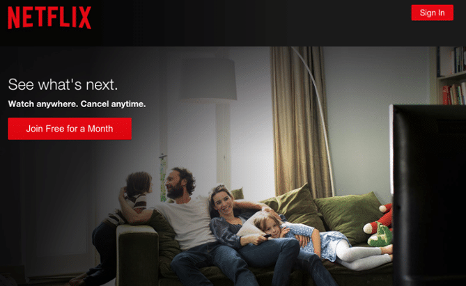
However, I can tell you that as a general rule, it is a good practice to add your CTAs in areas where you’ve provided massive value to your readers like the image above, taken from Netflix. That way, if they are convinced that they need your help, then they can contact you immediately without having to look for your CTA buttons.
Adding a floating CTA also works. A good example is Furl.co.uk’s “Talk to Us” button. A quick visit to their website and you will see that no matter where you’ve scrolled at the page, their “Talk to Us” button is still highly visible because it is floating.
3. The relevance of the page is apparent.
Those who arrive on landing pages often have a goal in mind. That is why you need to convey to your readers immediately that your page is relevant to what they’re looking for, otherwise, they might think that they’re in the wrong place which will then cause them to click away.
A perfect way to deal with this is to make sure that your title directly addresses their concerns. Since your title is one of the first things they’ll see immediately after arriving at your page, the issue of relevance no longer becomes a threat.
4. No distractions.

It is ideal to use one type of call-to-action per landing page. That way, your audience doesn’t end up getting confused or distracted from doing the primary goal that you predetermined when you created your landing page.
That being said, do not ask your audience to share, buy, or contact you all at the same time and be careful not to distract your visitors from your main goal. Here’s an example of a homepage which distracts the visitor from completing a goal (in this instance, a purchase).
Just pick one type of CTA then sprinkle it strategically across the page. Also, make sure that your CTA buttons “pop.” If they aren’t highly visible, then your audience might not see them.
5. Carefully crafted headlines.
Your headline needs to be clear, concise, relevant, and punchy. These characteristics will ensure (somewhat) that your audience will continue reading the copy on your landing page.
See here for some tools for optimizing headlines and the ultimate list of headlines.
6. Add testimonials.

Adding testimonials on your landing page will skyrocket its credibility. What makes it so effective is the fact that testimonials are not sales pitches, and they come across as unbiased.
To make the testimonials on your landing page look more credible, add your client’s profile picture and a short information about who they are.
At Marketing Labs, we include our clients’ name, their position in the company, and their business names. This is how our testimonials section looks.
When your prospect customers see the testimonies shared by your previous customers about how positive their experience is with you, it becomes a lot easier for them to trust you and do business with you.
7. Use images or videos that are relevant to the copy.
Countless case studies are showing that images and videos can boost your conversion rates. The thing with images and videos is they can help your audience create a clearer mental picture of the ideas that you want to convey.
Of course, the ideas that we’re talking about here are meant to influence them to take action on your offers. This effort from Spotify is excellent and encapsulates the impression of peacefulness.

When your audience can create a mental picture of themselves experiencing happiness, convenience, and joy (among other things) because of your product, it becomes almost impossible for them to leave your landing page without taking action on your offers.
The Anatomy of a Perfect Landing Page Infographic

Infographic by SmartBugMedia.com
What’s next?
I know for a fact that I’m just scratching the surface with the points that I shared above. If you have wisdom bombs that you’d like to share about creating a high-converting landing page, then please share them in the comments section below. Cheers!


Leave a Reply
Want to join the discussion?Feel free to contribute!