To Hell With Subtle Design

Original Source: https://www.webdesignerdepot.com/2017/12/to-hell-with-subtle-design/

Don’t try to be so damn subtle in web design.

Okay, let me explain that…

About a year or so ago, I made a terrible mistake: I tried to be funny; More specifically, I tried my hand at stand-up comedy. I sat down, wrote out a bunch of jokes that I found amusing; and collected some online acquaintances in video chat to try them out. I did it this way because I live in Mexico, but my first language is English.

And here’s what I found out: Unless people already know you, they may not immediately understand you when you’re trying to be clever. They tend to take what you say rather literally. Also, they will only trust you with a joke that has a long set-up if they already think you’re funny. Also, Mexicans can have a really dark and subtle sense of humor that doesn’t translate to everyone else and it has rubbed off on me. The only Mexican in the virtual room was my biggest fan.

Cleverness is overrated; Subtlety is useless

In web design, those first two points are the ones that truly apply: Cleverness is overrated; Subtlety is useless.

Just give them what they want without making them jump through mental hoops. As a comedian, I failed my “audience” by presenting them with small puzzles. I mean, I thought they were just clever references with obvious punchlines. I figured if they just thought about it for a split second, they’d laugh like I did. That was silly of me.

When people go to a comedian, they don’t want puzzles. They want laughs. That’s why some of the most obvious jokes can carry entire careers. It’s why comedians usually start a set with quick, almost-guaranteed jokes. Once they have captured the attention of the audience—once the audience trusts them to deliver the laughs—they can go into subtler material, and longer jokes.

When people browse the Internet looking for information, they don’t want websites to be puzzles. They don’t want references or clever gimmicks. Those things can be a nice bonus (or Easter egg) but users shouldn’t have to get through them to get to the information or product they want.

So What Exactly Do You Want Us To Stop Doing?

I’m so glad you asked! Let’s tackle subtlety and overwrought cleverness in UX Design: Every time someone comes up with a newfangled form of navigation, an overly-artistic layout, or hides content behind unnecessary clicks, Sir Tim Berners-Lee cries. Stop making Sir Tim cry.

Every time someone…hides content behind unnecessary clicks, Sir Tim Berners-Lee cries

I’m not saying to never do anything new or interesting with your layout. I’m saying that you need to be more careful about it. Every time you consider a brand new approach in web design, ask yourself if it’s going to make things easier or harder for users to find. Then go ask some users. Any users. For the love of all that is holy, stop hiding information and UI elements that people need.

Now, on mobile devices, it might make some sense to hide your navigation behind an extra tap, but that’s really the limit. On tablets and desktop computers, primary navigation just shouldn’t be hidden. It just shouldn’t. There is no good reason. Aesthetics is not a good reason.

Let’s take another example: forms. There is no reason they should not look like forms. No matter how clever it might seem to make text inputs look like something else, it’s really not a big help. Not unless you put up a sign that says, “Click here, and here, and here…”, and then you’re just making more work for yourself.

Yes, forms are sometimes ugly, boring, and frustrating—just like in the offline world. Can they be better? Yes, but only as long as they are still recognizable as forms. The moment they look like anything else, users have to spend extra time figuring them out. Congratulations! You made forms more irritating.

The bits of your website that users actually interact with don’t have to be clever, innovative, or subtle. They just need to work.

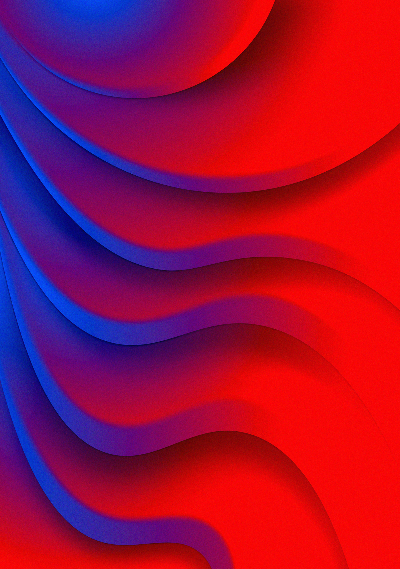
On Subtle UI Flourishes

Let’s address UI design next: drop shadows, gradients, and contrast. Specifically, let’s talk about the near-complete absence of contrast on some sites. I’ll admit, this is a trap I’ve fallen into many times, myself: Please don’t look at my current writing portfolio, I’m just about to redesign it yet again.

When you make a gradient, or a drop shadow, it can be tempting to make it as subtle as possible. Light grey stuff on white backgrounds looks elegant. Or at least that’s something we tell ourselves. The truth is, if your user is looking at your site on a screen where that’s not quite calibrated right, a lot of those details can disappear entirely.

If you’re depending on something like a drop shadow or gradient to create affordances (or clues as to how the interface works), having those details disappear can seriously affect usability. It’s a different kind of subtlety, yes, but it needs to be addressed.

Conclusion

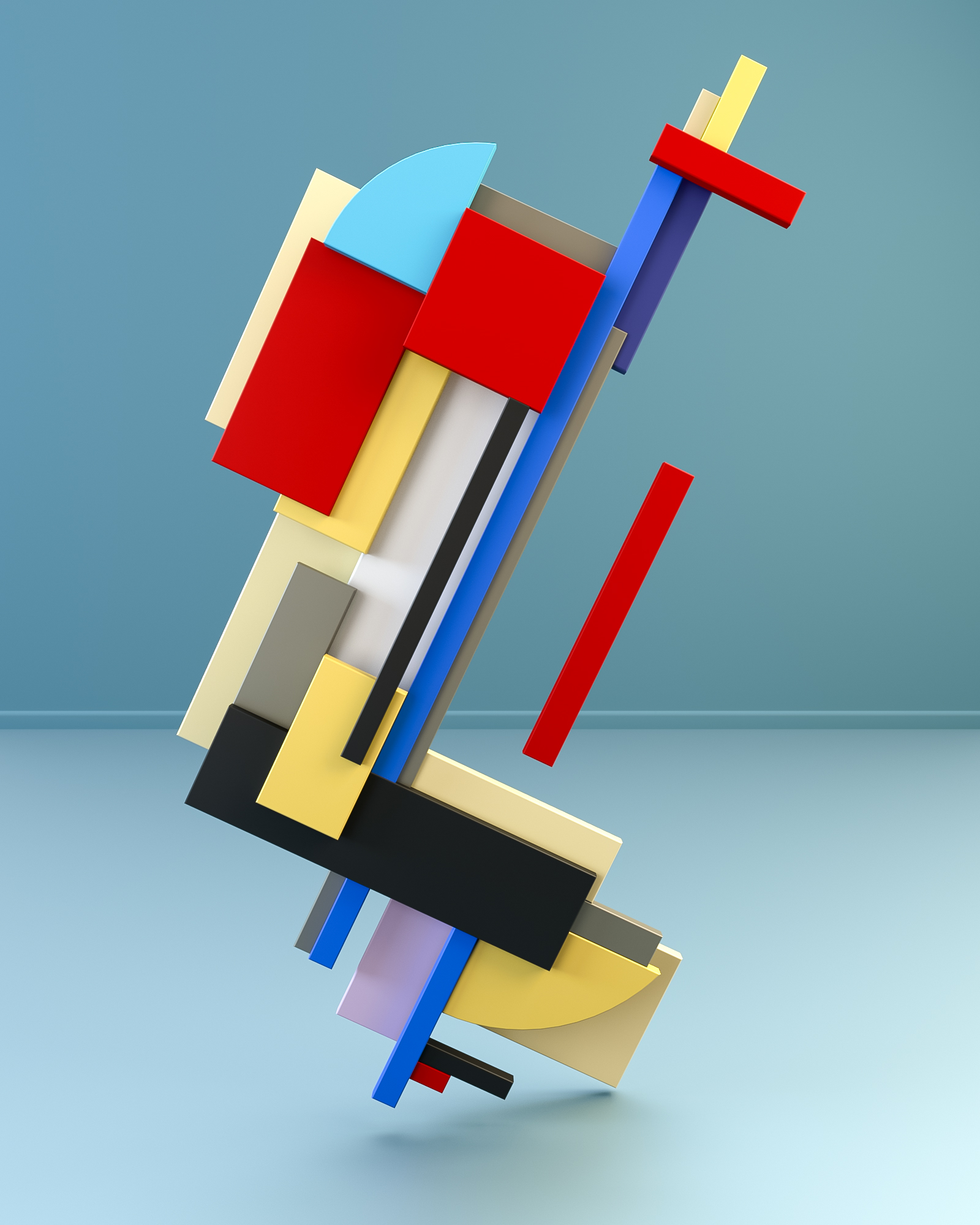
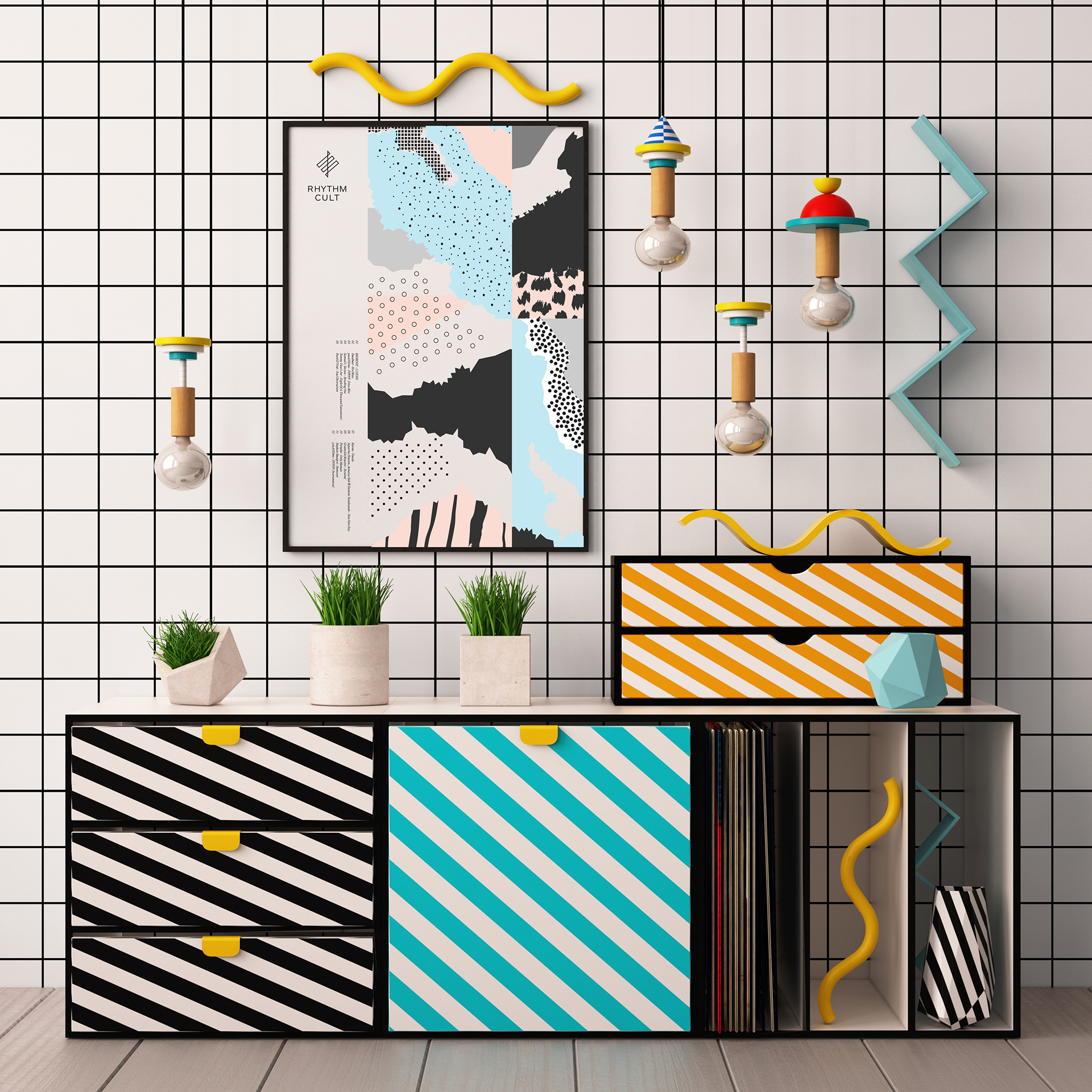
Don’t hold back. Be bold with your colors, your contrast, and your user experience design. Go wild! The only real constraints should be usability, and efficiency. And by that I mean don’t hide the content or features that your users are looking for.

Metaphorically hit them in the face with what they want. It’s what they want.

3500+ Textures, Brushes, Icons, Watercolors & More Graphic Elements

Source

p img {display:inline-block; margin-right:10px;}
.alignleft {float:left;}
p.showcase {clear:both;}
body#browserfriendly p, body#podcast p, div#emailbody p{margin:0;}

Top 10 Web Design Trends From 2017

Original Source: http://feedproxy.google.com/~r/1stwebdesigner/~3/0pcjN1GtfxI/

As another year comes to a close we can marvel at the massive growth in the design space. There’s no denying this year was an active one that’s seen enough growth to rival the past decade combined!

It’s hard whittling down to a few select trends but I always find a few that jump out at me.

This list is merely the best trends that I’ve seen over 2017, most of which I expect to carry over well into 2018. If you’re looking for the latest design trends have a peek and see what you think!

1. Building With Frameworks

Bootstrap framework homepage

The explosion of web frameworks comes at a time when the number of modern frameworks just keeps growing. It seems never-ending and it’s pretty clear that frameworks are here to stay.

Developers can save loads of time by using these frameworks rather than starting from scratch. The only trouble is that, in the past, frameworks have always seemed so limited.

But these days you have dozens of amazing frameworks to pick from that go far beyond Bootstrap. This makes it easy to build custom sites from scratch with unique designs – without having to reinvent the wheel.

2. In-Post Related Links

in-post related items

I’ve noticed this trend on a few larger news sites and it’s something I hope to see more often in blogs.

We all know about the “related post” widgets that appear after articles. Many of these run through native ad networks like Taboola, while others consist of legitimate internal links. But you can also add these related posts inside your content.

WordPress makes this super easy with free plugins that pull links automatically into your content.

This is likely to increase pageviews and keep people on your site for longer periods of time. Not a bad strategy if you’re hoping to increase your pageviews in 2018.

3. Scroll-Up Sticky Navigation

Android Authority sticky nav

The sticky navigation trend has been around for years. But over the past year, I’ve noticed a slightly different trend growing in popularity: scroll-up sticky navigation.

These only appear when the user is scrolling back up the page. When the user scrolls down past a certain point the navigation automatically hides out of view. This increases readability while still making navigation accessible with one scroll (or swipe).

You can see a great example of this technique at Android Authority.

4. Microinteractions

example microinteraction

The more I research microinteractions, the more I notice these features on the web. Heck, visit the Android Authority example above and click on their search icon. It’s an example of microinteraction to a tee.

I have a feeling these little animations are here to stay. They’re getting easier to create with so many JS/CSS animation libraries, and modern browsers can support much more interactivity (including mobile browsers).

You don’t need to force these microinteractions into your projects but they’re worth considering if you want to test some UX ideas.

5. Native In-Post Sponsorships

Native in-post ad blocks

I’ll admit, this trend is a mix of one-part design and one-part marketing. But if you can blend ads naturally into your content they’ll be far less annoying than the auto-play garbage we get from traditional ad networks.

Take a look at almost any post on Search Engine Journal. You’ll notice they use in-post ad blocks with custom icons, backgrounds and disclosures stating that they’re advertisements. Naturally blended and very well designed.

I’m not sure how much they could charge for this placement but I think it’s a great choice for small publishers with a niche audience.

6. Article Subheadings

Article subheading

Your page headline is perhaps the most important factor in getting people to stick around. But what about adding a sub-headline?

This can help explain the content in more detail. Plus, it gives you another chance to sell the article and keep people scrolling down.

I see this on many Computerworld posts along with other major news sites. If you use a fullscreen headline layout this would definitely be worth testing.

7. Single-Page Table of Contents

Table of contents Android Authority

We’re all familiar with the Wikipedia table of contents. This is a table for browsing complex entries to find that one tidbit you’re looking for…or to help you waste 30 minutes researching unrelated factoids.

Nonetheless, I think more websites are adopting the table of contents feature in the coming year. This is already popular in large guides where the linkable headers certainly help to spruce up the content.

You can try this with guides like custom reviews that draw in readers who just want fast information (Android Authority really has implemented a lot of these trends!)

The table of contents may take awhile to go mainstream in web design. But with Google favoring longform content I think they are here to stay.

8. Google AMP

AMP mobile pages

Google announced their Accelerated Mobile Pages in late 2015. It’s been around for a few years but it’s been a slow grind to reach mainstream designers.

I can’t say this will become the norm for all mobile sites. But I do think it has grown a lot and it’ll keep growing with larger publishers into 2018.

Most AMP pages see a higher listing in Google and a faster page load. It can also lead to higher bounce rates, but this is usually fine for news sites or fast-paced viral blogs.

9. Animated Page Logos

Animated page logos

I haven’t seen this effect on too many websites but I have a feeling it’s gaining momentum. The popularity of vector graphics, HTML5 canvas elements, and JS animations means that anyone can animate their logo.

There are multiple ways to approach animated logos. You can follow the likes of Bittbox with a custom logo animation on every page. Or you can approach things like Search Engine Land’s logo, where it appears larger at the top of the page, then slides into the sticky navigation when scrolling down.

Web animation as a whole trend is massive. It’s already been a huge part of 2017 and I think it’s going to sneak into website logos more in the coming years.

10. SVG Graphics

Snap.svg library

As a follow-up to my previous point, I’ve also seen a massive increase in SVGs used unabashedly in modern websites.

Even production sites for large businesses and startups are using SVGs. They’re natively supported by all browsers so you really can’t go wrong here. Not to mention that with a graphics library like SVG.js, you can even manipulate these graphics far easier than JPEGs or PNGs.

Nobody can really tell the future, but these are some of the fastest rising design trends that I think will carry into the coming year. They’ve left quite a mark on 2017 – so keep your eyes peeled for these trends while out browsing the web.


5 Free Tools To Notify You of Website Content Changes

Original Source: https://www.hongkiat.com/blog/detect-website-change-notification/

To know when a website changes its content, you have to go to that website and check it frequently and manually. This doesn’t sound like much work, unless it comes to an e-commerce site or a…

Visit hongkiat.com for full content.

Clever Brand Identity For European Space Agency

Original Source: http://feedproxy.google.com/~r/abduzeedo/~3/NjaRZyyJHZ8/clever-brand-identity-european-space-agency

Clever Brand Identity For European Space Agency

Clever Brand Identity For European Space Agency

abduzeedo
Dec 18, 2017

Tata&Friends Studio shared an super smart and elegant brand identity project on their Behance profile for the European Space Agency, or ESA. Rethink cESA is the European Space Agency and its mission is to shape the development of space exploration. Less known than it’s American counterpart NASA, but just as strong in its achievements. ESA is part of the elite in space exploration. The result is a clever usage of negative space to create a rocket with one of the letters of ESA. 

Icon Magazine asked us to rebrand any possible thing for their rethink section. As we’ve been in love with the idea of rebranding the European Space Agency since a long time, we knew we had to go for it. Our rethink goal was to awaken the curiosity of people to space & understand the achievements of a united Europe in exploring the universe. Union makes force.  

Brand Identity

This new approach brings a memorable branding that fits with the modern and futuristic ideas of ESA, helping them to awaken interest in new generations. 

Tata&Friends Studio is a design studio focused on brand identity, graphic design and illustration. They are based in Madrid, Spain and we definitely recommend that you check their work out at http://tatafriends.com/


branding


Will Web Designers Be Replaced by Artificial Intelligence?

Original Source: http://feedproxy.google.com/~r/Designrfix/~3/cznuM6CNYvM/web-designers-replaced-artificial-intelligence

Artificial intelligence is something that brings a lot of excitement. We see it everywhere; it’s used in chatbots, in banks, in everything remotely-related to management. We even have AI that translates texts for us and manages our content. Still, designing is about arts, creativity. You don’t imagine a machine being ‘artsy.’ It needs to feel […]

The post Will Web Designers Be Replaced by Artificial Intelligence? appeared first on designrfix.com.

94% Off: Get the Ultimate Crowdfunding Bundle for Only $25

Original Source: http://feedproxy.google.com/~r/Designrfix/~3/80Fzptbyt94/94-ultimate-crowdfunding-bundle-25

A few years ago, people were required to come up with a huge sum of money in order to turn their product idea into reality. Without money to fund their project, they wouldn’t be able to create a unique product to sell to the public. Today, however, business owners and inventors can present their idea […]

The post 94% Off: Get the Ultimate Crowdfunding Bundle for Only $25 appeared first on designrfix.com.

5 Everlasting E-commerce Website Design Hacks for Modern Entrepreneurs

Original Source: http://feedproxy.google.com/~r/Designrfix/~3/n9SEQSC0_Zs/5-everlasting-ecommerce-website-design-hacks-modern-entrepreneurs

As a serial Entrepreneur, I know what it feels like to start a business and not get orders for your product. When I started 6 years back, it was less crowded and we all knew who our target market was, and the saturation was less in the field of Entrepreneurship (in my niche). At that […]

The post 5 Everlasting E-commerce Website Design Hacks for Modern Entrepreneurs appeared first on designrfix.com.

Abduzeedo's Best of 2017: our 80 most popular articles of the year – Part II

Original Source: http://feedproxy.google.com/~r/abduzeedo/~3/UtvTqeEvU6M/abduzeedos-best-2017-our-80-most-popular-articles-year-part-ii

Abduzeedo’s Best of 2017: our 80 most popular articles of the year – Part II

Abduzeedo's Best of 2017: our 80 most popular articles of the year - Part II

AoiroStudio
Dec 15, 2017

We are about less than 3 weeks before the end of the year, we decided to make our year in review for you guys. We feel now would be the best time before we turn our computers off for the holidays! Let us introduce our picks for Abduzeedo’s Best of 2017! This year, we have seen a rise of UI/UX but you guys are still into projects related to illustration, 3D, CGI, graphic design and more. This year, we have featured 900+ projects and made 300+ daily design inspirations. Let’s keep going and from the Abduzeedo team; Happy Holidays everyone!

More Links
Follow my tweets @aoirostudio
Follow my pictures on Instagram
Year in Review (In chronological order) – Part II
41. Gradient Exploration with Radial Series

Abduzeedo's Best of 2017: our 80 most popular articles of the year

42. Incredible Graphic Design Process for a Poster by Partee Design

Abduzeedo's Best of 2017: our 80 most popular articles of the year

43. Black & White Photography: Exploring Huacachina Lines

Abduzeedo's Best of 2017: our 80 most popular articles of the year

44. Fantastic Doodles by Visothkakvei

Abduzeedo's Best of 2017: our 80 most popular articles of the year

45. Conceptual Art & Illustration by Sylvain Sarrailh

Abduzeedo's Best of 2017: our 80 most popular articles of the year

46. Art Direction & Advertising: Everything is okay Until it’s not.

Abduzeedo's Best of 2017: our 80 most popular articles of the year

47. 3D Rendering & Digital Art: Suprematism & Constructivism

Abduzeedo's Best of 2017: our 80 most popular articles of the year

48. Digital Photography of Hong Kong by Ludwig Favre

Abduzeedo's Best of 2017: our 80 most popular articles of the year

49. Graphic Design: a New Poster Collection Spring

Abduzeedo's Best of 2017: our 80 most popular articles of the year

50. 4th of July Illustration by Brian Miller

Abduzeedo's Best of 2017: our 80 most popular articles of the year

51. Astonishing Papercut Artworks by John Ed De Vera

Abduzeedo's Best of 2017: our 80 most popular articles of the year

52. Illustration & CGI: Kiplinger Magazine Spread

Abduzeedo's Best of 2017: our 80 most popular articles of the year

53. Digital Art Series: Pop Culture Dystopia

Abduzeedo's Best of 2017: our 80 most popular articles of the year

54. Eerie 3D Rendering Work by Stuart Lippincott

Abduzeedo's Best of 2017: our 80 most popular articles of the year

55. Illustration: Mayweather V McGregor by Yann Dalon

Abduzeedo's Best of 2017: our 80 most popular articles of the year

56. Delicious Brand Identity and Packaging: Utopick Chocolate Bars

Abduzeedo's Best of 2017: our 80 most popular articles of the year

57. Elegant and Minimalist Web Design Ideas

Abduzeedo's Best of 2017: our 80 most popular articles of the year

58. Natura Insects: A series of Insects made of Flowers

Abduzeedo's Best of 2017: our 80 most popular articles of the year

59. Interaction Design & UI/UX: Sherpahire.comd

Abduzeedo's Best of 2017: our 80 most popular articles of the year

60. Surreal Illustration Style: The observatory

Abduzeedo's Best of 2017: our 80 most popular articles of the year

61. A Collection of Solar Eclipse Photography

Abduzeedo's Best of 2017: our 80 most popular articles of the year

62. Stylish UI Design for Nike SB Concept Project

Abduzeedo's Best of 2017: our 80 most popular articles of the year

63. Beautiful Vector Illustration by FUGSTRATOR

Abduzeedo's Best of 2017: our 80 most popular articles of the year

64. Street Art & Illustration: Seawalls Mural

Abduzeedo's Best of 2017: our 80 most popular articles of the year

65. Spectacular Drone Photography

Abduzeedo's Best of 2017: our 80 most popular articles of the year

66. Wallpaper of the Week x Unsplash – The Shape of Dorset, UK

Abduzeedo's Best of 2017: our 80 most popular articles of the year

67. Dazzling Neon Artworks by Juliette Oberndorfer

Abduzeedo's Best of 2017: our 80 most popular articles of the year

68. 10+ Embroidery Works That Will Brighten Your Day

Abduzeedo's Best of 2017: our 80 most popular articles of the year

69. Tokyo Photography Series: Neon Dreams

Abduzeedo's Best of 2017: our 80 most popular articles of the year

70. Introducing the 2017 Selection of the Unsplash Awards

Abduzeedo's Best of 2017: our 80 most popular articles of the year

71. Introducing InVision Studio: the World’s most powerful screen design tool

Abduzeedo's Best of 2017: our 80 most popular articles of the year

72. UI Inspiration: Some more Fresh UI/UX Interactions

Abduzeedo's Best of 2017: our 80 most popular articles of the year

73. 80s Throwback with Netflix’s Stranger Things 2 Tribute Posters

Abduzeedo's Best of 2017: our 80 most popular articles of the year

74. Illustration & Graphic Design: Butcher Billy’s Stranger Tales: S2

Abduzeedo's Best of 2017: our 80 most popular articles of the year

75. Beautiful Photography with the iPhone by Eric Van Nynatten

Abduzeedo's Best of 2017: our 80 most popular articles of the year

76. Workspaces Inspiration: Some Ideas to spice up your productivity

Abduzeedo's Best of 2017: our 80 most popular articles of the year

77. Graphic Design on Instagram by Lucas Berghoef

Abduzeedo's Best of 2017: our 80 most popular articles of the year

78. UI Inspiration: This week’s selections from Outcrowd, Nicola Baldo and more

Abduzeedo's Best of 2017: our 80 most popular articles of the year

79. Awesome 80s Typography with The Sonnyfive

Abduzeedo's Best of 2017: our 80 most popular articles of the year

80. Mind-boggling Vector Illustration Work by James Gilleard

Abduzeedo's Best of 2017: our 80 most popular articles of the year

abduzeedo
best of 2017
best of


Review: Dieter Rams – Ten Principles for Good Design

Original Source: http://feedproxy.google.com/~r/CreativeBloq/~3/jsCC2cLPCNU/review-dieter-rams-ten-principles-for-good-design

While there’s certainly no shortage of books on Dieter Rams, a hefty new tome cuts to the chase with surely what all designers really want to hear: the titular Ten Principles for Good Design. But alongside concise, helpful lessons from the great Rams, the volume also shows (as if we didn’t know) exactly why he’s the man to be learning from, discussing his role as part of the birth of the Braun design ethos in the mid-1950s; and showcasing his product design work from the Jorrit Maan Collection.

There’s also a clear, helpful timeline of key points in Rams’ life and career, revealing just how talented he was at such a young age: the designer wasn’t even 30 years old when was appointed head of the Braun Design Department in 1961.

The volume opens with what it titles 'an important question'. As editor Cees W. de Jong writes, “back in the late 1970s, Dieter Rams was becoming increasingly concerned by the state of the world about him – ‘an impenetrable confusion of forms, colours and noises.’

Aware that he was a significant contributor to that world, he asked himself an important question: is my design good design? As good design cannot be measured in a finite way, he set about expressing the ten most important principles for what he considered good design.”

Rams was ahead of his time in taking an approach to product design that not only brought aesthetics and functionality to the fore, but also prioritised durability and ease of use for those they were designing for. It’s this legacy and those all-important principles that this book presents so beautifully.

The quiet, confident layout designs let Rams’ work speak for itself while showcasing imagery of 100 items in a detailed, considered way

Alongside contributions written by Rams himself, including his Tokyo manifesto and an essay entitled ‘Design – Ritual of a Hopeful Society?’, the book also publishes interviews such as an in-conversation piece with Erik Mattie, and a contribution about the importance of teamwork to industrial design by the Braun Design Team.

Naturally, the book design, layout and typesetting (by de Jong, VK Projects, Naarden & Asher Hazelaar, and Dutch studio Puls Ontwerp) takes Rams’ aesthetic principles and shows them in action, in book form. A few of these – as outlined in his 10 principles – are “good design is innovative; good design is aesthetic; good design is useful”. 

The quiet, confident layout designs let Rams’ work speak for itself while showcasing imagery of 100 items in a detailed, considered way. Among these are, of course, Rams' famous coffee grinder, but we also see less celebrated objects like shelving systems and cigarette lighters.

In another helpful nod to design as a utopian idea that should be as easy to use as it is beautiful, the final part of the book presents a chronological overview of Rams’ designs, categorised by function, presenting a narrative of not just of his work, but also the evolution of industrial design.


Monthly Web Development Update 12/2017: Pragmatic Releasing, Custom Elements, And Making Decisions

Original Source: https://www.smashingmagazine.com/2017/12/monthly-web-development-update-12-2017/

Today I read an eye-opening article about the current young generation and their financial future. It’s hard to grasp words like “Millenials”, and there’s much talk about specific issues they face, but, for many of us, it’s not easy to understand their struggle — no matter if you’re older or younger than me (I qualify under the Millenial generation). But Michael Hobbes’ entertaining and super informative article revealed a lot to me.