New & Upcoming Course Highlights: Build a Simple Android App with Java & Python for File Systems

Original Source: http://blog.teamtreehouse.com/new-upcoming-course-highlights-simple-android-app-java-python-file-systems

Every week, new courses and workshops are published to the growing Treehouse Library! Here’s a short list of what we’ve added recently, upcoming course highlights, and our weekly video update of What’s New at Treehouse.

NEW COURSES

android-app-w-java-2

Build a Simple Android App with Java– Ben Deitch (199 minutes)

This course covers the very basics of Android development. We will build a simple app that will serve up some fun facts when you tap on a button. We introduce you to programming in Android, a tool for Android development called Android Studio, and some very basic concepts of the Android Software Development Kit, or SDK. By the end you will have a good idea of how a basic app works, and you will be armed with the knowledge to start building more.

Python for File Systems– Kenneth Love (115 minutes)

Python is a great language for the automated handling of files and directories. In this course, you’ll learn how to navigate your file system with Python and create and manipulate files and directories. At the end, you’ll build a project starter to make starting your Flask project just a little bit easier.


python-for-file-systems-3

UPCOMING

Introduction to Selenium– (August 2017)

As web applications grow in size it becomes difficult to reliably and thoroughly verify that the application behaves as intended. Manually stepping through the system gets tedious and time consuming. That’s where automated testing tools become invaluable. In this course we will learn to use Selenium Webdriver, one of the most popular utilities for automating interactions with web browsers, to build automated tests for the purpose of verifying and maintaining a quality application.

Security Literacy– (August 2017)

The internet is an invaluable resource for information and entertainment, but it doesn’t always protect your privacy and identity. This course offers an overview on how to stay safe and secure when using your browser and beyond. We’ll introduce foundational concepts about how online activity translates to internet traffic. We’ll then explore some common ways that attackers can view and manipulate this traffic for their uses and how to protect against them. And finally, we’ll establish some industry-recommended habits to keep you and your data secure.

Start learning to code today with your free trial on Treehouse.

The post New & Upcoming Course Highlights: Build a Simple Android App with Java & Python for File Systems appeared first on Treehouse Blog.

5 Examples Of Awesome And 5 Examples Of Awful Landing Pages

Original Source: https://webdesignledger.com/5-examples-of-awesome-and-5-examples-of-awful-landing-pages/

In an absolute sense, landing pages are any web page where a visitor can arrive at or “land” on as a response to clicking on a search engine optimized result or an online advertisement. Regardless their types (click through or lead generation), the only purpose of the landing pages is to convert the visitors to the next stage of their buyer’s journey.

Although their goal is simple enough in theory, in reality, designing an efficient landing page that really converts, requires some detailed planning, creative designing, and testing.

There are few core elements that a successful landing page should include:

Simple design – including here the hero shot (images/video showing context of use)
Unique Selling Proposition (USP) – the main headline, a supporting headline, a reinforcement statement and the closing argument
The benefits of your offering
Proof – including social proof and trust indicators
A single conversion goal – your Call-To-Action (CTA) (with or without a form)

Although you have to follow the best practices for designing a successful landing page and you will find many trends related to this subject, there is no “right” way of doing this.

Regardless of what conversion you hope to get, it’s always helpful to check out some examples of great and also of awful landing pages, in order not just to get some inspiration from the best, but also to learn from the mistakes of the worst ones.

Keep in mind, I don’t have access to the analytics for each of these landing pages, so I can’t tell you specifically how well they convert visitors, contacts, leads, and customers. Also, for shorter pages, I’ve shown the entire page; for longer pages, I only displayed above the fold. You may need to click through the page to see some of the points I discuss.


The Good Ones

Many marketers and designers know the basics of a great landing page: clever, simple and attractive design, easy navigation, impactful copy and clear call to action. Anyway, an excellent landing page has to have the right mix of all of these elements.

Here are five examples of companies that do it well:

1. H. Bloom

H. Bloom is an online floral arrangement service that allows their customers to subscribe for having custom tailored bouquets delivered at home or at the office or for scheduling a complimentary design consultation. Its subscription landing page is a pleasure to look at, first because of using a high-resolution image and of a lot of white space that allows the visitor’s eyes to breathe.

Also, this landing has all the great conversion elements laid out: the benefits of the service and what customers will receive if they subscribe, the above-the-fold form superimposed over the image and even the bright orange “Submit” button. There are a few more images and information below the fold, but all the key information is listed.


2. PeekCalendar

An app for managing your time on the go, the PeekCalendar landing page uses images and two calls to action. Although this may distract the visitors from the purpose of the landing page, both CTAs are simple enough not to conflict each other. As powerful use of images and putting the call to action at the top of the page are effective strategies, we can find both of them here.

The page gives viewers the option to watch a video about the product or download the app. The background images show people using the product. While scrolling down, the page has logos and links to good press about the app, enhancing social proof and also the benefits the users will get.


3. Litmus

Email marketing platform Litmus has a great landing page for subscribing to its newsletter. The call to action is the first thing you can see on the above-the-fold white background, along with the snappy headline “Keep up with the latest in email”.

The subhead clearly communicates the benefits of the visitors after taking the action and all you have to do is to enter your email address.

Bellow the one-field form, Litmus has some trust indicators and a colorful list of newsletter archives.


4. Airbnb

Airbnb gives us another great example of an excellent landing page. For converting the website’s visitors into hosts, the company offers some enticing and personalized estimated weekly average earnings based on your location. If you want to get an even more customized appraisal, you can enter some additional information about your potential accommodations. Scrolling down, the landing page has listed the benefits the visitor can get if he becomes a host. If you’ve already used the website for a some of your travels and you visit the page knowing how the things work, the clear call-to-action at the top of the page makes it easy to convert on the spot.


5. Shopify

Like the other landing pages listed in this post in “The Good Ones” category, Shopify‘s trial landing page keeps things as simple as possible. The user-oriented headline is short and impactful, followed by the sub-headline that includes a trust element, like the number of users, for example. Also, the page relies on simple bullets, not paragraphs, to communicate the trial’s details and benefits. There are only a few fields you need to fill out before you get started. All of this makes it easier for you to get to the point: selling online with their tool.

The Awful Ones

As I mentioned in the beginning of this post, your landing page must be focused on a specific purpose and have a clear call to action. If you try to mix too many different elements into a landing page, it’s no surprise that things can go wrong and you don’t get the results you hope for.

Anything, starting with using too many colors, poor contrast, disengaging copy or just not understanding what your audience needs and wants can destroy your communication efforts and sent the visitors away from your landing page instead of making them go further with your website.

Oh, how does an awful landing page look like? Let’s check the examples listed below:

1. Chase

For a large bank, with sleek advertisements, Chase’s landing page for credit cards looks pretty bad. It is cluttered and some specific pages, as the sign in for existing customers, signing up for the new ones, using the token and learning about different credit card offering have irrelevant calls to action.

In terms of design, the page doesn’t look too bad, but it could look better if they would focus on just one goal. In terms of functionality, multiple calls to action could perform well and be efficient, but only if they don’t conflict each other and confuse the visitors.


2. Novum Publishing

Taking into consideration how many information related to design trends for online communication there are out there, Novum Publishing’s landing page is surprisingly outdated. Because the first impression always counts when it comes to your website’s conversion rate, having a fresh and up-to-date design is one of the key elements for a landing page.

Even if there is nothing wrong with the content in the top paragraph, its actual placement is a distraction from the sign-up form listed below the fold. Therefore, switching these two elements would be more beneficial for this landing page.


3. Lowes

Home improvement retailer Lowes has an issue of trying to get too much from one single landing page and see what finally gets. Its landing page includes a bevy of calls to action, which could easily overwhelm the visitor.

Instead of putting all on the same wall and see what will stick, it’s more efficient to have more landing pages, each of them being streamlined around a single goal.


4. Marketo

I’m sorry to put this on the list of the awful landing pages, but there is real room for improvement here.

First of all, there is too much content here and therefore the page looks cluttered. The bolded text “Download The Definitive Guide To Digital Advertising to learn:” explains what the visitor gets if he downloads the guide, but it should be further up the page. Most viewers will start reading from the top and they might be bored before they reach the bullet point section, especially because it’s below the fold.

Also, the contact form is too intense. Maybe this comes from the desire to get as much information as they can about their audience, but having lots of section to fill is labor intensive and might determine people not finishing the signing up process. Contact forms should only ask for necessary information like an email address and a name.


5. Office Furniture

I think this is one of the worst landing pages I’ve ever seen. It’s so much clutter here, that I don’t have any idea where I’m supposed to look. First, this landing page really needs some white space to make the content and images more digestible for the viewers. Second, it needs a clear direction for the visitor.

One positive note – when scrolling down, you’ll find on the right side the customers reviews, which is an encouraging social proof.

Bottom line

Landing pages work or don’t work for many reasons, but they are effective when they speak directly to your audience.

Trying to do too much with a single page is almost always more overwhelming than impactful. Therefore, before designing a landing page, you should set a clear goal and follow the best practices for doing this.


Read More at 5 Examples Of Awesome And 5 Examples Of Awful Landing Pages

“Combine the transparency of a PNG with the compression of a JPG”

Original Source: https://codepen.io/shshaw/full/LVKEdv

JPG doesn’t support alpha transparency. PNGs that do support alpha transparency don’t compress nearly as well as JPG. SVG has masks and clipping paths, which we can use to our advantage here.

Drag and drop tool by Shaw to help do the trick. It produces an SVG containing a mask (for the transparency) and the raster graphic put together.
It’s like ZorroSVG with more features. There is also some prior art here.
You can see how the masking works more clearly in this (non-automated) Pen.
These create raster masks. I’ve written about how vector clipping paths can be useful here too.

Direct Link to Article — Permalink

“Combine the transparency of a PNG with the compression of a JPG” is a post from CSS-Tricks

15 Awesome Tools and Resources to Boost Your Productivity in 2017

Original Source: https://line25.com/web-development/15-awesome-tools-resources-boost-productivity-2017

Web designers, like anyone else, are sometimes guilty of procrastination. The reasons for putting off a project may be many. But one of them is because you feel you don’t have the right tools or resources to get it done quickly. Even if you have the necessary tools, you still might feel a need to have something better.

These days, it’s admittedly difficult to keep up-to-date.  The stream of new and improved products and services appears over the horizon day after day. This collection of our favorites was assembled with the idea of making your work a little easier. We also aimed to give you a good reason to take that project off the shelf and get started.

Whether you’re an expert designer, or still relatively new to the game, doesn’t matter. You’ll enjoy working with any of these tools and resources.
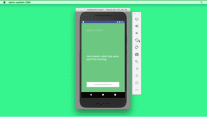
Proto.io

Pro - productivity tool

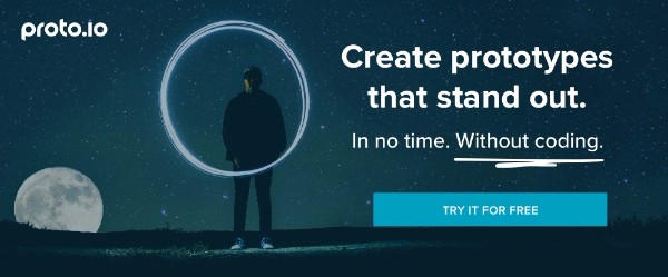
          Proto.io enables you to construct prototypes at any level of complexity. You may want to share a low-fi prototype to get feedback on the design direction you’retaking. Or, it may be an ultra hi-fi test version that’s difficult to tell from the real thing, or something in between.

You don’t need special design skills to use Proto.io, and you don’t have to worry about coding. All you need is an idea of what you plan to build.

Proto.io enables you to do your design work, create prototypes, preview and share information, conduct testing, and collaborate with team members; all from a single platform.

This web application is made up of three major elements. 1) The Dashboard helps you maintain version control, and helps you with your collaboration efforts as well. 2) The Editor takes on the heavy lifting required to build complex, interactive, high-fidelity prototypes. 3) The Player is indispensable for conducting testing and viewing the results of your efforts on your browser to see how your prototypes look and feel on mobile devices.

SITE123

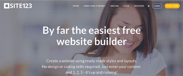
          SITE123 is a great choice for beginning web designers,as well as for those who are strapped for time and in need of something that will enable them to set up a website (or a portfolio) in mere minutes.

Since SITE123 comes with ready-made layouts and a WYSIWYG editor, all that’srequired is to upload your content and put it in its proper place. The intuitive interface encourages using text, video, gallery, and other modules which can be customized and arranged on the dashboard. Every website you create automatically adjusts to tablets and smartphones, so your brand will display perfectly on every device.

SITE123 is multilingual. This new feature makes it easy to create a website in any language you select. Other clever features include an app market that enables you to integrate external apps into your websites, and a web wizard for updating a website after it’s up and running.

Xfive

Xfive development agency

          Xfiveis an Australian-based development agency with offices of three continents, and can boast of a worldwide network of professional developers. When you need their services, help is usually close at hand.

Xfive(formerly XHTMLized), not only performs the development work on website designssubmitted to them, but they can also assist in the design if needed; including the design and development of WordPress themes and plugins. They offer their services to large teams or agencies, as well as to individuals, and they provide assistance to those having large projects or multiple projects.

The Xfive team likes to think of themselves as a partner or an extension of a design team, when they provide their development services. They also carry over their idea of caring for their clients when working with you on a single project, whether you represent a team, or an individual or freelancing web designer.

Pro

Pro WordPress Theme

The Pro approach to website building differs from that of most of its competitors. This WordPress app features 3 separate builders (content, header, and footer), along with a valuable selection of web-building tools that primarily consists of popular Themeco and 3rd party developed plugins.

Pro’s focus is on creative website design. As such, it offers free access to Themeco’s creative professionals community, where you can share ideas, seek assistance, and learn.
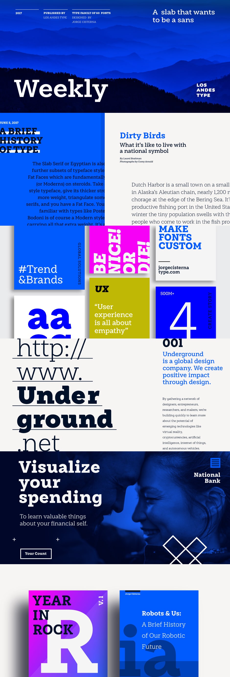
wpDataTables

wpDataTables Useful Productivity Tool

It’s generally not a difficult task to create simple tables or charts to incorporate into a website, but building complex, interactive, and responsive charts based on huge amounts of data is a completely different story.

wpDataTables does all the heavy lifting for you. With this app in your toolkit, you can create tables and charts that are not only informative and accurate, but attention-getting as well. Even better, there’s no learning curve involved.

Webflow

Webflow Responsive Website Builder

          Webflow is a multipurpose web design tool that unites your prototyping, design, and development work in a single platform. There’s no need to write code, and once your design’s ready, you can launch straight to the web, or export your code to hand off to developers to use however you’d like.

Webflow enables you to create ultra-high-fidelity prototypes powered by HTML, CSS, and JS, allowing you to dramatically shorten design and development time, as well as the inevitable feedback loops.

Pressmate

Pressmate all-in-one WordPress productivity tool

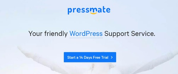
Pressmate is for those who already have websites up and running, own a website, or are finding it difficult to keep up to speed on design and development tool updates. Pressmate keeps its clientele up to date on everything to do with WordPress, including its themes and plugins.

They also monitor website performance, remove malware, and offer 100% uptime reliability by backing it up on the cloud.

Ultra

Ultra productivity tool

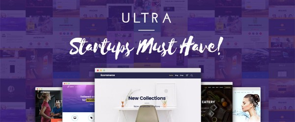
Meeting and exceeding a client’s requirements sometimes requires taking a novel approach to website building; and a novel approach is precisely what Ultra offers its users.

This innovative website-building tool relies on a modern, well-structured collection of customizable and responsive pre-made row designs. Using drag and drop, you can apply this modular approach to page building, and create or change a page in minutes.
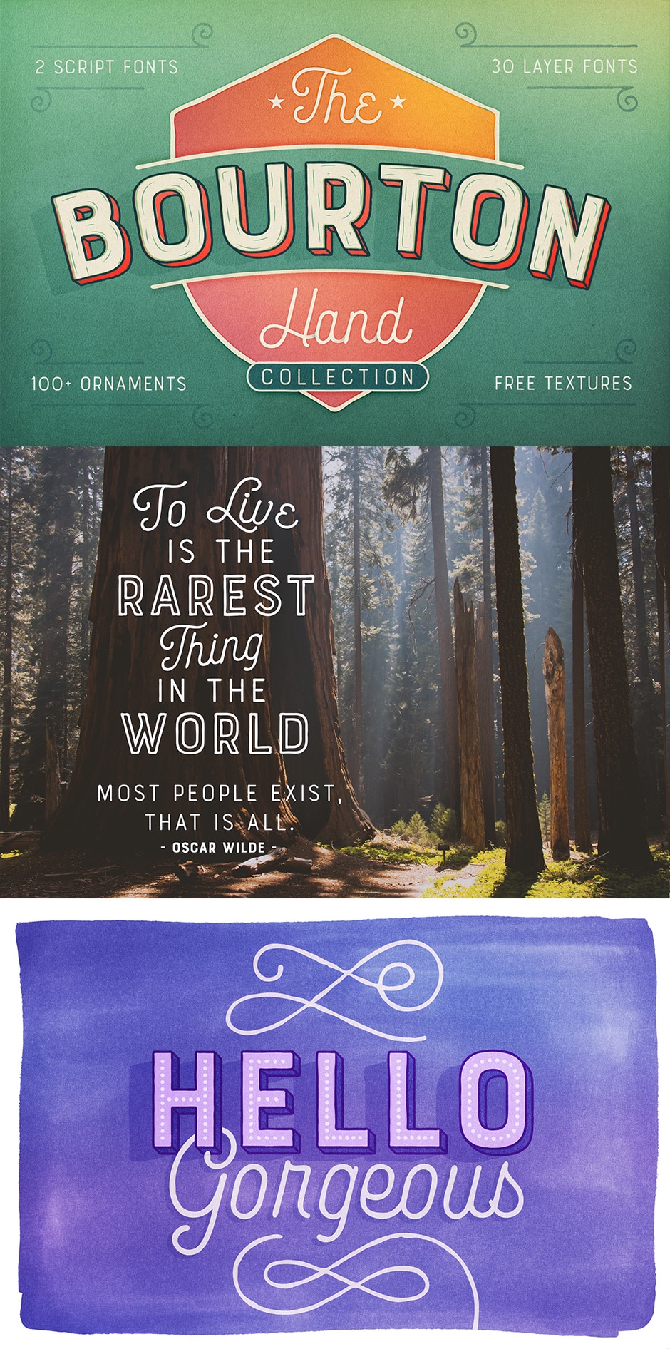
FFonts

Ffonts free font resource

It’s a good feeling to know that there’s a large inventory or free fonts you can tap into, but what about the time it takes to find exactly the font you want? FFonts solves that problem by neatly placing its thousands of free fonts in 30+ clearly defined categories. These categories range from serif and sans serif, to classical, comic and cartoon, to computer and digital.
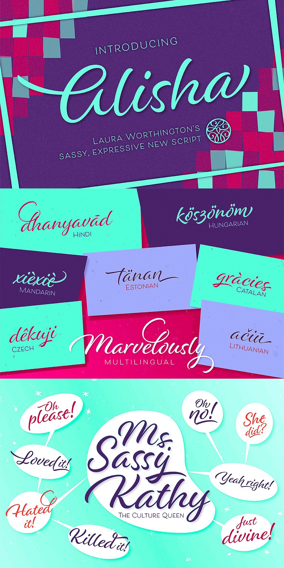
WhatFontIs

WhatFontIs font choosing tool

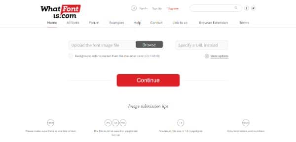
It can be more than a little annoying to come across a “must have” font for one of your projects, when you don’t know its name, nor do you have the means to identify it. WhatFontis provides a ready solution to that problem.

Simply submit a sample of the font in question, and this free service will either identify it, or provide you with one or more nearly exact matches.

SnapPages

Snappages website template

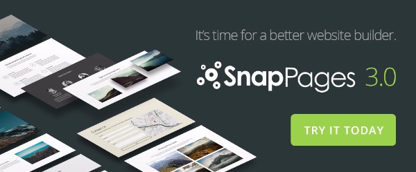
SnapPagesis well named. The professionally-crafted template included in the latest version, SnapPages 3.0 provide excellent starting points for building page after sharp-looking page quickly and easily. Your work and your completed website are hosted on the cloud. You’ll have access anytime when there’s a need for editing or maintenance, plus you’ll enjoy 100% reliable backup.

SnapPages is a great choice for bloggers.

Goodie

Goodie web development platform

          Goodie is a software development service/platform that joins clients directly with developers. It is an excellent match for designers of single-page or simple WordPress websites, or e-mail templates. They do quick work, for a fixed, previously agreed upon price.

Once you’ve selected Goodie for your coding needs, you’ll be working directly with a web developer. Should questions or issues arise, they can be dealt with quickly.

BBT Drag and Drop Email Builder

Email Form Builder

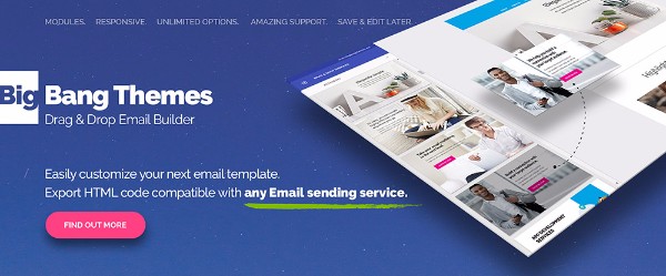
It’s all too easy for a business to get in a rut and keep using the same old e-mail template time after time. Even if it’s producing good results, there’s always room for something better.

The Big Bang Themes Drag and Drop Email Builder offers an easy way to build templates that are customized to fit the marketing situation at hand. A nice selection of responsive pre-made templates comes with the package.

Stockfresh

Stockfresh stock photos website

In the relatively short time Stockfresh has served as a resource of high-quality stock photos and vectors, it’s accumulated an inventory of several million of these items for its clients and customers. Their service is excellent and the prices they ask are competitive.

Stockfresh’s offerings will soon be significantly expanded, making this a good resource to have for your web design needs.

Aurora

Aurora HDR image creator

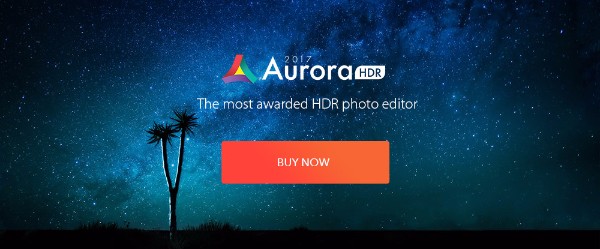
Award-winning websites are generally the result of careful attention to design and great content, including high-quality, attention-getting professional images. With the help from Aurora HDR, you can create jaw-dropping images for your websites.

This project by Macphun and Trey Ratcliff offers more than 40 tools and features to aid you in creating the ‘next generation’ dramatic images. Aurora HDR was created for Mac users, but a PC version is scheduled for release in September.

Conclusion

Just select one or more products from this list of tools and resources! It should go a long way toward making your web-building efforts a little faster and easier.

Now, you can take that project off the shelf that you had put away in mothballs, and get started on it. The new tools and resources you’ve selected should give you that extra free time you’ve been chasing after.

The post 15 Awesome Tools and Resources to Boost Your Productivity in 2017 appeared first on Line25.

My Journey Of Learning Programming Through Flatiron School #35

Original Source: https://webdesignledger.com/my-journey-of-learning-programming-through-flatiron-school-35/

flatiron school

My name is Mason Ellwood, and I’m currently working on Flatiron School’s Online Full Stack Web Development Program. Each week, I’ll be writing about my experience, what I’m learning, and tips on learning to code.

One question I have grown to loath is, is something that probably gets asked most often. Which is “what are you up to these days”….. This is a loaded question and I have a hard time answering it for some reason.

For most people around my age there life follows a track to success. Graduate high school, go to college, graduates college, get a job, then to ultimately move to the suburbs, the end. But right now I am in a weird place on my path to the suburbs. I graduated college, but I am not in grad school, but I am in school. The place that I am at currently makes sense for me; to be in this school right now. But communicating that to… say my dad has been one of the most difficult things I have ever done. Your answer to being asked may be more elaborate than mine, but I usually just tell them “I am in school, studying computer stuff”. If you are in the dev world, then you get it and all the dots connect easily, but outside of it; it’s like me looking into a car engine and trying to point stuff out.

Currently, in school, we are poking around in an ORM. An ORM stands for object relational mapping and is used to correlate sql databases to ruby classes and vice versa. This is how people build databases for their applications as well as instantiate, add, pull, and alter their databases through their program. For me to get into how this all works and how it all fits together, would take weeks. The Flatiron School does an awesome job at explaining this in a comprehensible way. Working through building out a SQLight3 database, then slowly moving towards integrating database with OO Ruby and the importance of it. One awesome lecture I watched recently I have listed below.

The video below is a code walkthrough of building out your own interactive ORM, built by Avi one of the professors and leaders at The Flatiron School.

Please watch the video and ask any questions you may have. I will try my best to answer anything you need clarification on.

Read More at My Journey Of Learning Programming Through Flatiron School #35

You Still Have Time to Enter Your Designs to The A’ Design Competition

Original Source: http://feedproxy.google.com/~r/Colorburned/~3/4giKiGLazpU/

A’ Design Competition is one of the World’s largest international design competition. The A’ Design Competitions are organized in numerous creative fields to acknowledge the very best designers from all countries in all disciplines. Entries to the competition are peer-reviewed and anonymously judged by an influential jury panel of experienced scholars, prominent press members and experienced professionals. The A’ Design Award promises popularity, eminence, promotion and international recognition to The A’ Design Award Medalists through the A’ Design Prize which is given to celebrate the awarded designs.

The “A’ Design Prize” was designed to create value for the awarded works. The Coveted “A’ Design Prize” includes : design excellence certificate, invitation to the black-tie award ceremony, online + offline exhibition of award winning designs, poster of award winning designs, hardcover annual of best designs, special 3d printed metal award trophy in luxury black box, international press campaign, interview with the award winning designer, press kit preparation and distribution, good design symbol, pitching award winning designs to press members worldwide, articles through design award press partners, inclusion in World Design Rankings and further tools and services for PR.

A’ Design Competition was founded to publicize and recognize top design works in all countries and in all creative disciplines. The primary aim of the A’ Design Award is to create a global awareness and appreciation for good design practices and principles by promoting the best designs in all countries and in all creative fields. The ultimate aim of the Award is to encourage designers, companies and institutions worldwide to create superior products and projects that advance society.

Every year, original design work that focus on positive change, technology, design and creativity from across the globe are awarded with the A’ Design Award. Entries to A’ Design Competition are accepted in categories such as Spatial Design, Graphics Design, Industrial Design, and more. The complete list of award categories are available here.

Submissions are accepted every year until the design award deadline of February 28th and results are announced every year on April 15. Designers worldwide are called to take part in the accolades by signing-up their greatest design works, projects and products. Learn more about A’ Design Award & Competition and see past winners at A’ Design Award Winners’ Page which showcases great design work worldwide.

Present Your Works today to The A’ Design Award : Submit Your Design Work.

Below enjoy a selection of some projects that you might like:

ab097409ba36095e9017641eadef3e50899f9c15-t710

Pepsi Metlife Stadium by PepsiCo Design and Innovation – Platinum A’ Advertising, Marketing and Communication Design Award in 2015

1311985296438cb43389399eda3957d0d181b4ef-t710

Santander World by Jose Angel Cicero – Platinum A’ Arts, Crafts and Ready-Made Design Award in 2015

db22526a2ac4b9b541ce845efc16c0be8d5fe706-t710

Netatmo Welcome by Netatmo – Platinum A’ Home Appliances Design Award in 2015

85e7ac38b43e28829b7f292c53373899966ae376-t710

Ane by Troy Backhouse – Platinum A’ Furniture, Decorative Items and Homeware Design Award in 2015

142b52b5ae4f4f98e1645c07f3ea17e08b9ee6f9-t710

Smrt Image Lumica by Design Team – Platinum A’ Scientific Instruments, Medical Devices and Research Equipment Design Award in 2015

dc108a99d2df3a38c8e467c0c6b1784b54f3e2ac-t710

Lin Mao Sen by Ahead Concept Design – Platinum A’ Interior Space, Retail and Exhibition Design Award in 2015

bf68c7016810734bb2ac309e6de4a1510bbad43e-t710

Ice Krakow by Ingarden & Ewý Architects – Platinum A’ Architecture, Building and Structure Design Award in 2015

81a27077db17f21ac8129851b3f4595c6d096147-t710

Air Touch by LKK Innovation Design Group – Platinum A’ Home Appliances Design Award in 2015

928a38b0763773b973d5a14ad93021ae1fb98f5b-t710

Pegtop by Anastasia Gavrilova – Golden A’ Bakeware, Tableware, Drinkware and Cookware Design Award in 2015

e51ec5a3cd4a3bca2eb62b93ac27d486958f69e2-t710

Plexus by Taras Zheltyshev – Golden A’ Lighting Products and Projects Design Award in 2015

2fceea205c3f6a5dbc19922c7ba7cd75ec626b7c-t710

Reflect by Ice9 Interactive – Golden A’ Generative, Algorithmic and Parametric Design Award in 2015

0356324a38e09ace60ff8548e50eb390454458fd-t710

Sarp 46m by SARP YACHT – Golden A’ Yacht and Marine Vessels Design Award in 2015

4a0e98b128e791400536647a8e76274c1aa3e589-t710

Bond by Jimin Jung – Golden A’ Jewelry, Eyewear and Watch Design Award in 2015

b35da7d35de178dc48def055c2805da1ee103958-t710

Nissan Skyline by E-graphics communications – Golden A’ Advertising, Marketing and Communication Design Award in 2015

55979178351c2f67f3180323a5fc6f7947597d6c-t710

Robo Ming by LKK Innovation Design Group – Golden A’ Digital and Electronic Devices Design Award in 2015

246f6f872582945d659df8b0b3ab76f0f03c31de-t710

Méo by Desrochers Olivier – Golden A’ Furniture, Decorative Items and Homeware Design Award in 2013
41373ea80b3b5ac191c1d7aa3209e9734eb36b4b-t710


Dell’ Albero Limoncello by Kent Walker – Golden A’ Packaging Design Award in 2013

26a3b9635722aa5c4d463969b4515c3773bf28ea-t710

Paintable by Nien-Fu Chen – Golden A’ Baby, Kids and Children’s Products Design Award in 2013

45460dde363d5f9e0d76fe4042d0b2ca73aa7f2a-t710

Xx265 by Vestel ID Team – Golden A’ Digital and Electronic Devices Design Award in 2013

114429c11a1465b40854ecccaefae1e999d6a3e5-t710

Multimedia Exhibition Lsx20 by Design studio H2E – Golden A’ Interior Space, Retail and Exhibition Design Award in 2014

Hope, you liked the designs above. We will publish a selection of award winning projects on April 15, once the results are public. To have an opportunity to get your design published, featured and exhibited, remember to enter it before the deadline. Take part with Your Greatest Designs today to The A’ Design Competition : Nominate Your Design Design.

The post You Still Have Time to Enter Your Designs to The A’ Design Competition appeared first on Colorburned.

Save $3465 on The Influential Font Lover’s Library

Original Source: http://justcreative.com/2017/08/02/influential-font-lovers-library/

Premium font bundles are my weakness. They’re just such good value, especially when you consider that one typeface alone can cost $20-$50+. And this Influential Font Lover’s Bundle is no exception!

In this hand-selected bundle, are 17 influential typefaces (470 fonts in total) which usually come to a total of $3465, however you can get them at 99% off for a limited time only, making the bundle just $29!

This is crazy good value, especially when you consider that Futura (one of the most successful fonts of all time) and the trendy Bourton Hand are included inside, along with a huge variety of other styles including modern sans fonts, hand-drawn fonts, display fonts, brush fonts, serif fonts and scripted fonts.

To summarise, you’re going to get all of the below for just $29:

17 best-selling, versatile and exceptional font families (featuring a total of 470 individual fonts), perfect for adding professional typography to your design work.
Many fonts include extra weights, styles and stylistic alternates.
Many fonts also include bonus/extras packs, containing additional creative resources.
Fonts are organised into carefully labelled folders, including desktop and web versions for all fonts.
Extended licensing
Full customer support from DesignCuts

» Check out this deal now (99% Off) – Deal expires August 15, 2017

Font Bundle

Futura

Futura Font

Bourton

Bourton Font

Karu

Karu Font

Alisha

Alisha Font

Weekly

Weekly Font

Sonny Gothic

Avant Garde Font

The quality of this collection is superb. Each family includes a wide range of supporting weights, giving you ultimate creative choice. Details such as the kerning, baselines and letterforms have been meticulously refined, by some of the font industry’s biggest foundries. Enjoy a huge array of language support as well as tons of creative extras. These fonts have never been discounted to this extent, in fact, you’ll be hard pressed not to pay hundreds of dollars for some of these individual families.

This is an exclusive offering at Design Cuts, and a once in a lifetime opportunity to own all of these game-changing font families as part of one affordable collection.

» Check out this deal now (99% Off) 

Hurry as this deal expires August 15, 2017

The Lowdown on Becoming a Developer

Original Source: http://blog.teamtreehouse.com/lowdown-on-becoming-a-developer

If you’re searching for a new career path and you’ve heard that the tech industry has a staggering number of jobs available, then you’ve heard correctly. In fact, economic research by Glassdoor into the value of unfilled U.S. jobs estimated that there are “263,586 open IT roles listed online, with an economic value of $21 billion.” As tech becomes more and more integrated into our everyday lives, so does the need for people who can shape and control it. The result: a booming demand for developers. But there are a few key factors that are often left out when people talk about the demand for people who can code. Below are a few important caveats to becoming a developer that aren’t always mentioned.

Location

Yes, when it comes to the opportunities available to those who can code, there are jobs in startups and silicon valley that much resemble pop culture’s portrayal of the tech industry (think “The Social Network” or “Silicon Valley”).

But, in reality, the demand for developers expands far wider than that, tech jobs are everywhere. In fact, you’d be hard pressed to find an industry or a company that isn’t touched by tech today or featuring talented programmers on their teams. Don’t assume you’d need to move to a tech hub or big city to embark on a successful career as a developer. Don’t just take my word for it, search “developers” in your local area, or even take a look at open positions at a particular company that interests you.

Career Attainability

Yes, when it comes to how attainable developer careers are, anyone can learn to code and you don’t necessarily need a CS degree to be a developer. Stack Overflow’s most recent Developer Survey illustrated that 50% of the developers who participated confirmed they didn’t have a CS degree. Provided you have the right coding skills, the majority of employers will be interested, regardless of where you learned those skills.

But, don’t assume learning to code and landing your first job will be easy. Learning a programming language is similar to learning any language. At first, it will be challenging and alien to you, but with hard work and dedication, you’ll progress. There will be learning roadblocks along the way, and occasionally, you will feel like you want to quit. When that happens, know that you’re not alone. Both aspiring and professional coders encounter challenges with their code, but problem-solving is the skill they – and you – will use to overcome them.

Be Patient

Yes, there is demand for developers and there are a lot of people taking advantage of the opportunities and competing for positions. Make sure you are ready before you start interviewing for your first job as a developer.

But, if you don’t land that first job, don’t be disheartened. Ask for feedback from the interviewer, take it to heart and go into your next interview more confident. Also remember that new job opportunities will open up, and it may take time to find the right fit for you. It’s worth the wait.

Find the Right Language For You

Yes, there are a lot of programming languages out there today, which can seem a bit overwhelming when you start learning to code.

But, you don’t have to be good at every aspect of tech. Don’t try to be a Jack of all trades, master of none. Find which language you like and focus on specializing your skills. Not sure where to start? Here’s a great post about choosing a programming language. Once you’ve sharpened your skills, you’ll also find it easier to embark on your job search. There’s also no reason you can’t add languages to your skill set as you grow as a developer.

Never Stop Learning

Yes, you may have heard it takes X number of weeks or months to learn to code.

But, as an aspiring developer, you should also be comfortable with knowing that your learning is never complete. Tech is constantly evolving, which means that your programming skills will have to too. Keep your skills sharp and your knowledge up-to-date to stay competitive in the industry.

Hopefully, these caveats will help depict the bigger picture when it comes to embarking on a career as a developer. Have thoughts you’d like to add? Share them below.

Start learning to code today with your free trial on Treehouse.

Tips I Wish I’d Known When Learning to Code

The post The Lowdown on Becoming a Developer appeared first on Treehouse Blog.

An Introduction To Material Design

Original Source: http://feedproxy.google.com/~r/Colorburned/~3/BYJ6izYNvd0/

When Google released Android Lollipop, it also brought into the market its whole new Material Design concept. Ever since its debut, designers and technologists everywhere are full of praise for the new design language, but for those who are new to it, here is a look at what Material Design is all about.

Basically, Material Design is a visual language for users, a set of design styles that blends the essence of the classic principle of good design with the innovation and opportunities of science and technology. But Material Design also has a far broader goal. It aspires to unite Google’s expansive product line under a rich set of design styles and principles, so that a uniform interface is found through all of Google products, everything from watches to cars. By developing a single underlying system, Material Design will allow for a unified experience across platforms and device sizes.

According to the Google’s manifesto, the concept of Material Design is based on three Principles:

“Material” is Just a Metaphor.

The whole design is based on the physical and material world, with the material metaphor being the unifying theory of a rationalized space and a system of motion. What it means to say that the material design is grounded in tactile reality, and takes it inspiration from the study of paper and ink, its motions and how it interacts. To sum up, Material Design brings an element of physical reality to the digital and yet remains technologically advanced and open to imagination and magic.

Speaking more on the subject, the surfaces and edges in Material design takes visual cues from the physical reality with the added flexibility of the digital material that creates some new affordances. It also makes use of the fundamentals of light, surface, and movement in its design, especially in the way objects move, interact, and exist in space and in relation to each other. These familiar tactile attributes resonate well with users.

material-design-2

Bold, Graphic, Intentional!

Moving to the second principle, Material Design makes use of all the basics of print design, that is typography, grids, space, scale, color, and use of imagery. But Material design does not take these elements just at the face value and aesthetic quality, it uses these elements to create hierarchy, meaning, and focus.

Material Design creates a bold and graphic interface by employing deliberate color choices, edge-to-edge imagery, large-scale typography, and intentional white space to provide a whole new experience to users. Importance is also given to user actions such that core functionality is evident immediately and also provides way-points for the user.

Motion Provides Meaning to Design.

Another salient feature of Material Design is that it gives attention to motion and respects and reinforces the user as the prime mover. It is the primary user whose actions are inflection points that initiate motion. All the actions and the motions thereof take place in a single environment without breaking the continuity of experience. To focus the attention, all motion is significant and appropriate and does not divert attention. Transition, which is yet another element of motion, is efficient yet coherent.

With the basics of Material Design and its principles out of the way, let’s take a look at the impact of material design and how it will appear to end-users.

material-design-1

Android

Simply from a visual perspective, Material Design will transform the look of the entire Android ecosystem. From the looks of the apps to its color palette, Google has set up a series of rules that influences it all. This is done by standardizing the graphic layout of Android and removing its complexity.

To ensure readability across all devices, Google has also set up a standard grid that dictates spacing across all sorts of shapes and sizes. Moreover, it is more vivid and simple!

Moving away from visual elements, an important aspect of Material design is its motion. Even in android, Material design introduces an important element in form of three-dimensional elements such that the apps in form of standard grids aren’t just a collection of white squares but is also embedded with the behavior of a real cardstock which is evident when it moves around the screen. This also applies to animated features which uses real life shadow and perspective to give depth to the design.

Beyond Android

One important thing to keep in mind about Material design is its broad outlook, that it is not just limited to Android and is always looking into new avenues of digital technology. From Glasses, Robots, Laptops, TVs to Houses, Google has its fingers on everything. And its latest material design language reflects this vision. Material Design is designed to be uniform across all platforms and devices, and is not limited to just tablet or phone screens. Material Design reflects an innovative yet systematic approach to its consumer-product interaction and aims to make it more simple and yet more lively!

What do you think of Material Design? Share your views in the comments below!

The post An Introduction To Material Design appeared first on Colorburned.

It is now the time to Nominate Your Designs

Original Source: http://feedproxy.google.com/~r/Colorburned/~3/AKbqeuzPwLs/

A’ Design Award is the World’s leading international annual juried competition for design. The A’ Design Competitions are organized in many creative fields to highlight the very best designers from all countries in all disciplines. Entries to the A’ Design Competition are blind peer reviewed by an expert jury panel of leading scholars, prominent press members and experienced professionals. A’ Design Award & Competition promises popularity, prestige, attention and international recognition to The A’ Design Award Laureates through the Coveted A’ Design Prize which is given to celebrate all awarded designs.

Entering your work to A’ Design Competition is a great opportunity for everyone who produces original design work. The A’ Design Competition is an exceptional medium to publicize good work to millions of design oriented audiences including design buyers and press members. Indeed, as a part of the A’ Design Prize, the laureates are given services such as exhibition of awarded works, inclusion of awarded designs in annual yearbook of best designs, a special public relations campaign for laureates, invitation to the glamourous gala-night and award ceremony and most important of all, the ability to use the award winning design logo on your marketing and communications. Here is what A’ Design Competition laureates get; Checkout the complete A’ Design Prize.

The A’ Design Award & Competition has a philanthropic goal to advance society by pushing the frontiers of art, design, creativity and technology forward by pushing innovators to come up with better ideas. The “A’ Design Award’s Award Winning Design” logo, given to award winning designs, signifies authentic, useful and efficient designs that help the world become a better place.

Every year, original design work that focus on positive change, art, design and creativity from across the globe are awarded with the A’ Design Award. Entries to A’ Design Award are accepted in categories such as Architectural Design, Graphics Design, Industrial Design, and more. The unabridged list of competition categories are available here.

Nominations are accepted annually until February 28th (For 2016, the deadline has been extended to March 7th) and results are announced every year on April 15. Designers, agencies and brands worldwide are called to join the accolades by nominating their best works, projects and products. Discover A’ Design Award and see past winners at A’ Design Award Press Page which is a showcase of great design work worldwide.

Join with Your Designs today to The A’ Design Award : Nominate Your Design Project.

See some of the award winning works below.

1b84b6226b0057434236db1167191c2ea0d03b68-t710

Barb Perfume by Roma Lazarev – Platinum A’ Packaging Design Award in 2015

91cee763a6ac0b8b9976d6a3c54f5fbe22179ca6-t710

Maxplo by Hae Rim Jung – Platinum A’ Futuristic Design Award in 2015

76a91ab57c83a17aacd30e995fd968e47e082902-t710

Nemesis Fins by Speedo Usa – Platinum A’ Sports, Entertainment and Recreation Equipment Design Award in 2015

7099f867b1cfb0ffe8d07ae50c759720f5a84334-t710

Calendar 2015 “town” by Katsumi Tamura – Platinum A’ Graphics and Visual Communication Design Award in 2015

557bab07f979538f40d68d16d5c63185fc78d76d-t710

Chhatrapti Shivaji International Airport by Mumbai International Airport Ltd. & SOM – Platinum A’ Architecture, Building and Structure Design Award in 2015

ef17f125aa9274dc7d10f917bb1e7e6a0c395e16-t710

Williamson Tea Elephant Caddies by Springetts Brand Design Consultants – Platinum A’ Packaging Design Award in 2015

8ae1c2d2f8e20aba6f38a6124d61e3c5985c0aac-t710

Tactica One by Michael Chijoff – Platinum A’ Bakeware, Tableware, Drinkware and Cookware Design Award in 2015

bf68c7016810734bb2ac309e6de4a1510bbad43e-t710

Ice Krakow by Ingarden & Ewý Architects – Platinum A’ Architecture, Building and Structure Design Award in 2015

0356324a38e09ace60ff8548e50eb390454458fd-t710

Sarp 46m by SARP YACHT – Golden A’ Yacht and Marine Vessels Design Award in 2015

aba15161e8efc8330df9aa6ee84cdbac6c0ec02d-t710

Onebip by Gokmen Atak – Golden A’ Mobile Technologies, Applications and Software Design Award in 2015

f139b589d2022db6f856186b3f9e80329e13abd4-t710

Kawaii : Cute by Tetsuya Matsumoto – Golden A’ Interior Space, Retail and Exhibition Design Award in 2015

14dc734435e420f5c5c8e5b54f90990df64d4d69-t710

Sterling Bag-The Epitome of Versatilit by Alejandro P Figueredo – Golden A’ Fashion and Travel Accessories Design Award in 2015

6808a2bc59436616d79f012fe23732a623f86a0f-t710

The Cut by Alessandro Isola – Golden A’ Furniture, Decorative Items and Homeware Design Award in 2015

5e63dc64abb1a8f0c9f8f23b63f072d849aed7c5-t710

Pooleaf by SIL GI , LEE – Golden A’ Art Materials, Stationery Supplies and Gift Items Design Award in 2015

25bbc3d7be20243c556cbd09b3cfd669fe06a9c6-t710

Musik by Clive Choo – Golden A’ Advertising, Marketing and Communication Design Award in 2015

7f98a4c4e8d989d4fd3349789fe5669db5b737e2-t710

Baan by Mr. Paitoon Keatkeereerut, Mr.Chawin Hanjing – Platinum A’ Furniture, Decorative Items and Homeware Design Award in 2014

08ccac152de8af5f37d74f2cfd2ddc25a3eef56b-t710

Tango Pouch by Gretchen – Anne-Christin Schmitt – Platinum A’ Fashion and Travel Accessories Design Award in 2014

eb026e932c529eecd06371e6fdd193cce5cbce81-t710

Profit Sports Drink by Jeff Klok – Golden A’ Packaging Design Award in 2014

114429c11a1465b40854ecccaefae1e999d6a3e5-t710

Multimedia Exhibition Lsx20 by Design studio H2E – Golden A’ Interior Space, Retail and Exhibition Design Award in 2014

6d30e4797a45ab92f13f4a3845a415c887997d49-t710

Frohne Eclip by Derrick Frohne – Golden A’ Digital and Electronic Devices Design Award in 2013

Hope, you liked the designs above. We will publish select award winning projects on April 15, once the results are announced. To have an opportunity to have your design published, featured and exhibited, remember to nominate it before the deadline. Send Your Designs today to The A’ Design Award & Competition : Send Your Best Design Project.

The post It is now the time to Nominate Your Designs appeared first on Colorburned.