The State of Web Design, December 2017
Original Source: https://www.webdesignerdepot.com/2017/12/the-state-of-web-design-december-2017/
 I might have noticed a trend or two in web design this last year.
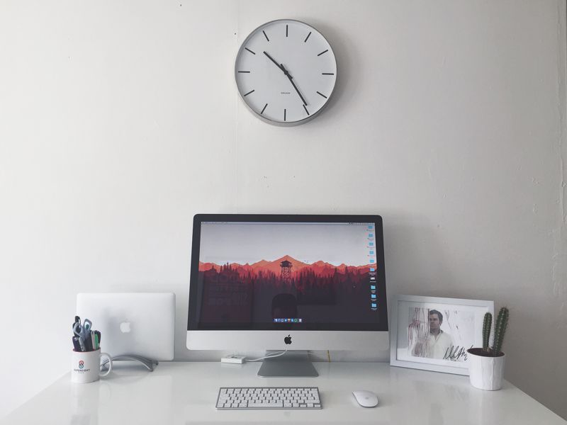
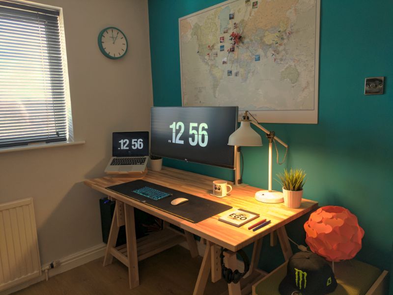
Let me rephrase that: I spend the vast majority of my time online. I do my shopping, here, and my work, and a lot of my leisure reading. I browse the Internet mid-gaming, whether to look up information on the game I’m playing, or just to entertain myself some more because my ADD is really that bad. I even spend a huge amount of time browsing portfolio sites, where designers get to live out their design fantasies.
And even with all of that, I know for a fact that I’ve barely scratched the surface of this huge-ass network. But in my corner of it—the corner mostly dominated by Western designers—I have noticed a trend or two. And here’s where we are:
Revenge of the Flash
No, not that Flash. I wish. Watching Barry Allen tear the world apart with his sheer ridiculous power would be kind of awesome.
I believe that we are currently in the middle of a light backlash, though few might say it that way. It’s a response to the trend of flat design (and the short moment of brutalism that would follow). But instead of making 3D-looking dials and knobs on every UI again, many people seem determined to resurrect Flash, or at least call up its spirit and put it into JavaScript’s body.
Designers very quickly got tired of “flat design” as a style. I don’t blame them. Many people just grabbed a framework that looked like Material Design and didn’t think too much about it. Nowadays, while many sites are still technically flat, they try to avoid the feel of flat design, and even the word itself. Their answer to this has been to take advantage of HTML5 and JavaScript to animate pretty much everything they could think of. Think I’m kidding?
Daniel Archam’s brutalist-looking website depends on JS to work at all. And it has a screen-saver. Now don’t get me wrong: it’s a creative and good-looking site. I even featured it in November’s monthly portfolio article. But you can’t deny that there’s a certain mentality at work, here.

The response to flat design has been turn it into flash design. Or some weird post-minimalist thing. Or some combination of the two. This mentality has resulted in some beautiful and highly innovative websites that are unintuitive, inaccessible, and generally a pain to use.
I predict that the pendulum will swing once more (now there’s a safe prediction if I ever saw one). Web standards advocates will probably turn their attention to JS and animation in general, and point out some of the flaws inherent websites that require JS to show their content at all. Then some people will take that too far, and ditch JS entirely, and perhaps CSS, too. Then there will be a backlash to that.
I’m only mostly kidding about that last part.
The Divide
I feel like the web design community may, for a while, become split in two. I mean, it kind of already is, but it might even become official. The two primary parties will probably be what I call The Standardistas and the Experimentalists.
The Standardistas are dedicated to making sure the web is accessible, usable, and as idiot-proof as humanly possible. If they can build it without touching JavaScript, they will. If they can make it a static site, they probably will. Fancy animations and effects are used minimally.

The Experimentalists are tired of being constrained by the technology of our era. As far as they’re concerned, if the user’s JavaScript is broken, or their browser is outdated, who cares? Their target demographic uses up-to-date hardware and software. They’re going to try new things, because they intend to lead the next wave of innovation, or at least follow right behind whomever is leading it.

Those are extreme descriptions, of course. Any good designer will recognize characteristics of both sides in themselves. The industry needs both. But as the pendulum keeps swinging, I can see more and more designers choosing one path over the other to some extent. I doubt it’ll ever come to blows, metaphorical or physical, but a contest of sorts may one day come.
Variety Ain’t Just a Magazine
People love their bandwagons. While some people are set on going their own way, and others are set on going whatever way is opposite the majority, most love a trend. This isn’t necessarily a bad thing. In web design, trends have been used to teach basic design principles, help new technologies catch on, oppose bad practices, and so on.
Sure, adopting a design trend without clearly understanding what it’s for has caused some issues. However, I’d say that overall, trends have pushed the web forward. The fact that a whole lot of websites end up looking almost exactly the same is probably just the price we pay.
That all being said, I have seen a lot more variety this year than in previous years. Maybe that’s because I was looking for it, though I doubt it. I’ve always looked for variety, and it has occasionally been darned difficult to find.
And then maybe it’s because we have a wide variety of trends now, and people are getting on board with all of them. Perhaps that’s the future of web design: if we eventually create hundreds or thousands of distinct aesthetic trends, we’ll get some variety by the sheer force of statistics. I can think of worse futures for the industry.
All around, I think we’re in for interesting times, and a lot of debate. I personally can’t wait.
Hi-Res Xmas Mockup Scene Generator – only $14 $10!
![]()
Source
p img {display:inline-block; margin-right:10px;}
.alignleft {float:left;}
p.showcase {clear:both;}
body#browserfriendly p, body#podcast p, div#emailbody p{margin:0;}


 Businesses looking for online marketing and web services are rarely looking for one provision. Typically, they are looking for an agency that can act as a one-stop-shop for all their internet-based projects.


 The holiday season is upon us, and that’s the perfect time to give yourself a few design goodies. While the season for new releases has slowed some, there are still plenty of news design tools and beta releases to test out. Take the opportunity to play with some of these great new elements for designers.


 Norman Zammitt, Blue Burning, 1982 at SFMOMA
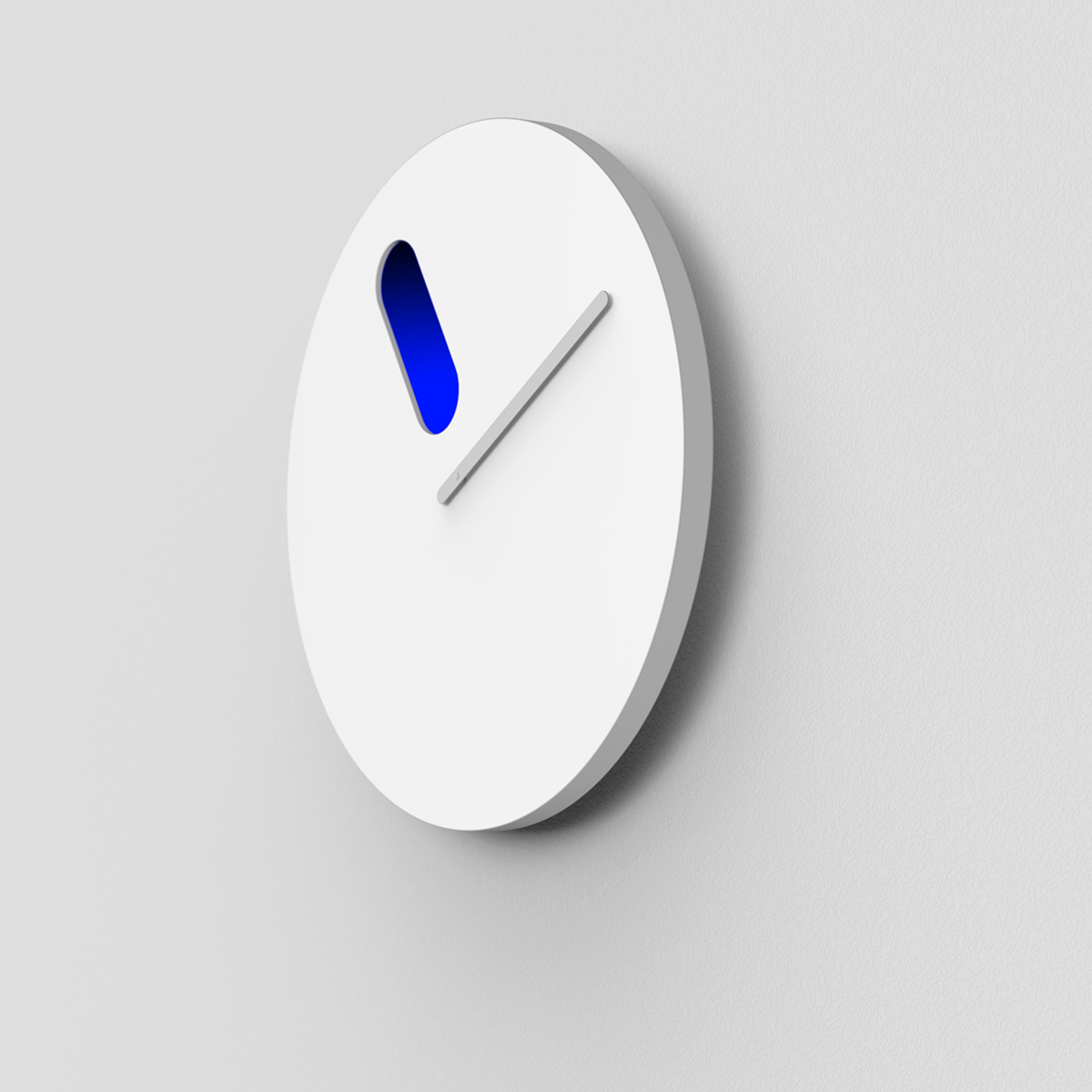
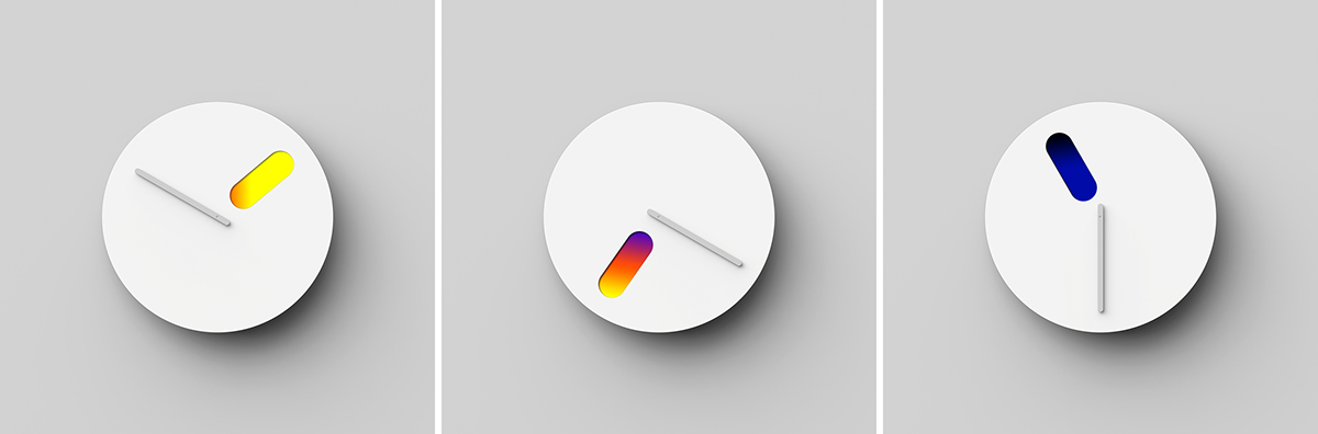
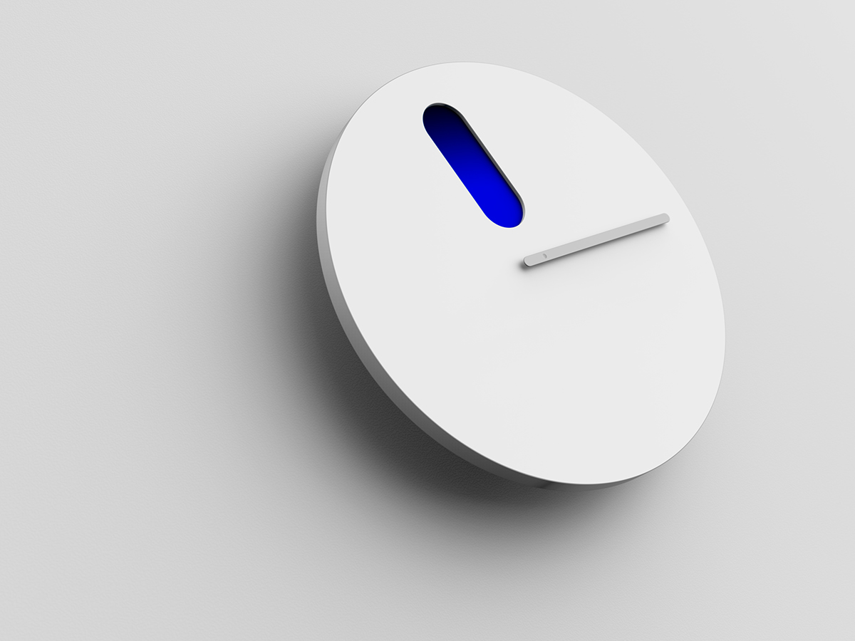
 23 : 30
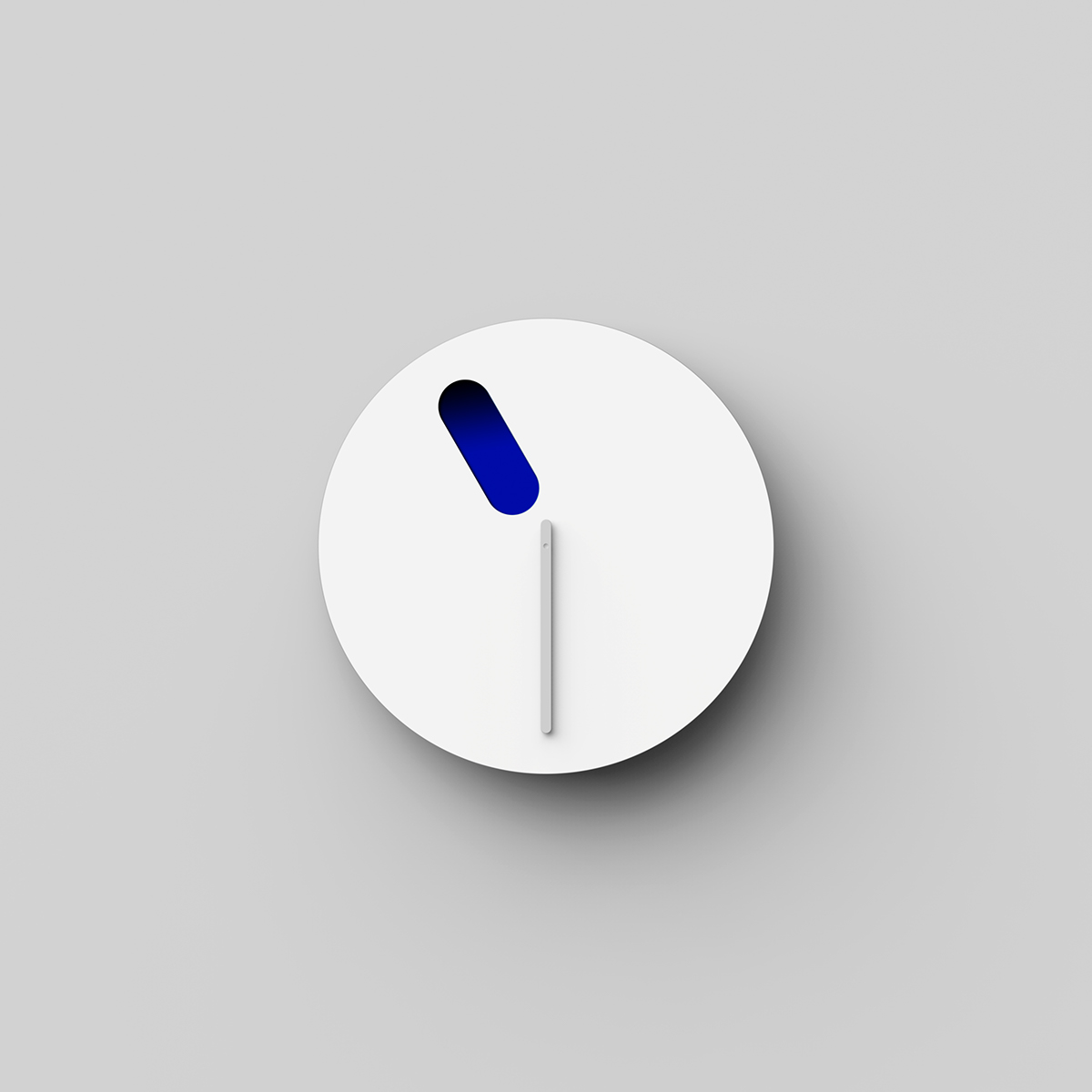
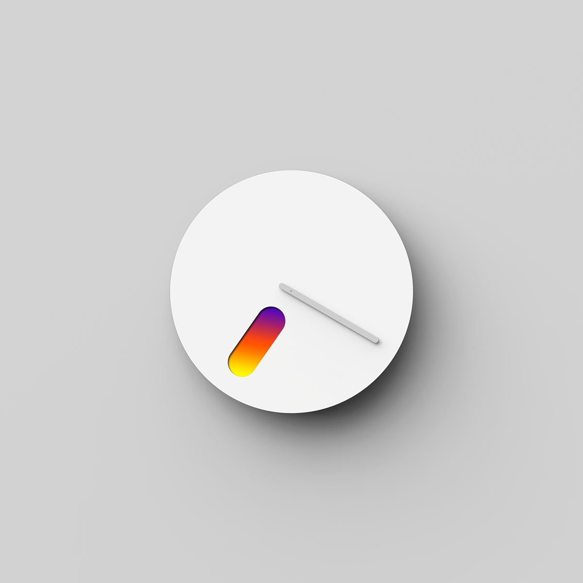 19 : 20
 13 : 50