User Authentication For Web And iOS Apps With AWS Cognito (Part 2)

Original Source: https://www.smashingmagazine.com/2017/09/user-authentication-web-ios-apps-aws-cognito-part-2/


In today’s digital landscape, developers constantly need to be adding new tools to remain competitive and at the top of their craft.

User Authentication For Web And iOS Apps With AWS Cognito (Part 2)

If you regularly create new web or mobile applications, then Amazon Cognito is a powerful tool that can cut 90% of the time it usually takes to set up a custom user-management solution. If that is intriguing to you, then let’s continue the journey to learn more about what Amazon Cognito has to offer.

The post User Authentication For Web And iOS Apps With AWS Cognito (Part 2) appeared first on Smashing Magazine.

10 Outstanding Shopify Themes to Boost Your Store

Original Source: http://feedproxy.google.com/~r/1stwebdesigner/~3/H1SljIH2MhY/

Shopify is one of the most popular eCommerce service providers, with over 500,000 businesses having used their suite of tools to sell online. One of the main attractions for site owners is the flexibility of Shopify themes. Each theme comes with its own customization settings – great for novices and pros alike. Templates can be changed with the ease of a drag-and-drop UI. But advanced designers can take even more control via custom HTML and CSS, thanks to the Liquid templating language.

What this means is that you aren’t limited to just the same old basic designs – regardless of your skill level. And just as great is the sheer selection of professional themes available. No matter what type of store you run, you’re sure to find a theme that’s a perfect fit.

With that in mind, let’s take a look at 10 of the top themes available for Shopify:
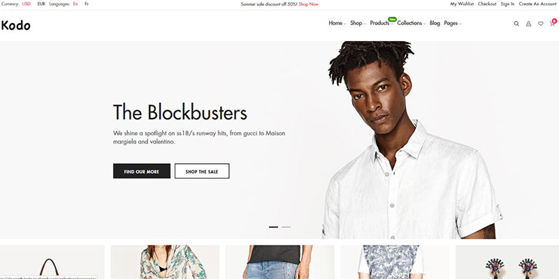
Kodo

Kodo brings the style of high fashion to Shopify. The theme features 11 different home page layouts, with each sporting a classic look that is perfect for high end merchandise.

Product photos are heavily featured to ensure that your products are the focal point. Kodo is compatible with Shopify’s page builder – so customization of the header, footer and body of the theme is simple. You’ll also find lovely mega menus, product quick-views, live search and a sharp look on mobile screens.
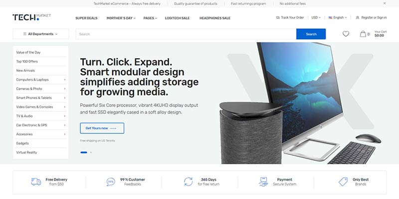
Kodo

TechMarket

TechMarket makes wonderful use of every last pixel on large screens – resulting in a fully-immersive experience. 

But don’t worry; it still looks amazing on a phone. Choose from eight home page designs, two landing pages, 10 category layouts and three single-product pages to get just the look you’re after. The theme also includes several custom blocks, product labels for “new” and “sale” items, along with horizontal and vertical mega menus.
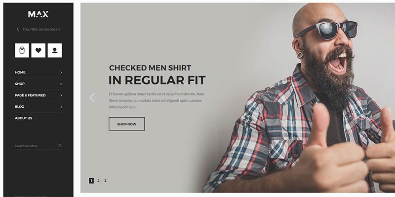
TechMarket

Max

Max is a flexible, multi-purpose Shopify theme that includes a dozen home page layouts. They range from designs featuring large promotional images to those that get right down to business with immediate product display.

There are also multiple category and single-product layouts available, as well. A popup or slide-out shopping cart makes for convenient viewing from anywhere on your site. Product quick-views allow customers to browse products without having to leave their current page. Mega menus, a newsletter popup window and product carousel is also included.
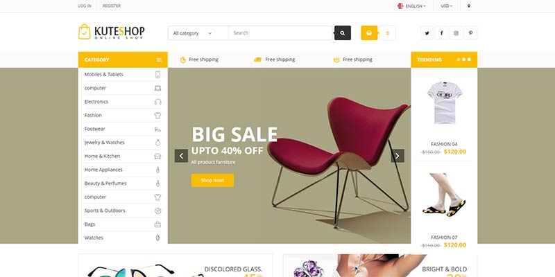
Max

Kute Shop

Kute Shop is aimed at supermarket/general retailers and includes some very handy features. A daily deals module allows for creating limited-time promotions, while a variety of different content sliders encourage further exploration of your catalog.

The theme makes use of AJAX with an optimized toolbar and navigation. Plus, it’s easy to customize with Shopify’s drag-and-drop builder. Choose from multiple home, product and category page designs. Overall, Kute Shop is a very well-organized and easy to navigate theme.
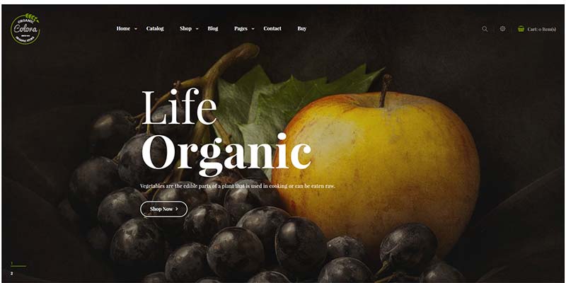
Kute Shop

Colora

Colora sports a look that will bring a nature-inspired feel to your online store. Features include AJAX filtered navigation, mega menus, a blog module, product/category slider and a daily deals module.

You’ll also find four home page layouts, a featured products slider, wish list, product quick-views and the ability to display items in a grid or list view. The look is quite attractive and fits well for shops promoting a natural lifestyle. It’s built to take advantage of large photos.
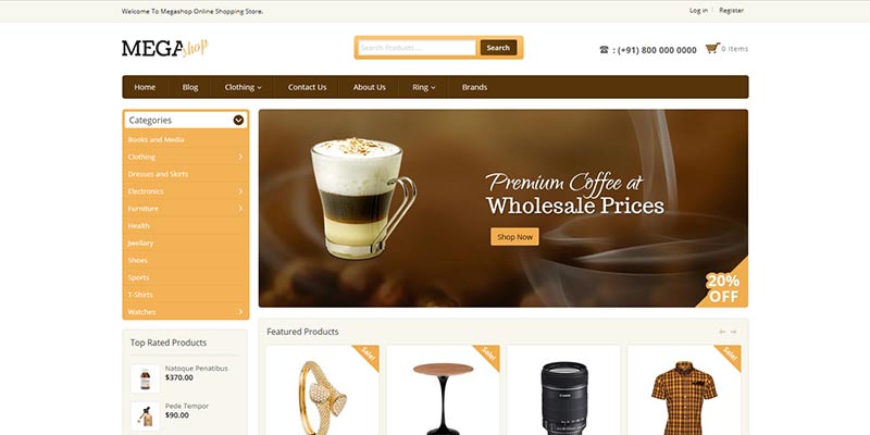
Colora

Mega Shop

Mega Shop works with Shopify’s drag-and-drop builder to let you easily add and move page sections to the desired spot. The theme includes lots of useful features like displaying announcement text, zooming in on images, product quick-views, tabbed content and a newsletter signup form. Also included are sliders for displaying products and brand logos.

Templates for categories and products can easily be customized through the admin. There are six home page layouts to choose from – each with a different specialty. Mega Shop is a clean, convenient and user-friendly package.
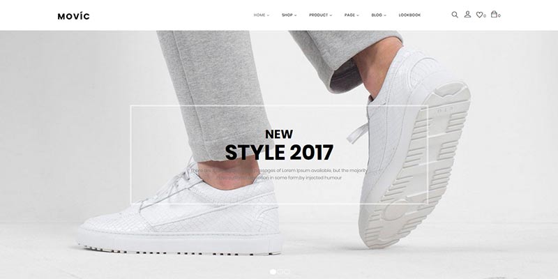
Mega Shop

Movic

Movic lets you show off your products in style. Its’ must-have feature is “Lookbooks”, which let shopkeepers put together highly-visual product collections. They consist of a photo with one or more hotspots that, when hovered or touched reveal the related product.

While intended for fashion, it could easily be used for other areas like home décor. You’ll also find six home page designs, multiple header styles, product hover and quick-view, along with AJAX layered navigation. The available looks are very modern and make nice use of subtle effects to create a high-class shop.
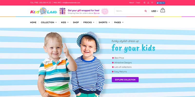
Movic

Kids Store

Kids Store focuses on children’s fashion, but could also be repurposed for a variety of kid-related shops. Navigation is really well-thought-out, with great effects and five different mega menu styles included.

Also in the mix is AJAX product filtering, product quick-views, image zooming, a product carousel and a wish list. This theme will certainly brighten up your Shopify store while bringing attention to your products.
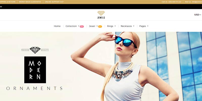
Kids Store

Jewellery

Jewellery ups the ante with a very high-end look. The fantastic grid layout on the home page is both functional and attractive. The use of hover effects brings a level of excitement to images.

The theme features multiple mega menu and header styles, AJAX product filtering, a wish list, product quick-view and image zoom. It’s a very nice choice for those looking to appeal to an upscale audience.
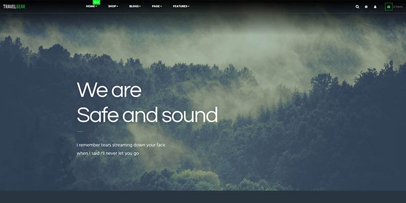
Jewellery

Ap Travel Gear

Ap Travel Gear brings big features to any outdoor or travel related shop. Choose from five home page styles – each featuring an attractive full-width slideshow with a variety of clean-cut grid layouts beneath.

Also included are mega menus for easy navigation and product variant color swatches. Other conveniences like product quick-view and AJAX product filtering are also in the box. The theme supports Shopify’s drag-and-drop builder, so customization is easy.

Ap Travel Gear

Sell in Style

Part of the beauty of Shopify is that you don’t need to gather various components in order to create a beautiful, user-friendly and successful store. Simply pick a theme and start building. All the features you need are right there, waiting for you to take advantage.

The themes featured above will help you achieve the look and functionality you’ve always wanted for both desktop and mobile customers. Having those two items crossed off your to-do list means that you can focus on what you do best: Running your store.

You might like: Shopify vs WooCommerce.


10 top design-related movies

Original Source: http://feedproxy.google.com/~r/CreativeBloq/~3/1-prdvavI0k/the-top-10-design-related-movies

We all love a good movie, but rather than tune into the latest action film or comedy, why not take a look at some of the many awesome design movies and documentaries out there? There’s nothing better than seeing what some of the great designers have done to help boost your creative ideas and spur you on. 

With new for 2017 Netflix series Abstract: The Art of Design booming, it's clear there's a huge appetite in the design community for films about other designers and areas of design.

So in no particular order, here’s a rundown of 10 of the best classic design documentaries to catch, featuring famous names and inspiring stories, covering everything from typography to street art.

01. Why Man Creates, 1968

Seminal artist Saul Bass and Mayo Simon created animated short documentary Why Man Creates in 1968. An early classic, the film discusses the nature of creativity and is as much inspiring today as it was 50 years ago.

02. Helvetica, 2007

American director Gary Hustwit celebrates 50 years of the typeface with a feature-length documentary focusing on the wider conversation about how type affects our culture. 

Released in 2007, the documentary has received widespread recognition and been shown at over 200 film festivals, museums, design conferences, and cinemas worldwide.

03. Design and Thinking, 2012

Directed by Mu-Ming Tsai, Design and Thinking examines how design can influence the world of business and social change and calls on creative minds to work together to change the world. 

Interviewees David Kelley, Bill Moggridge and Tim Brown put forward the idea that attempting to ask the right question is more important than providing firm answers.

04. Objectified, 2009

Following on from Helvetica, Gary Hustwit’s second film looks at the world of design engineering and the creative concepts behind everyday objects such as toothbrushes to tech gadgets. He also completed a trilogy with his third film, Urbanized, which looks at the design of cities.

05. Milton Glaser: To Inform and Delight, 2009

Wendy Keys’ debut documentary offers a glimpse into the brain behind the iconic I ❤ NY logo and New York Magazine. Released in 2008, the film illustrates the full-breadth of Glaser’s artistic work and has become a design docu classic.

06. PressPausePlay, 2011

Directed by David Dworsky and Victor Köhler, PressPausePlay interviews with some of the world’s most influential creators of the digital era to ask: Does democratized culture mean better art or is true talent instead drowned out?

07. The Universe of Keith Haring, 2008

Christina Clausen plays homage to Haring’s iconic career, told through archive footage and a series of interviews from the likes of Jeffrey Deitch to David LaChapelle to Yoko Ono.

08. Sign Painters, 2014

This pay-per-view documentary from Faythe Levine and Sam Macon depicts the fascinating stories of more than two dozen sign painters working in cities throughout the US, celebrating the specialised art form.

09. The Cool School, 2008

A documentary depicting the art scene of 1940s America, The Cool School tells the story of how a small group of creatives gave birth to the LA art scene. Walter Hopps and Irving Blum, owners of the Ferus Gallery, painters Ed Ruscha and John Altoon, and architect Frank Gehry are just some of those featured.

10. Beautiful Losers, 2008

Directed by Aaron Rose, founder of the now-closed Alleged Gallery in New York City, Beautiful Losers depicts the work of a 1990s collective that championed a 'do-it-yourself' style – influenced by skateboarding, graffiti and hip hop.

Liked this? Read these:

4 classic movie poster designs making a comeback10 famous designers’ online portfolios and what you can learn from themBest free fonts for designers

Google App’s "Recent" Feature – All There’s to Know

Original Source: http://www.hongkiat.com/blog/google-app-recent-feature/

When it comes to search history, Google has been known to keep a record of your searches in the My Activity page as text records. However, it appears that Google has up the ante when it comes to…

Visit hongkiat.com for full content.

Organic SVG Shape Morph Ideas

Original Source: http://feedproxy.google.com/~r/tympanus/~3/DQy-PQj6iOY/

Today we’d like to share some more animated organic SVG shapes with you. The idea is to integrate some flowy, natural looking shapes into a web page as decorative elements, sometimes with an interaction, i.e. a background of menu that changes on hovering the menu items, or simply, a constantly animating wave background that got inspired by Kévin Lagier’s design. In one of the demos we also use some patterns and clip paths that get animated to fullscreen in order to reveal some other content. The morphing path and other animations in these demos are powered by anime.js.

OrganicShapeMorphIdeas

This demo is kindly sponsored by: Jetpack Professional, the only WordPress plugin you really need.

Attention: Note that the demos are highly experimental and are best viewed on a modern desktop browser.

Have a quick look at all the demos:

OrganicShapeMorphIdeas01

OrganicShapeMorphIdeas02

OrganicShapeMorphIdeas03

OrganicShapeMorphIdeas04

OrganicShapeMorphIdeas05

We hope you enjoy the demos and find them inspiring!

References and Credits

anime.js by Julian Garnier
Keyboard icon by Paul te Kortschot from the Noun Project
Patterns from Hero Patterns

Organic SVG Shape Morph Ideas was written by Mary Lou and published on Codrops.

Collective #350

Original Source: http://feedproxy.google.com/~r/tympanus/~3/keK0WbStk3E/

C350_nomnom

Our Sponsor
Data-driven designers use NomNom to learn from customers faster

The easiest way to search, organize and share all your customer feedback and user research in one place. NomNom is data-driven design made easy.

Check it out

C350_typography

How New Font Technologies Will Improve The Web

François Poizat writes on how promising the future of web typography looks.

Read it

C350_postmodencss

A Rube Goldberg Machine

An introduction to post-modern web development by Ada Rose covering topics such as CSS Grid, CSS Custom Properties and Web Animations.

Read it

C350_colors

Colors

Colors is a data-driven collection of color palettes.

Check it out

C350_minmax

min() and max() now in WebKit

Vincent De Oliveira’s tweet on the amazing min() and max() CSS functions that are now supported in WebKit.

Check it out

C350_swingingcat

CSS: Cat Swinging on String

An adorable swinging kitten demo by David Khourshid.

Check it out

C350_sensor

Sensors For The Web!

Read how the Generic Sensor API is bridging the gap between native and web applications when it comes to sensor data.

Read it

C350_webpush

Web Push Notifications with Firebase (Video Series)

A video series by Ire Aderinokun on how Web Push Notifications work on the example of the Simply Notify app.

Read it

C350_nextreality

Next Reality

A great place to find and submit the newest augmented reality applications.

Check it out

C350_documentation

The Ten Essentials for Good API Documentation

Diana Lakatos’ first article of a two part guide on how to write a good API documentation.

Read it

C350_chromeext

Chrome extensions for quick site redesigns

Monica Dinculescu made a Chrome extension that you easily use to alter a site’s CSS.

Read it

C350_reactdesigner

React and Styled Components for Designers

Will Thomas shows how a designer can get up and running with React quickly, and start building and styling components.

Read it

C350_finally

Finally the Promise.prototype.finally() is available

Read about Promise.prototype.finally which makes it easier to apply some code after a JavaScript Promise is fulfilled.

Read it

C350_jscheatsheet

Modern JavaScript cheatsheet

A cheatsheet for JavaScript code you will frequently encounter in modern projects. By Manuel Beaudru.

Check it out

C350_speechbubbles

Eccentric Speech Bubbles Vector Pack (AI, EPS, SVG, PSD, PNG)

A set of creative speech bubble vectors by Creative Veila.

Get it

C350_changecss

How to View and Edit CSS in Chrome Developer Tools

Learn how to make real-time changes to a website with Chrome DevTools in this tutorial by Brandon Morelli.

Read it

C350_redux

The Problems with Redux: Can React, MobX, and Realm save us?

Erich Reich shares his experiences creating mobile apps with React Native and highlights some challenges with Redux.

Read it

C350_paperbird

Only CSS: Paper Bird

A nice demo of a flying paper bird by Yusuke Nakaya.

Check it out

C350_flexbox

The Ultimate Guide to Flexbox – Learning Through Examples

Ohans Emmanuel’s guide to flexbox with many practical examples.

Read it

C350_themeswitch

A Theme Switcher

Another useful inclusive component tutorial by Heydon Pickering.

Read it

C350_sketch

Cherise Sketch App

A great Sketch design resource by Andrew Chraniotis.

C350_global

Global Mutable State

Learn how reducing the amount of global mutable state in your program is one of the best ways to improve the quality of your code. By Eric Normand.

Read it

C350_toolkit

AR Tool Belt

A set of augmented-reality tools for the professional or DIY handyman, launching alongside iOS 11 and ARKit.

Check it out

Collective #350 was written by Pedro Botelho and published on Codrops.

Name Your Price for The Marketing Copywriter Bundle

Original Source: http://feedproxy.google.com/~r/Designrfix/~3/GH_fA8yLUlM/price-marketing-copywriter-bundle

Your website is usually the first contact your target audience has with your business. Often, people would do research before and look up your website before doing business with you. This way, they can see whether or not you’re running a reliable and trustworthy company. While a professional-looking website gives off the idea that you […]

The post Name Your Price for The Marketing Copywriter Bundle appeared first on designrfix.com.

Industrial Design: Tiller, a Minimal Device for tracking your time

Original Source: http://feedproxy.google.com/~r/abduzeedo/~3/Nd2ScPoxXRw/industrial-design-tiller-minimal-device-tracking-your-time

Industrial Design: Tiller, a Minimal Device for tracking your time

Industrial Design: Tiller, a Minimal Device for tracking your time

AoiroStudio
Sep 20, 2017

We would like to share another project that is currently live on Kickstarter. For this case, it’s a beautiful, minimal device for tracking your time. Introducing Tiller, approached with a clean industrial design. This product has been created to make time tracking straightforward, simple, and unnoticeable. Just one tap starts or stops a timer, and a small turn switches between items. It’s a significant reduction compared to other software-based products. Let’s dive in.

In their words

We solve real problems by bringing good design and technology together. Like most professionals, our work stacks up, so we strived to find an easier way to track our time and get the most out of our work day. That’s how Tiller was born.

Take the time out of time tracking and get more work done.

Product Gallery
Industrial Design: Tiller, a Minimal Device for tracking your timeIndustrial Design: Tiller, a Minimal Device for tracking your timeIndustrial Design: Tiller, a Minimal Device for tracking your timeIndustrial Design: Tiller, a Minimal Device for tracking your timeIndustrial Design: Tiller, a Minimal Device for tracking your timeIndustrial Design: Tiller, a Minimal Device for tracking your timeIndustrial Design: Tiller, a Minimal Device for tracking your timeIndustrial Design: Tiller, a Minimal Device for tracking your timeIndustrial Design: Tiller, a Minimal Device for tracking your time


Industrial Design: Tiller, a Minimal Device for tracking your time

Some Facts

• Integrations with some of your favorite apps starting with Harvest, Toggl, WorkflowMax, and AND CO. 
• Our software has been designed to be as unobtrusive as possible. The interface to track your time only pops up when you need it.

More Links
Support Tiller on Kickstarter
Learn more about Joan at wearejoan.com

industrial design
design
kickstarter


The Designer’s Guide to Color Contrast

Original Source: https://www.webdesignerdepot.com/2017/09/the-designers-guide-to-color-contrast/

The colors you choose while designing a website, poster, or any other type of image, will have a huge impact on whether or not the overall design is successful. After all, there is a lot of psychology behind the colors that people are attracted to, and designers need to incorporate this into everything they do.

Color contrast plays a very valuable role, but it is often overlooked, undervalued and misunderstood. To avoid this problem, you must learn more about color contrast, including how and why you should use it. Once you go beyond the basics of knowing that red and orange aren’t good colors to create contrast but black and white are, you can begin to develop an enhanced aesthetic that will please clients and viewers.

Why is Color Contrast So Useful?

Color contrast, in a nutshell, provides visual intrigue and keeps viewers interested. Consider for a moment how boring it would be if an entire poster was made out of one color or only included shades from the same color family. Although there are some instances when this does work from an artistic perspective, it’s not an approach that is likely to grab someone’s attention when they’re perusing store shelves, looking at movie posters or surfing the web. Therefore, it’s wise to use contrasting colors whenever appropriate.

Think about the classic Coca-Cola can. If the entire thing was red, it wouldn’t stand out nearly as much as it does. The white writing truly pops off of the red background, which grabs attention and is instantly recognizable. This contrast is visually stunning, and it stands out from its competitors.

How to Best Use Color Contrast

The color choices you make must depend largely on the format that you’re using. The Coca-Cola can provides a great way to explain this process. In a physical product such as a can of soda, the red background works. It also stands out well in print advertising, on TV commercials and much more. But what if you were to attempt to design a website with these same colors?

To put it as bluntly as possible, a solid red website page background with white text on top would be atrocious. A full red background will work, though, if you put a text box on top of it that has a lighter color such as white or tan. From there, you’d most likely want to use black text in the text box to create another layer of contrast. Not only will this approach be more eye-catching but it will also enable people to actually read the text. Remember: black text on red is very difficult to read.

Other examples of contrasting color combinations that won’t work well on the web and may also be almost indecipherable in other formats include light green on medium green, green on red and red on blue. Instead, consider using white on green and yellow or white on blue. If you must put text on a solid red background, it’s best to use white just like Coca-Cola.

Of course, color contrast isn’t always used to call attention to text. If you’re looking to put two different contrasting colors together to draw the eye to something specific on the page, you can choose between dramatically different colors and the more subtle contrast that is caused by changes in shade, tint and saturation.

Color contrast plays a huge role in getting your CTA or button standing out. This should go without saying but when the user is skimming the landing page or your article, a CTA with a different color than the page will grab their attention.

This all sounds good but in order to see it in action we should take a look at some companies that are using color contrast to their advantage.
Teamweek is by far one of the best examples I can give you. As you can see in the image above, although the plans are all a different color, the contrast between the turquoise button and the rest of the page still does an amazing job drawing your attention to the CTA. 

The same thing happens on their sign-up page. Although the page is rich in colors and patterns, the user’s attention is redirected to the center of the page.

Trip Advisor does a nice job of using contrasting colors and white space to direct each user’s eyes to the most important aspects of their search results. The mixture of green and yellow is pleasing to the eye, and they kept the classic blue hyperlink color to make it easy for people to know where to click to learn more. Even better, they chose a bold yellow with black text for their “show prices” button, which stands out so much that people are virtually certain to engage with this call-to-action.

Another prime example of how to use contrasting colors to your advantage can be found at CheeseSurvivalKit.com. Alternating between open and negative space with their choice of white and gray pulls the eye in. Topping off this combination with a splash of red helps ensure that website visitors will be visually intrigued enough to stick around.

What Every Designer Needs to Know

Approximately 8 percent of men worldwide suffer from some form of color-blindness. This condition is much rarer in women, but 1 out of every 17 people with color-blindness is female. In total, 4.5 percent of the world’s population does not see all colors as the rest of the world does.

This may seem like a small enough percentage that you wouldn’t cater to their needs. However, the reality is that in the UK alone, 2.7 million people are colorblind. This is something designers really need to consider, especially if they’re creating something that is targeted at men.

Red/green blindness is the most common version of color-blindness. What this means is that the red and green elements of any color will not have their true appearance to these individuals. For instance, a person with red/green blindness will perceive purple as blue. This happens because they’re unable to see the red tone that helps differentiate purple from blue.

As you can imagine, this makes the process of choosing the perfect color contrast even more difficult. If you were to choose green as your primary background color or even as a font color, 4.5 percent of your intended viewing audience may not be able to accurately see everything. They may not even be able to read the words very well depending on the hue you chose and how severe their color-blindness is.

The Bottom Line

Ultimately, a color contrast should make both elements stand out, but especially the element that is most important. In other words, if you’re putting text on a colorful background or image, make sure that the words are easy to see and read. Keep your audience in mind and try to steer clear of color combinations that would make the final result difficult for people with color-blindness.

300+ Beautiful, Hi-Res Textures and Backgrounds – only $24!

Source

p img {display:inline-block; margin-right:10px;}
.alignleft {float:left;}
p.showcase {clear:both;}
body#browserfriendly p, body#podcast p, div#emailbody p{margin:0;}

What Can a Web Designer Achieve that You Can’t?

Original Source: http://feedproxy.google.com/~r/Designrfix/~3/KTsM69XteOg/web-designer-achieve

It has become a truism of the modern internet that a cut-throat website matters. Anyone with a decent education can build a basic DIY website, but that’s not always enough. If you want people to find your website, let alone interact with it, a lot needs to be done. Here is what a web developer […]

The post What Can a Web Designer Achieve that You Can’t? appeared first on designrfix.com.