Original Source: https://line25.com/inspiration/user-friendly-website-designs
We’ve rounded up a massive collection of 50 user-friendly website designs to inspire you. These user-friendly website designs are gathered from various niches, from popular websites such as National Geographic, Marni or The Winter Olympic Games, to website concepts or small web design projects we found featured on Behance.
All web designers should create their websites with usability in mind. This feature keeps your visitors more engaged, making sure they will stay longer on your website.
But what makes your website more user-friendly? A fully responsive design, make your content visible, for instance, the menu, important buttons, be careful of what fonts you use, colors etc. Also, you should keep in mind to put your contact information, social media, use a fixed menu which is visible at all times. Moreover, you should consider accepting online orders or including a search bar, all to make your visitor’s job easier when navigating through your site.
These great user-friendly websites are not only beautifully designed but also have some key features which are beneficial to the overall design.
Browse through these awesome user-friendly website designs and study them! They will surely inspire you to create beautiful and functional web designs.
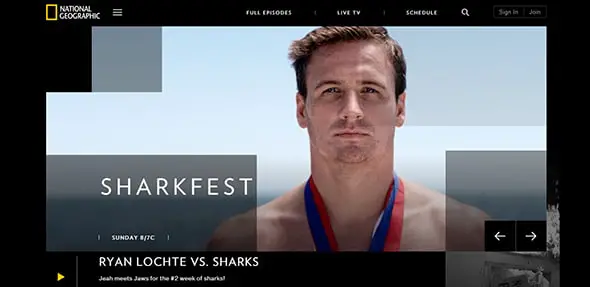
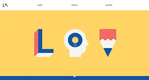
National Geographic
This is a gorgeous website which has a clear structure, a visible menu, beautiful typefaces, and a unique homepage slider.
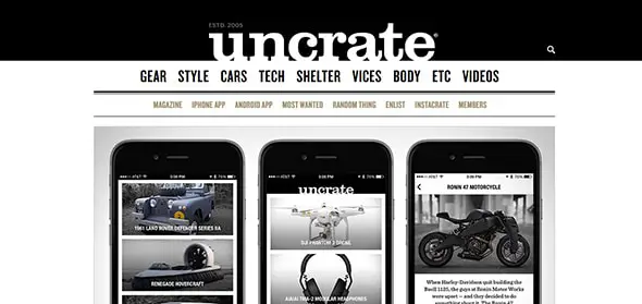
Uncrate 2.0
This wonderful website concept has a fully responsive design, includes a search bar and the content is well-organized and visible. All these features make it more user-friendly and appealing to the visitors.
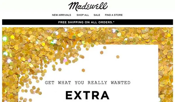
Madewell
Here’s a beautiful website concept design that has a user-friendly layout. Get your inspiration from this stunning design and see what neat features your discover.
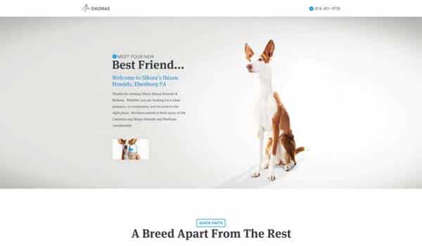
Sikora Ibizan Hounds by Brandon Termini
This website has a clear structure with concise information and beautiful high-quality images. The logo and the contact information are visible and at reach.
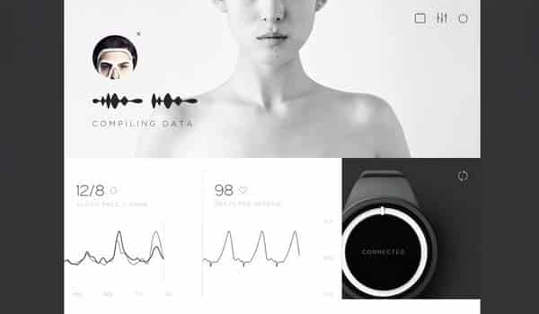
Aquawa on Behance
This is a fully responsive design which will automatically adapt its content to perfectly fit any screen size.
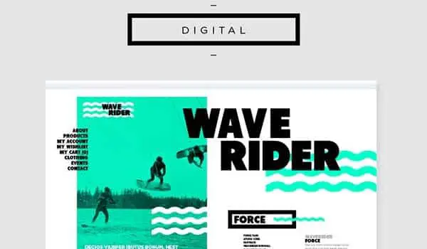
WAVERIDER
This is another user-friendly website design which includes user-friendly features. These include visible menu and logo design, 100% responsive layout, big headings with precise information, etc.
Kara
This is a stunning web design concept which has an eye-catching design that will surely keep your users engaged.
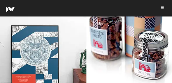
Drew Watts
This website has a fixed header and footer which include all the necessary information to navigate through your website.
STP – Simple, Clean, Masonry
This design includes a neat feature which brings back the header, with the menu and the logo, each time you scroll up. Also, it has a well-thought overall design with beautiful high-quality images.
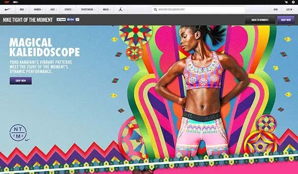
Nike: Tights of the Moment by Mariola Bruszewska
This is a beautifully colored website which includes neat features and an eye-catching design. The homepage slider is unique and has some great transitions.
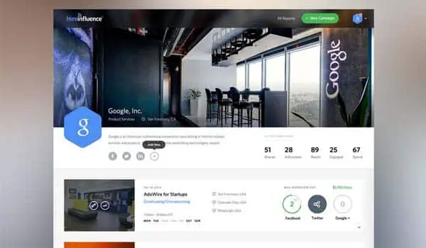
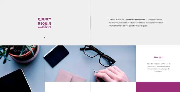
Hireinfluence
Here you have an excellent website which has a wonderful eye-catching design and neat features.
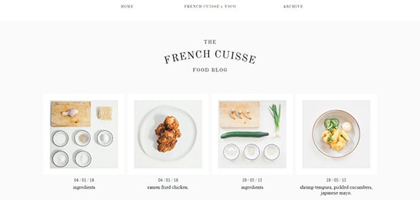
The French Cuisse
This is a minimalistic design with a well-organized grid layout. Also, it’s 100% responsible and it includes neat features that make it user-friendly.
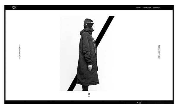
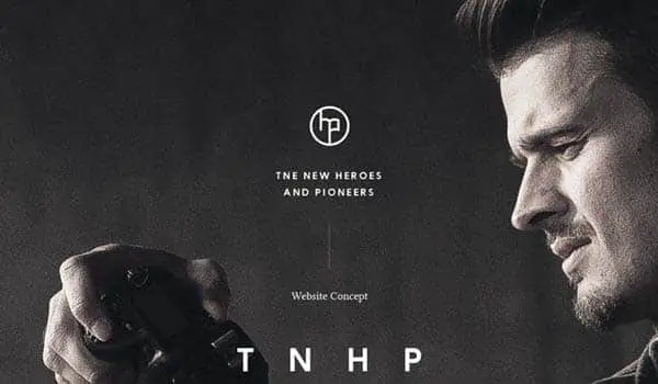
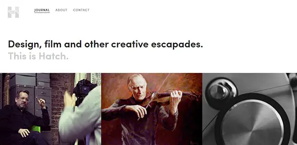
The New Heroes & Pioneers
Here’s another outstanding website concept which you can use as an inspiration. Discover its full features and see what new things you can learn.
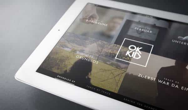
Ok Kid – Grundlos Extended
The design of this website is minimalistic with subtle animations. The simple details and the creative design give it a unique appearance.
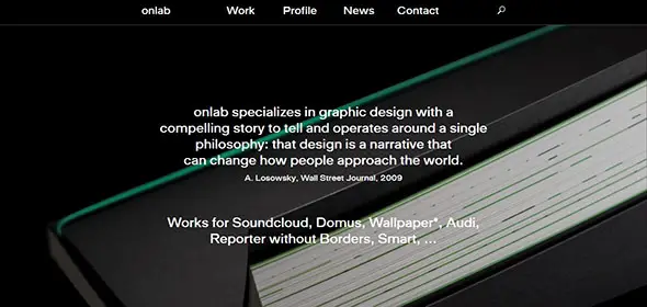
Onlab – Font for the HBC
Here’s an outstanding one-page design which has an eye-catching design that will get your attention. This design uses a fixed menu design which allows you to easily navigate through each section.
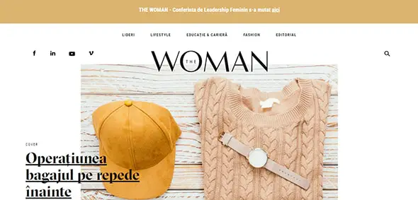
The Woman
You can use this beautiful website design as an inspiration for future projects. This layout is fully responsive with neat features and stunning design.
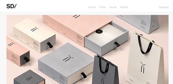
SocioDesign
SocioDesign is an experienced design and strategy agency based in London. This is an excellent website with a well-organized layout.
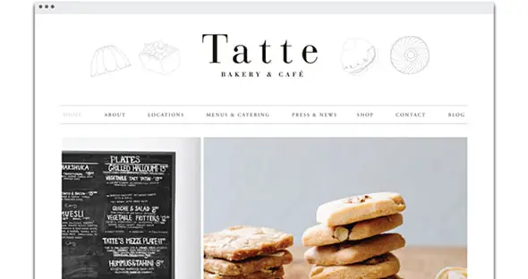
Tatte – Amanda Jane Jones
Get inspired by this outstanding website design concept and use what you learn in your future projects. The menu, buttons and minimalist style are perfect for this kind of website.
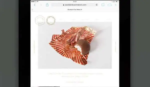
Scotland Can Make It! designed by Graphical House
This is a beautiful website design with a user-friendly layout. It is fully responsive, has a minimalist design style and the typography is very well chosen.
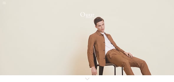
Ouur Collection
This website has a fully responsive layout which will automatically adapt its content to fit any screen size. It makes use of large images to increase the visual impact of the design.
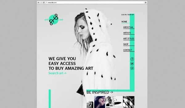
And And Web Design
This website uses the ultimate trends in web design, animations, creative menus, high-quality images, and more.
Shotfolio PSD Theme by Julián Pascual, via Behance
Here’s a well-designed website theme which you can quickly customize to make it meet your requirements. This design has a user-friendly design and it includes powerful features.

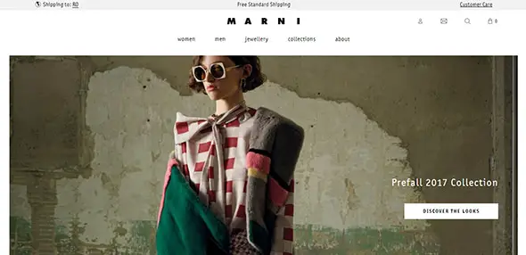
Marni
Marni is a user-friendly website with all the necessary functionalities of an online store. The designer included many great features which will ease the navigation through the website.
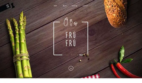
Frú Frú
There’s much to say about this wonderful website design. With a responsive design, well-organized content, and other neat features, this website has a user-friendly layout which will keep your users engaged.
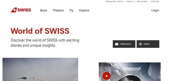
World of Swiss
Use this beautiful website design as an inspiration for your future projects. This layout includes an interactive design, high-quality images, and more.
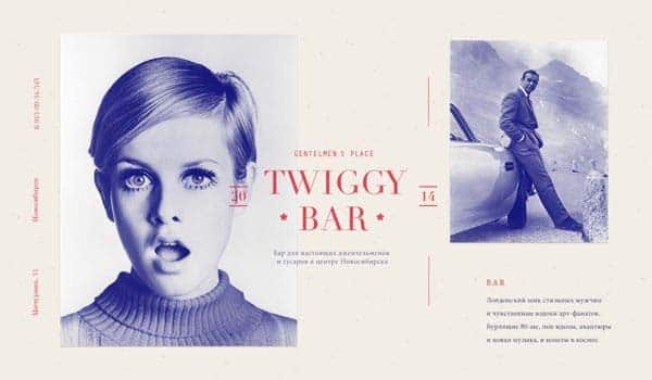
Twiggy Bar
This is a beautiful website which has well-organized content with a creative design that will surely get noticed. It almost has a magazine-style layout.
Lala Berlin by Stefan Schuster
Here’s an outstanding web design with also includes an online shop. Follow this link and see its full design and features.

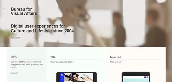
Bureau of Visual Affairs
This website has a creative menu design, parallax effect, neat animations and a stunning design. These features make it user-friendly and accessible to all viewers.
Johann Lucchini
Here you have an outstanding portfolio website with a user-friendly design. The works previews are showcased in an organized grid pattern which allows you to view them better.

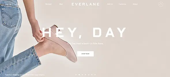
Everlane
You can use this wonderful website design as an inspiration for future projects. This layout has a fixed menu navigation which eases your navigation through the website.
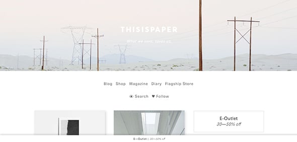
THISISPAPER
This is an amazing website design which has many user-friendly features. These include a well-organized content, clean design, visible information, responsive design, and more.
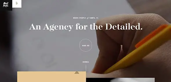
Brave People
This website has a professional design with powerful features such as parallax effect, animations, full-screen layout, etc.
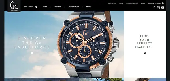
GC Watches
In this website, you’ll discover high-quality images, a sticky menu, 100% responsive, all used with great craftsmanship and attention to details. This is an overall elegant and luxurious design.
Escape Committee
This website makes use of white space perfectly, the images being at the center of attention throughout the site. Its layout is fully responsive which allows you to view the content perfectly on any screen size.
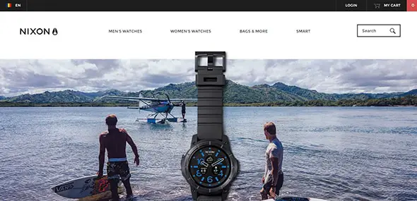
Nixon
This is an elegant website with a store that was created for watches and premium accessories. Get inspired by the way this online store emphasizes its products while having a great UX design.
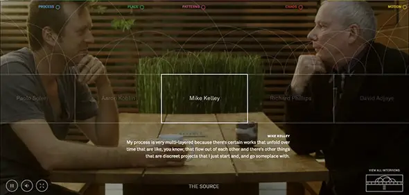
Doug Aitken: The Source
Here you have a beautiful website with a creative design. The layout includes multiple interviews which are showcased in a unique manner, on top of the web page.
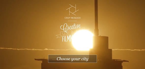
Crop the Block
This is an amazing full-screen website which has a user-friendly design. Also, you’ll find lots of eye-catching videos and beautiful fonts.
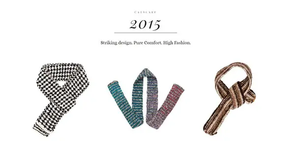
Catscarf
There are a lot of high-quality images on this online shop that will impress any animal lover. Besides having a great design, this website also has a fully responsive layout that adapts to any screen size.
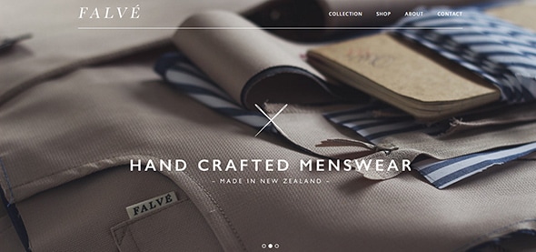
Falve
This is a beautiful website design which has a user-friendly layout. This includes a responsive design, well-organized content with visible headings, buttons, and other neat features.
Intersection
The design of this website is fully responsive, which allows it to be displayed perfectly on any device. The headings blend perfectly with the full-screen image backgrounds.

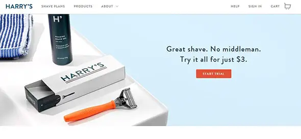
Harry’s
This is a full-screen website design with an user-friendly layout. You’ll discover stunning images, beautiful fonts, well-organized content, etc.
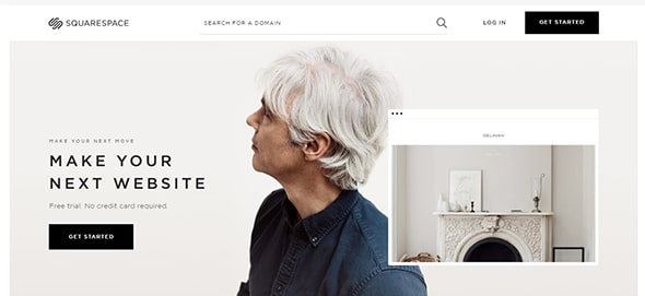
Squarespace
You all have heard about Squarespace. Use this outstanding design as an inspiration for your future projects. This design uses interactive animations, beautiful images, and many customizable features.
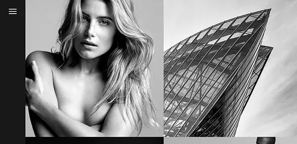
Jonathan Decosta
This website uses an organized grid structure to display various images. Also, the menu has a fixed position and, when used, it enables an overlay which takes up almost all the page space.
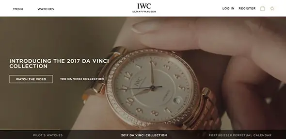
IWC Schaffhausen
IWC Schaffhausen is an online store with a professional design and an user-friendly layout. There are multiple video backgrounds which will definitely get your attention.
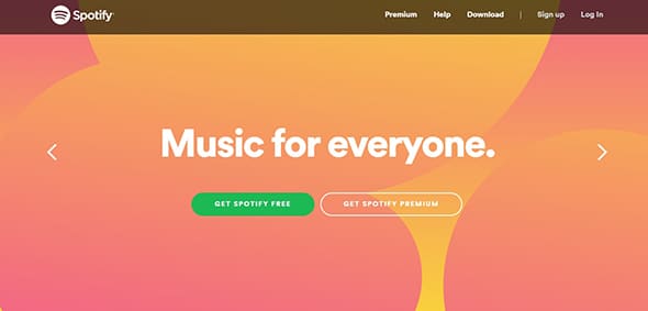
Spotify
Spotify’s popular website includes a fixed header design, with a transparent background. Also, this design has a beautiful colored background image. There are plenty of design tricks to learn from this website’s layout.
Google Glass
Google Glass website design is simple yet effective. See what features you discover and use in your designs.

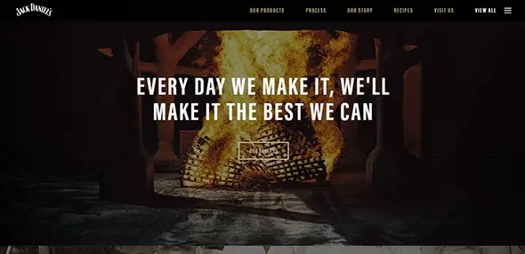
Jack Daniels
With a beautiful parallax effect, high-quality images and a well-known brand, this website attracts and keeps its users engaged.
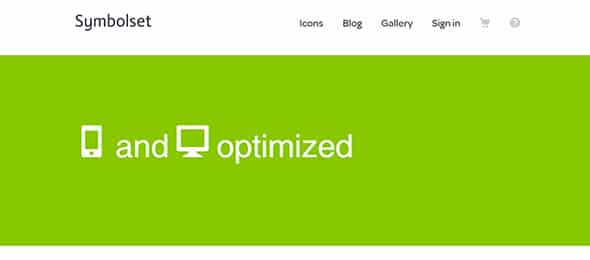
Symbolset
This website has an eye-catching color-changing background and an animated typography. These are some neat features that add to the creativity of this website.
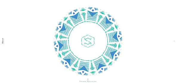
Simone Marcarino
Here is an interactively animated homepage which encourages you to take action. This design has a minimalistic layout which comes to life when hovered over.
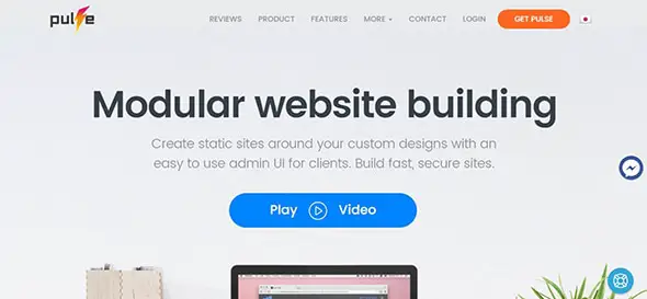
Pulse
This is a complex website design which includes multiple neat features and a well-thought design with beautiful colors and stunning graphics.
Creating a user friendly design is important for many reason. First, a cluttered design will frustrate your user, and they may leave – way before they have done whatever it is they were meant to do on your website (whether it is to purchase something, fill out a lead form, read an article, or anything else). Secondly, a well thought of and well laid-out design will keep your users coming back – something that every website owner will be happy with. So user these designs for inspiration when creating your next user-friendly website.
Which of these designs were your favorite and why?
The post 50 User-Friendly Website Designs That Work appeared first on Line25.


