Original Source: http://inspiredm.com/making-better-html-tables/
Inspired Magazine
Inspired Magazine – creativity & inspiration daily
Strangely enough, one of the most difficult web technologies to master is one of the earliest ones to be available for the browser after plain text and images. The problem is even greater today with so many different device types that need to be thought about.
Perfect tables are nearly impossible to create unless they contain so few items that no problems are likely to be triggered. The kinds of errors that can arise include:
Text wrapping incorrectly
Justification errors
Table rendering off screen
Scroll problems
Row height errors
Column width errors
General ugliness or untidiness
In this article we’ll take a look at how to avoid problems like that, so your tables have the best chance of creating a good impression.
Avoidance strategies to avoid
Because tables are so difficult to get right, some people try to avoid using them. Some common strategies are using CSS to create a fake table, and using an image of the data table without implementing it in code.
Both of these avoidance strategies have flaws and should be avoided. Using CSS to imitate a table lacks the semantic structure inherent in a table, which can create usability and accessibility problems.
An image of a table won’t suffer the problems that are listed in the introduction, but degrades your SEO potential and can’t be easily modified if your data needs updating. It also introduces usability and accessibility problems.
Frameworks are your friends
Common frameworks such as Bootstrap and Foundation contain many time-saving tools, and tables are no exception. Building a classy looking table in Bootstrap is not difficult, but does come with some limitations if you just build off the rack without adding some bespoke tailoring to your efforts.
Looks aren’t everything
Because content and style should always be independent, it can make sense to build your table in plain HTML first just to make sure it will look good before any special table styling is applied.
This can also be helpful in reminding you that good table construction requires more than just making the table look good. It should also be a useful information delivery system. If the goal of the table is not to convey information, then you shouldn’t be using a table for whatever it is you are doing.
Aim for accessibility
Some people have difficulty seeing and reading printed text, so it’s a good idea to make tables accessible for them. You can find out everything you need to know about making your tables more accessible from WebAIM.
Consider giving ID values to table components
For maximum control over each part of the table (rows, cells), you can consider giving them individual ID values. Adding class values as well will give you even more flexibility.
Doing these things creates a lot more work for you, so it’s only practical when you need to be able to fine tune any item by reference. If you do decide to do this, you will be able to directly manipulate any table item using JavaScript and CSS.
One of the complexities of table making is that we declare rows but not columns. The columns are created dynamically, calculated according to how many data items you place on each row. This is why tables add to your page loading time.
Effectively it means columns exist only in an abstract sense before the page is rendered, so you can’t give them any kind of reference. By giving the first TD item on a row a class of, for example, “firstCol”, you provide a way to directly reference a column.
Compact tables are best
It has become fashionable to build everything with big, high visibility components. From an accessibility point-of-view, this is wonderful. In terms of usability, however, it isn’t always the best way, because it can lead to problems.
The developers of Bootstrap experimented with responsive tables, but tables and responsiveness don’t go well together. Designing your tables from the start so they’ll fit on a mobile screen in portrait mode is a smart move.
Tables should always be scrollable
It’s a good practice to always set the overflow value of a table to auto, but not on the table itself. Instead, wrap the table inside a div, something like this:

Then there’s a lot of PHP code that constructs the table body, closing with this:

The part that does the work of making the table scrollable is on the first line, where the table-wrap div is given a fixed height and has its overflow value set to auto. If you do this to the table itself, instead of to a wrapper around the table, it can have unintended effects.
Call in the heavy hitters if you need to
For simple tables, this is overkill, but when you have a table that really needs advantages like adjustable column widths and column sorting, there are some powerful jQuery applications that have been built to help with the task of constructing complex tables.
The biggest and most likely best is Flexigrid. This has a similar look to a Java Swing table, and works in a similar way.

The features of Flexigrid may even be too much for what you need, so in this case you could consider TableSorter, which is quite a bit simpler.

While the features of these kinds of tools can be exciting, it’s important to that they’re going to add even more to your page loading time. It’s best to save this kind of thing for when you really must have it.
Automated conversion tools won’t normally give best results
There are CMS plug-ins available that allow you to convert document tables to HTML tables. These are not anywhere near as good as building the table yourself manually, so if you want superior results, automation of this kind is not the way to go.
Your own home-grown automation is fine, however
Using PHP to construct your tables from database information is always a good idea, and definitely preferable to typing everything manually. The difference here is you have full control over how the automation works.
When you use third party automation, the third party author has to make assumptions about your table. This means you’ll end up with a generic table that may lack many features compared to creating the table yourself.
Use tables appropriately and they will reward you
Good tables are designed, they don’t just happen. When you design an information delivery system, you want it to be efficient and effective. Make sure your tables are designed to be just that, and your site will achieve maximum benefit from their inclusion.
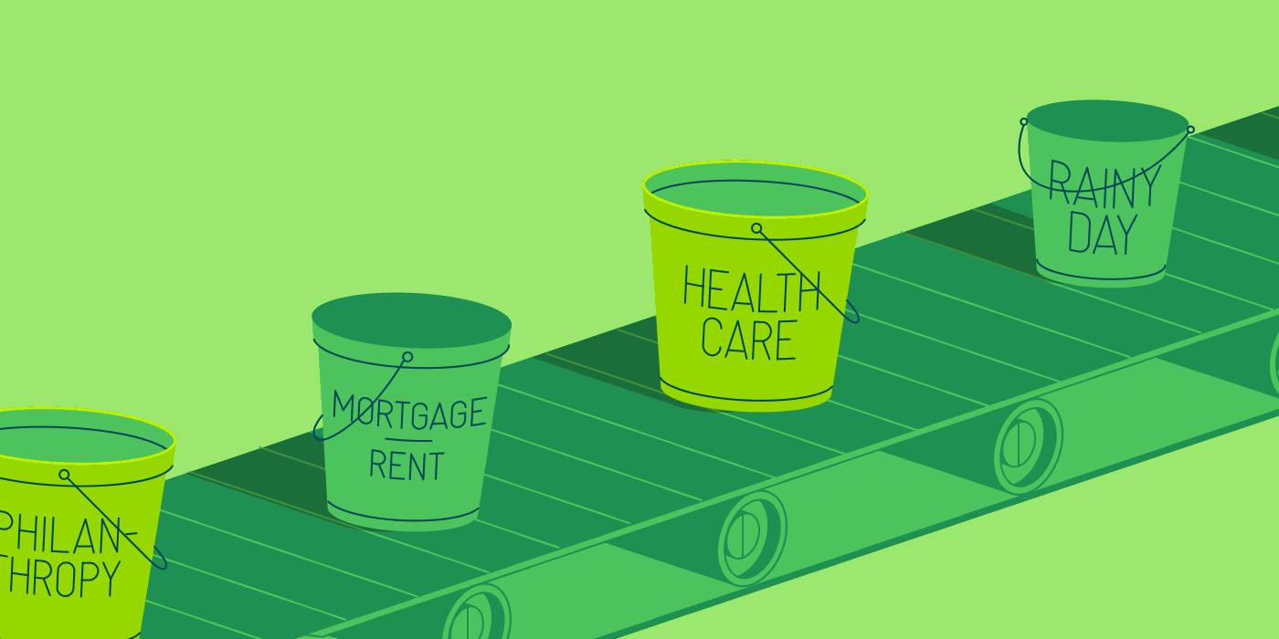
header image courtesy of Maggie Appleton
This post Making Better HTML Tables was written by Inspired Mag Team and first appearedon Inspired Magazine.


 One screen divided in two.


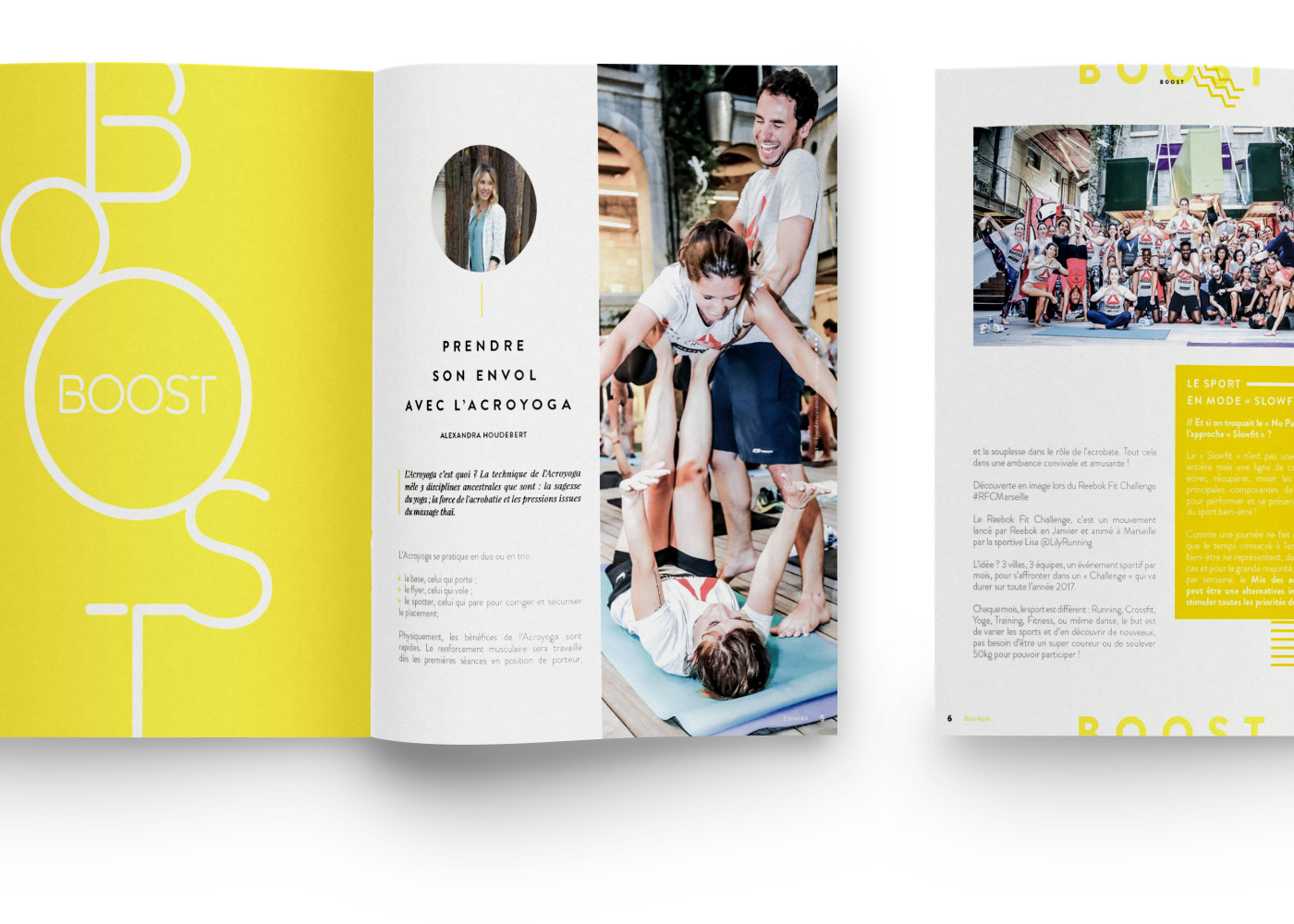
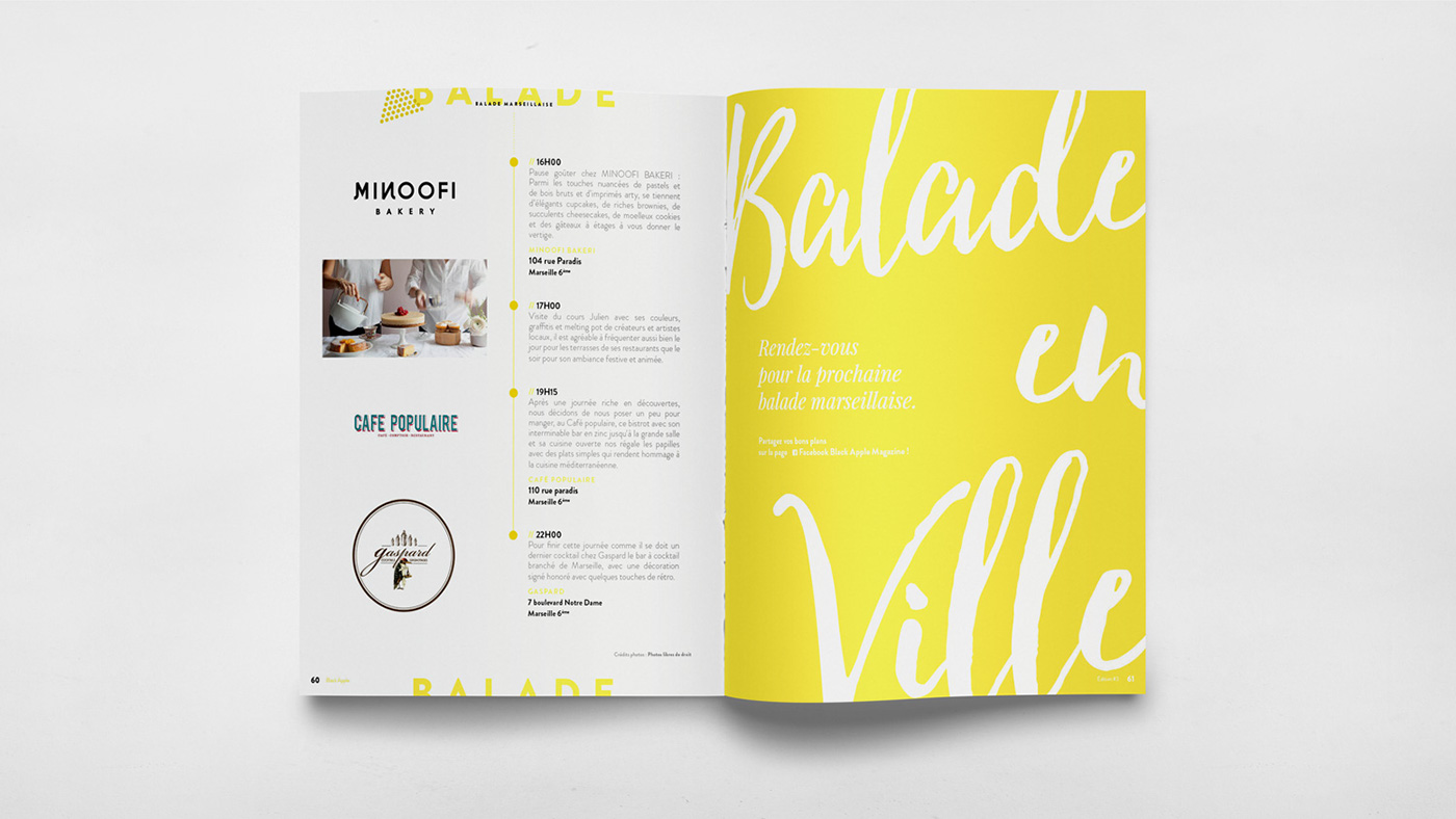
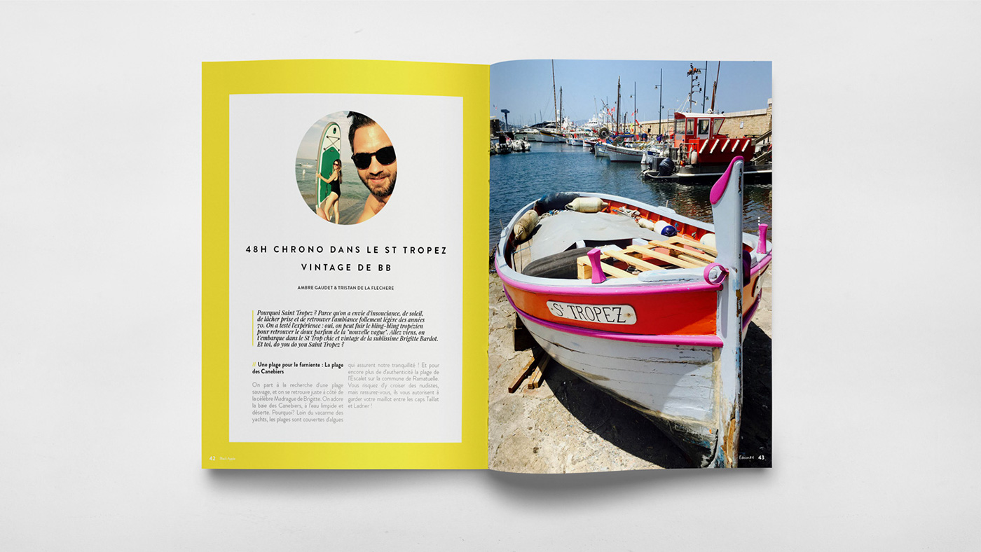
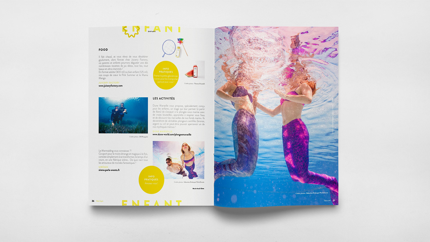
![Editorial Design for the Beautiful Black Apple Magazine [BAM]](https://abduzeedo.com/sites/default/files/originals/0ff28055783043.59944530760f6.jpg "Editorial Design for the Beautiful Black Apple Magazine [BAM]")